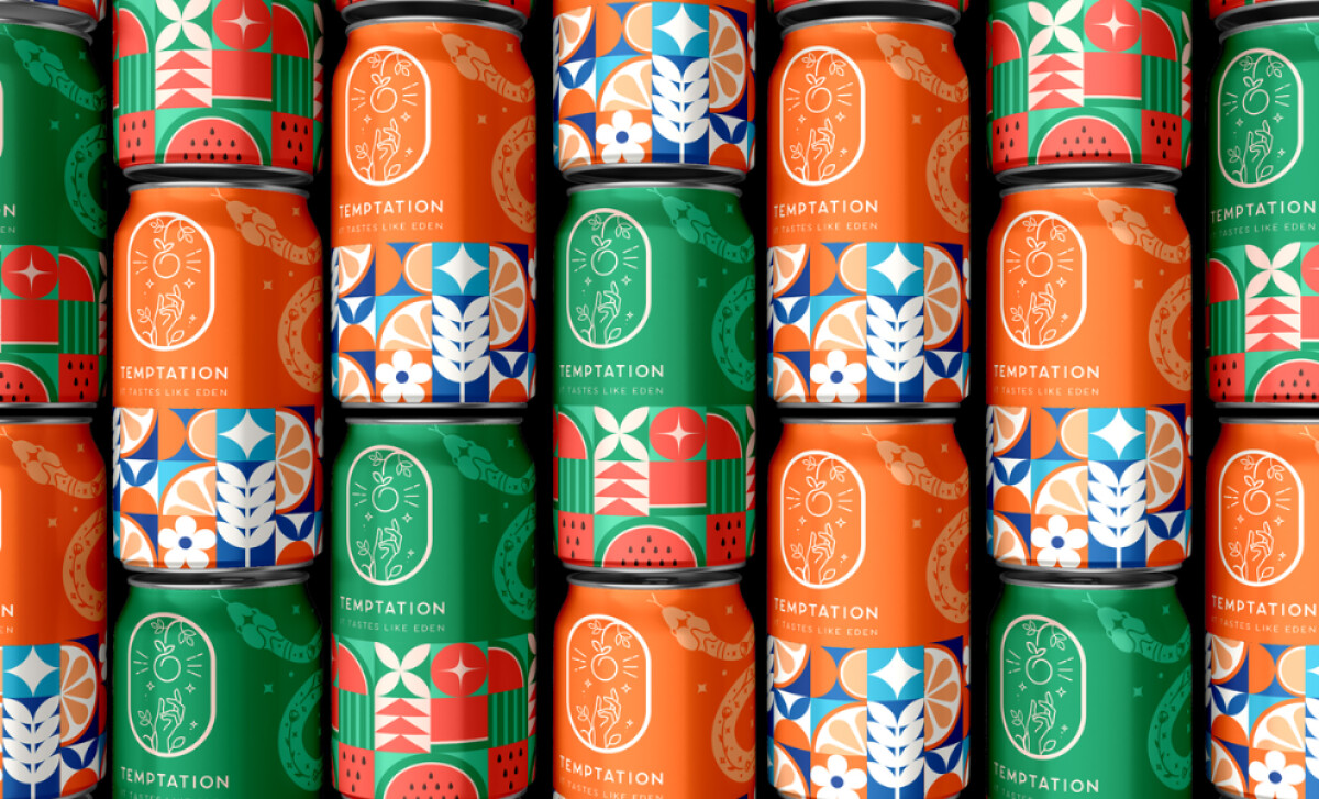
Creative Subs' Temptation Juice packaging design merges myth, minimalism, and modern organic values. With inspiration drawn from the biblical Eden narrative, the design elevates the ordinary juice can into a compelling story artifact.
Key Insights for Brands:
- Green color cues foster instant organic associations and support sustainability claims
- Bold geometrics enhance shelf standout and convey energy and freshness
- Eden symbolism adds emotional storytelling for deeper brand connection
Temptation’s Color Story Signals Organic Purity and Flavor Cues
A 2024 research shows that color is the most effective tool to evoke eco-consciousness, with vivid greens and oranges playing a pivotal role in consumer perception.
Temptation Juice uses a combination of bright colors and playful patterns. For instance, the green variant signals natural, organic purity, while the orange palette conveys ripe, fruity freshness. Together, they reinforce Temptation Juice’s core values through smart color psychology.
Complemented by patterns of stylized leaves, fruits, and geometric forms, this visual language taps into the 85% of consumers who cite color as the primary reason for buying a product, making the packaging both meaningful and irresistibly eye-catching.
Geometric Patterns Deliver Bold Shelf Presence and Product Differentiation
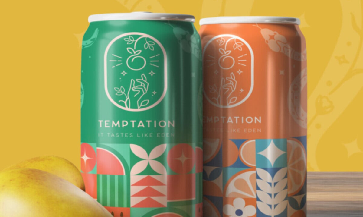
Geometric structure and matte finishes give Temptation Juice a high-impact, tactile edge. The can becomes a canvas of sharp, balanced patterns. Textured finishes like matte elevate the tactile and visual appeal, enhancing the feeling of quality and care in packaging, as validated by Packaging Digest.
Meanwhile, each variant is cleanly distinguished by color. Temptation’s use of repeating circles, leaves, and segments forms a bold mosaic that not only commands attention but also visually encodes flavor distinctions.
Explore more colorful packaging design that stands out on every shelf.
It’s a visual system designed for shelf clarity, where every SKU is recognizable at a glance without compromising the brand’s cohesion.
Minimalist Typography Reinforces Brand Clarity and Trust
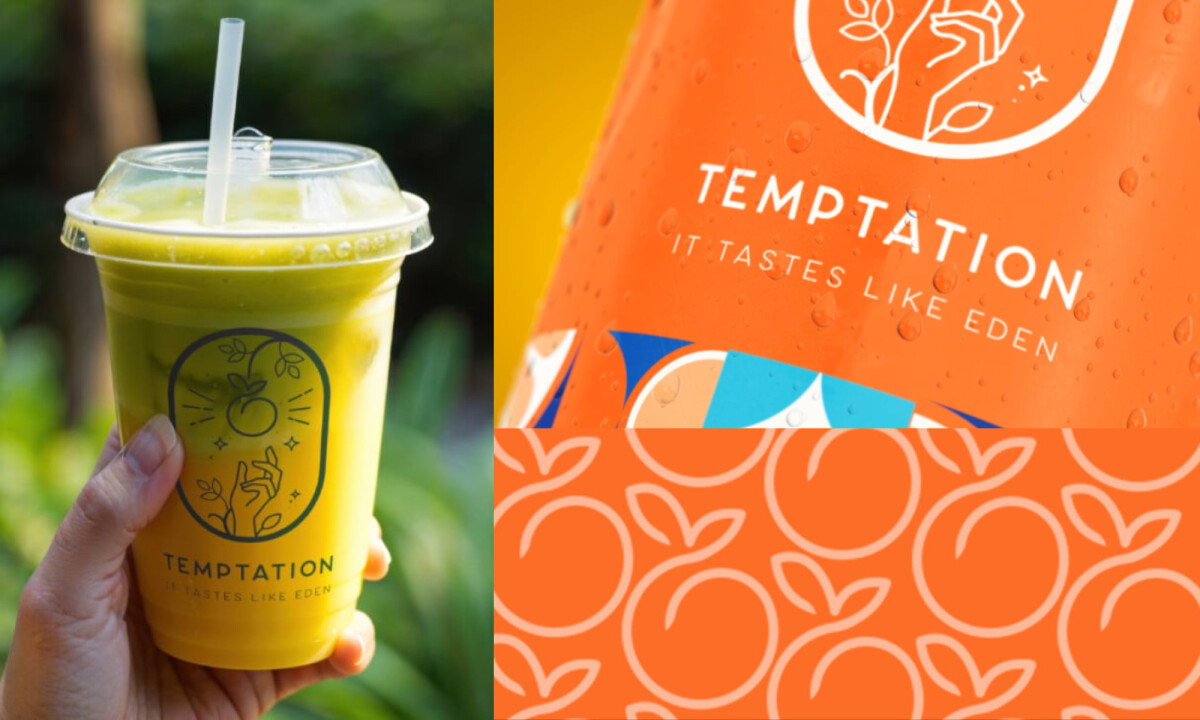
Temptation Juice strips away excess in its choice of font and layout. The brand name, set in a modern, sans-serif font with generous spacing, reads as clean and deliberate. It doesn’t compete with the bold patterns.
Instead, it floats above them, creating visual breathing room. Just beneath, the tagline “It Tastes Like Eden” sits in smaller uppercase type, unobtrusive yet anchoring the narrative. Both elements use a muted tone, allowing the typography to remain legible without overpowering the can’s design.
And this is strategic juice packaging. According to Forbes, 94% of consumers are more likely to remain loyal to brands that communicate transparently. Clear typography and minimal messaging reinforce that trust by making the product feel honest and accessible.
This is a principleexpert packaging design agencies understand well: every design choice, even the weight of a typeface, becomes part of the story a brand tells.
Temptation Juice Draws Power From Mythological Storytelling to Build Emotional Resonance
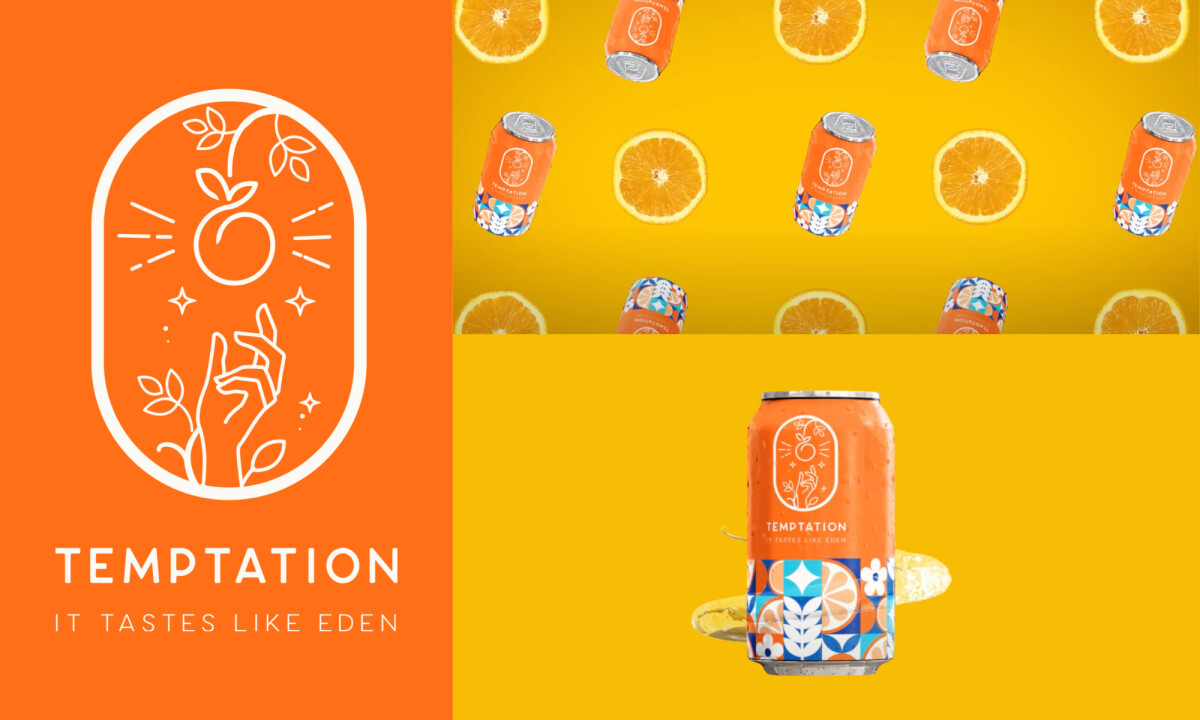
The design references Eve and the apple, but avoids literal illustration. Instead, it abstracts the idea. The concept of temptation is embedded through form, not a contrived narrative.
A single illustrated hand reaching for an apple anchors the design in the Eden theme. This use of iconography invites emotional recognition without resorting to overused imagery.
Neuroscience-backed research from New Neuromarketing shows that emotionally driven packaging stories enhance memory and drive purchase behavior.
It's a deliberate choice rooted in design psychology: visual metaphors like this, drawn from shared cultural memory, create faster, deeper brand associations through sensation transference. The result is packaging that sparks curiosity, signals quality, and builds a lasting connection.
Actionable Insight: Authentic, emotionally charged brand stories on packaging boost consumer trust and recall by making brands relatable and memorable. A 2025 IRJMETS study shows that even brief narratives on FMCG packaging drive stronger emotional engagement, improve attitudes and perceived value, and outperform traditional ads by building deeper loyalty.
Creative Subs' Temptation Juice packaging achieves a rare blend of visual storytelling, sustainable design, and market alignment. It has successfully combined geometric elegance with mythological cues and premium tactile finishes and appeals to the conscious consumer without sacrificing visual punch.
In doing so, it carves out a place among the best packaging design examples in 2025, proof that thematic, beautiful, and effective branding can coexist in every sip.
