The Prisoner’s Reserve Wine Collection Sets A Customized And Tantalizing Mood
The Prisoner Wine Company dares to be different. They take an unconventional approach to winemaking. They are passionate and want to work with others who are equally passionate about what they do and the wine they create.
This company works with vineyards all across California, creating wine blends that are sensual, seductive and alluring.
As a result, each wine gets their own personality and their own story. And each comes with a label and packaging that matches that persona. This wine company pulls from a variety of sources to come up with these enigmatic blends and characters, and it’s a beautiful way to bring wine and the wine experience to life.
One of their most recent concoctions came to life in the spring of 2016. They were creating a vintage reserve that combined a host of concentrated grape varieties. The end result was the vintage Dérangé offering.
This tantalizing and seductive wine is bursting with black cherry, clove spice, blackberry cobbler and vanilla toast flavors. It’s a full-bodied wine that’s both soft and acidic. The brand knew they had a real winner with this creation, and the price reflects that.
This bad boy sells for $100 a bottle — so you know it’s a good one.
But in coming up with a new flavor, the team knew they had to give it an identity to match. It had to be regal and sophisticated, but also mysterious and seductive. They needed to give it a personality and a life story that would blend with the multitude of flavors within.
They ended up going with a moody bottle design that captures this essence in a stunning and ethereal way.
The Prisoner’s Bottle Design Entices With Moody Colors And Mysterious Designs
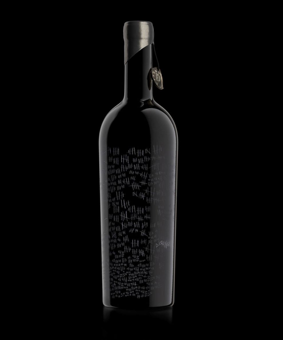
This wine bottle packaging for The Prisoner’s reserve Dérangé wine is moody and dark. It’s sophisticated, deep and a little bit creepy.
The sophisticated packaging starts out covered in a glossy black coloring. There is no color to this design, only a monochromatic usage of black and grey. The neck of the bottle is covered in an angular silver matte wrapping. This adds a subtle edginess to the design overall.
There’s a tiny charm hanging from the top of the bottle as well. It’s a metal coin-looking token with the D for Dérangé pressed into it. This coin looks bent out of shape, dirty and old. It adds a mysterious tone to the bottle, and to the wine drinking experience.
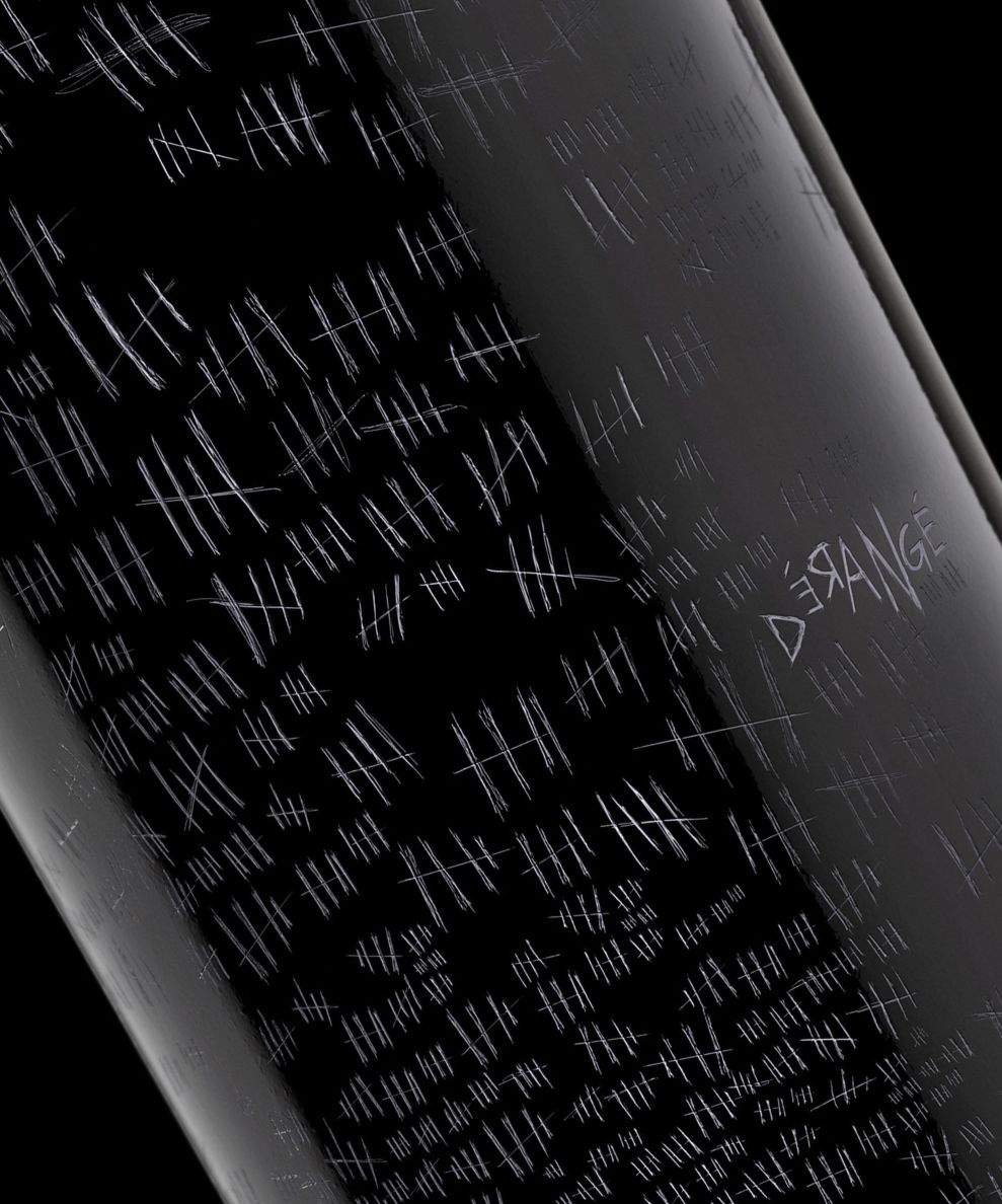
The bottle itself is covered in scratch marks. There is no copy except for the name of the wine which is also scratched into the bottle.
There are tally marks covering the bottle in various sizes. It looks like something straight out of a horror movie — like these etchings were made by a madman or were written out by a prisoner locked up using a blank wall to count the days they’ve been incarcerated.
It’s creepy. It’s dark. It’s mysterious. And it certainly makes you want to learn more.
The name of this special edition wine is also etched in the same scribbling. The size of the letters change, and some are even written backward. This adds to the horror-like quality of the design.
This moody atmosphere created by the innovative and eery etchings adds a depth to the wine. It gives it character. It gives it a purpose.
This air of mystery makes you want to investigate. And what better way to uncover a mystery than with a large glass of red wine?
The choice to go with a creepy and otherworldly vibe was a smart one by the creatives in this case. It’s just creepy enough to give you pause, but mysterious enough to pull you right back in.

The Prisoner’s Dérangé Package Design Is Alluring, Exciting And A Little Bit Creepy
People buy wine based on the packaging more often than not. I know I do. And if I came across this bottle design in stores, I’d be quick to pick it up and give it a look.
It’s edgy, grundy and mysterious. It’s paranormal and creepy and stunning. The etched-out tally marks and the mysterious writing is compelling on a level that is almost unexplainable — but we all like to get a little spooked sometimes, so it makes sense.
The black coating, the creepy token and the carved-out nature of this bottle adds to the character and personality of the packaging design. It’s enigmatic and engaging and can’t be contained. It’s bursting at the seams and wants to be released. This wine wants to breathe.
This packaging walks the fine line between creepy and captivating. It’s a breath of fresh air — steering away from the usual bright, colorful and floral nature of most wine bottle designs. And it gets your taste buds salivating.


-preview.jpg)
-preview.jpg)
-preview.jpg)

