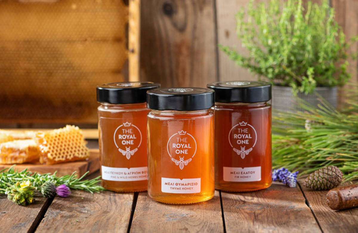
Standout features:
- Transparent label
- Crown symbolism
- Capital Doric font typeface
The Royal One is a brand conceived by the joint efforts of Maria and Elias, a couple of beekeepers from Boeotia, Elena Anagnostelou, and her design team. The product name reflects the quality and legacy of their premium honey, and the packaging design helped provide an appropriate visual identity for the brand.
The label features a logo that depicts a queen bee below the wordmark and the crown above it. The packaging design follows a modern, stylish, artistic approach with a fresh look. The label is transparent, letting the customers witness the color and fluidity of the product before purchasing it.
The jar is placed in a peach orange, peanut green, or lavender purple box, each emphasizing the identity of the three types of honey marketed (Fir Honey, Pine Honey and Wild Herbs, Thyme Honey).


-preview.jpg)
