Audemars Piguet makes watches that cost more than most people's cars. Swatch makes watches you buy at the airport. On paper, putting them in the same sentence is a joke. The Royal Pop collection is what happens when the joke turns out to be the point.
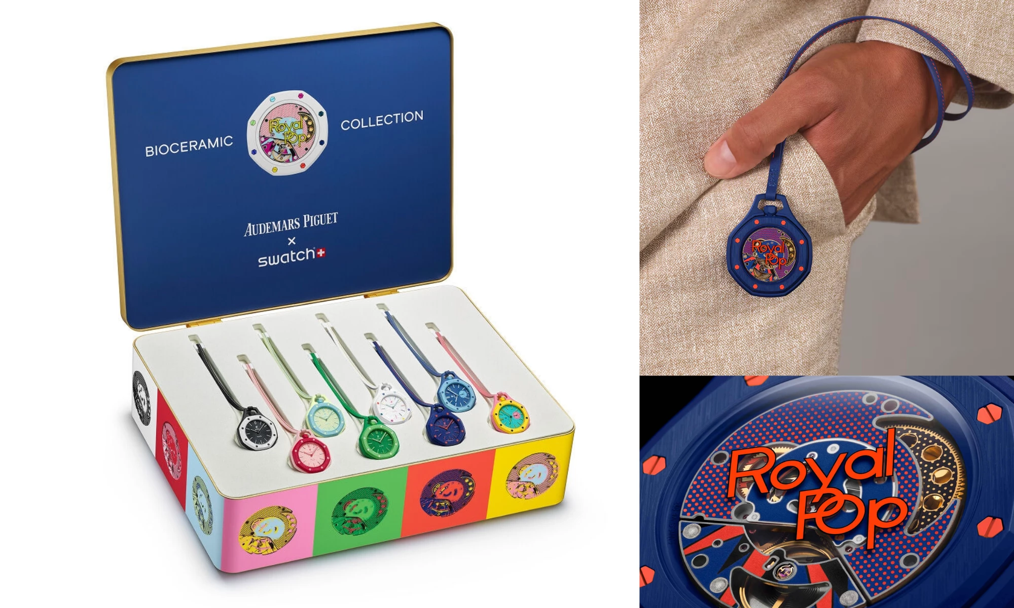
The collection dropped May 16, 2026 — one per person per store per day, eight colorways in bioceramic, worn around the neck on a calfskin lanyard or clipped to a bag.
Before Swatch could make an official announcement, AI-generated concept renders of what the collab "might" look like flooded Instagram, performing well enough that Swatch pushed up the official reveal.
A collaboration between two brands with a 600-to-1 price gap had cultural gravity before anyone saw the actual product.
That is worth paying attention to.
Inside the AP x Swatch Royal Pop Design
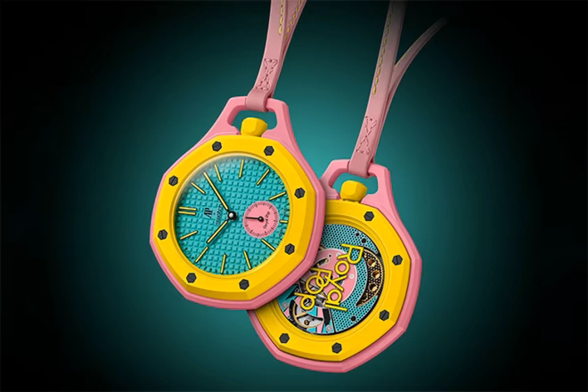
The Royal Pop is not a wristwatch. That decision is the first signal that something unusual is happening.
The timepiece moves beyond the wrist to express itself differently. Worn around the neck, in the pocket, as a bag charm or as an accessory, each piece comes on a high-quality calfskin lanyard with contrast stitching.

The format removes the object from wristwatch conventions entirely — no bracelet negotiation, no lug-width debate, no dress-versus-sport classification. It becomes a fashion object operating in different territory than either brand normally occupies.
From a design perspective, the Royal Pop incorporates key Royal Oak signatures: the "Petite Tapisserie" pattern, the octagonal bezel and its eight hexagonal screws, and the vertical satin finish on the bezel and case back. AP's design language — developed across 50 years of Royal Oak production — is fully legible at Swatch scale.
The collection runs on Swatch's SISTEM51 movement in a new hand-wound version incorporating 15 active patents, with over 90 hours of power reserve and an anti-magnetic Nivachron balance spring.
Both sapphire crystals keep the movement visible, front and back. Pop art halftone dots cover the SISTEM51's rotor plate, so a collector sees AP's engineering and Swatch's graphic language working in the same window.
The collector tin extends the design concept before the watch is ever removed. Warhol-style color-blocked portrait panels on the exterior, Ben-Day dot printing inside each medallion, eight pieces displayed in a white interior tray. The packaging is not an afterthought. It runs the same argument as the watch in a different form.
On paper, none of this should work. That is exactly where this article is going.
The Pattern
The Royal Pop is not the first brand pairing that looked wrong on paper. It will not be the last.
So what actually separates the collabs that produce something real from the ones that dissolve into a press release? Three cases. One consistent pattern.
Case 1: AP x Swatch Royal Pop - Why This One Works
The first proof that this pairing produced something real did not come from a design critic. It came from outside Swatch stores after its weekend launch.
View this post on Instagram
Police were called. Scalpers were doing deals in line. Within minutes of the first sales, watches were hitting eBay for multiples of retail. Most customers left empty-handed. The majority of locations had fewer than 200 units.
That is not a distribution strategy. What it is, is a controlled ignition.
The product itself explains why the demand was there.

What makes this luxury brand collaboration design work is simple: neither brand disappears into the other.
AP brings a design language with five decades of equity. The Royal Oak's octagonal bezel and Petite Tapisserie dial pattern are not referenced or nodded to — they are structurally present in the Royal Pop. A collector who knows AP can read it immediately.
Swatch brings bioceramic material innovation, the SISTEM51 movement, and the production infrastructure to put that movement in eight colorways at accessible price points. Both contributions are visible to the naked eye, thro What makes this luxury brand collaboration design work is simple: neither brand disappears into the other.
The form factor is where the creative risk lives, and it did not come from splitting the difference between AP and Swatch, it came from finding something neither would have done alone.
An AP pocket watch on a lanyard in 2026 is not a product that exists in the luxury category. It is also not a product that exists in the Swatch category. It exists in the space the collaboration created.
The collector tin makes the same point. The Ben-Day dot printing and pop art portrait panels on the exterior are a design decision that extends the concept beyond the object. Packaging that argues the same idea as the product is not common. It is worth noting.
The Royal Pop is not the only time this logic has produced something real.
Case 2: Crocs Balenciaga Collab Design - Why This One Also Worked
Balenciaga put high heels on Crocs, and they may sell for as much as $1,000. But the internet is walking all over the idea. CNN's Jeanne Moos reports. https://t.co/6z350m3uh8pic.twitter.com/F4RR0NbAAA
— CNN (@CNN) June 20, 2021
Critics mocked Crocs for most of its existence. Rubber clogs with holes in them, associated with nurses and toddlers and people who had stopped caring about footwear entirely.
Balenciaga creative director Demna Gvasalia first teamed with Crocs for the brand's spring 2018 ready-to-wear collection, dressing models in platform versions in pink, green, yellow and black.
The collaboration upgraded the Classic Clog to a 10-centimeter platform called the "Foam," adding Jibbitz charms — Balenciaga logos, flowers, peace signs, stars. It retailed for $850 and sold out immediately.
What made it work was the same logic at play in the Royal Pop. Gvasalia did not apologize for the Croc's form. "Everything is an appropriation," he said. The technique elevated even the most unexpected items to cult status.
Balenciaga treated the platform clog with the same absurdist seriousness as any other silhouette in its collection. The ugliness was not something to overcome. It was the point. Crocs, for its part, did not try to look luxurious. The clog remained entirely itself.
Both brands were fully committed to the irony, and both benefited from it. Neither softened its identity to make the fit more comfortable. That is the through-line.
Not every pairing survives contact with reality.
Case 3: Yeezy Gap - A Collab That Did Not
In June 2020, Ye and Gap announced a 10-year partnership. Ye would design a Yeezy line for Gap: his aesthetic, Gap's stores. Gap's stock rose 42% on the day of the announcement.
What followed was commercially promising and operationally incompatible.
Yeezy Gap delivered zipperless puffer Round Jackets, billowy closure-free silhouettes in recycled nylon with a matte rubberized coating. The first hoodie release set Gap's record for single-day sales, with 70% of buyers new to the retailer.
Where the partnership broke down was retail. Ye wanted product piled in bags on the floor, with no hangers and no merchandising scaffolding. That was the concept.
Gap had designed its stores for something else entirely, and the few attempts to execute the vision (including a Yeezy Gap Engineered by Balenciaga pop-up at the Times Square flagship) left shoppers digging through vinyl bags to find product.
The partnership dissolved publicly in September 2022. The remaining inventory hit markdown racks and stayed there. The Yeezy Gap design failure was not that the product was too strange.
The Round Jacket was strange in a legible, purposeful way. The failure was that both parties held a fundamentally different definition of what the partnership was actually for.
Ye wanted to rebuild Gap's relationship with product and retail. Gap wanted to sell elevated basics to its existing customer. The briefs were never the same document.
The Brand Collaboration Strategy Design Pattern
The three cases point to one finding: the collabs that work are not always the ones where the brands have the most in common.
They are the ones where each partner brings something the other cannot replicate, and neither softens its identity to make the fit more comfortable.
For any brand evaluating a luxury brand collaboration design, or any agency recommending one, the actual diagnostic is not "does this make sense on paper" but "will both brands still be recognizably themselves when the product shipped, and do they agree on what the product is for?"
The Royal Pop answers both.

Our team ranks agencies worldwide to help you discover the best partners for building iconic brand visuals. Visit our Agency Directory for the Top Packaging Design Companies, as well as: