Most packaging gets ignored. The stuff that sells doesn't rely on clever copy or extra features. It wins in the first two seconds, before someone even picks it up.
I've dissected what separates the products people grab from the ones they skip. This guide breaks down 20 retail packaging designs that actually move units, along with the specific decisions behind them that you can apply whether you're launching a new product or optimizing one that's underperforming.
Retail Packaging Designs: Key Findings
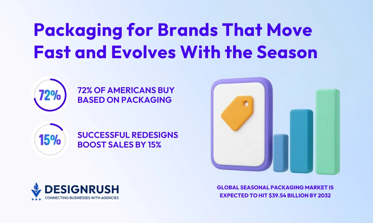
- Design for the five-second glance:72% of consumers decide based on packaging. Audit your shelf presence and eliminate anything that doesn't communicate value.
- Tie every design choice to margin impact: Exceptional packaging drives brand value and pricing power. Test conversion at point of sale, not just aesthetic appeal.
- Make sustainability visible, not theoretical:67% will pay more for recyclable packaging. Material choices must signal ethics as clearly as they signal quality.
- Build seasonal systems, not one-offs: The $24.99B seasonal market rewards ritual and emotion. Design modular structures that adapt from Thanksgiving to Christmas without losing brand recognition.
Standout Retail Packaging Examples to Inspire
- Copper Spirit Distillery
- The Thirsty Crow
- Hen Up
- Despierta Tea
- Mirzam Dreamy Chocolate
- Abeeja Honey
- Charm Villa's Goldfish Tea Bags
- Haps Handy Bugs Pliers
- Far Shore Merchants
- Bruadarach Whisky
- Munch’n Berries
- BASIK
- Zkano Socks
- Poilu Paintbrushes
- Butcher's Meat
In my experience, the best creative packaging makes a physical and emotional connection with the person holding it.
These examples don't just protect the product, they also:
- Tell the story
- Create theater, and
- Often solve a sustainability problem
Copper Spirit Distillery

Standout Features:
- Deep green labels with copper-foil detailing mirror copper stills
- Cylindrical bottle with wooden cap balances minimalism and eco-luxury
- Tactile materials connect craftsmanship directly to brand identity
Key Takeaway:Material selection communicates brand values before a word is read. Copper Spirit proves that sustainable choices don't dilute premium positioning when executed with restraint and purpose.
The Thirsty Crow

Standout Features:
- Geometric crow illustration creates instant brand recognition
- Earthy palette prioritizes narrative over visual noise
- Restraint in color ensures story drives engagement
Key Takeaway:Story beats style when recognition matters. The Thirsty Crow's minimal color strategy and iconic character create a visual identity that scales across formats without losing impact.
Hen Up

Standout Features:
- Bold geometric birds turn feed bags into lifestyle products
- Cheerful illustrations shift perception from functional to premium
- Kraft substrate reinforces sustainability while maintaining shelf appeal
Key Takeaway: Even commodity categories benefit from thoughtful design systems. Hen Up demonstrates how illustration and color can elevate perception and create differentiation in traditionally generic spaces.
Despierta Tea

Standout Features:
- Lavender and violet gradients create immediate calm associations
- Iridescent finish adds tactile dimension that shifts with light
- Soft color transitions mirror the ritual of brewing and unwinding
Key Takeaway:Packaging can precondition the experience. Despierta's gradient and finish work together to signal serenity before the product is opened, aligning visual cues with emotional benefits.
Mirzam Dreamy Chocolate

Standout Features:
- Lavender and violet gradients create immediate calm associations
- Iridescent finish adds tactile dimension that shifts with light
- Soft color transitions mirror the ritual of brewing and unwinding
Key Takeaway: Ships drift across cosmic seas, echoing the spice routes that brought cocoa to Arabia. Each wrapper shifts from linework to vivid color, turning chocolate into a story of discovery.
Abeeja Honey

Standout Features:
- Die-cut yellow sleeve folds into bee wings
- Paper engineering transforms static jar into interactive character
- Low-cost structural creativity delivers premium impact
Key Takeaway: Interaction drives memorability. Abeeja proves that structural creativity can deliver premium impact at accessible cost, turning functional packaging into shareable moments.
Charm Villa's Goldfish Tea Bags

Standout Features:
- Tea bags shaped like goldfish create movement in the cup
- Product itself becomes the design element
- Routine ritual transformed into shareable experience
Key Takeaway: The product can be the packaging. Charm Villa's goldfish bags show how functional design can create social currency and turn everyday moments into content-worthy experiences.
Haps Handy Bugs Pliers

Standout Features:
- Illustrated beetles transform plier handles into insect bodies
- Tools positioned as collectibles through graphic overlay
- Bright yellow with bold black ensures shelf recognition
Key Takeaway: Humor differentiates in serious categories. Haps turns utilitarian tools into objects of desire by layering personality onto function, proving that B2C thinking can work in traditionally B2B spaces.
Far Shore Merchants

Standout Features:
- Metallic foils and mythic creatures channel maritime romance
- Layered textures create depth across classic glass bottles
- Unified system allows variants to tell individual stories
Key Takeaway: Heritage can be engineered. Far Shore Merchants demonstrates how historical references and craft details build perceived authenticity, even for new brands seeking premium positioning.
Bruadarach Whisky

Standout Features:
- Sculptural glass wrapped in rib-like metallic exoskeletons
- Golden core glows from within, symbolizing time preserved
- Bottle doubles as display art beyond consumption
Key Takeaway: Luxury is built through restraint and precision. Bruadarach's sculptural approach proves that packaging can transcend utility to become art, justifying premium pricing through permanent brand presence.
Munch’n Berries

Standout Features:
- "Munch'n Man" character bites into label, framing fruit inside
- Playful design creates instant social media appeal
- Humor drives engagement and shelf visibility
Key Takeaway: Character-driven packaging creates shareability. Munch'n Berries proves that playful design can turn routine grocery purchases into photogenic moments that drive organic marketing.
BASIK

Standout Features:
- Muted geometric bottles reject traditional gender coding
- Minimalist design signals inclusivity through simplicity
- Clean lines prioritize function over decoration
Key Takeaway: Inclusivity starts with restraint. BASIK demonstrates how neutral design language can expand market reach by removing visual barriers that limit appeal.
Zkano Socks

Standout Features:
- Cylindrical packaging inspired by industrial smokestacks
- Design nods to American manufacturing heritage
- Nostalgia engineered for contemporary retail environments
Key Takeaway: Heritage messaging works when it's structural. Zkano uses form to tell a manufacturing story, turning packaging into a brand statement that resonates with values-driven consumers.
Poilu Paintbrushes

Standout Features:
- Die-cut sleeve turns brush bristles into illustrated hair
- Recyclable design with self-referential humor
- Product becomes part of the visual joke
Key Takeaway: Packaging can be the punchline. Poilu's clever sleeve demonstrates how wit and sustainability can coexist, creating delight without excess materials or cost.
Butcher's Meat

Standout Features:
- Kraft tray die-cut with animal silhouettes
- Honest, minimal design reconnects consumers with food origins
- Transparency as design principle
Key Takeaway: Honesty differentiates in commodity categories. Butcher's Meat uses die-cut clarity to signal authenticity, turning a potentially uncomfortable truth into a trust-building design choice.
Seasonal Retail Packaging Designs
- Cadbury Easter Collection
- Pringles Glow-in-the-Dark Halloween Edition
- Trader Joe’s Fall 2024 Collection
- Starbucks Holiday Cup Designs 2024
- Hershey’s Kisses Valentine’s Edition
Cadbury Easter Collection

Standout Features:
- Vibrant Easter hues and bold patterns across variants
- Playful characters create festive unity under Dairy Milk purple
- Collectible designs encourage repeat purchase
Key Takeaway: Seasonal systems need consistency with variation. Cadbury maintains brand recognition while creating enough novelty to drive collection behavior and multiple purchases.
Pringles Glow-in-the-Dark Halloween Edition

Standout Features:
- UV-reactive inks transform can into glowing Halloween prop
- Neon prints create high novelty at accessible cost
- Interactive feature drives instant shareability
Key Takeaway: Novelty creates virality. Pringles proves that simple technical additions like UV inks can generate outsized social engagement and justify seasonal premium pricing.
Trader Joe’s Fall 2024 Collection

Standout Features:
- Hand-drawn illustrations across entire product line
- Palette of cinnamon, mustard, and burnt orange signals fall warmth
- Unified design evokes comfort of seasonal gatherings
Key Takeaway: Seasonal cohesion builds ritual. Trader Joe's consistent visual language across categories creates an immersive fall experience that positions the brand as essential to holiday traditions.
Starbucks Holiday Cup Designs 2024

Standout Features:
- Signature red base with overlapping circles in mint and blush pink
- Modern geometry creates fresh take on nostalgic holiday feeling
- Cup design becomes seasonal ritual and cultural marker
Key Takeaway: Annual rituals require consistency with evolution. Starbucks' red cup is instantly recognizable yet refreshed yearly, proving that brand equity allows creative flexibility within constraints.
Hershey’s Kisses Valentine’s Edition

Standout Features:
- Heart-shaped windows reveal foil-wrapped Kiss inside
- Simple structural modification creates emotional connection
- Design transforms product into ritual of giving
Key Takeaway: Small changes create seasonal meaning. Hershey's proves that minimal structural adjustments can reposition a year-round product as a holiday-specific gift without expensive redesigns.
Each of these retail packaging designs proves a universal truth: design sells when it tells a story people can feel.
What Makes Exceptional Retail Packaging
Packaging is where brand identity faces the real world. It’s not decoration. It’s strategy expressed through material, form, and emotion.
Core Principles of Retail Packaging Design
Your retail packaging design has one second to communicate value. Color and contrast create the first pull.
Studies show that color increases brand recognition by up to 80%, which makes thoughtful palette choices essential. Clarity must follow instantly. If a customer has to search for meaning, the design has already failed.
Branding expert Zach Colman explains it simply:
“If something looks good, consumers feel safer about the purchase they’ve made — and it’s all possible thanks to the psychology of packaging.”
Structure protects the product and ensures it stands correctly on the shelf. Storytelling gives purpose to every detail, from typography to material finish.
I see packaging as a handshake between brand and buyer, a quiet promise that what’s inside is worth attention. Design is not just seen; it’s felt through cohesion.
Beyond Looks: Packaging as a Business Lever
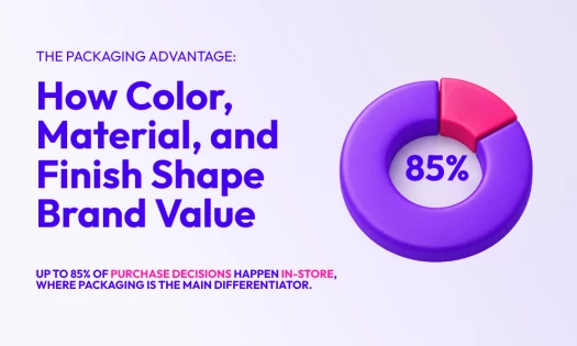
Research reveals that 72% of American consumers say product packaging influences their buying decisions. Great retail packaging design sells in that instant.
Shelf impact drives conversion, and the unboxing experience builds loyalty that lasts beyond the first purchase.
7 Hallmarks of Creative Retail Packaging

I’ve always believed that creative retail packaging is a moment of contact, a physical expression of the brand’s intent.
The best designs work on multiple levels: they look right, they feel right, and they earn attention in the few seconds that matter.
1. Innovative Structures and Shapes
A strong silhouette can do what a headline cannot. When I look at Abeeja Honey’s bee sleeve or the sculptural form of the Bruadarach Whisky bottle, I see memory built into structure. Shape carries emotion. It gives the product presence before a single word is read.
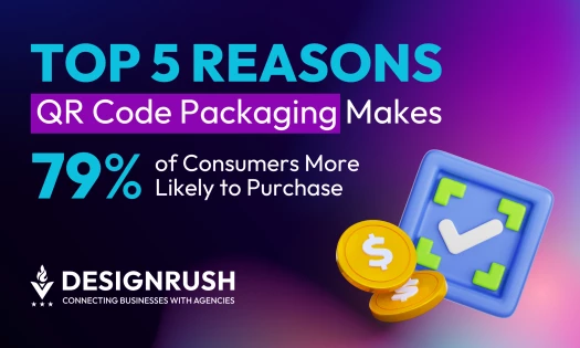
2. Smart or Interactive Elements
I like packaging that invites curiosity. QR codes, NFC tags, or simple folds that reveal new layers make people pause. They turn a static object into a small experience, which is rare and powerful in retail.
3. Sustainable Materials and Minimalism
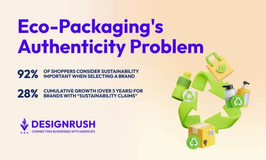
Research shows that 67% of consumers prefer recyclable packaging and will pay more for it. That number matters. It means sustainability isn’t an accessory anymore; it’s a buying trigger. I choose materials that age well, feel honest, and communicate care without clutter.
4. Limited Edition and Seasonal Sleeves
I use short-run sleeves or overlays to keep products fresh through the year. Small changes in print or texture can create urgency without changing the core structure. The customer sees something new, but the brand stays familiar.
In a DesignRush exclusive, brand strategist Will Williams notes,
“More established brands not only benefit from greater brand awareness. More importantly, they have built strong emotional connections with customers, which means their packaging design can focus more on supporting the overall brand proposition. If necessary, they can choose to be very single-minded in their approach — a sure way to win the attention of consumers.”
5. Unboxing and Multi-sensory Experiences
Touch matters more than most people admit. The texture of a surface, the sound of an opening seal, or the weight of a bottle can change perception. When packaging is deliberate, the brand feels premium.
6. Labeling and Illustrative Storytelling
A label is storytelling in shorthand. Illustration and typography express the voice of a brand faster than any paragraph could. I look for clarity and restraint, enough detail to inform, but enough space to breathe.
7. Cost-efficient Differentiation
Not every idea needs a structural overhaul. Spot UV, embossing, or foil can add distinction at scale. Digital printing gives me the freedom to test small batches or seasonal editions without waste.
These are the standards I rely on when building retail product packaging systems. They work because they respect both emotion and function. When done right, retail packaging designs don’t just sell a product. They leave an impression that lasts.
Retail Packaging Design Process and Validation
The truth about retail packaging design is that process creates power. The path from concept to shelf follows a clear rhythm: creative brief, dieline development, prototyping, visual execution, testing, and production.
This structure may sound rigid, but it’s the backbone of every successful launch.
Most brands fail at the same point. They skip testing in the name of speed. I’ve seen brilliant ideas fall apart because no one verified what the customer actually sees or feels at the shelf.
Validation is not an afterthought; it is the moment design meets reality.
As Packaging Digest reports, “successful redesigns boost sales by 15% on average” when testing focuses on conversion, not just visibility.
Steve Lamoureux of Designalytics says it best:
“It’s very likely that your business is going to grow or shrink based on whether or not people convert.”
In other words, the goal isn’t just to stand out — it’s to sell.
Smart testing happens across three dimensions:
- Consumer Testing: A/B shelf trials reveal what stops shoppers. Rapid feedback clarifies which colors, contrasts, and visual hierarchies drive engagement before production begins.
- Structural Prototyping: Physical mockups expose functional flaws early. The way a box opens, stacks, or ships determines long-term success more than most teams realize.
- Cross-channel Validation: Every retail package design must perform everywhere: on a shelf, in a feed, and at thumbnail scale. The story must stay consistent across every platform.
The rule I live by: never let production trap the design. Build flexibility in from the start. Modular components, digital printing, and short-run options let brands pivot fast for seasonal campaigns without losing integrity.
The best creative retail packaging lives beyond one launch. It adapts, evolves, and turns the entire retail product packaging process into a system built for growth.
The Numbers Don't Lie: Why Seasonal Retail Packaging Shouldn't Be Ignored
Every year, the industry rediscovers the power of timing. Seasonal packaging is one of those recurring moments. It rises, peaks, and reshapes the shelf.
The market hit $24.99 billion in 2023 and is on track to reach $39.54 billion by 2032.

But I keep asking: are brands doing it for impact, or just for show?
When 80% of consumers forget brand content within three days, seasonal packaging isn’t a gimmick. It’s how memory is made.
The ROI Speaks for Itself
Toblerone changed its name to "Ho Ho Ho" on Christmas packaging in 2006. Sales jumped 400%. One tweak. Quadruple revenue.

Seasonal packaging works through four mechanisms:
- Impulse Purchase Acceleration: Time-limited designs trigger urgency. Shoppers buy on impulse during Christmas, Halloween, and Easter when packaging signals scarcity.
- Basket Size Expansion: Multipacks and collectible sets increase units per transaction. Seasonal packaging turns single purchases into bundles.
- Brand Loyalty Returns: Customers remember emotional moments. Limited editions create rituals. People come back each year expecting the next release.
- Social Distribution: Shoppers photograph and share distinctive packaging. Free reach. Real credibility.
For Brands: Four Moves
Brands that master seasonal retail packaging design become year-round favorites:
- Own Peak Periods: Execute well during holidays and you control the shelf when spending peaks.
- Create Predictable Cycles: Annual releases build anticipation. Customers plan purchases around your calendar.
- Test Without Risk: Seasonal releases let you experiment with materials and formats your permanent line can't support.
- Charge More: Limited editions justify premium pricing. Customers pay for exclusivity and gift-readiness.
For Agencies: Where You Win
Agencies that solve seasonal packaging become essential partners:
- Build Flexible Systems: Design frameworks that express seasonal themes without eroding brand recognition. Holiday versions should strengthen identity, not confuse it.
- Add Technical Depth: QR codes, AR triggers, and dynamic content make packaging interactive. You gain engagement data and extend the experience past purchase.
- Lead on Sustainability: Eco-friendly seasonal solutions differentiate you as recyclable materials and minimal waste become standard expectations.
- Use Real Data: Market analysis identifies which seasonal windows matter most. Good forecasting prevents overproduction and protects margins.
Why Intentional Retail Packaging Always Wins
Retail packaging design is the intersection of art and commerce. Trends will shift, but clarity, structure, and emotion remain constants. Every creative choice must serve a purpose.
If you embrace creative retail packaging, make it count. Use it to tell your brand’s story, to invite participation, to make people care. When executed with discipline, retail packaging designs don’t just sit on shelves.
They sell, they speak, and they endure.
![]()
For retail and consumer goods, great packaging design begins with clarity, shelf impact, and a sense of purpose.
Looking to create packaging that attracts, informs, and endures?
Our team ranks agencies worldwide to help you find a qualified partner. Visit our Agency Directory for the Top Packaging Design Companies, as well as:
- Best Packaging Designs
- Best App Designs
- Best Website Designs
- Best Logo Designs
- Best Print Designs
- Best Video Designs
Retail Packaging Design: FAQs
1. How important is packaging in influencing purchase decisions?
Very. About 72% of U.S. consumers say packaging impacts what they buy. Good design builds trust, communicates value, and drives conversion faster than any ad campaign.
2. Why is testing packaging design so important?
I’ve seen too many brands skip it. Testing early helps reveal what customers actually notice, choose, and trust before production locks the design.
3. How can seasonal packaging help a brand grow?
Seasonal packaging builds excitement and loyalty. Limited editions create moments customers look forward to, like Starbucks’ red cups or Cadbury’s Easter eggs.