Standout Features:
- Simple yet creative layout
- Color-coded product variation
- Ingredient-centric imagery
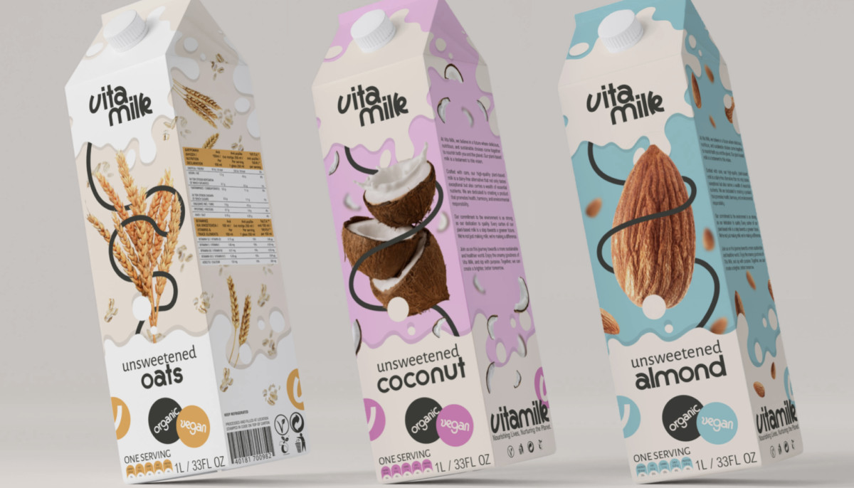
In the bustling plant-based milk market, capturing consumer attention is paramount. Vita Milk, recognizing the need for standout packaging, enlisted the expertise of Designs by Olympia. They aimed to create a design that would communicate the brand's values and stand out on crowded shelves.
The result? A packaging system that is as refreshing as the product, a harmonious blend of minimalism and visual storytelling.
Vita Milk’s packaging design employs a clean, uncluttered aesthetic and ample white space. This layout allows the brand's name and key information, such as the flavor and organic certification, to shine without competition.
It’s then followed up by an effective color-coding system to quickly identify various flavors, such as gentle pink for coconut and serene blue for almond. These muted tones convey Vita Milk’s commitment to natural ingredients and gentle, wholesome nature.
Lastly, the packaging communicates the product's organic origins with high-resolution ingredient images, such as oats, coconuts, and almonds. This focus on raw ingredients allows the design to resonate with consumers looking for simple, unprocessed foods.