-desktop.jpg)
Strategic consulting can easily fall into sterile, predictable design language, but Lostaunau Consulting’s print identity swerves boldly in the opposite direction.
Designed by Kiddo™, this branding system is alive with movement, color, and expressive optimism. It’s a perfect visual match for a firm that is dedicated to helping other businesses transform.
Industry Insight: The out-of-home advertising market is experiencing strong growth and is projected to exceed $35 billion in 2025. In this increasingly crowded space, a brand's ability to capture attention with a bold print identity, like Lostaunau Consulting's, is more critical than ever.
Key Findings for Brands:
- A simple, recurring graphic motif creates a strong, recognizable brand identity that can be applied across all materials.
- Asymmetrical and rhythmic layouts can make a brand feel more dynamic and personal than traditional, rigid corporate designs.
- A bold, optimistic color palette is an effective way to differentiate from conservative competitors in a traditional market.
Billboard Typography Drives Emphasis Through Rhythm and Variation
On the billboard, the headline uses a variety of font weights and colors to create emphasis. These key phrases are presented in a bold, geometric sans-serif font.
Other words are set in a contrasting thin weight. This creates a rhythmic and engaging reading experience. Then, a final call-to-action button invites the viewer to “Take flight.”
The way the text is presented feels very intentional and choreographed. The rhythm created by the contrasting weights and colors makes the message much more impactful.
Additionally, in a public setting like a billboard, immediate legibility is paramount. Lostaunau’s design cleverly balances this with its expressive hierarchy.
The copy grabs attention, but more importantly, it guides the viewer through a layered message of partnership and innovation.
This balance of artistry and clarity is what makes it one of the best billboard ads with inspirational designs.
Wavy Motifs Create a Visual Language of Movement and Growth
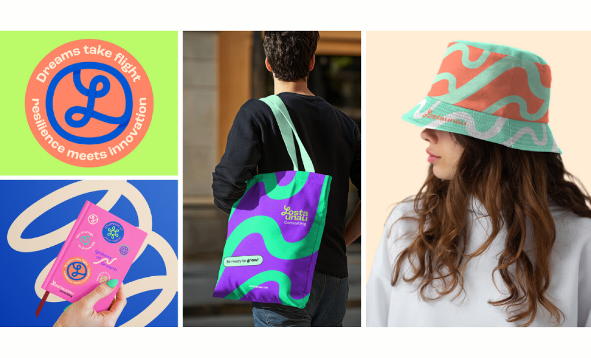
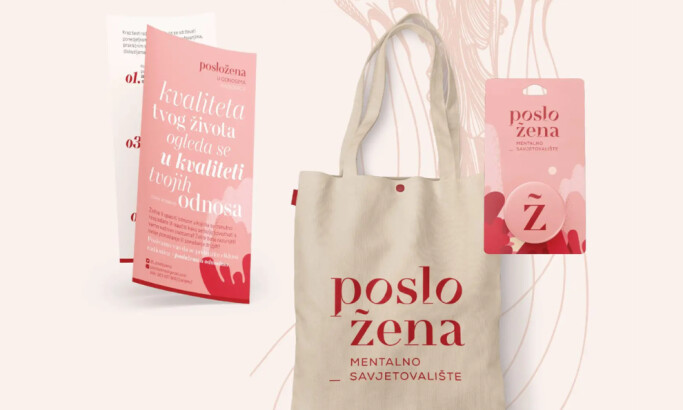
A flowing, curved line is the brand’s signature graphic motif. This “wave” appears everywhere in the branding, from the billboard to business cards and tote bags.
It is usually a vibrant seafoam green, set against a bold, contrasting color. This makes the motif both eye-catching and a consistent part of the brand’s identity.
It also serves as a strong, memorable icon that makes the brand easy to recognize in any context.
The wave graphic is a thematic choice, not just a decorative one. We can interpret the wave as a visual metaphor for the brand’s focus on transformation and progress, which is exactly the level of strategic thinking expected from top print design companies.
Additionally, this flowing graphic helps to soften the brand’s image. According to a 2025 Vistaprint survey, 42% of consumers say that it is the brand's personality that makes them trust it.
And this brand personality signifier is a welcome departure from the rigid look that is so common in the consulting industry, aligning with graphic design trends that favor more organic and approachable visuals.
Vibrant Color Pairings Reinforce Optimism and Boldness
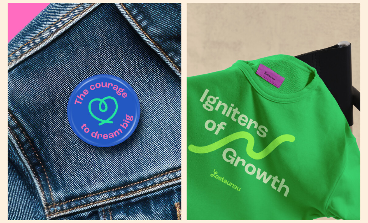
A 2024 study suggests that vibrant colors can inject significant energy and excitement into a design. And the color palette here is a key part of what makes this brand so energetic.
It features a range of high-saturation colors, including a vivid purple and a fresh mint green, often used in bold, contrasting pairs. To balance the brightness, the backgrounds are often a more muted pastel shade.
This bright color contrast also has a strong impact on the effectiveness of print designs like billboards because it makes the message easier to spot and much more impactful (Clausius Scientific Press, 2022).
Strategic consulting rarely leans into such a celebratory color system. But here, it’s clearly deliberate.
The use of color is both bold and controlled, made to direct the viewer’s attention and improve readability. But it also supports the idea that transformation can be joyful and that business growth can be a vibrant and exciting process.
Business Cards Serve as Playful Micro-Canvases of Brand Personality
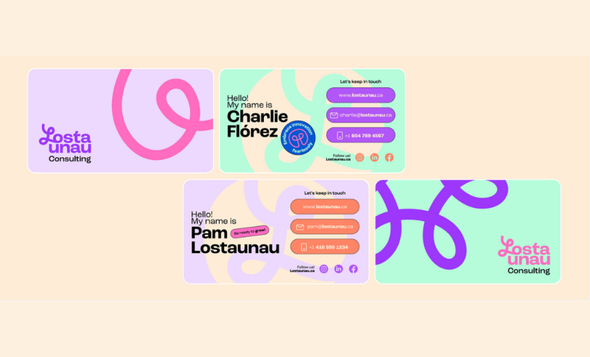
The design extends into the brand’s business cards, which are another great expression of the brand’s personality. They feature a playful headline, a large version of the brand’s graphic motif, and colorful, easy-to-read contact buttons.
Similar to the billboard, the design of these cards is much less formal than a typical business card. According to a 2024 study by Wave, people are 70% more likely to remember a person based on a unique business card.
The friendly language and asymmetrical design are exactly what give them a modern and approachable feel, showcasing the creative possibilities of what print design is.
Additionally, the use of different background colors across the set adds a layer of personalization and visual interest to the design.
These cards are a great tool for making the brand feel more human. Their friendly and playful design is a perfect match for a company that values partnership, and it's this attention to every touchpoint that defines the best print design.
What Agencies Can Learn from Lostaunau Consulting
Kiddo™'s work for Lostaunau proves that a well-executed print strategy is a powerful tool for differentiation and engagement, capable of delivering tangible results.
Here’s what creative teams can take away:
- Challenge conservative industry norms. Many corporate brands default to colors like blue to signal trustworthiness. Lostaunau’s success shows that an unexpected, optimistic palette can also be an effective differentiator.
- Ensure brand personality permeates every touchpoint. Maintaining a consistent brand has been shown to contribute to revenue growth of 10-20%, and Lostaunau's energetic and approachable personality is consistent, from a massive billboard to a small business card.
In conclusion, this print identity for Lostaunau Consulting proves that consulting design doesn't need to be stiff or sterile. With confident color and symbolic graphics, Kiddo™ has delivered a brand expression that truly feels 'ready to grow.'
This fresh approach is why it's a clear winner of this month's Design Awards.
It’s a huge challenge for a professional service to stand out, but a bold and optimistic design can break away from the stiff, corporate look.
That's why brands turn to expert partners, and our team has ranked the best agencies worldwide to make finding them simple.
Visit our Agency Directory for the Top Print Design Companies, as well as:
Our design experts also recognize the most innovative design projects across the globe. Visit our Awards section to see the best & latest in print design.

-preview.jpg)