This business card from MadLow Studio perfectly captures its brand. Specializing in 3D visualization, the studio uses this card to make a statement. It employs a smart dual-logo system, premium materials, and high-contrast to leave a lasting impression on potential clients.
Key Insights for Brands:
- Invest in premium print finishes to create a tactile experience that signals quality
- Use high-contrast, asymmetrical layouts to capture immediate visual interest
- Keep typography simple in graphically bold designs to maintain readability
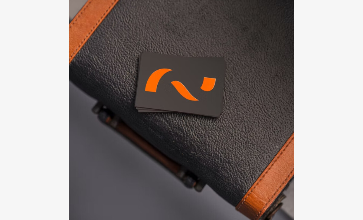
The Business Card’s Tactile Finishing Signals Premium Quality
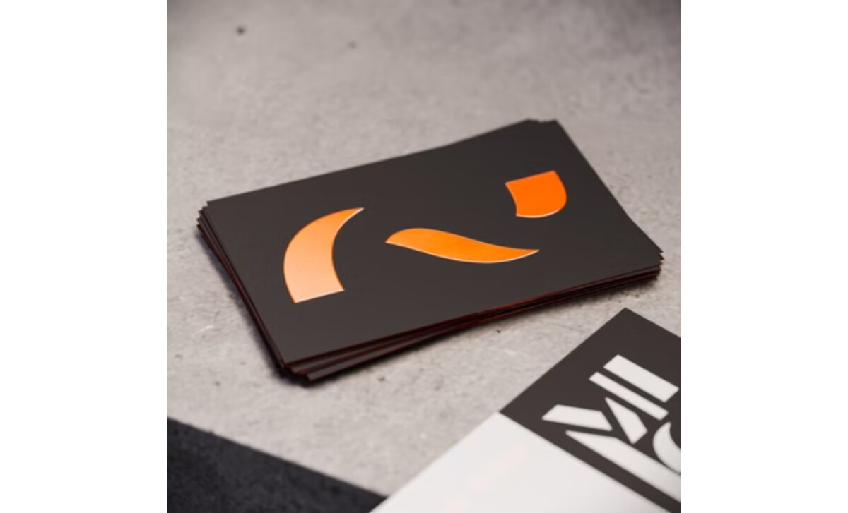
A thick, matte black card stock gives Madlow Studio’s business card an immediate feeling of quality. This is enhanced by a glossy spot varnish applied to the orange logo, revealing a flash of color when viewed from one side.
By investing in this premium finish, the card becomes more than just a piece of contact information. It’s a technique used by top print design companies to communicate high standards and establish a perception of quality from the very first handshake.
Additionally, this card creates a memorable experience through touch. The substantial weight of the paper and the contrast between the matte and gloss finishes are very effective.
This is a critical advantage, as research shows people are 70% more likely to remember a person based on a unique business card design, particularly if it includes a non-traditional feature like this one.
Madlow’s High-Contrast, Asymmetrical Layout Commands Attention
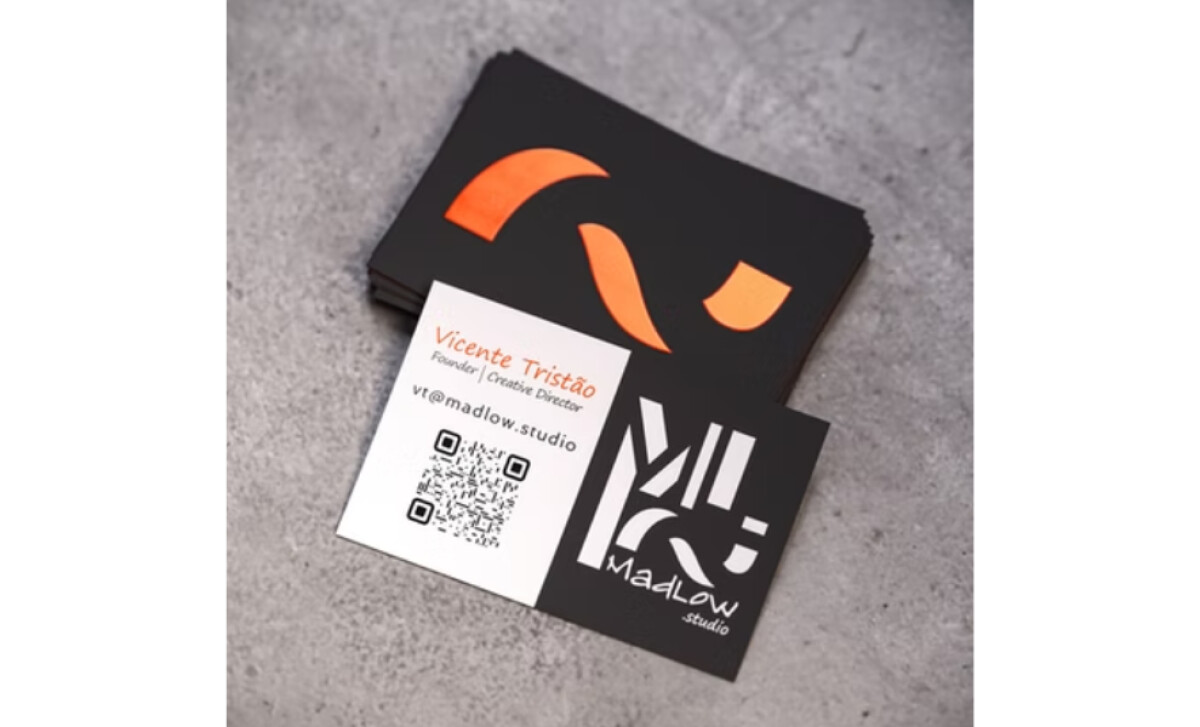
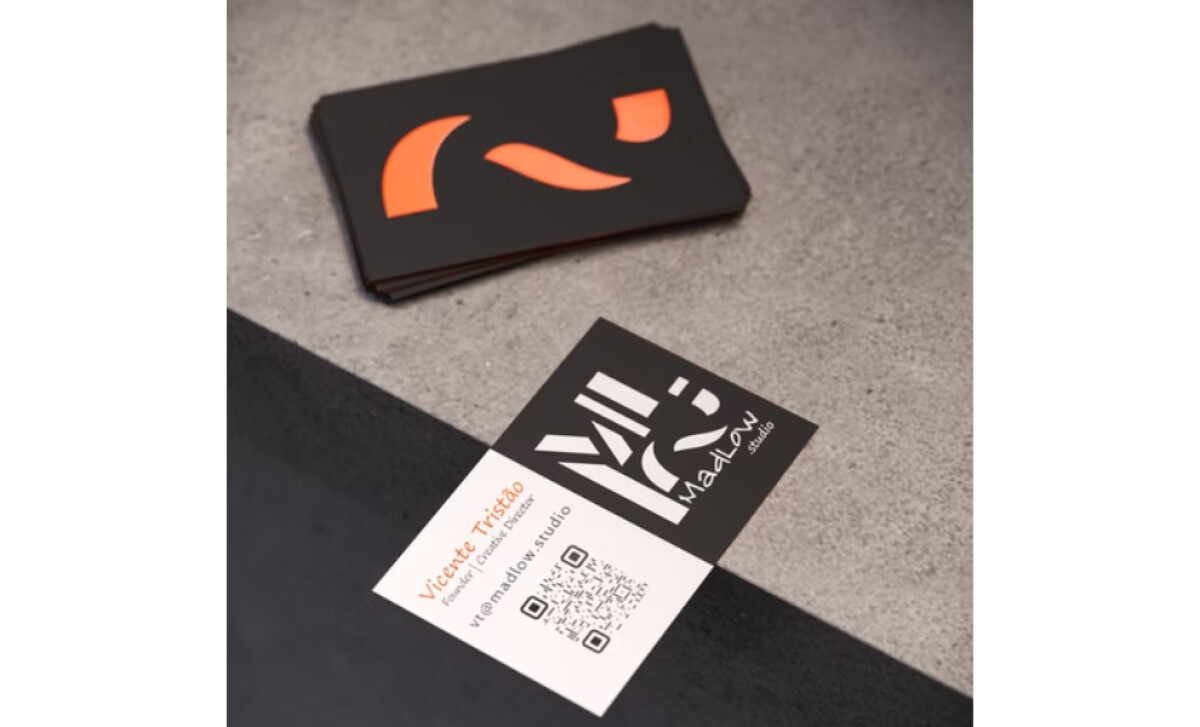
The information side of the card is dramatically bisected into two starkly contrasting vertical sections: pure white on the left and pure black on the right.
The white section cleanly houses the contact details and a QR code in black type. The inclusion of the QR code is a key move for integrating print in digital marketing.
As the digital business card market grows — projected to hit over $500 million by 2032 — and scanning now a reflexive habit for 9 in 10 users weekly, a physical card that links to digital assets becomes exponentially more powerful.
On the other hand, the black section is dedicated to the studio's complex geometric wordmark in white. The asymmetrical design is a bold departure from the norm, a choice that feels confident and contemporary.
The strong, blocky structure of the layout also serves as a subtle nod to the world of 3D modeling, where precision and form are key.
This layout is a great example of how a bold design can also be clear. The split into black and white sections creates a natural organization. It's a core principle of the best two-color print designs: using contrast to create intuitive visual paths for the viewer.
A Dual-Logo System Expresses Creative Versatility
The branding relies on a smart, two-logo strategy. A minimalist orange mark (taken from the main logo), made of two curved shapes, is featured on the back.
This is balanced by a complex, architectural logotype on the front. The logotype is a geometric construction of the letters 'M' and 'L.’
This approach gives the brand a rich, multi-faceted personality. It avoids a monolithic identity and instead presents MadLow Studio as adaptable and versatile.
The memorable orange mark serves as a powerful icon for brand recall, while the complex logotype communicates professionalism and technical prowess. This strategic flexibility is a hallmark of the best business card designs, which do more than just share information.
Minimalist Typography Establishes Clear Hierarchy
The handling of the text on the card is a great example of minimalist typography. A lightweight sans-serif font gives the name and title a delicate, clean look.
The email address below it is set in a regular weight, which makes it stand out just enough. This creates a clear reading order without any unnecessary graphic elements.
The use of such a lightweight font is a deliberate and effective choice. It creates a stark contrast with the dense, solid logo on the adjacent panel.
This is a great example of using typography to create balance. The text doesn't compete with the other design elements, which makes the whole card feel well-composed. It's a lesson in some of the best print design: every element should serve the whole.
Despite the limited space and the card's powerful graphic elements, the essential contact information remains perfectly readable. This ensures that the card successfully fulfills its primary utilitarian function without ever compromising its potent aesthetic statement.
The MadLow Studio business card is a portfolio piece in miniature. The confident contrast, premium materials, and dual-logo system demonstrate the studio's creative range.
This design is a powerful and successful piece of self-branding, making it a clear winner of this month's Design Award.


