Team Behind the Design
Print Design Analysis
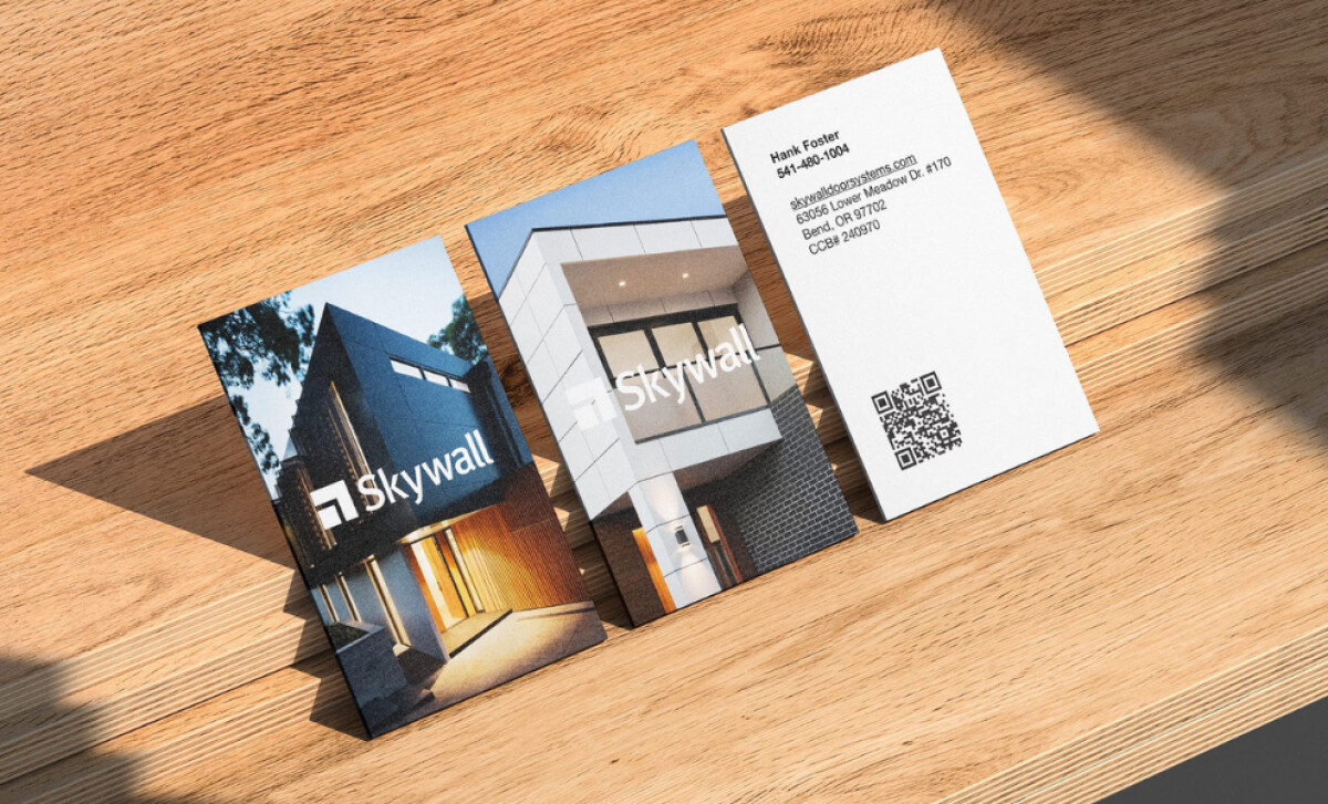
When assessing business card print designs, I focus on material quality, typography, photography, and brand alignment.
Blastoff! Studio’s work for Skywall succeeds across all these elements.
- Concept: The full-bleed architectural photography creates an immediate connection to Skywall’s craft.
- Typography: Clean, sans-serif type creates a precise and modern look that echoes architectural design principles.
- Layout: Its minimalist compositions balance the white space with impactful imagery
- Application: From business cards to branded print collateral, the identity improves upon Skywall’s professional presence and aligns with its luxury market positioning.
What Brands & Agencies Can Learn from Skywall
This print identity shows how minimalist layouts and strong photography can create a sophisticated, high-end impression.
1. Use Full-Bleed Images
You can create an immersive visual experience by running your photography to the absolute edge of the page. This technique gives your print materials a premium, expansive quality.
2. Embrace White Space
Your layout should never feel crowded with information. Use generous negative space around your key content to give it visual breathing room. This choice creates an uncluttered look and helps direct the viewer’s eye.
3. Choose Precise Typography
A clean sans-serif typeface with precise geometric forms is a direct way to establish a modern character.
About DesignRush Featured Designs
From hundreds of projects reviewed, only the most compelling are featured. The designs we feature distinguish themselves through originality, clarity, and strong brand impact.
And often, they go on to earn a place among the winners of the Monthly Design Awards.
You can also explore our awards categories by design type:
- Best Print Designs
- Best Website Designs
- Best App Designs
- Best Logo Designs
- Best Packaging Designs
- Best Video Designs
For a full list of design agencies and related services, see our Agency Directory.


-preview.jpg)
