


- Agency: Fuman Design Studio
- Client: B&F Papers
- Category: Print Design — Arts & Recreation
- Location: Auckland, New Zealand
- Project Brief: Produce print design that showcases Rives paper textures and versatility through tactile formats and experimental presentation.
"What a welcome tonic to the oversaturated digital world we live in."
- Brett Jefferson Stott, Design Awards Juror
Arts and recreation print design earns its keep when the medium and the message are the same thing. For Touchy Feely, Fuman Design Studio's promotional publication for B&F Papers, the paper itself is the subject. Every design decision here demonstrates what Rives stock can do. Nothing undermines it.
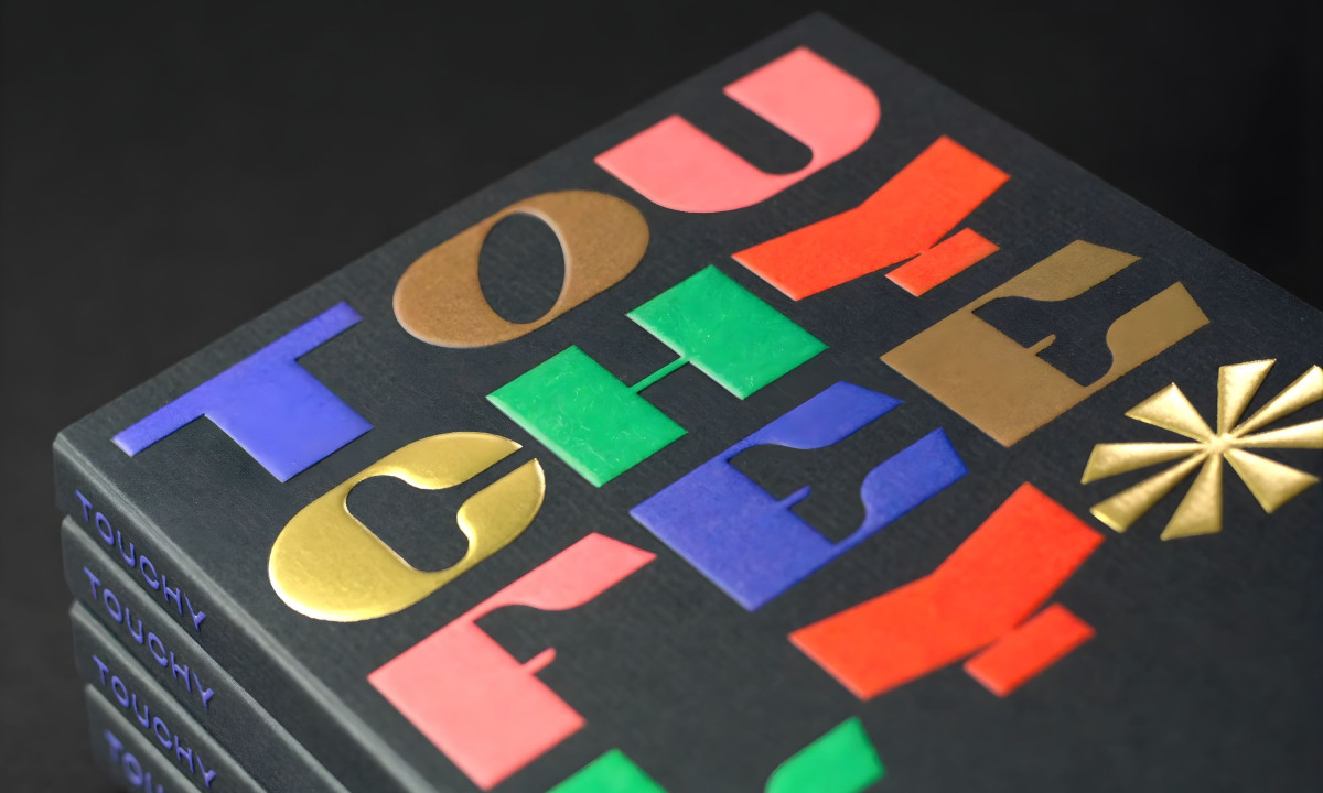
The book cover commits immediately. Multi-colored slab serif letterforms in coral pink, cobalt blue, signal red, forest green, and metallic gold foil sit against a deep charcoal surface, each embossed and stamped at a different depth. It's a stress test of what Rives stock can withstand before a single page is opened.
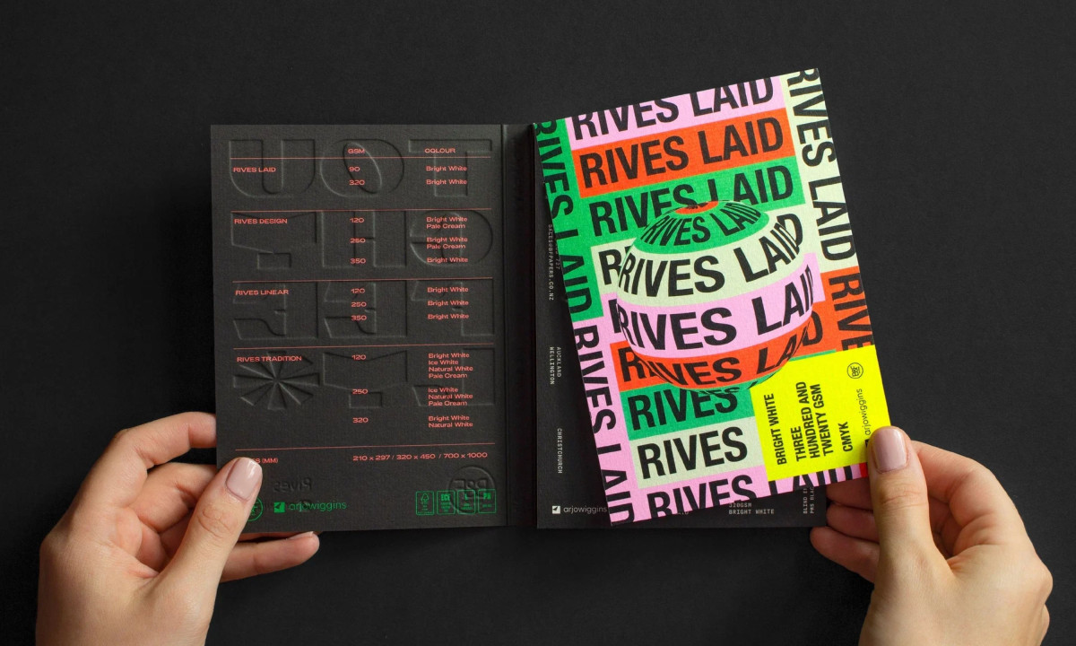
Inside, the publication works across two distinct modes. Blind embossing carries technical specifications on one side, letting texture do the communicating. The other goes full neon with saturated color blocking and oversized typography. Same paper, opposite moods.
The range of printing techniques across the sample sheets, fluorescent inks, wireframe illustration, gradient printing, holographic foil, and blind embossing, proves the versatility argument without stating it. Each sheet is a different finish on the same stock.
The soft-glued spine is the detail that extends the publication's life. Each page pulls out as a standalone artwork, making Touchy Feely function as both a showpiece and a working reference for printers and studios. That dual purpose is what separates a promotional piece from a collectible one.
Design Awards Juror, Brett Jefferson Stott, said it best: