Receive our NewsletterJoin over 70,000 B2B decision-makers growing their brands
Graphic Design Trends
We share the latest graphic design trends through guides, expert insights, and forecasts that define the field. Whether you’re a designer, entrepreneur, or content creator, you’re sure to stay ahead in the realm of graphic design through our hub.

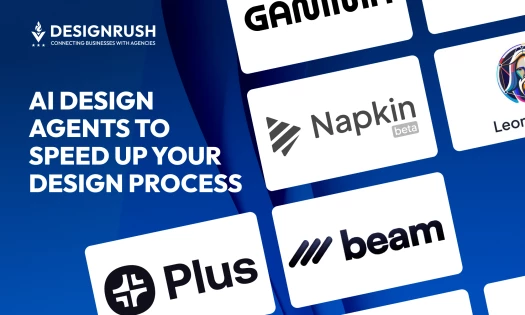
I Explored 5 AI Design Agents for Faster, Smarter Design Workflows
| 1 year ago | 16 min read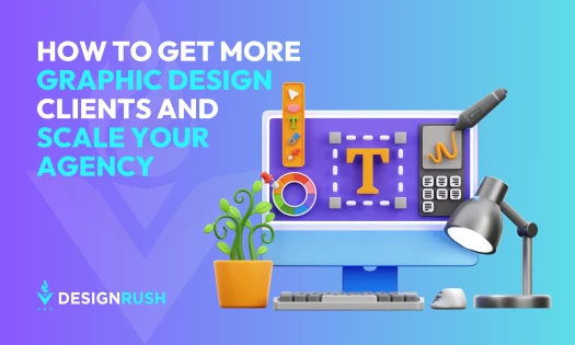
How To Get More Graphic Design Clients and Scale Your Agency
| 1 year ago | 11 min read

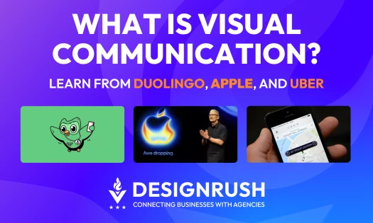
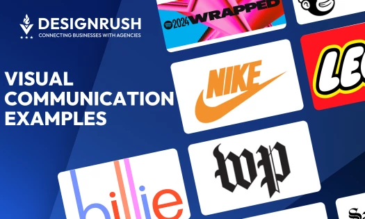
What Is Visual Communication? Definition, Types, and Examples
| 7 months ago | 11 min read

Thinking of Starting a Design Firm? Here are 5 Things to Keep in Mind
| 1 year ago | 5 min read
Receive our NewsletterJoin over 70,000 B2B decision-makers growing their brands