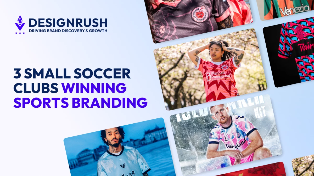
Small soccer clubs like Venezia FC, Forward Madison, and the Portland Cherry Bombs are rewriting what effective sports branding looks like, and none of them needed a trophy or a broadcast deal to do it.
Yet they are building brand identities that many legacy clubs and even global brands struggle to achieve. Their advantage isn't budget. It's focus.
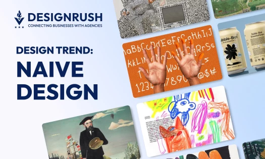
Sports Branding for Small Brands: Key Findings
- Constraint is a creative asset. The clubs with the least resources made the most distinctive brand decisions because they had no room for noise.
- Specificity beats scale. A city, a fanbase, or a set of values. The narrower the brief, the stronger the identity.
- Brand is the product. Venezia, Forward Madison, and the Cherry Bombs treated design as the first decision, not the last.
When money and mass audiences are not guaranteed, clarity becomes the strategy. Connection becomes the currency. Constraint becomes the edge.
For design leaders, the lesson here isn't theoretical. These clubs are doing it right now, with less.
Venezia FC: How a Second-Division Club Became a Fashion Brand
Most sports rebrands begin with commercial logic. A sponsor. A manufacturer. A distribution plan. Venezia FC started somewhere else entirely. It started with Venice.
Venezia had already earned a reputation that had nothing to do with league position. GQ called it the "world's most fashionable football club" in 2021. A BBC documentary followed. The 2022 rebrand wasn't starting from zero. It was raising the bar on something already working.
Managing director Tancredi Vitale describes the city as a “creative playground,” a place so visually and culturally dense that any identity detached from it would feel hollow. The brief was not to modernize a football club. It was to translate a city into a brand system.
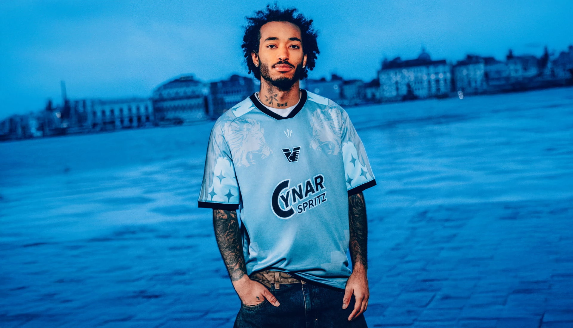
For that, Venezia bypassed traditional kit suppliers entirely and brought in Bureau Borsche, the Munich design studio known for its work with Supreme, Balenciaga, and Highsnobiety. The scope covered the club's full rebrand: a new crest and pre-match shirts that together reframed what a football club identity could look like.
Bureau Borsche started where any honest rebrand should: the archive. The Lion of St. Mark, the winged symbol of Venice that had always anchored the club's identity, stayed.
What changed was everything around it. The lion returned to gold, its most historically authentic form, after years of white iterations.
The horizontal lines representing the lion's wings were redrawn as a direct reference to the iron prow of a Venetian gondola. The result was a minimal "V" crest that felt both modern and earned.
The match kits and later collaborations, including releases with Drake’s NOCTA label, evolved alongside this identity but were not part of the Bureau Borsche redesign. These releases maintained the same direction through material, color, and styling rather than redefining it.
Every decision pointed in the same direction. This was not about performance on the pitch. It was about belonging to the visual and cultural language of Venice.
So when players appeared at the Venice Film Festival wearing away kits, it did not feel like a stunt. It felt inevitable. Football stepped into fashion, and fashion met it halfway.
The team may not dominate headlines in the sports pages, but it has found space in publications like Vogue. As head of marketing, Nicholas Vieira puts it, everything they produce must be “authentically and unapologetically rooted in the city.”
That is not just a philosophy. It is a competitive advantage.
What You Can Learn from Venezia FC Club:
Rooting identity in a specific place, culture, or city creates a brand that can't be replicated.
Forward Madison: When Fans Write the Brief

If Venezia represents precision and design authorship, Forward Madison offers a different kind of authorship altogether. One that is shared.
Playing in the third tier of American soccer, the Wisconsin-based club has turned its supporters into collaborators. Each season, a committee of fans works directly with manufacturer Hummel to shape new kits. They bring ideas, references, and stories. The process feels less like a product cycle and more like a conversation.
The results are anything but generic. Jerseys nicknamed “cotton candy” or “3D” stand out not just visually but culturally. One design embedded a QR code that allowed fans to buy beers for strangers in the stadium. Another directed funds toward Ukraine. Another celebrated LGBTQ+ community.
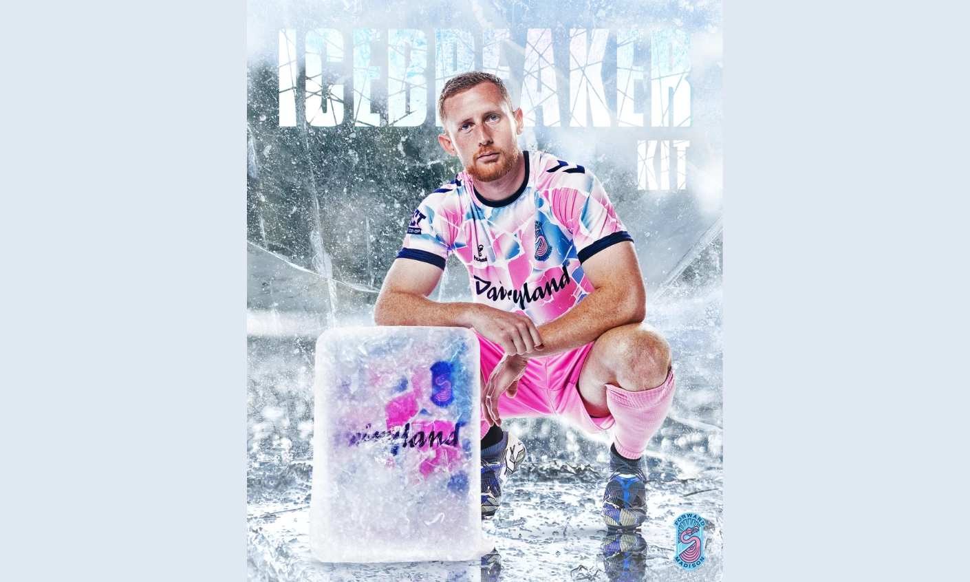
These are not isolated campaigns. They are expressions of an ongoing relationship between club and community. The jersey becomes a canvas, but also a message.
That message travels. While the club competes in a regional American league, its visual identity is a global export. Forward Madison jerseys are now staples in international showrooms like London’s Classic Football Shirts, reaching a worldwide audience not through on-field dominance, but through pure narrative resonance.
Creative director William Jenkins captures the distinction clearly. When design is paired with a strong initiative, when it carries a story, it stops being decoration and becomes identity.
For top agencies, the implication is hard to ignore. The audience is no longer waiting at the end of the branding process. They are part of the brief from the beginning.
What You Can Learn from Forward Madison:
Let fans co-author the brand. They become its most credible ambassadors.
Portland Cherry Bombs: Brand Before Ball
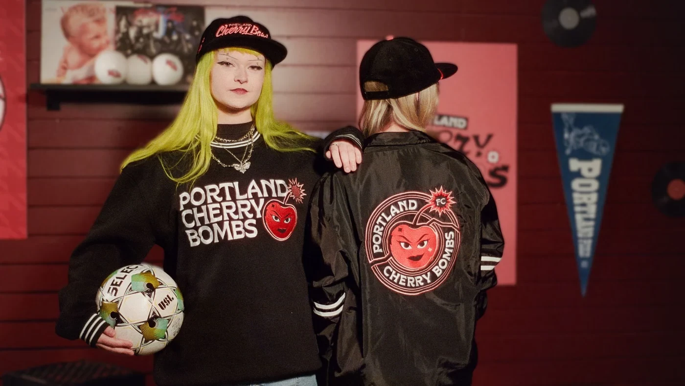
The Portland Cherry Bombs take the idea even further. They show what happens when brand comes before product.
Before playing a single match, the team released a jersey that people were already recognizing in public. Their general manager, Courtney Schmidt, was being stopped in airports by fans who had not yet seen the team play.
View this post on Instagram
That level of recognition did not come from performance. It came from clarity.
The visual direction was described as “very female forward,” a deliberate and confident articulation of identity. The club’s first partnership with Planned Parenthood was not positioned as a sponsorship. It was a statement. A portion of every jersey sale supports the organization’s work, embedding values directly into the product.
There is no ambiguity in what the Cherry Bombs stand for. The brand does not wait for results to define it. It defines itself, then invites people to belong.
In doing so, the club has built a community before building a record.
For early-stage brands, this flips a familiar sequence. Instead of waiting for proof, they invest in meaning. Instead of treating design as an output, they treat it as the starting point.
What You Can Learn from The Cherry Bombs:
You don't need results to build recognition. A clear point of view, expressed through design from day one, builds an audience on conviction alone.
The Design Lesson: Necessity Breeds Identity
Venezia FC, Forward Madison, and the Portland Cherry Bombs share very little on the surface. Different countries. Different leagues. Different audiences.
What they share is perspective.
Each began with a clear understanding of who they are.
- Venezia looked inward to its city.
- Forward Madison opened outward to its fans.
- The Cherry Bombs anchored themselves in values from day one.
That clarity is often what larger brands lose. Scale introduces noise. More stakeholders, more inputs, more compromise. Purpose becomes diluted.
Constraint, on the other hand, removes excess. It forces decisions. It demands intention.
Design thrives in that environment. Boundaries do not suffocate creativity. They focus it.
For marketing agencies and brand leaders, the questionis not how to do more. It is how to say less with greater precision. Because the strongest identities are not built on abundance. They are built on conviction.
![]()
Our team ranks agencies worldwide to help you find a qualified partner. Visit our Agency Directory for the top print design agencies, as well as:
- Top Sports Branding Agencies in Portland
- Top Print Design Agencies in New York
- Top Sports App Development Companies
- Top Sports Marketing Companies in 2026
If you want to see what high-quality print design looks like in practice, check out our Awards Section.
We feature extraordinary work on Best Print Designs that shows how tactile craftsmanship, typography, and visual hierarchy converge.