We understand that creating a sexual health advertising campaign can be challenging due to the taboo nature of the topic in many parts of the world. These campaigns should tackle the crucial fight against HIV/AIDS directly, ensuring the message resonates deeply and sparks conversations without being too cheeky or offensive.
To commemorate the upcoming World AIDS Day, we have used our proven methodology to identify the most innovative and effective advertising strategies that changed the way the world looks at sexual well-being. Allow us to inspire you with these compelling examples that encourage people to discuss and engage in the fight against HIV/AIDS.
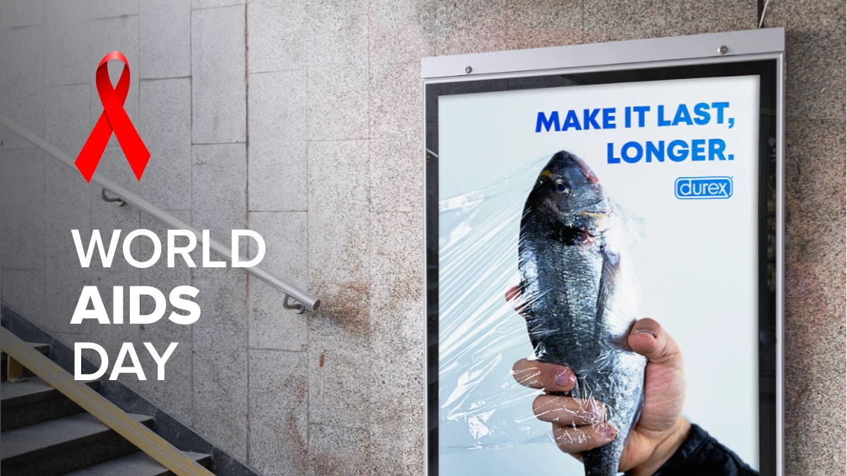
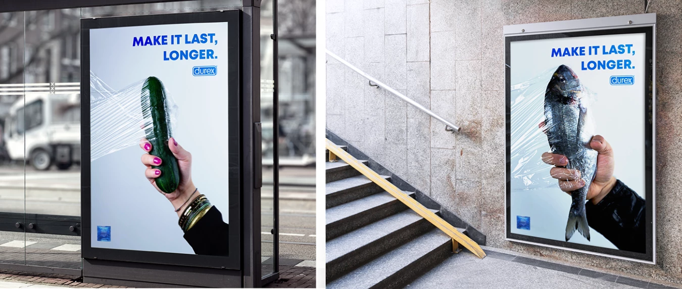
1. Durex Make It Last Longer by Pina’s Factory
Standout Features:
- Clear slogan
- Minimalistic layout
- Humorous and compelling visual story
It’s no secret that Durex always comes through with intelligent, witty, and engaging campaigns. This series of out-of-home advertising is just one of their many impressive and high-impact creations.
Made in collaboration with the director of photography at Pina’s Factory and art director Mariano Barresi, these posters reinforce the importance of sexual health and protection in a fun and humorous light.
The campaign features close-up shots of phallic-shaped food items such as cucumber, fish, and eggplant. Each one is wrapped in plastic, recommending contraception to “Make It Last, Longer.” Innuendos are always sure to spark conversation, especially for sexual health campaigns!
Not only do these visuals contribute to the global cause of preventing the spread of HIV/AIDS, but they do so by effectively promoting the brand’s contraceptive solutions!
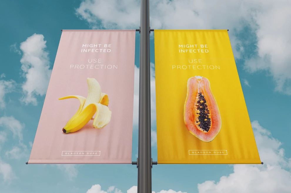
2. Be Safe by Ninkuro Studio
Standout Features:
- Provocative visual innuendos
- Soft and pastel hues
- Straightforward message
The Be Safe project is a campaign that urges the public to use protection to take care of their sexual health. Designed by Gladson Dube of Ninkuro Studio, this ad, unlike others, is straightforward yet super approachable.
The thing is, not everyone is comfortable with discussing sexual health publicly, so the designer, yet again, used food items, albeit without any insinuation. The more family-friendly visual elements effectively communicate a sensitive topic to a broader audience, and it works!
They used soft and pastel colors as the main themes for the banner posters for their out-of-home advertising efforts. Pairing that with minimalist typography that reads “Might Be Infected, Use Protection” enhanced the design, too. It’s concise and direct without being too bold and preachy.
Going back to the visuals, they’re not too vulgar and not too vague — the sweet spot for an effective HIV/AIDS prevention campaign!
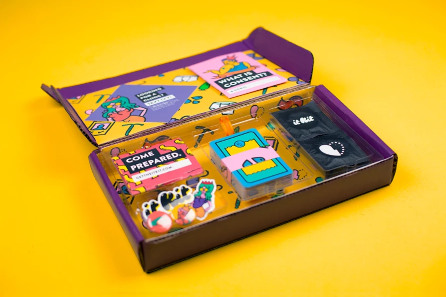
3. The It Kit by Laura Pursel
Standout Features:
- Creative and informative sexual education
- Pop art-inspired visuals
- Easy-to-read flashcards
The It Kit is a collection of sexual items and products that help young women become more sexually prepared.
Laura Pursel developed the prototype in collaboration with the global design agency IDEO. The project is part of the Innovation Next initiative with the National Campaign to Prevent Teen and Unplanned Pregnancy.
Filled with safe sex products, educational information, conversational prompts, and games, the subscription kit interactively introduces sexual preparedness. And that’s the best way to approach it, knowing how challenging it is to bring these issues to light, especially for the youth.
The colorful visuals, fun illustrations, and friendly messaging add value to the kit’s usability. Interacting with the materials is like having a mature friend reminding you to make informed decisions regarding sexual health. This thoughtful approach is a hallmark of an effective design, ensuring the message resonates and educates effectively.
4. Beat HIV by White Alligator

Standout Features:
- Powerful visual storytelling
- Attention-grabbing imagery
- Strategic use of negative space
The Beat HIV campaign poster is another Durex entry, exemplifying its consistent, brilliant HIV/AIDS awareness campaigns. Designed by White Alligator, the poster features a striking and incredibly intriguing image of HIV’s impact, illustrated as a tic-tac-toe game.
Here, the word HIV hits the three squares, visualizing an infection. The letters are also written in bright red with splatters and specks of blood — enough to make any passersby stop and stare at the chilling image.
Two Os in the form of Durex’s contraceptive products take the empty squares, effectively conveying a crucial message at the bottom of the poster that reads, “In this game, your only weapon is contraception.”
The entire illustration lies on a plain white surface, driving all the viewer’s focus to the powerful illustration at the center.
5. HIV Is a LABEL by Direct Media United Solutions
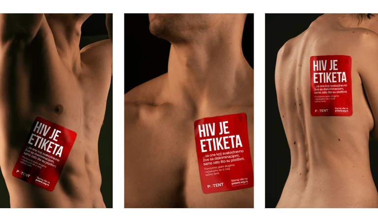
Standout Features:
- Impactful nude photography
- Sticker attached to the body
- Shadowy lighting
Apart from the disease, people living with HIV struggle with an even tougher hardship — discrimination. That’s what “HIV Is a LABEL” campaign aims to address.
Created by Direct Media Solutions, this campaign sheds light on the problems and challenges faced by people living with HIV — from getting refused casual contact to being deprived of essential services.
The nude photography instantly captures the viewer’s attention. However, it also highlights each affected person’s vulnerability and portrays a powerful image enough to evoke a feeling of empathy from the public.
Each image features different body parts and physiques, captured in its purest and raw form. The photographers used several lighting techniques to cast shadows into the bodies, adding more drama and intensity to the images.
Plus, the campaign messages are integrated into the design as red stickers. Each one is placed on a body part, further reinforcing the harsh reality that HIV is a label.
Explore the best photography portfolios.
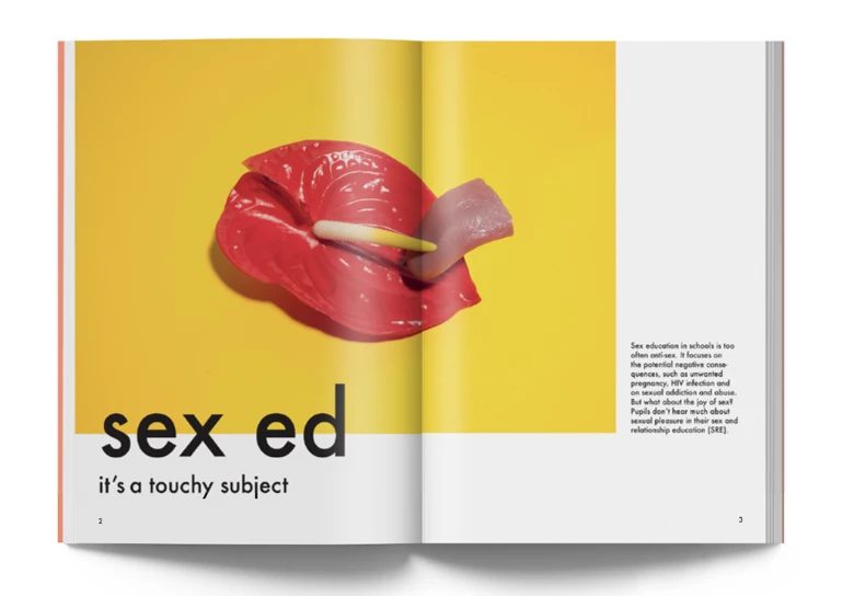
6. Sex Ed by Jo Crossley
Standout Features:
- Symbolic illustrations
- Realistic artwork
- Clean visual layouts and typography
Sex education is something that London-based designer Jo Crossley feels strongly about, and her dedication can be seen through her beautiful illustrations for a magazine section focusing on this topic.
The two-page spread features an article that underscores the importance of sex education in schools and how the conversation should be shifted from anti-sex to pro-safe sex.
Much of the aversion to such a topic is because sex ed is a touchy subject, so the designer used soft and conservative imagery to illustrate safe sex. These illustrations make the topic friendly and approachable and elevate the editorial design with their artistic visual character.
7. Condom Advertisement by Anamaria Sabino
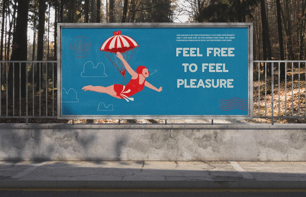
Standout Features:
- Metaphoric imagery
- Vintage illustrations
- Vibrant colors
Durex is back with its fun and humorous campaigns promoting safe sex. This condom advertisement uses cheeky storytelling brought to life by Brazilian illustrator and designer Anamaria Sabino.
The ad features vintage visuals that reflect the vibrance of the product’s color. The bright red and blue sketch-style illustrations showcase the freedom to experience pleasure safely.
How? Two words — visual metaphor. The ad paints a picture of a diver jumping head-first into the water, wearing a parachute to keep them safe as they take the plunge. That’s a fun and friendly way to put it. Even without explicitly saying to practice safe sex, we get the idea! The words “Feel Free To Feel Pleasure” accompany the visuals.
8. Imunis by Gregory Mendoza
Standout Features:
- Engaging slogans
- Bold and uniform typography
- Colors representing HIV awareness
Imunis is proof that excellent branding can mobilize a massive crowd. Designed by Gregory Mendoza, it educates the public about the importance of HIV tests through social media campaigns, podcasts, and more. The company even prepared a test kit to make the process more accessible!
Design-wise, the materials used for this campaign are driven to inspire immediate action from individuals. Engaging campaign slogans like “get tested,” “be proactive,” and “be in control of your health” create a feeling of urgency, reinforcing the importance of knowing one’s status to ensure safety.
These elements make it a prime example of effective health promotion ads. Plus, they are written in bold and large letters with a particular typeface, so they’re guaranteed to grab the viewer’s attention.
Red and blue also serve as the central theme for the campaign. It’s the perfect color combo because these primary colors make a huge statement and represent HIV awareness.
9. Rimango ramingo by ANDREA PAPI DESIGN

Standout Features:
- Realistic imagery
- Minimalistic design
- Plain rose background
Many brands leaned on utilizing fruits or different foods to represent sexual hints since they are easily suggestive, but Rimango ramingo steered clear of the usual path. Created by Italian designer Andrea Papi, this simple print design bears a creative visual story.
The designer combined realistic imagery and a beautiful pastel color palette to create a simple yet striking visual. The elements sit on a plain rose background, drawing more focus on the artistic imagery.
Upon encountering this design, viewers are urged to look at the arm in a light blue sweatshirt with sleeves stretched at the center of the visual. At the end of the sleeves is a man’s fist wrapped in a condom.
Through this uncomplicated layout, the designer beautifully depicted a story of a man in solitude. Dramatic and interesting — two characteristics of a visual design no one can resist.
10. POSTE(RED) by Ahmet Ugurel
-content-large-webp.webp)
Standout Features:
- Abstract illustrations
- Geometric patterns
- Red and white hues
A licensed brand under (RED), (PRODUCT)RED is a series of positive health advertisements that connect with the private sector to increase reach, awareness, and funds to fight HIV/AIDS in select African countries.
As of writing, 20% of all international funding goes to HIV/AIDS programs, while the rest is distributed to other critical health concerns. Then, funds generated by its partners, including this campaign, go to the Global Fund programs that help people with HIV/AIDS access quality health and medical services.
To ensure the materialization of the plans, the brand enlisted graphic designer Ahmet Ugurel to develop one of the best print designs. And the result? As attention-grabbing as it gets!
This collaboration brought eight designs, all bridged by an impactful two-color combination (red and white). Although all designs have a common denominator, each is unique and can stand alone.
Overall, these designs are easily recognizable and familiar. It invites viewers to look in and stay for a while — just enough to learn about the cause this brand stands for.
11. Sex Education Program INLY by Kidults
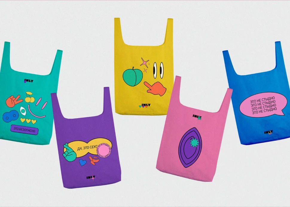
Standout Features:
- Fun illustrations
- Sticker-type visuals
- Flashy colors
INLY is a fun and modern approach to promoting sexual health, especially to an audience that needs it most: the youth. Created by Masha Prokhorova of Kidults, INLY educates and urges young ones to make informed sexual choices and practice safe sex.
This company launched digital campaigns and marketing materials promoting this cause. From social media posts and Instagram filters to branded notebooks, clothing pieces, and other merch forms, INLY successfully made sex education more engaging and approachable.
These efforts exemplify how health promotion ads can effectively raise awareness and encourage positive behaviors. Instead of a minimalist design, they chose artistic choices that would resonate well with the youth. Their statement pieces are dressed in flashy colors — very much on-trend!
And unlike most brands here, they went with conservative yet fun representations to depict sensitive imagery. Sticker-type icons like bananas, cherries, and peaches are stamped on the materials, elevating the whole look.
12. #endbedroomdistancing by Craving Digital
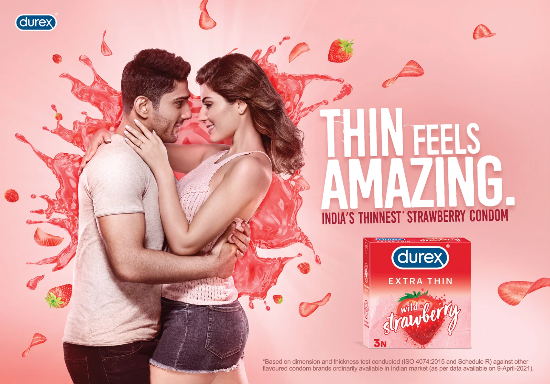
Standout Features:
- Passion-emitting imagery
- Splash illustration
- Play on social distancing
When Durex, the world's number one sexual well-being brand, launched its first-ever #madeforindia innovation, the Extra Thin flavored condom, they were met with thunderous applause or at least, bedroom choir. For the design, Durex came to the aptly named Craving Digital studio to make "social distancing" a thing of the past.
The print pieces required the right blend of skills and imagination. Similar to an ice cream campaign, the agency mixed extra-thin sliced strawberries and chocolate shavings, seamlessly blending these elements with the brand promise.
Durex Extra-Thin flavored condoms product launch campaign #EndBedroomDistancing is based on user experiences who are looking for more from their flavored condoms! They seek to put the world where it was before the COVID pandemic — as sensually as possible.