Fruit Love Island got hundreds of millions of views. Its characters have proportions that do not exist in nature, expressions that arrive half a second too late, and storylines built entirely around infidelity and status anxiety. It is also, by every engagement metric, a design success.
That's the problem.
What is AI Slop?
AI slop design is what you get when generative tools prioritize speed and engagement over any real aesthetic intention.
The fruit soap opera trend on TikTok and YouTube Shorts, Fruit Love Island chief among them, sits at the center of a much bigger conversation about where visual culture is heading when algorithms, not designers, are making the calls.
The term "AI slop" has gained traction across design criticism circles to describe this category of output: technically functional, emotionally optimized, and aesthetically hollow. It is content that was never meant to be looked at carefully, only scrolled past quickly enough to trigger a reaction.
Most coverage has focused on the weirdness of it all: the scale, the discomfort, the inexplicable virality. But those are surface observations.
The design itself deserves a closer look.
The Design Autopsy
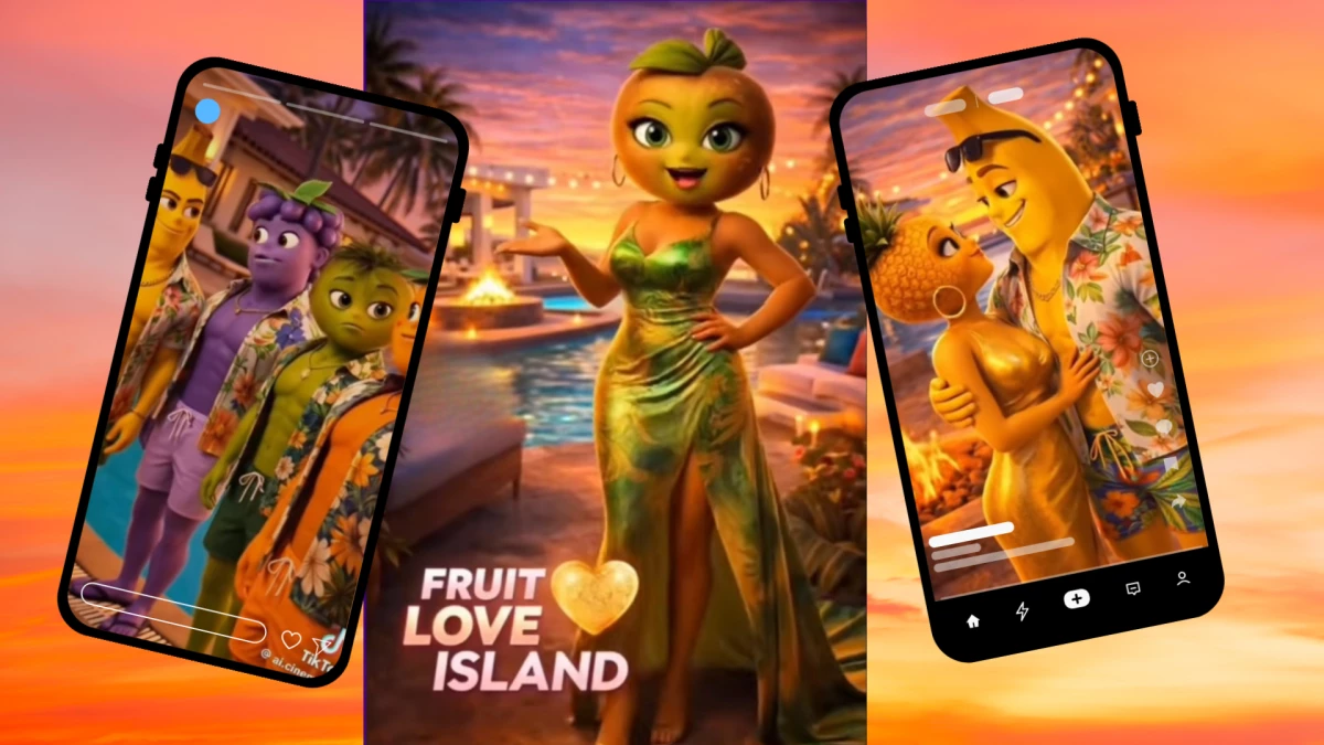
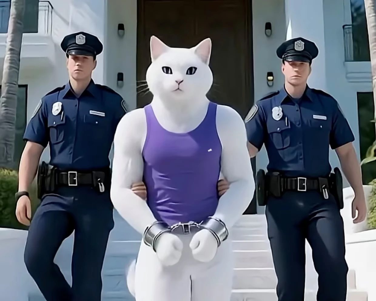
Fruit Love Island launched on TikTok on March 13, 2026. Within nine days, @ai.cinema021, under the name "AI Cinema," had become the platform's fastest-growing account, pulling over 3 million followers and 300 million total views. Individual episodes averaged 10 to 15 million views. One, New Dates... New Doubts, hit 39 million.
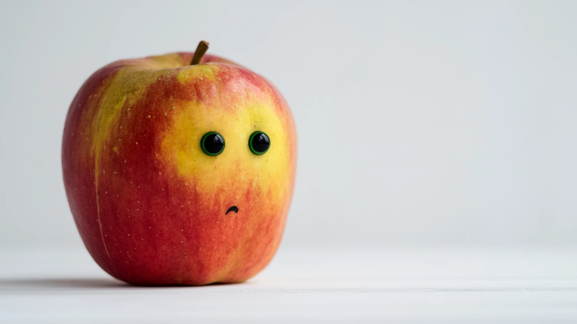
The premise is a parody of ITV's Love Island where every contestant is an anthropomorphized piece of fruit. Characters like "Strawberina," "Melonita," and the buff, open-shirted "Bananito" cycle through love triangles, paternity scandals, and emotional re-couplings, all hosted by a voluptuous green apple.
Silly as that sounds, the design choices behind it tell a more serious story.
The character proportions sit somewhere between a Pixar draft and a rendering error, neither cartoony nor anatomically coherent.
Limb lengths shift between cuts, skin tones bleed at the edges, and color temperature drifts from warm to cool mid-scene. One YouTube reviewer pointed out a character whose right arm is a different shade than the left.
The mouths are the most telling detail. Lip sync lands near the audio rather than with it, and expressions like shock, betrayal, or longing arrive a beat late, like emotional subtitles run through one translation too many.
This is called temporal inconsistency. Because the AI generates each frame with imperfect memory of the one before it, characters subtly shift between cuts: a sleeve changes shade, a jawline softens, an expression resets.
What you actually feel watching it is harder to name. It's the sense of watching emotion performed by something that studied what emotion looks like without ever having felt it.
Clothing and hair carry the same quality. Fabric drapes plausibly, but with a stiffness real cloth doesn't have, and hair moves in frames rather than fluidly. The villa's pool, sunset terrace, and confessional booth have the color-saturated gloss of a holiday brochure, every surface too clean to feel lived in.
None of this happened by accident, exactly. Each two-minute episode reportedly took around three hours to produce, and at that pace, visual inconsistency isn't a flaw in the process. It's the cost of it.
Yet none of this explains the numbers.
Why It Worked Anyway
Here is what design criticism tends to get wrong about content like this: It assumes that because it looks wrong, it shouldn't have worked.
The Conversation's academic analysis identifies something important about the mechanics. Short-form video platforms run on something close to variable reinforcement, the same psychological pattern behind gambling.
The content delivers emotional whiplash: betrayal, then comedy, then pathos, all within sixty seconds, and that volatility is what the brain registers as engagement.
You don't know whether the next episode will be absurd or weirdly affecting, and that unpredictability keeps the loop running.
There's also narrative compression at work. Fruit Love Island stripped the Love Island format to its bare structure: romantic contestants, threats to those romances, and a vote.
That skeleton gave audiences a reason to return, pick sides, and post comments demanding answers. A full fan universe, recap accounts, fan art, spinoff series, formed around a show that had been online for less than two weeks.
As one Substack writer put it, actual Love Island took ten seasons to build that kind of obsession.
The absurdity was functional. Fruit characters create automatic ironic distance, letting you invest in Clementine's paternity scandal without fully admitting you're doing it.
The synthetic quality of the visuals, the slightly off proportions, and the half-second expression delays deepened that distance.
Research on moral disengagement suggests audiences relax their scrutiny when harm feels fictional or abstract, and the AI rendering made everything feel more fictional. That helped.
What you're left with is a format that was structurally sound and aesthetically poor, and in which the aesthetic failures quietly supported the structural success. That's an uncomfortable finding, and it's worth sitting with.
The real question isn’t why it worked. It’s what happens when others try to reproduce it.
The Brand Trap
View this post on Instagram
Several brands made the mistake of treating Fruit Love Island as a trend worth chasing. The reach was real. What they misread was what that reach actually meant.
Ad Age covered this directly: the format matters more than the AI, and deciding what a brand should or shouldn't copy is harder than saying, "this got views, so let's get close to it."
The brands that fared worse were the ones that treated virality like a genre they could guest-star in, as if showing up near something popular was the same as being part of it.
It isn't. Virality belongs to specific moments, and you can't borrow it by association.
View this post on Instagram
The design instinct behind chasing AI slop is the same one that produces it: optimizing for signals that are easy to measure but don't necessarily mean anything.
Click-through rate, watch time, and share velocity are real numbers. But they’re not the same as trust, or the kind of recognition that builds over the years.
Brands that chased the Fruit Love Island moment were essentially redecorating their shop window to match whatever was trending on a street they don't live on.
The agencies behind those decisions are the ones who should read this most carefully.
Chasing a viral moment on a client's behalf is a design failure before it's a marketing failure, because it means the brief was never really "build something that means something." It was just "be seen."
Find branding partners who build for the long term — not the trending moment. Explore Top Branding Companies.
Where AI-Generated Design Is Actually Headed
Fruit Love Island is a leading edge, not an outlier. Analysis tracking the wider AI slop trend on social media points to a content landscape increasingly shaped by optimization rather than creative intent.
The question is not whether AI-generated visual content will proliferate; it will, and rapidly, but what design standards the industry will hold it to.
The Conversation's framing, calling the phenomenon "unethical brain rot," captures the cultural anxiety but not the structural problem. When content is designed by optimization, it reliably converges on the same emotional triggers: status, betrayal, desire, humiliation.
These are not the full range of human experience. They are the parts of human experience that are easiest to recognize and hardest to look away from, and an algorithm trained on engagement will always find them.
Today it’s fruit, tomorrow it’s something else.
That's the real trajectory: not a world full of fruit dramas specifically, but a content environment where a growing proportion of visual material has been optimized toward these same emotional primitives, dressed in whatever rendering style the current AI aesthetic favors.
The uncanny valley will narrow. Proportions will improve. Expression timing will get closer. But if the underlying design process stays optimization-first, you get higher-quality slop.
Better rendering doesn’t fix that. It just makes the slop more convincing.
The Bar That Was Cleared, and the Bar That Wasn't
Here is the useful question to end on: what would Fruit Love Island look like if it had been made with actual design intent?
The structure would survive. Narrative compression works. Emotional legibility works.
Short-form video that resolves a complete arc in ninety seconds is a valid and interesting format, and those are real achievements, even in the context of content that is otherwise indefensible.
What would change is everything underneath. A designer with intent would ask what the characters' world says about the people watching, build color relationships that create atmosphere rather than maximize brightness, and time emotional expression to feel discovered rather than displayed.
They would choose a storyline that does something with the human drives it engages, rather than simply triggering them and moving on.
The bar Fruit Love Island cleared: it reached people, quickly, at massive scale, and made them feel something immediate.
The bar it missed entirely: it left nothing behind. No image that lingers, no idea that travels, no feeling that matures into something worth having.
That is the standard. Not virality, not engagement rate, not reach. Design that clears the first bar and the second one.
Fruit Love Island cleared one. The industry should stop treating that as enough.

Our team ranks agencies worldwide to help you discover the best partners for building iconic brand visuals. Visit our Agency Directory for the Top Video Production Companies, as well as: