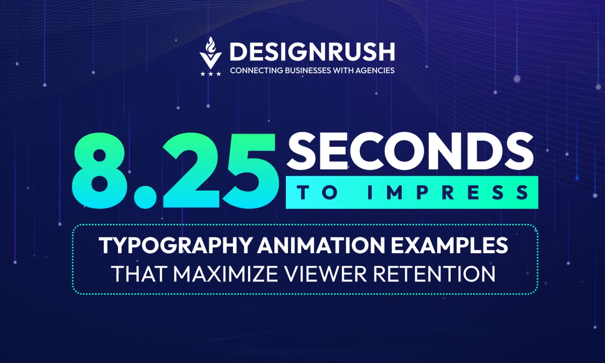
Typography Animation Examples: Key Points
- Kinetic Typography Drives Revenue and Engagement: Typography animation significantly boosts digital performance metrics — Spotify Wrapped’s 2023 campaign achieved 4B+ global in-app interactions, a double-digit re-engagement increase, and 461% spike in Twitter chatter. For agencies, this proves motion typography is a scalable growth lever.
Personalization + Motion = Shareability at Scale: Strava’s Year in Sport campaign turned user stats into 2M+ personalized, cinematic kinetic videos, proving that real-time, data-driven animation transforms dry metrics into emotional storytelling—driving UGC, loyalty, and organic reach.
Short-Form Content Success Relies on Timed Typography: In platforms where users scroll in silence (TikTok, Reels, YouTube Shorts), kinetic text is king. Examples like Taylor Swift’s lyric videos and TNT’s SAG Awards promo illustrate how well-executed animated text boosts click-throughs, watch time, and recall within 15 seconds or less.
As digital attention spans shrink to under 8 seconds, static visuals aren't cutting it. Animated typography, whether subtle microinteractions or bold kinetic titles, has become a top-performing visual strategy for agencies and brands alike.
It combines design precision with motion psychology to deliver meaning, energy, and brand tone in a fraction of a second. This guide unpacks high-performing examples, tools, and tactics to help creative leaders monetize this motion trend.
Want to know how top brands hold attention in under 10 seconds?
We break down the motion, type, and timing tricks behind today’s most effective animated videos.
Hit play on the audio summary — now streaming on Spotify.
20 Typography Animation Examples
1. Typography Animation for Brand Identity & Repositioning
When launching a rebrand or updating your visual system, motion is no longer optional. These examples show how typography in motion builds recall, strengthens consistency, and communicates brand tone across every touchpoint, from logo IDs to hero videos.
Solves: Stale branding, low recognition, weak visual differentiation
Why it matters:
Motion enhances recall and expresses brand tone across media. Ideal for rebrands, identity refreshes, and modernizing legacy brands.
Audience Value:
Use these to guide motion systems for rebrands, product line extensions, and logo animation packages.
MTV – Searching for Life
Overview: Short-form identity piece animated to evoke search and discovery through floating, exploratory typography.
Best Features:
- Narrative immersion: 3D animation builds a sci-fi world in 10 seconds, framing the MTV logo as an alien lifeform in stasis.
- POV storytelling: Designed from the perspective of “M,” the character’s search adds depth, tension, and originality.
- Visual-world cohesion: Fully modeled, textured, and sound-designed for a surreal micro-narrative that reinforces MTV’s offbeat, exploratory brand identity.
Use Cases:
- Brands with exploration or journey themes
- Digital identity rollouts needing semantic motion
- Platform intros with conceptual animation
Brand Insights: Motion can be concept-driven as well as aesthetic; logos animated to convey brand values deepen brand messaging.
Burger King Rebrand
Overview: This launch film announces Burger King’s 2021 rebrand, featuring pop-up typography that interacts with real-world production & brand tone.
Best Features:
- Real-world texture alignment: 3D text matches cooking scenes with food textures, boosting sensory appeal.
- Brand personality: Bold and playful animation mirrors Burger King’s “flame-grilled” image.
- Narrative cohesion: Typography tells the brand story in alignment with visuals.
- Real-world impact: Generated buzz and perception of “modern but roots-connected” identity, reinforcing marketing lift post-rebrand.
Use Cases
- Rebrand announcements requiring text that lives in real environments.
- Food and lifestyle brands that want texture-focused, sensory design.
- Campaigns with hybrid live-action and animation seeking cohesive messaging.
Brand Insights: MTV's ident proves brands can use 3D animation and point-of-view narrative to create immersive, character-driven moments, even in under 10 seconds. It’s a blueprint for brands looking to express tone, genre, or identity through micro-narratives rather than static logos or generic motion.
Honda Clarity – ABCs
Overview: An educational vehicle video that teaches viewers via animated title overlays and kinetic captions.
Best Features:
- Didactic motion: Typographic overlays reinforce headline information.
- Educational clarity: Text simplifies engineering concepts for consumers.
- Brand trust: Clean, reassuring motion reinforces Honda’s credibility.
Use Cases:
- Product explainers and feature demos
- Educational brand content requiring clarity
- Tech launches needing user-friendly visuals
Brand Insights: Strategic animated text supports consumer education; beneficial for complex industries needing clarity and trust.
Nickelodeon Logo Animation
Overview: This identity refresh reintroduces Nickelodeon’s iconic splat in a reimagined form, using vibrant 3D splashes and expressive letterforms to bridge past and present.
The animation pays homage to the brand’s 90s-era legacy while projecting a renewed sense of play, energy, and modular motion for today’s multiplatform world.
Best Features:
- Nostalgia reimagined: The animated splat evokes Nickelodeon’s classic 90s identity while updating it with modern texture, shape, and timing.
- Playful visual rhythm: Dynamic splashes and stretchy letterforms bring kinetic energy to the logo, appealing to both longtime fans and new audiences.
- Modular identity design: Built for cross-platform flexibility—from streaming intros to social bumpers—while maintaining a cohesive visual tone.
Use Cases:
- Family and entertainment brands seeking cross-generational appeal
- Rebrands looking to modernize legacy IP with emotional continuity
- Motion identities for networks, streamers, or IP franchises needing playful tone systems
Brand Insights: Nickelodeon’s logo animation taps into brand memory, reviving the beloved “splat” with a modern polish that resonates with both Gen Z and millennial audiences.
By blending nostalgia with modular motion design, the brand reinforces its emotional roots while positioning itself for a new era of digital-native storytelling.
This approach is a smart template for legacy brands balancing reinvention with audience loyalty.
2. Typography for Clarifying Complex Messages
Need to explain a product, pitch an ESG (Environmental, Social, and Governance) initiative, or make data human?
These examples prove that motion type can break down complexity, reinforce trust, and help audiences retain your message, especially in tech, healthcare, and corporate communications.
Solves: Low engagement with technical, ESG, or data-heavy content
Why it matters:
Moving text helps break down complex ideas into digestible chunks. Great for health, tech, sustainability, and finance verticals.
Audience Value:
These are perfect for building pitch decks around explainers, product videos, or thought leadership content that actually gets watched.
Philip Morris – What is Nicotine?
Overview: This animated explainer video aims to clarify misconceptions surrounding nicotine as a corporate initiative by Philip Morris.
The objective is to educate and recalibrate public perception through clear, digestible information.
Best Features:
- Data-driven clarity: Text moves in sync with statistics and voiceover, reinforcing credibility.
- Trust-building design: Simple, bold typography enhances clarity—crucial in a controversial brand context.
- Narrative pacing: Smooth pacing and layering of text maintains attention and readability.
Use Cases:
- Corporate reputation campaigns where complex data must be simplified.
- PR-driven video briefs requiring factual, transparent messaging.
- Agency pitches showcasing clients with reputational sensitivity.
Brand Insights: Brands can leverage clean kinetic type to debunk myths, especially in regulated industries or amid reputational challenges. The synergy of voice, data, and typography creates trust and clarity.
Apple Carbon Neutral
Overview: Corporate vision film using bold type to reinforce sustainability messaging.
Best Features:
- Purpose-driven text: Type appears with bold cleanliness reflecting brand values.
- Sustainability anchor: Clear, strong visuals enforce commitment.
- Brand authority: Reinforces Apple’s leadership positioning.
Use Cases:
- Mission-aligned brand films
- ESG and sustainability campaigns
- Corporate storytelling needing visual gravity
Brand Insights: Bold typography conveys purpose; when aligned with social responsibility messaging, it builds trust and brand leadership.
Vocus Brand Video
Overview: Corporate ad emphasizing brand innovation and voice-over messaging, animated with kinetic type overlay.
Designed in collaboration with FutureBrand, the animation centers around the letter “O” as a visual motif, symbolizing the cross-section of fiber-optic cables and echoing throughout the video as a unifying, brand-defining shape.
Best Features:
- Symbolic repetition: The recurring “O” ties every visual beat back to the brand’s fiber-optic infrastructure, reinforcing identity through form.
- Minimalist design, maximum clarity: Clean overlays and type motion support the voiceover while staying visually restrained, delivering both elegance and impact.
- Visual mnemonic: The repetition of the “O” becomes a subconscious anchor, making the message (and the brand) more memorable.
Use Cases:
- B2B brand films with technical complexity
- Executive-level presentations or investor messaging
- Go-to-market product launches
Brand Insights: Vocus turns a single letterform into a brand storytelling device. By embedding the “O” throughout its animated typography, the video builds recognition, clarity, and cohesion, without needing flashy effects.
It’s a smart approach for B2B brands: simplify, repeat, and embed meaning in motion to turn abstract infrastructure into tangible identity.
Strava Year in Sport
Overview: Year-end recap showing user performance selectable through animated type and interaction, tying text to user-generated data.
Created by Giant Ant, the project features 20 code-driven, customizable scenes designed to dynamically visualize each user's fitness achievements in a 75-second film. Rather than static metrics, it turns personal data into cinematic motion, resulting in over 2 million unique kinetic typography videos shared globally.
Best Features:
- Real-time data responsiveness: Typography and visuals adapt to user data instantly—every stat, label, and animation is generated on the fly.
- Personalization at scale: Millions of users receive a uniquely animated film, transforming raw numbers into a narrative of personal progress.
- Cinematic shareability: High-quality motion design makes each video social-ready, turning users into brand advocates without a single push notification.
Use Cases:
- Year-end user recaps that drive retention and earned media
- Data-driven apps in health, finance, or productivity
- UGC-powered campaigns with dynamic personalization
Brand Insights: Strava’s approach turns performance stats into emotional storytelling. By using code-driven typography and dynamic animation, the brand doesn’t just show data. Instead, it celebrates it.
This is the blueprint for any digital-first brand looking to turn user data into community, retention, and organic reach. When content feels personal, users don’t just consume it, they share it.
3. Typography Animation for Emotional Storytelling
Some messages need to be felt, not just read. Whether it's a values-driven campaign or founder-led storytelling, these typography treatments use pacing, texture, and form to create emotional depth, and audience connection.
Solves: Lack of emotional resonance in campaigns or branded content
Why it matters:
When you need to feel something, not just understand it, typography animation adds subtle emotional cues that images alone can’t.
Audience Value:
Ideal for purpose-driven campaigns, brand documentaries, values videos, or personal storytelling projects for founders or movements.
The Mother Rising
Overview: Created by the Canadian Women’s Foundation, The Mother Rising uses dynamic typography, poetic lyrics, and powerful live-action footage to highlight the often-invisible labor of mothers and caregivers.
The film draws attention to the disproportionate burdens these women carry: unpaid care work, precarious frontline jobs, and systemic inequalities, while calling for collective action toward gender justice.
Best Features:
- Emotionally charged motion: Sweeping, expressive typography mirrors the lyrical cadence and amplifies the emotional gravity of the message.
- Purpose-led narrative: Text becomes a voice for marginalized mothers and caregivers, spotlighting real social issues without relying on overt exposition.
- Cohesive lyric-visual integration: Typography and footage move in harmony, turning advocacy into visceral storytelling.
Use Cases:
- Advocacy or nonprofit campaigns centered on equity or care work
- Gender-focused storytelling that blends poetry, motion, and live action
- Brand films needing emotional resonance with a social justice lens
Brand Insights: The Mother Rising demonstrates how kinetic typography can be used as a tool to turn policy points into poetry and transforming statistics into shared emotion.
By pairing abstract type with human-centered visuals, the film more than informs. It also mobilizes. This is a model for brands and nonprofits aiming to build empathy, urgency, and movement around complex social issues.
Catch Me If You Can
Overview: This iconic 2002 Saul Bass–inspired title sequence sets the tone for the film through minimalist design and 60s-inspired kinetic elements, reinforcing thematic tension and intrigue.
Best Features:
- Psychological efficacy: Motion and alignment evoke suspense, style, and thematic dissonance.
- Economy of form: Simple shapes and letter motion generate rich visual subtext.
- Enduring legacy: Became a stylistic template, cementing its icon status in title design.
Use Cases:
- Entertainment and film branding seeking thematic identity through motion.
- Cinematic-style brand intros in high-production digital campaigns.
- Any intro requiring dramatic atmosphere — perfect for conferences or pitch decks.
Brand Insights: This work shows that even minimalist kinetic typography carries emotional weight. Brands can use similar methods to reinforce narrative through spacing, timing, and motion alignment with thematic tone.
Charade
Overview: 1963 title design that blends photography, typography, and animation, establishing tone, intrigue, and genre through motion integration.
Best Features:
- Mixed media approach: Typographic animation over photographic elements adds texture, intrigue, and sophistication.
- Mood reinforcement: Blurred transitions, fragmented text, and visual pacing mirror the mystery-thriller genre.
- Cultural influence: A hallmark of mid-century motion design, Charade helped define the graphic language of the era. Its stylistic DNA continues to shape modern genre branding and editorial visuals.
Use Cases:
- Noir or genre-adjacent campaigns (suspense or retro aesthetics)
- Editorial projects merging photography, motion, and typography
- Style-sensitive brand identity narratives that seek timeless, mid-century sophistication
Brand Insights: Charade illustrates the power of mid-century kinetic typography to convey tone, rhythm, and mystery through visual minimalism. For brands leaning into editorial, cinematic, or vintage aesthetics, this kind of layered design still holds strong emotional and stylistic currency.
From Paper to Screen
Overview: Created by Thibault de Fournas, From Paper to Screen is both a typographic demonstration and a love letter to the craft.
The reel visually charts the evolution of typography, from traditional typesetting to modern kinetic motion, while using type itself as the medium for storytelling.
Best Features:
- Structured duality: The video is split into two halves: one poetic and analog, the other dynamic and cinematic, mirroring the transformation of typography across time.
- Typographic storytelling: Text doesn’t just explain the craft; it embodies it, with letters moving in rhythm to Debussy’s Clair de Lune in the first half and escalating in complexity in the second.
- Craft as credibility: By showcasing both foundational rules and modern motion, the video positions design as a thoughtful, evolving discipline.
Use Cases
- Studio portfolios aiming to convey artistic process and depth
- Education-based content explaining design evolution or technique
- Client-facing reels emphasizing handcrafted methodology
Brand Insights: From Paper to Screen proves that process is positioning. By transparently showing the journey from analog to animation, it builds credibility with clients who value thoughtfulness, technical skill, and design heritage.
It’s a strong example of how agencies can use self-initiated content to signal craft leadership, especially when selling premium or bespoke creative services.
4. Typography That Drives Engagement in Ads & Social Media
- Taylor Swift – You Need to Calm Down
- Coldplay x Chainsmokers – Something Just Like This
- TNT – 22nd Annual SAG Awards Promo
- Spotify x Casefile – Pseudocide
Short-form content lives or dies by its opening seconds. These examples use kinetic type to increase watch time, click-throughs, and shares in digital campaigns, lyric videos, and platform-first promos.
Solves: Scroll-by behavior, short attention spans, poor click-throughs
Why it matters:
Short-form video with timed text captures attention, boosts engagement, and reinforces key messaging in 15 seconds or less.
Audience Value:
Perfect for agencies pitching snackable content, Reels/TikToks, performance campaigns, or music marketing.
Taylor Swift – You Need to Calm Down
Overview: A vibrant lyric video for Taylor Swift’s pop anthem aimed at boosting song buzz and engagement across digital platforms.
And its real-world impact? It has resulted in viral spread (35M views as of this writing), adding organic reach without an official music video.
Best Features:
- Bold, playful typography matched with pastel illustrations elevates engagement in social feed formats.
- Mood alignment: Type size, speed, and color shift with lyrical tone, reinforcing emotional resonance.
- Shareability: The visual synergy encourages fans to share short animated segments as Reels/stories.
Use Cases:
- Entertainment marketing looking to maximize buzz pre-release.
- Bold brand campaigns seeking vibrant, shareable social content.
- Consumer lifestyle brands targeting younger, image-driven audiences.
Brand Insights: Integrating illustration and kinetic type in lyric videos can amplify fan engagement and fuel organic reach. For brands, this served as a model for visual storytelling via product taglines or digital campaigns.
Coldplay x Chainsmokers – Something Just Like This
Overview: This lyric video blends bold, animated typography with illustrated, cinematic backdrops to visually echo the song’s theme: the tension between everyday longing and fantastical ideals.
It transforms lyrics into an immersive emotional landscape, one that feels both intimate and expansive.
Best Features:
- Visual alignment: The illustrative elements (space scenes, superheroes, constellations) mirror the lyrics’ references to myth and aspiration.
- Emotive pacing: Typography shifts tempo with the music, slowing during introspection and swelling with the chorus for emotional lift.
- Stream performance: Designed for replay value and lyric retention, increasing shareability across fan and platform-driven channels.
Use Cases
- Campaigns connecting emotional narrative to visual metaphor
- Youth-focused brand content tapping into nostalgia or fantasy
TNT – 22nd Annual SAG Awards Promo
Overview: To re-energize its awards-season promotions, TNT partnered with Giant Ant to create a cinematic, animated campaign for the SAG Awards.
Using iconic sound bites from previous speeches and 3D kinetic typography, the promo builds a golden world where storytelling (and the actors behind it) take center stage.
Best Features:
- Narrative-first motion: 3D animated text gives weight and emotion to real actor sound bites, reinforcing voice as visual.
- Awards-season atmosphere: A warm, golden palette and bold transitions amplify the elegance and energy of the event.
- Multi-platform ready: Designed to scale across broadcast, digital, and social without losing impact or clarity.
Use Cases:
- Award show campaigns and red-carpet content
- Sound bite–driven event trailers or retrospectives
- Entertainment brands needing prestige visuals with emotion
Brand Insights: This promo shows how animated typography can elevate past moments into a new narrative.
By turning dialogue into design, TNT reframed familiar content through a cinematic, motion-led lens, proving that even repurposed assets can feel fresh when paired with bold visuals and a premium tone. Use this to turning seasonal content into shareable brand storytelling.
Spotify x Casefile – Pseudocide
Overview: Created by Never Sit Still in collaboration with Christopher Doyle & Co., this 15-second teaser promotes Pseudocide, a Spotify-exclusive true crime podcast series exploring stories of people who faked their own deaths.
The motion piece animates the series’ cover art using kinetic typography to build suspense, mood, and genre alignment in just seconds.
Best Features:
- Tension-building motion: Text flickers, slides, and distorts to mirror the psychological tension and uncertainty of faked death narratives.
- Visual tone matching: Typeface, pacing, and motion sync with Casefile’s signature storytelling style: moody, deliberate, and serious.
- Platform-optimized length: A 15-second format that delivers genre and intrigue instantly. Ideal for podcasts, trailers, and social rollouts.
Use Cases:
- Podcast teasers and visual trailers
- Audio-first campaigns needing tonal branding
- Short-form content that builds genre expectation quickly
Brand Insights: Pseudocide shows how kinetic typography can turn cover art into a chilling, genre-specific teaser.
For audio-driven brands, motion type becomes a crucial storytelling layer, setting narrative tone even before the first word is spoken. This approach is especially powerful for podcasts, trailers, and episodic series needing high emotional return in short visual bursts.
5. Boundary-Pushing Typography for Creative Innovation
When the brief demands edge, experimentation, or industry leadership, these examples deliver. Use them as creative references to stand out in pitches, RFPs, or to inspire concept-forward brand storytelling.
Solves: Generic creative output, lack of differentiation in pitches or portfolios
Why it matters:
These are concept-forward, unconventional uses of typography animation that position your agency as a design leader, not a service vendor.
Audience Value:
Great for RFPs (Request for Proposals), pitch decks, and visual showpieces that help agencies justify premium pricing and showcase design innovation.
Apocalypse Rhyme
Overview: Every graphic element builds into text, an experimental animation pushing typography-as-visual-form.
Best Features:
- Text as texture: Elements form letter shapes, subverting type-as-container.
- Craft showcase: Experimental design makes it stand out.
- Creative magnetism: Appeals to design-heavy audiences seeking innovation.
Use Cases:
- Design studio reels
- Experimental branding
- Teaching typography as visual form
Brand Insights: Text becomes form, not just carrier, when you need boundary-pushing branding or stand-out thought-leader campaigns.
Paper Invitation – Lexus
Overview: Invitation video, presented as a mashup of 3 videos created for Lexus, is actualized entirely through paper-crafted, stop-motion typography—conveying tactile luxury and craftsmanship.
Best Features:
- Tactile analogue feel: Aligns with Lexus’s craftsmanship and premium positioning.
- Heritage narrative: Handmade aesthetic supports luxury storytelling.
- Craft signature: Distinctive approach enhances memorability.
Use Cases:
- Luxury brand invitations or hero videos
- Product storytelling rooted in materiality
- Campaigns focused on craftsmanship
Brand Insights: Analog and tactile text animation support premium positioning; detail-led motion communicates care and brand values.
Sunflower – Into the Spiderverse
Overview: A visually engaging music video merging typography with animated comic-style visuals, aligning with the unique aesthetic of the Spider-Verse franchise.
The result eventually culminates in a genre-defining visual experience that’s racked up over 2.7 billion views on YouTube.
Best Features:
- Creative integration: Text weaves into visuals, mimicking graphic novel art.
- Dynamic transitions: Letterforms deform and pop with music beats and lyric cues.
- Cultural resonance: Builds on explosive visuals tied to the brand mythos of Spider-Verse.
Use Cases:
- Marketing campaigns seeking cohesive, thematic brand-creative alignment.
- Music or entertainment promotions in multi-format campaigns.
- Brands embracing comic, pop-culture aesthetics in their content.
Brand Insights: Typography animation becomes a storytelling vehicle when aligned with franchise aesthetics. The Spider-Verse synergy shows how text reinforces worldbuilding and audience affinity.
North by Northwest
Overview: This iconic 1959 title sequence by Saul Bass introduced a new era of film design, using bold, geometric typography and sharp motion to evoke suspense and psychological tension.
It marked one of the first major uses of kinetic typography in cinema, setting the tone for Alfred Hitchcock’s North by Northwest and influencing decades of motion design.
Best Features:
- Timeless influence: Strong typographic movement and grid-based layout remain foundational in modern motion design.
- Emotion via motion: Sharp, angular transitions create tension and urgency with minimalist visual elements.
- Cultural legacy: Widely regarded as the birth of the modern title sequence, inspiring designers from Kyle Cooper to modern UX motion teams.
Use Cases:
- Retro-inspired brand campaigns or cinematic narratives
- Heritage intros for conferences or documentaries
- Design-forward storytelling with minimalist cues
Brand Insights: This sequence cemented kinetic typography as a storytelling device, not just a decorative element. Saul Bass’s work offers a timeless template: distill emotion through geometry, pacing, and restraint.
For brands, referencing this style signals legacy, sophistication, and a respect for visual craft that still resonates today.
How Agencies and Brands Use Typography Animation to Drive ROI
Typography in motion isn’t just a stylistic choice; it’s a revenue catalyst.
Over the past few years, kinetic typography has seen a resurgence, fueled by the rise of short-form video, mobile-first UX, and social-native storytelling.
Platforms like TikTok, Instagram Reels, and YouTube Shorts have rewired how audiences consume content:fast, sound-off, and text-led.
As a result, animated type has become a go-to visual strategy for brands that need to communicate quickly and memorably.
Smart agencies now treat animated typography as a high-conversion asset across client touchpoints, including:
- Landing pages: Scroll-triggered motion text improves time-on-site and reduces bounce.
- Social ads and short-form videos: Kinetic text holds user attention while emphasizing CTAs.
- Product tutorials and onboarding flows: Animated text guides users intuitively.
- Brand storytelling: Paired with sound and pacing, motion typography evokes emotion and builds deeper brand affinity.
Today’s motion typography is no longer just about flair. It’s about function, framing, and conversion. When done right, it increases message retention, drives click-throughs and reinforces brand tone in seconds.
Case Study: Spotify Wrapped
Category: Multi-platform motion branding using animated typography
Spotify Wrapped is a masterclass in audience engagement powered by personalized design and motion-first storytelling.
In its 2023 edition, Spotify leveraged custom-animated typography across in-app stories, year-end shareables, and real-world OOH (out-of-home) placements to create a unified, scroll-stopping experience.
Business Impact

- 4 billion+ in-app interactions globally in 2023 alone
- Double-digit increase in appre-engagement across key global markets
- 461% increase in Twitter conversation volume between 2020 and 2021
Wrapped has become a viral tentpole moment each December. Its animated lyric-style headlines, scrolling stats, and swipeable stories showcase how kinetic typography can make data not just digestible, but celebrated.
Strategic Takeaways for Brands
- Personalized motion design drives participation: Wrapped’s use of typography mimics social-native formats like Stories and Reels, making it instantly familiar and shareable.
- Emotive motion = earned media: The typography moves like a celebration—amplifying user pride and turning stats into status symbols.
- Cross-platform consistency wins: Spotify’s use of consistent typographic animation across mobile, desktop, and OOH reinforces recognition and multiplies brand impressions.
Agency Insight: Design teams can borrow Spotify’s typography logic: short phrases, movement tied to user behavior, bold font + color interplay, to create campaigns that scale from feed to billboard.
How to Pitch Typography Animation as a Premium Service
1. Lead with business outcomes
Frame animated text as an engagement-driver that improves metrics like watch time, click-throughs, and brand recall; not just a stylistic overlay.
2. Price against performance, not time
Rather than billing hourly, link pricing to what the animation achieves: audience retention, click-throughs, or conversion lifts.
3. Use price anchors
According to Advids.co, kinetic typography videos typically cost $2,000–$4,000 with a 2–4 week turnaround. That’s a tangible benchmark for premium but efficient motion design services.
4. Demonstrate impact visually
When pitching, don’t explain — show. Pull direct analogs from projects and incorporate these references into your client mood boards, proposal decks, or case study libraries.
5. Offer structured add-ons
Bundle motion typography into story-driven deliverables (like launch films, onboarding content, or annual brand recaps) to elevate perceived value.
6. Use scalable production workflows
AE presets, Lottie-ready templates, and reusable animation kits can help maintain creative quality while preserving margins.
Common Mistakes to Avoid in Typography Animation
Poorly executed typography animation can do more harm than good. Avoid these common pitfalls that undermine performance or credibility:
- Overanimation kills clarity: Motion should enhance the message, not compete with it.
- Wrong tool for the job: Using heavyweight 3D software for a mobile-first CTA banner? That’s inefficiency with no return.
- Ignoring load/performance constraints: Not optimizing for Lottie or low-bandwidth environments can sabotage UX.
- Lack of brand alignment: Motion style must reflect tone, pace, and identity; otherwise it dilutes branding.
- Accessibility oversight: High-motion content should offer reduced-motion alternatives to accommodate sensory sensitivity.
Typography Animation Examples: Wrap Up
Typography in motion isn’t new, but its role has changed. What was once aesthetic flair is now strategic signaling: of relevance. Of intent. Of a brand that understands how to show up in motion-first, attention-starved environments.
The difference between forgettable content and brand recall often comes down to milliseconds, and animated type fills them with meaning. So if your next pitch still treats typography as static, you’re not only behind, you stand the risk of staying invisible. Use this guide to change that.
![]()
Our team ranks agencies worldwide to help you find a qualified partner. Visit our Agency Directory for the top animation companies, as well as:
1. Top Video Production Agencies
2. Top Video Marketing Agencies
3. Top Social Media Marketing Agencies
4. Top Enterprise Social Media Agencies
Our design experts also recognize the most innovative design projects across the globe. Visit our Awards section to see the best in video design.
Typography Animation Examples: FAQs
1. What are the best typography animation styles for video?
Typography animation in video comes in several high-performing styles, each suited to different goals and audiences:
- Kinetic Typography: Syncs animated text with voiceovers or music for TEDx talks, lyric videos, or emotional storytelling. Perfect for campaigns where pacing and rhythm matter.
- Morphing / 3D Typography: Letters transform or evolve, ideal for tech and product intros. Often used in gaming or innovation-led branding.
- Illustration-Enhanced Typography: Combines animated type with illustrated visuals. Common in youth-focused music videos or playful brand campaigns.
- Cinematic Title Typography: Minimalist, mood-setting motion inspired by classic film titles. Best for documentaries, prestige content, or dramatic openers.
2. What are the best tools for animated typography?
Top tools include Adobe After Effects, Lottie + Bodymovin, Webflow, Framer, and GSAP for different levels of complexity and deployment.
3. Where is typography animation most effective?
It performs best in social videos, app onboarding flows, landing page hero sections, and brand storytelling campaigns.