Every four years, the World Cup breaks the internet. In 2026, people who have never cut a pattern, argued over Pantone swatches, or understood why a badge has to work at 16 millimeters made a significant portion of what breaks it. They typed a prompt instead.
The result is a specific category of visual garbage this publication exists to diagnose: AI football design that looks authoritative, circulates as real, and falls apart the moment anyone who knows what they're looking at gets close.
This is the autopsy.
The Crest That Cannot Read Itself
On March 20, the Football Association posted a teaser video for England's 2026 home and away kits. Within hours, replies were screenshotting a detail and asking, at volume, what exactly "IV Omree Lionss" was supposed to mean.
View this post on Instagram
That string of characters, garbled, Roman-numeral-adjacent, approximately leonine, appeared where the Three Lions crest should have been. Observers widely accused the teaser of being AI-generated. Nike and the Football Association declined to confirm the production method. The badge spoke for itself.
Here is what gives it away every time: the generator does not read. It pattern-matches. It knows a football kit has a badge with text curving around a heraldic animal, and renders that with complete confidence. The thing looks, at thumbnail size, exactly like a badge.
It is the statistical average of what badges look like, with the semantic content replaced by noise. "IV Omree Lionss" is not a typo. It is evidence of a system that has no concept of what words are for.

Every element of a real crest, from the three lions passant guardant to the Tudor roses to the single gold star for 1966, carries heraldic weight that designers, lawyers, and federation officials fought over across decades.
Someone removed the crown specifically to distinguish the football badge from the cricket one. An image generator has no access to decisions. It only has proximity.
Verdict: The failure is not aesthetic. It's ontological. The model produced an object that performs the function of a badge without being one. Someone at the FA, or at the agency it hired, did not notice. That is two separate problems.
The Shirt That Forgot About Shoulders
This one is not AI fan art. This one is Nike.
When the Aero-FIT template debuted during the March international break, something went immediately wrong with the shoulders. Uruguay's players looked, as one Guardian writer noted, like Shredder from Teenage Mutant Ninja Turtles. Kylian Mbappé's France shirt displayed a rigid raised seam past his natural shoulder line. Phil Foden's England kit had the same problem.
View this post on Instagram
Nike confirmed the failure to the Guardian: "Performance is unaffected, but the overall aesthetic is not where it needs to be."
The Aero-FIT template's computational design set the shoulder width too broad, placed the seam too high, and made the reinforcement too rigid. Three decisions that each made sense in isolation combined into a silhouette that reads as a costume, not a kit.
Every AI generated football kit concept lives in the gap between render and reality. The renders show fabric with the physics of poured concrete, always draping perfectly. Real garments do not behave that way.
Verdict: A $135 match shirt that requires a steamer before it looks right is a garment construction failure. AI fan art made these kits look perfect. The manufacturing process did not.
The Fan Art That Flattens Everyone
A viral reel by AI educator Maria Rubtsova (@dreamfallart) depicts stylized female fans from Argentina, Germany, the Netherlands, England, the USA, and Portugal in stadiums with national flag face paint and team jerseys — over 2.3 million views.
View this post on Instagram
The replies cataloged the failures: uniform facial features regardless of nationality, a Brazilian fan saying "yes" in English, misrepresented ethnicities, and the same AI beauty standard applied to every country. The model generated the signifiers of national identity without any understanding of what those signifiers mean or who actually wears them.
McDonald's ran into the same wall. Its AI-generated collectible World Cup cups drew mockery on Reddit's r/antiai: warped typography, anatomically suspect hands, every cup a variation on one hallucinated template.
Verdict: AI fan art does not depict fans. It depicts the statistical average of what fans look like in training data — skewed toward one beauty standard and a shallow read of national culture.
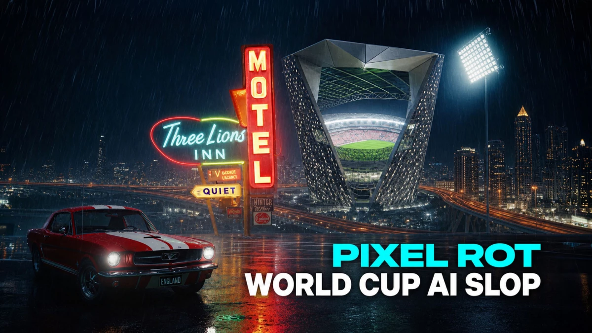
The Stadium in the City That Isn't Hosting
Search "World Cup 2026 stadium concept" on any platform and you will find renders for venues in cities not hosting the tournament. Jakarta. Riyadh. Lagos. Cairo. Sweeping rooflines, crowds rendered at a scale that would violate the seating geometry of any real arena.
@skynews Sky's Rob Harris looks into the legitimacy behind a viral video of a football stadium nestled on top of a skyscraper. But what is the real plan for the Saudi's World Cup bid? #worldcup#stadium#viralfootballstadium#football#sport♬ original sound - Sky News
The failures are consistent: columns requiring materials science that does not exist, roof spans no cable-stayed system could support, sight lines placing lower bowl seats below pitch level.
The failure only surfaces when you ask: how does this drain? AI was never asked. It produced concept art. Concept art is not architecture.
Verdict: These renders circulate as "leaked concepts" and "host city proposals." They are pattern completions that look buildable to an untrained eye — confidently wrong in ways expertise alone can detect.
The Sponsor That Didn't Even Try
AXE is an official FIFA World Cup 2026 sponsor. To announce the partnership, the brand posted on Instagram what is obviously a visual red flag.
This is a different category of failure. AXE is not a teenager with a Midjourney subscription. It is a global Unilever brand with a March 2026 campaign launch, an official FIFA licensing agreement, and a dedicated agency. The AI announcement graphic went out anyway.
View this post on Instagram
The problem is that AI erases the thing brands pay FIFA to borrow: the visual authority of the tournament. A real stadium photograph carries the weight of the event. An AI render carries the weight of a prompt.
Verdict: When a brand with the budget to do it properly reaches for a generator instead, the message is not efficiency. It is indifference. The draw never smelled so good. Neither did this.
What They All Have in Common
These are not random failures. They are the same failure, expressed differently.
Artificial intelligence has made it possible for a 13-year-old fan with no design training to put a concept in front of millions — which is exactly why what those concepts get wrong matters.
AI cannot produce things that work as members of the category it depicts. That requires knowledge outside images: materials science, institutional history, manufacturing tolerances, heraldic law, and the feel of a garment against a shoulder blade.
The best logos in any sport exist because someone understood all of them at once. Strip them out and what remains is AI design slop: decoration wearing the skin of a sports logo.
That gap lives in the fabric, in the tooling, in the meeting where someone decided the crown had to go.
Every fan with a subscription can now produce AI sports logos, AI generated football kits, or stadiums that will never be built. Most will make something that looks, from a phone screen, like the real thing.
It isn't.
Our team ranks agencies worldwide to help you find a qualified partner. Visit our Agency Directory for the Top UI/UX Design Companies as well as:
- Top App Design Companies
- Top Branding Companies
- Top Graphic Design Companies
- Top Product Design Companies