Storytelling is an art form, and Martin Osbourne combined that skills with web design. Through an experimental, interactive website, Osbourne shared a story about his friendship with an 86-year-old man named Joseph.
The fullscreen website starts with a high-resolution photograph of the subject, Joseph. The content on the page is minimal, yet direct. Users can opt to use their webcam or their spacebar to navigate through the story. This option improves the site’s UI and UX interface.
The transparency of the page draws attention to the photographed subject, forcing users to continue exploring the site and become a part of the story.

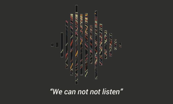
The website is primarily an audio narration by Martin Osbourne. In a book, writers compose a preface to the story, which gives readers background on the content. However, for his storytelling website, Osbourne did something different. He used the power of voice to create an “About” page, sharing the backstory and explaining the purpose of the website to users.
He evokes user experience by playing on visitors’ emotions. His black-and-white image of an interaction between the two men draws users’ attention. The black backdrop and light-gray call to action buttons add value to the page, without taking away from the subject.

The website is simplistic, yet impactful. It’s clean, symmetrical look is visually pleasing. As the story continues, users can choose a chapter from the menu to interact with first. Users can sift through the “chapter” pages by either holding the spacebar or by using their webcam. Every backdrop is white, with subtle effects and the option to skip a chapter on the right side of the screen.

Each chapter contains a recorded conversation between the two subjects. To keep users enthralled in the story, Osbourne uses both audio and visuals to connect visitors with the piece. He takes quotes from Joseph and puts them into captions on the page.
Here, the background is a transparent white, with a blurred image. There are three call to action buttons, two on the top and one at the bottom. Unlike the average website, use of peripheral blindness and light-gray coloring makes them unnoticeable, which keeps users from being distracted from the story.
86 and a Half Years is a brilliant website. Its infusion of storytelling and web design keeps visitors interested in the friendship between Joseph and Martin. It’s a compelling story, and the website's design makes it all the more powerful.
86andahalfyears is an amazing website design in the Arts & Recreation and Entertainment industries.


