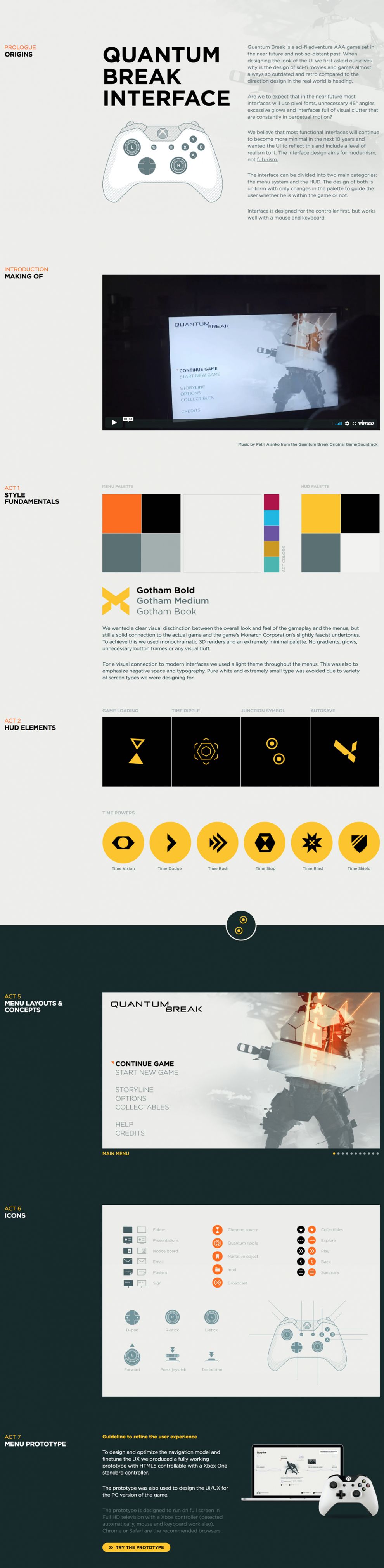
Sometimes, only artists know the genius of their work, and it takes a little extra effort to help others fully appreciate the skill, detail, and brilliance that combine to craft a finished creation. The site for Quantum Break Interface provides just the extra elements needed to explain the beauty, functionality, and design of a new science fiction video game.
Developing a drama from the prologue, through seven acts, to ending credits, this infinite scroll site describes the process of designing the gaming product. Excitement builds up until the end, where users are presented with the option to test a prototype version of the game.

Thought clearly went into every dimension of this game, and the site designers echo the minimalism and creative philosophy that shaped all the various aspects of the game itself. With icons that merge and images that describe the purpose behind the appearance of game weapons, the site leaves no questions about the care that went into constructing this game. Users can’t wait to explore an interface designed with so much effort.
To keep things clean and simple, the site design relies on a consistent color palette of bright yellow, orange, and blue contrasted by solid black or white backgrounds. Through video simulations and demonstrative animations, the game becomes real in the mind’s eye. Text information and directions to the menu and navigation layouts are presented in simple font families, and the overall UX gives gamers an understanding of the intentional effort that went into the game itself. All that is left for them to do is start playing!
Quantum Break Interface is a best website design in the Entertainment and Technology industries.

-preview.jpg)


