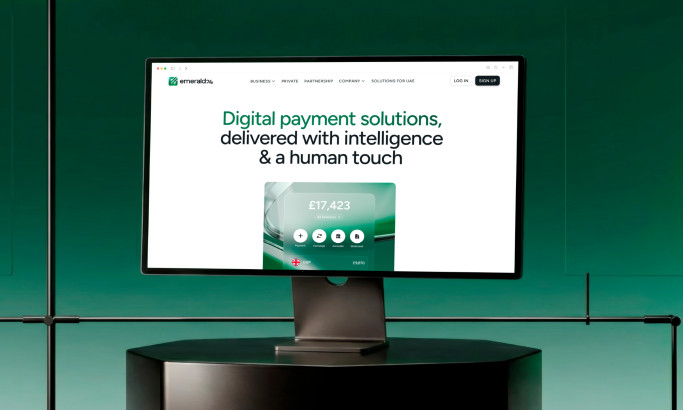
And Co is a site created to detail the findings of a recent study that focused on the freelance economy and provide a tool for freelancers to efficiently manage their projects, clients, earnings and everyday tasks.
It’s home page intended to expose the bright spots and harsh realities of the industry, while also dispelling the stigmatization of freelance as a career. Its opening body of text claims that emerging, intrepid freelancers are redefining the nature of independent employment.
Freelance is an exciting, creative, and technologically driven career path that is anything but stuffy. So, to properly express the findings of this study in a way that speaks to freelancers, their site has been designed to provide a vibrant, multimedia experience.
For example, the home page exposes the preliminary findings of the study with an embedded video. This provides a more engaging, immersive way to present the data to relevant users. Rather than having to sift through dense dossiers, users can engage with a dynamic video presentation that explains the information in a more compelling way.

Continuing the trend toward dynamic visualization, the flow of the site functions as a deep scroll through a single, extended page. This allows the designer to walk users through the information in the most optimal order possible, while also making the experience more engaging. Additionally, the page features a slight animation to the left of the text.
As users scroll down to the adjacent blurb, the papers to the left dynamically fall into place. This simple bit of animation expands user interest, and it keeps the experience from growing stale.
Furthermore, the bright blue underline of the word “fallback” and the blue coloring of one block of text makes the page even more dynamic and eye-catching. This is an example of how simple design choices make otherwise boring information light up and captivate users.

Lastly, these graphic pieces of data, provided as part of the “About” section of The Slash Workers’ study, further demonstrate the site’s interest in bringing data to life and capturing users’ attention.
By turning the data of the study into this brightly colored animated chart, the designer has again imbued the content of the site with a little more intrigue.
Pops of color, animation, and graphic interfaces can keep a site from stagnating and losing user interest. Here, and throughout the site, the designer has formatted a vibrant and engaging experience that morphs something stale into something magnificent.
And Co is a awesome website design in the Technology industy.