Key Points
- Video-Enhanced Websites Drive Sales and Conversion: 84% of video marketers say that using videos on their websites helped them drive more sales, making it one of the most effective assets for website performance. From product demos to explainer reels, videos help visitors understand offerings faster, leading to quicker decision-making and stronger conversions across funnels.
- Motion Content Boosts Recall and Brand Trust: 91% of consumers say video quality directly impacts their trust in a brand. In other words, it’s not just having video that matters — it’s how well it’s executed. Not only that, dynamic visuals grab attention within seconds and keep users engaged far longer than static pages. Videos make your website more memorable.
- Branded Storytelling Comes to Life Through Video: Websites with videos give brands a powerful way to show what they’re all about. Whether it’s culture, process, or product value, video communicates personality and purpose with authenticity. It humanizes your brand and creates that instant connection with consumers.
Website designs with structured mapping and artistic layout are good. But add a video to the background? Even better.
A website with embedded video, especially when curated to match your design theme, does more than just boost its visual appeal. It also has an impact on the site’s performance metrics.
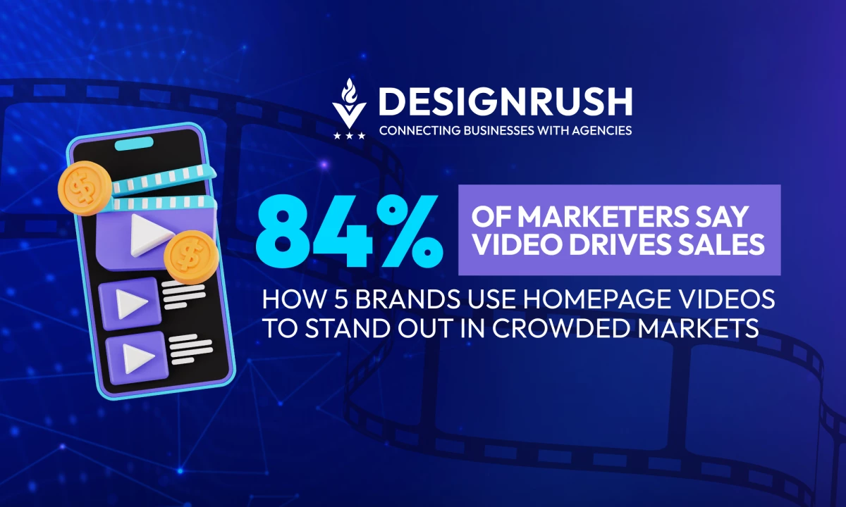
In fact, 84% of video marketers report that video has directly increased sales and helped keep visitors on their website for longer. Yet surprisingly, not a lot of brands take advantage of these benefits.
That's your chance to topple the competition. By integrating video into your website, you can elevate user experience and outperform competitors in both engagement and conversions.
Ready to give your website that edge? Start with these five websites with videos on their homepages as an example.
.gif)
5 Standout Websites With Video (By Industry Use Case)
1. Fabio Formato by Gianluca Armenio
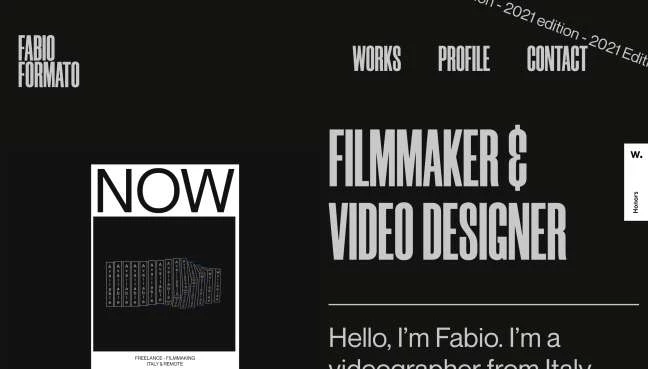
Overview: A portfolio website for videographer Fabio Formato, designed by Gianluca Armenio, featuring cinematic visuals and immersive video integration.
Best Features:
- Video on loop: The homepage immediately plays a looping highlight reel, showcasing Fabio’s work in a captivating way.
- Cinematic quality: Full-screen videos and bold typography give the site a strong visual impact.
- Responsive video display: The video resizes smoothly to match the visitor’s screen, delivering a consistent experience across devices.
Use Cases:
- Creative professionals looking to showcase video portfolios
- Personal branding websites for global freelancers
- Visual-first websites that prioritize content over navigation clutter
Brand Insights: The looped videos do a great job of showing off Fabio Formato’s skills; no extra explanation needed. The whole site is built to let the work speak for itself, with a layout that feels smooth and focused. Small details add just enough interactivity to make it engaging without overwhelming the viewer.
2. Masthead Magazine On Design by DTE Studio
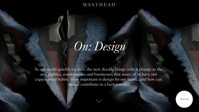
Overview: Masthead Magazine On Design keeps things simple but bold, using clean layouts and strong visuals to spotlight some of today’s most exciting creatives.
Best Features:
- Revolving mirror illusion: A hypnotic, abstract video of a Nike shoe greets visitors, reinforcing the design’s influence.
- Minimalist layout: Clean, dark visuals make content and imagery stand out without distractions.
- Personality-driven modules: Each creative has a unique, personal section with no visual overlap.
Use Cases:
- Digital magazines highlighting design or fashion
- Campaign pages focused on showcasing individual talents
- Editorial-style storytelling sites with heavy visual impact
Brand Insights: Every section of the website centers on the idea that good design speaks for itself. With subtle interactivity and focused navigation, DTE Studio proves that simple, strong visuals can drive attention and create a lasting impression.
3. Uniqlo
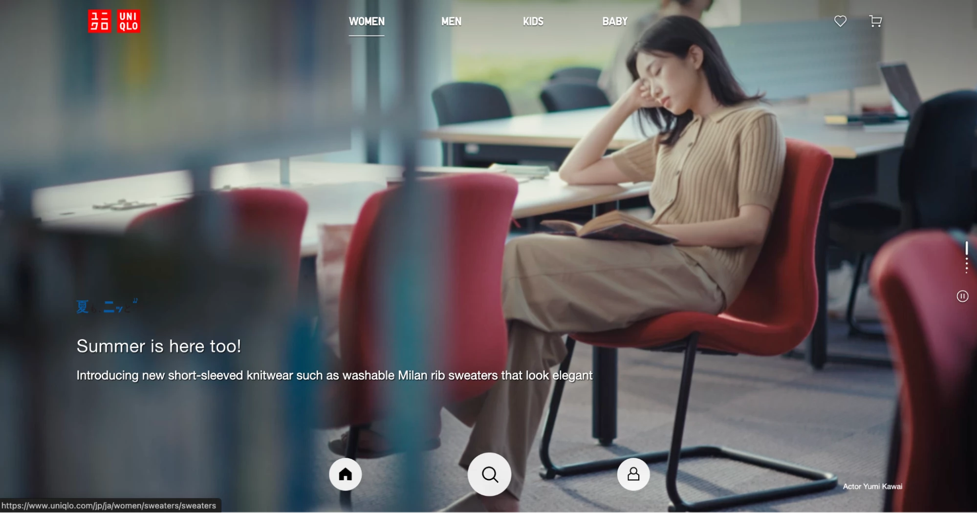
Overview: This sleek, image-led website from Uniqlo Japan uses lifestyle video and smooth transitions that create a highly appealing and user-friendly shopping experience.
Best Features:
- Immersive lifestyle imagery: Subtle videos of real people in motion make the brand more human and relatable.
- Seamless transitions: Browsing feels fluid and natural, like flipping through a curated lookbook.
- Simple navigation: Clear category hover states and minimal buttons make the experience intuitive.
Use Cases:
- Retail brands looking to elevate their online experience
- Fashion websites that want to connect with lifestyle-focused audiences
- Brands prioritizing ease of use and clean, mobile-friendly design
Brand Insights: Uniqlo’s site reflects the brand’s identity: simple, timeless, and thoughtful. Every visual feels intentional, and every scroll is seamless. It’s a strong example of how less can be much more when design matches brand tone perfectly.
4. Visit Austria
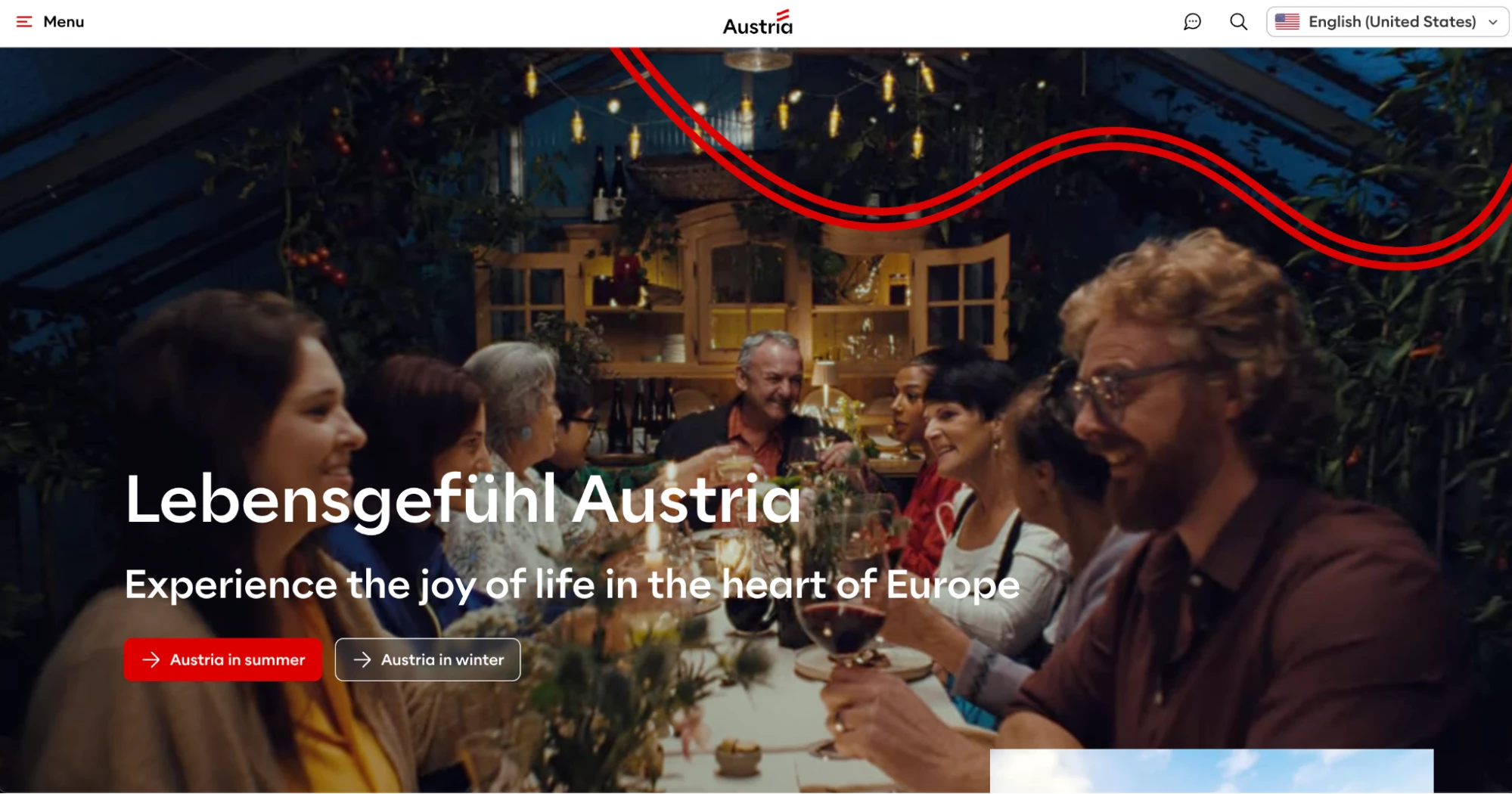
Overview: A tourism site for Austria built to evoke emotion through full-screen video, seasonal content, and calm, guided navigation.
Best Features:
- Full-screen video header: Warm, beautiful visuals showcase Austria’s landscapes and atmosphere.
- Dynamic, seasonal layout: Content matches the country’s current travel seasons and trends.
- Sleek navigation: A minimal slide-out menu keeps users focused on the experience.
Use Cases:
- Tourism boards looking to inspire travel through emotion
- Destination marketing sites with seasonal campaigns
- Story-first websites where video plays a major role
Brand Insights: Visit Austria’s site is an exhilarating digital experience. From the opening video to the carefully curated activities, everything is designed to pull users emotionally. The layout is easy to follow and feels personal, while the phrase “Lebensgefühl Austria” grounds the site in local culture. Every site element immerses users in the wonders of Austria.
5. Pasta Mancini
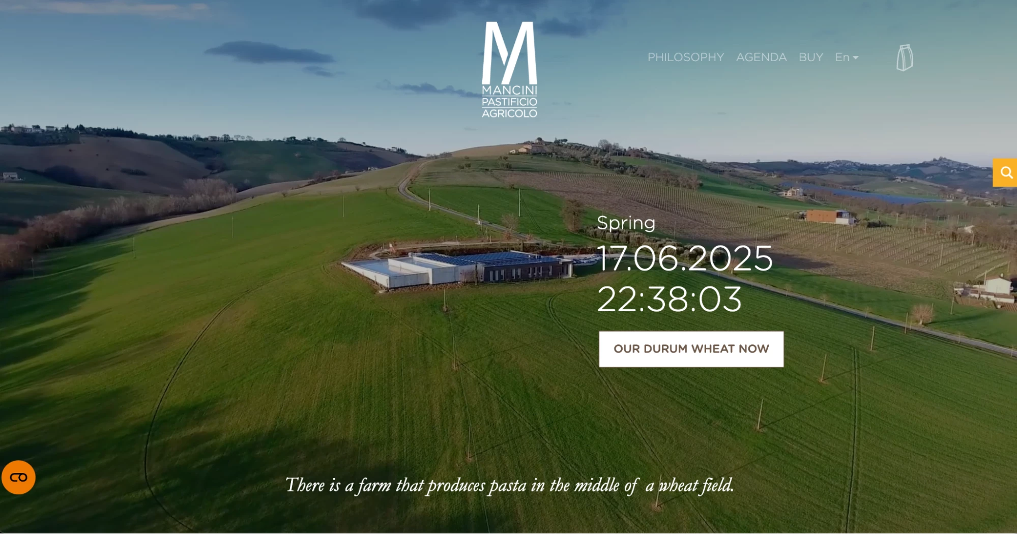
Overview: The farm-to-table pasta brand’s website uses real-time visuals and full-screen video to tell a story about tradition, care, and transparency.
Best Features:
- Video of wheat fields: A full-screen video opens the site with calm, honest imagery tied to the product’s origin.
- Minimalist guided layout: Clean sections introduce philosophy, brand values, and shop with simple navigation.
- Real-time phenological overlay: A unique button lets users see the current stage of the wheat’s growth cycle.
Use Cases:
- Food brands focused on traceability and storytelling
- Product websites that want to build an emotional connection through the process
- Ethical brands that value transparency and nature-based imagery
Brand Insights: Pasta Mancini’s website invites users into its world, using visuals to do the heavy lifting. Quietly showing the care and quality behind each product, its real-time wheat overlay turns something basic into something beautifully honest. With soft transitions and straightforward navigation, the site reflects the brand's values: clean, patient, and rooted in purpose.
Takeaways for Brands
Websites with video are more than just visually appealing — they’re a powerful strategy for connecting with your audience. A well-placed video on your homepage grabs attention right away and gives visitors an instant feel for what your brand is all about.
As the examples above show, a homepage with video can create a dynamic experience that tells your story, builds trust, and keeps people engaged from the first click.
In a nutshell,
- Brand-first video designs increase time-on-site and improve first impressions
- Videos on websites lower bounce and increase emotional engagement from visual storytelling
- Adding videos differentiates your website at first scroll, which is especially critical in saturated industries like fashion, travel, and food
So if you're thinking of redesigning or updating your site, take this as your sign to reach out to professional web designers.
Start with the basics, look at what these five brands are doing right, and create a website with a video on your homepage that reflects your brand.
What This Means for Agencies
- Homepage video is now a brand standard: From D2C to tourism, brands expect cinematic storytelling.
- Site performance matters: Smart video use (looped, responsive, lightweight) separates premium sites from bloated ones.
- Expect client briefs to include video UX as a baseline: Creative + tech fluency is the new edge.
According to Wyzowl, 83% of consumers say they want to see more video from brands. This clearly signals that audiences aren’t tired of video, they just want it done right.
Website with Videos FAQs
1. Why should I use videos on my website?
Adding videos to your website captures attention fast and brings your brand story to life. As mentioned, 84% of video marketers say video increases sales and helps keep visitors on-site longer. It’s a simple but powerful way to make a strong first impression.
2. What kind of video works best for a homepage?
It depends on your brand and audience. Let’s take the designs above as good examples:
- Pasta Mancini uses a full-screen video of wheat fields to emphasize its roots and values
- Fabio Formato highlights creative work with cinematic reels
- Uniqlo shows people in motion to connect their lifestyle with their product.
The best video is the one that clearly and authentically reflects your brand’s message.
3. Do websites with video improve SEO?
Videos can lower bounce rates and increase time-on-site, which are both positive signals to search engines. When done right (like in Visit Austria), they also enhance storytelling and make your content more shareable and link-worthy.
4. Will adding video slow down my website?
It can, but only if it is not optimized. Many of the sites featured (like Masthead Magazine and Uniqlo) use responsive videos and seamless transitions to maintain speed and flow. Compressing your videos, using lazy loading, and choosing the right format helps keep performance smooth.