Animated websites are redefining digital storytelling in 2026. From bold loading sequences to subtle motion cues, animation plays a critical role in modern web design and users’ interactive journeys.
Below, we highlight nine of the best animated websites in 2026 — each pushing creative and technical boundaries to deliver immersive, high-impact digital experiences.
9. Deed Delivery
Standout Features:
- Dynamic entry animation
- Interactive scrolling effects
- Seamless light-to-dark transitions
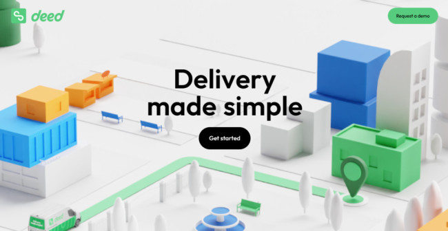
Deed Delivery earns its place among the best animated websites by pairing animation with utility. The homepage kicks off with a strong branded animation — the company name racing across the screen, establishing a confident, modern tone. As users scroll, animated paths trace down the page like a delivery route, reinforcing the brand metaphor in real time.
Horizontal and vertical scrolling transitions are accented by a smart light-to-dark theme switch. This not only breaks up the visual pacing but also aids in separating content sections, improving readability. These seamless transitions make navigation feel intentional and fluid, a must for websites with great animation aiming for high usability.
8. Wimpy Kid
Standout Features:
- Playful character animations
- Interactive hover states
- Dynamic section transitions
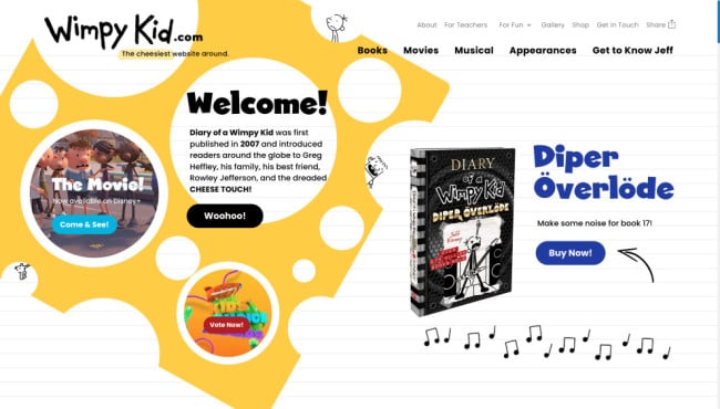
Wimpy Kid’s site shows how the best animation websites can balance branding with fun. Designed by eDesign Interactive, it features animated book excerpts, interactive illustrations, and hover-triggered effects that keep users engaged. Each element reacts playfully to the cursor, echoing the franchise’s signature humor and tone.
Animations aren’t just decorative here; they reinforce the narrative. Section transitions resemble splash pages from comic books, maintaining an immersive, story-driven feel throughout. It's a strong example of animation used to strengthen user connection and narrative flow, especially effective for brands targeting younger demographics.
7. QuadAngles
Standout Features:
- Dark/light switch
- Monochromatic approach
- On-brand design elements
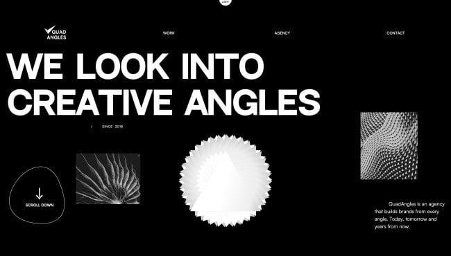
QuadAngles is a professional agency specializing in digital experiences, including branding, web design, and mobile app development. Proving their mastery of the latter, the company’s website wows audiences with the beautiful mix of streamlined efficiency, parallax effects, animated elements, and the purposeful lack of coloration.
While the initial presentation heavily draws from the current “dark mode” trend, visitors can flick it by clicking on the convenient button above the fold. Simple as that!
The unusual shapes adorning the website embody the company credo perfectly: “looking into creative angles.”
6. Ockom
Standout Features:
- Interactive 3D illustrations
- Creative text animations
- Matrix-esque transitions and icons
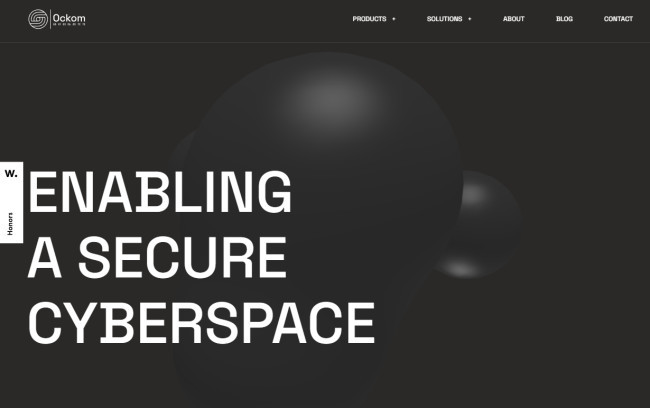
Ockom simplifies cybersecurity by providing its clients with scalable and sustainable cyber resilience products. The website is far from simple — and that’s a compliment.
The top web designers at Digital Butlers integrated a complex animation technique into an easy-to-navigate UI, creating a highly interactive, user-friendly website. It effectively establishes the company as a top-caliber and highly credible cybersecurity provider.
The website’s key pages feature animated symbols: a molecule and a shield, which perfectly represent the company’s area of expertise and the solutions it offers. And here’s the fun part — these visuals change their form and position as users scroll further down the pages!
From anagram letters forming into complete statements to color-changing texts, the website typography that Digital Butlers used also has its fair share of creative animations.
5. Buzzworthy Studio
Standout Features:
- Fluid blob animations
- Interactive beehive-inspired patterns
- Dynamic vertical and horizontal scrolling
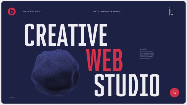
Buzzworthy Studio’s’s homepage is a visual playground and a benchmark for websites with great animation. A blob-like animation greets visitors and subtly adapts as they scroll, eventually becoming a navigation motif in the project gallery.
Bee-inspired patterns animate in the background as nods to the brand’s name, adding visual rhythm. Coupled with shifting scroll directions, the motion flow keeps users curious and engaged. It's proof that when motion is tied to brand DNA, the result is not just eye-catching but also memorable.
4. The Quake
Standout Features:
- Interactive text shake effect
- Dynamic tectonic plate animations
- Scrolling visual storytelling
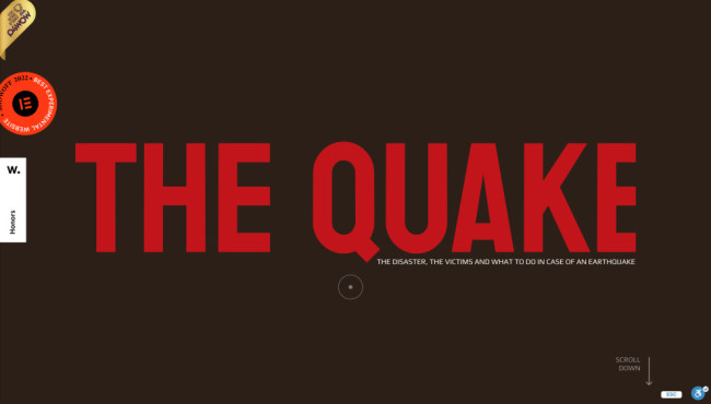
Yoni Kessler’s design for The Quake is a powerful case of motion with purpose. The intro features a shaking text effect mimicking seismic activity, a simple but effective way to establish theme. As users scroll, animations show tectonic plate shifts, rotating globes, and emergency tips.
This site is one of the best animated websites for educational storytelling. The motion elements don’t overwhelm but guide users through interactive learning moments. Visuals are coordinated with information, creating a memorable and informative experience, ideal for edtech and nonprofit sectors.
3. Poppr
Standout Features:
- Seamless parallax scrolling animations
- Dynamic color transitions on a dark canvas
- Interactive WebGL and smooth transitions
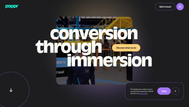
Poppr's website is a stunning treat of visual animations, drawing you in with its captivating parallax scrolling. As you explore, the site comes alive with dynamic web design elements that create a sense of depth and immersion, perfectly showcasing Poppr's mastery of interactive design.
The color palette is a sophisticated blend of gold, purple, and teal, set against a classic black backdrop. These vibrant hues are used strategically to highlight key content, while transitions from the dark canvas into purple and yellow backgrounds result in a luxurious yet welcoming atmosphere.
Interactive WebGL elements and seamless transitions further enhance the site's visual appeal. Every detail, from the engaging hero video background to subtle hover effects, even a hamburger menu that bursts into color once hovered, is designed to captivate and emphasize Poppr's unique offerings.
In short, Poppr's website is a spectacular example of combining bold visuals, smooth animations, and a striking color palette to create a truly immersive digital experience.
2. Roger Junior
Standout Features:
- Interactive, playful illustrations
- Dynamic scrolling animations
- Vibrant neon color palette
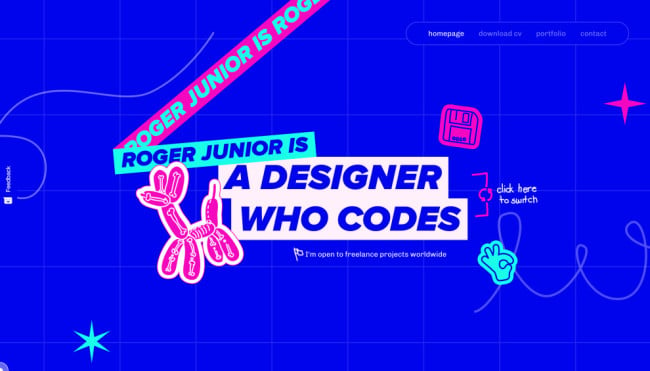
The hero section of Roger Junior’s portfolio immediately captures attention with its interactive illustrations. Visitors can drag and move graphic elements, offering a tactile and engaging experience that mirrors the designer's creative spirit. These playful elements set the tone for the site, making exploration as entertaining as it is informative.
From dynamic typography to lines being drawn as you scroll, dynamic animations bring life to every section and guide the user’s attention to key elements like project highlights and service descriptions. The smooth transitions and motion effects also add depth to the design, making the site feel lively and immersive.
Roger Junior’s portfolio website stands out with its bold combination of interactivity, motion, and electric color scheme of cobalt blue, sky blue, and magenta, the color psychology of which offers a unique and memorable user experience that reflects the designer’s exceptional creativity.
1. Wildcatter
Standout Features:
- Explosive loading screen animation
- Interactive menu hover effects
- Scroll-triggered typography animations
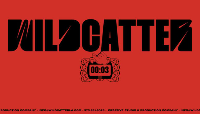
Workshop Built’s design for Wildcatter LA' is explosive, literally. The intro animation features hands holding dynamite, counting down to the homepage reveal. This high-drama start flows into chaotic hover effects on the menu and motion-triggered typography throughout the scroll journey.
Scrolling reveals even more impressive animation. The “Work” section stands out with its scroll-triggered typography, where words dynamically lean inward as users progress, while hover effects transform team photos in the “About” page.
Even the cursor transforms into a graphic hand, keeping users immersed. This site is a prime example of the best animated websites where motion design fully supports the brand’s bold, high-energy personality.
Best Animated Websites: Key Takeaways
These nine websites demonstrate that animation is not merely a decorative element but a powerful tool for storytelling, user engagement, and creating memorable brand experiences.
Whether through subtle hover effects, dynamic scrolling, or playful character animations, each website utilizes motion uniquely to enhance its message and purpose. They demonstrate that with creativity and strategic implementation, animation can transform a website from a boring, old-school, static page into a dynamic, engaging, and unforgettable experience.
Best Animated Websites FAQs
1. What are some popular animation techniques used in web design?
Popular techniques include:
- Scroll-triggered animations: Elements animate as the user scrolls down the page.
- Hover effects: Visual effects appear when the user hovers over an element.
- Loading animations: Entertaining visuals that appear while the page loads.
- Background animations: Subtle movements in the background to add depth and visual interest.
- Character animations: Animated characters to enhance storytelling or brand personality.
2. What tools are used to create animated websites?
Common tools include:
- CSS animations: Code-based animations for basic effects.
- JavaScript libraries: For more complex animations and interactions.
- Animation software: Adobe After Effects, Animate CC for creating advanced animations.
- Lottie: For rendering animations created in After Effects on the web.
3. How can I add animation to my existing website?
Start with small additions like hover effects or scroll-triggered animations. Consider using plugins or libraries for easy implementation. If you need more complex animations, consult a web designer with animation expertise.

