Digital Silk redesigned the website for Boeshield T-9®, a corrosion protection brand backed by over 40 years of aerospace engineering. The product is trusted across industries from marine to automotive to aviation. However, the brand’s previous website was outdated, slow, and hard to navigate. The new site fixes all that with a sharp, structured layout, stronger visual hierarchy, and a clean grid system that makes product discovery fast and intuitive.
Key Insights for Brands
- A grid-based layout makes product categories easier to browse
- Strong contrast between text and background improves readability
- Clear visual hierarchy helps guide users through dense information
Grid-Based Layout Makes Product Browsing Easy
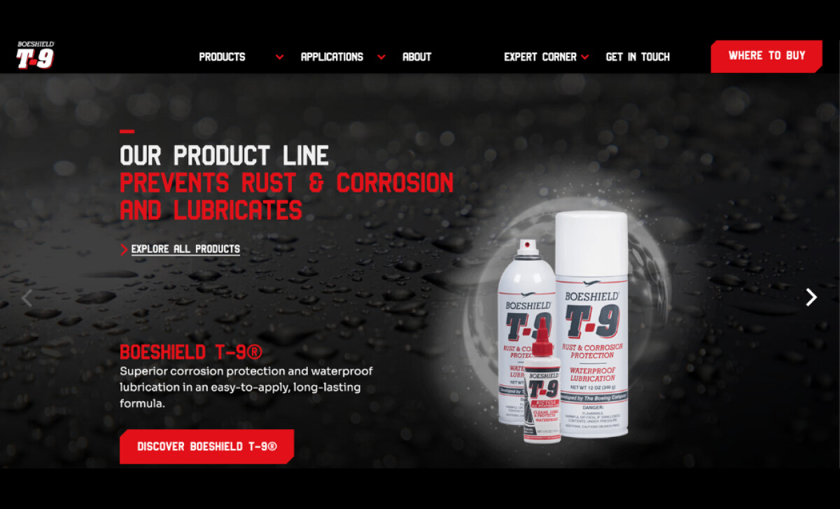
One of the most noticeable improvements in the Boeshield T-9® redesign is the product grid. Previously, the site relied on dense text blocks and inconsistent formatting, which made browsing tedious and visually unappealing. Digital Silk replaces this with a clean, evenly spaced grid that brings order and clarity to the browsing experience.
Each product is presented with a clear image, concise label, and consistent sizing. This allows users to quickly understand what each item is and what it’s used for, without having to dig through long descriptions or multiple pages. The new grid not only looks more modern but also improves usability by making product comparison faster and more intuitive.
For a site that serves both technical buyers and casual consumers, this visual-first approach works extremely well. It reduces cognitive load, increases time spent on product pages, and supports faster decision-making.
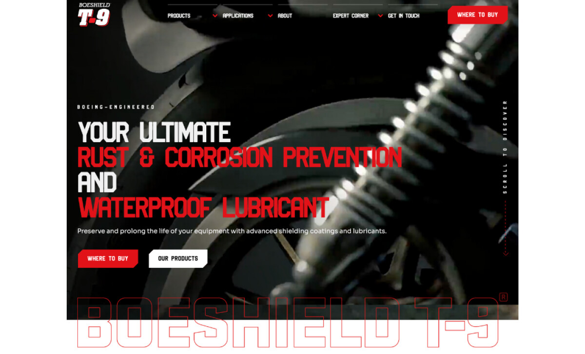
Strong Contrast Improves Readability
The color scheme uses high contrast: a solid base of white background is paired with deep black text, accented by the brand’s signature red. This combination keeps the visuals sharp and helps content stand out clearly. Whether someone is browsing on their desktop or mobile phone, the contrast improves legibility without strain.
Typography also plays a big role in this design. Large, bold fonts guide the viewer through the page, while smaller text is kept minimal and spaced out. Additionally, buttons and callouts are easy to spot,making the overall experience feel both professional and easy to trust.
Discover the best manufacturing website designs today.
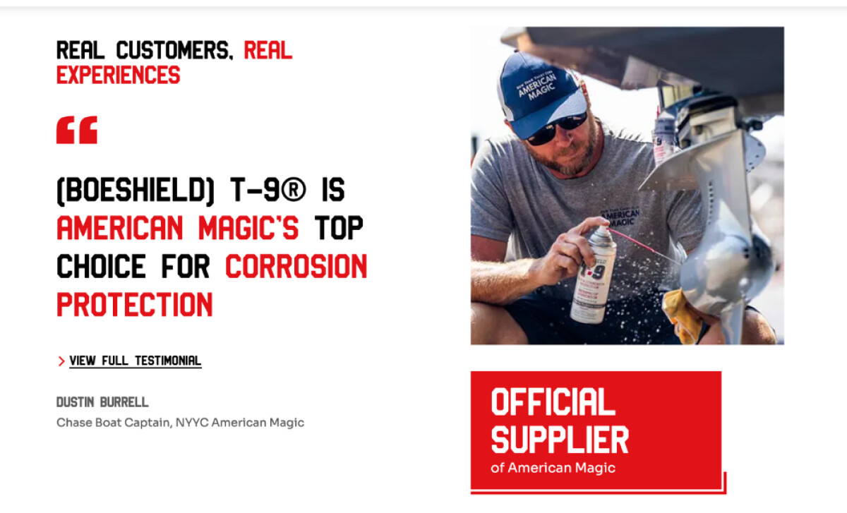
Clear Visual Hierarchy Guides the User Experience
Digital Silk uses a consistent layout structure that helps visitors move through the site naturally. Pages are broken into sections with distinct headers, icons, and product visuals. These repeating web design elements make it easy to understand what each section is about, even before reading the text.
Spacing is also used effectively; nothing feels cramped or overfilled. There’s enough room between elements for the content to breathe, which helps users focus on one thing at a time. Whether they’re looking for distributor info, product details, or contact support, the visual hierarchy makes navigation feel intuitive.
Boeshield T-9® Showcases Page Layouts That Guide User Action
Beyond visuals, the new Boeshield T-9® website delivers key improvements that directly impact user experience. The simplified layout, reduced clutter, and optimized image handling contributed to faster site speed, now loading well under the 2.5-second target.
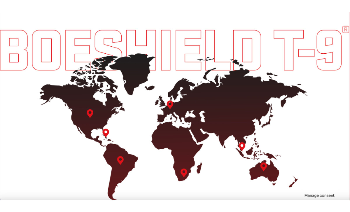
The contact form, which previously suffered from spam and broken submissions, was rebuilt with a cleaner layout and more reliable performance. Distributor visibility also improved with better sectioning and easier mobile access.
Internally, the CMS was set up with clear modules, allowing the solo marketing manager to update pages, products, and regional information without technical support. These design changes made the site not just better looking but also more functional.
This is more than a facelift. It’s a website redesign that prioritizes usability while maintaining an impressive industrial aesthetic. For brands in the manufacturing space, this project is a great example of how good design solves real problems.


