
Business Wire partnered with Bilberrry to redesign its website into a clean, modern experience that supports the brand’s long standing reputation in global press distribution. And the result? A polished and purposeful design that uses thoughtful layout, precise typography, and custom illustrations to communicate authority and approachability in equal measure.
Key Insights for Brands
- Custom illustrations add warmth without sacrificing professionalism
- Color and typography build trust while keeping content accessible
- Consistent spacing and alignment guide users through dense information
Custom Illustrations Add Personality Without Sacrificing Clarity
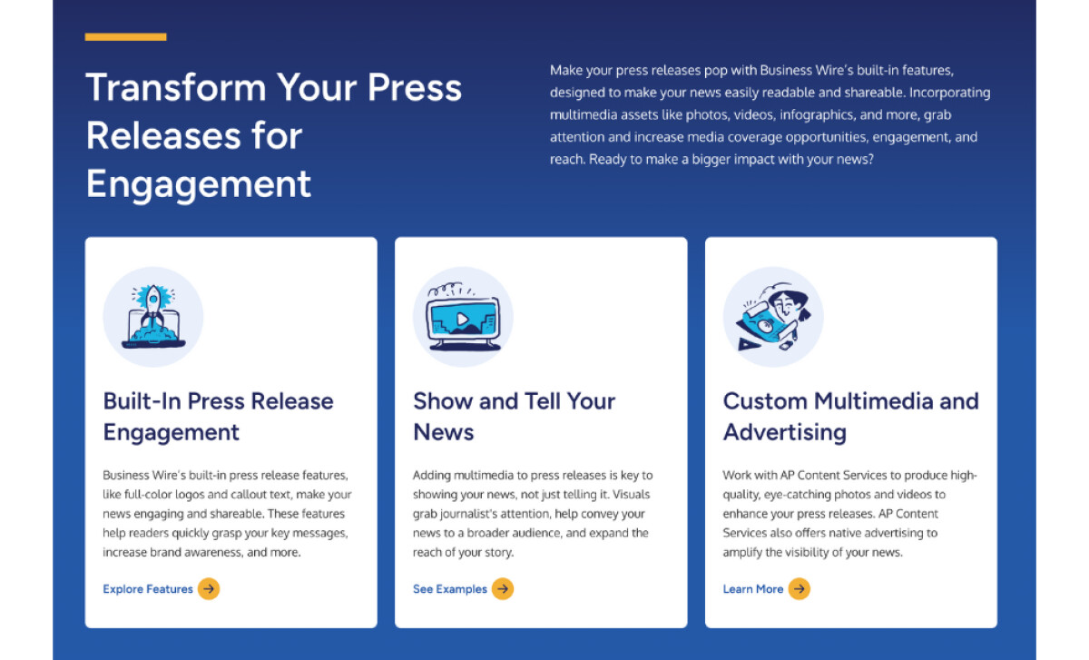
One of the standout features of the Business Wire web design is its use of creative illustrations. Instead of relying on generic stock imagery or overly polished icons, the design incorporates hand-drawn, character-driven illustrations that add warmth and personality to the interface.
Bilberry ensured that each visual had a clear purpose. From the rocket-powered press release to stylized audience-targeting graphics, these elements help reinforce messaging without crowding the screen. They guide the viewer’s eye, support the copy, and break up content in a way that feels friendly but still professional.
This approach helps Business Wire stand apart in a category where many platforms lean heavily on cold, corporate visuals. Creative illustrations bring a human touch to a brand known for speed, accuracy, and reach.
A Bold and Bright Color Palette Reinforces the Brand's Authority

A confident use of color gives the Business Wire website a strong and credible presence. Deep navy backgrounds convey stability and professionalism, while bright accent colors are used intentionally to draw attention to key actions. This careful contrast helps highlight elements like “Send a Press Release” or “Learn More” without overwhelming the overall layout. The color palette feels modern yet measured, supporting both the platform’s function and its reputation.
Learn actionable tips on how to choose your brand colors.
Straightforward Typography Supports Clarity and Professionalism
The Business Wire website's typography is clean, readable, and consistent. Headings use bold, well-spaced fonts that help organize content and guide the reader’s eye. Body text maintains a balanced weight and size that supports longer reading sessions, especially across detailed articles and feature descriptions.
And to complement the text, the website uses consistent spacing and precise alignment to create visual harmony. A well-structured grid system ensures every element on the page has a purpose and is placed with intention.
This thoughtful approach enhances the site's aesthetic appeal and aids in navigation by making the information easy to follow. Web designers often make such strategic choices to support the site’s authority while keeping the reading experience approachable and efficient.
Check out more examples of amazing professional service web designs.
Consistent Spacing and Alignment Build Visual Rhythm
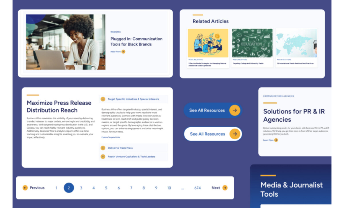
Space is used strategically to separate sections, giving the user visual breathing room. This technique helps prevent the site from cluttering and allows key content to stand out. Plus, proper alignment makes the UX more intuitive and comfortable, so visitors can easily navigate the website and find relevant information.
By maintaining a consistent visual rhythm, the design also reinforces Business Wire's professionalism. The layout guides users smoothly from one section to the next, creating a seamless experience that enhances engagement and readability.
Overall, Business Wire is a strong example of how clear structure, thoughtful visuals, and design consistency can support a high-content platform. Every element on the site serves a purpose, from how content is grouped to how headlines and visuals lead the user through the experience. Bilberrry’s work reflects a deep understanding of the brand and its audience, resulting in a polished, informative, and easy-to-navigate digital platform.


