This website is a vertical of Vanity Fair. It’s a digital news source and platform dedicated to the coverage of all things business, politics, and tech.
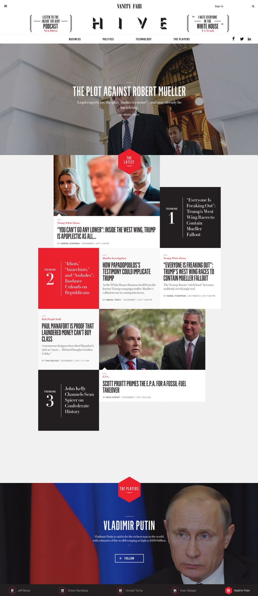
This site essentially falls under the glowing halo of media darling Vanity Fair—a fact that is quite literally represented in the site’s masthead. Located top-center is, of course, the Vanity Fair brand logo and link to the mother website. But directly below the VF logo is the hard-to-ignore title of this baby—the Hive.
By increasing the size and using bold drop shadows on the text here, designers have ensured that the Hive brand indeed stakes its claim over the page. Just below the title lies a clean navbar, with seven hover-animated buttons: four categories of news coverage and three social media links. Just below the white navbar, a dark photograph runs the width of the screen. Drama and contrast draw the user in.

Upon scroll, content is placed within sharp, geometric containers, giving order and depth to the page. Black, white, and gray tones play on minimalism, while touches of bright red add contrast.
Photographs also add visual interest to the page, but the typography does most of the talking here. The hierarchical structure of the text helps the user to easily process and organize content. What’s more, the sheer size and boldness of the headlines immediately glean user’s attention.
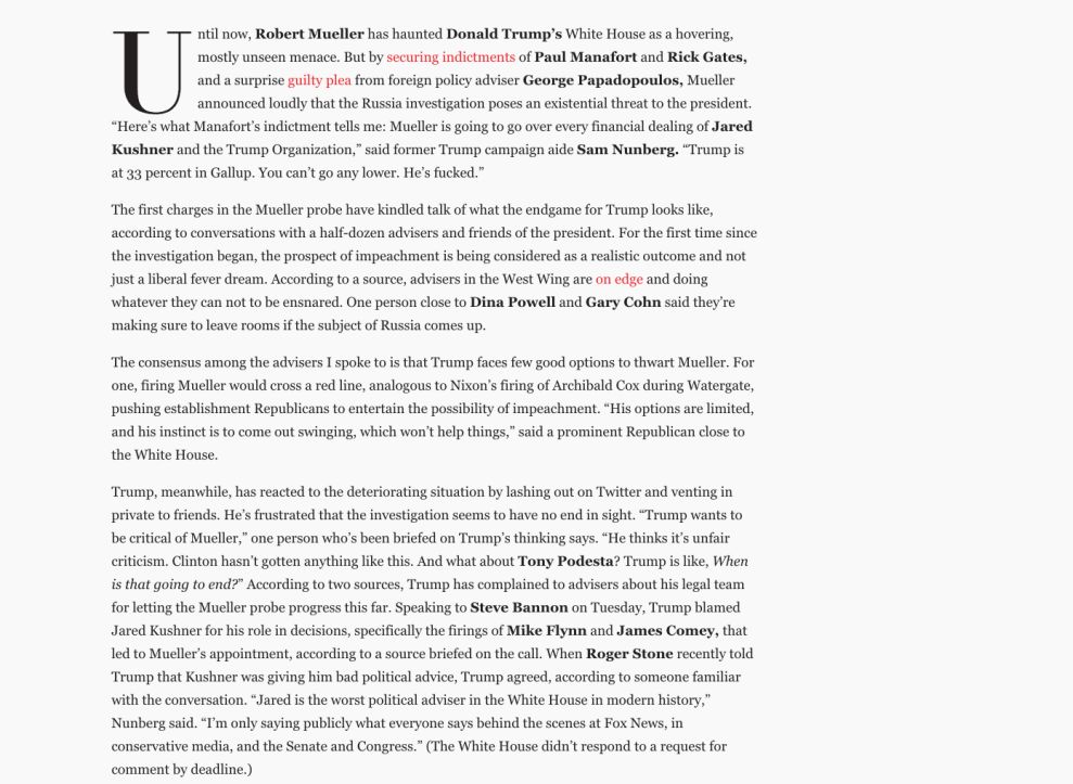
Once the article link is activated, users are taken to a page where traditional magazine elements prevail. The editorial content is what now takes center stage.
Crisp columns of white on both sides of the text create a real magazine-on-the-screen user experience. All the while, bright red hyperlinks add digital flair and contrast to the page. Names and snippets of text are bolded, enabling the user to hone in on the good stuff.
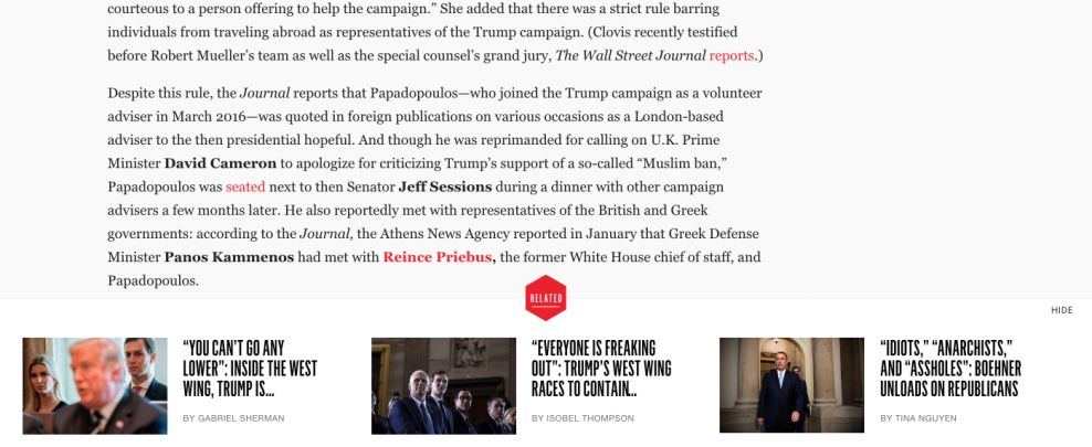
As the user approaches the end of the story, a modal window sneaks in at the bottom of the page, showcasing related content. Here the red hexagonal graphic, seen previously on the homepage, doubles as an interactive button. The size, shape, and color of the button all work together, allowing the user to intuit an important navigation element.
Users instinctively know that the little red hexagon doubles as a stop-the-pop-up button. This is functional minimalism at its best. And with its clean lines, high contrast, smooth UX/UI elements, and phenomenal editorials, well, that’s exactly what the Hive site seems to be all about.
VanityFair Hive is a top website design in the Arts & Recreation and Entertainment industries.


-preview.jpg)