Australia is one of the world’s most popular vacation destinations. From the Sydney Opera House to hanging out at the Australia Zoo, the land Down Under continues to attract people from all over the globe.
One place that is getting a lot of buzz is Fremantle -- a city in Western Australia. Nestled in the quaint town is the Tradewinds Hotel, where guests will find old-fashioned service with a contemporary look. That same modern style echoes throughout the hotel’s web design with its bright typography and ingenious layouts.
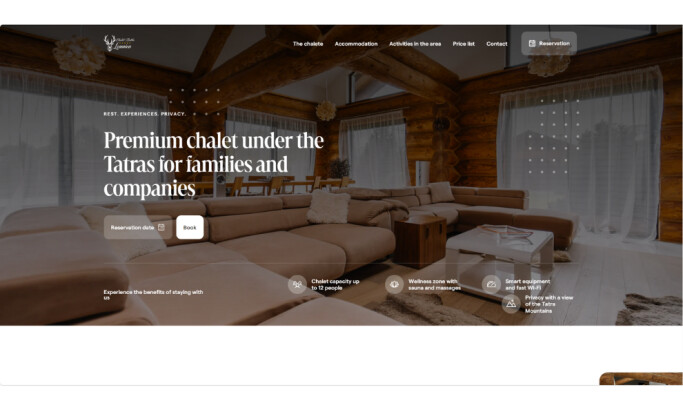
The landing page uses a power grid layout and manipulates shapes and color schemes to draw attention to the content on the page. It has a borderless horizontal menu with gold typography that transitions users into the page.
The home page features full-screen background images in a tile format. When users open the page, a module window appears on the right side of the screen. The window offers viewers an opportunity to earn a discount on their stay if they register their e-mail address. This approach enhances the UI and UX interface and gives visitors an opportunity to interact with the hotel’s website.

The “Facilities” page allows users an opportunity to learn about the services and amenities the hotel offers. It uses the same full-screen image format as the landing page.
On the right is a “Book direct and save” tab. Its black background and white typeface juxtapose well against the page’s color schemes. The tab is visible yet subtle, giving users an opportunity to explore the rest of the content.
The “Hotel and facilities” subpage only uses icons and identifying text. Each illustration features various shapes and lines, giving the subpage a clean look. Its simplicity allows for a smooth transition into the remaining subpages and doesn’t distract users from exploring other hotel features.
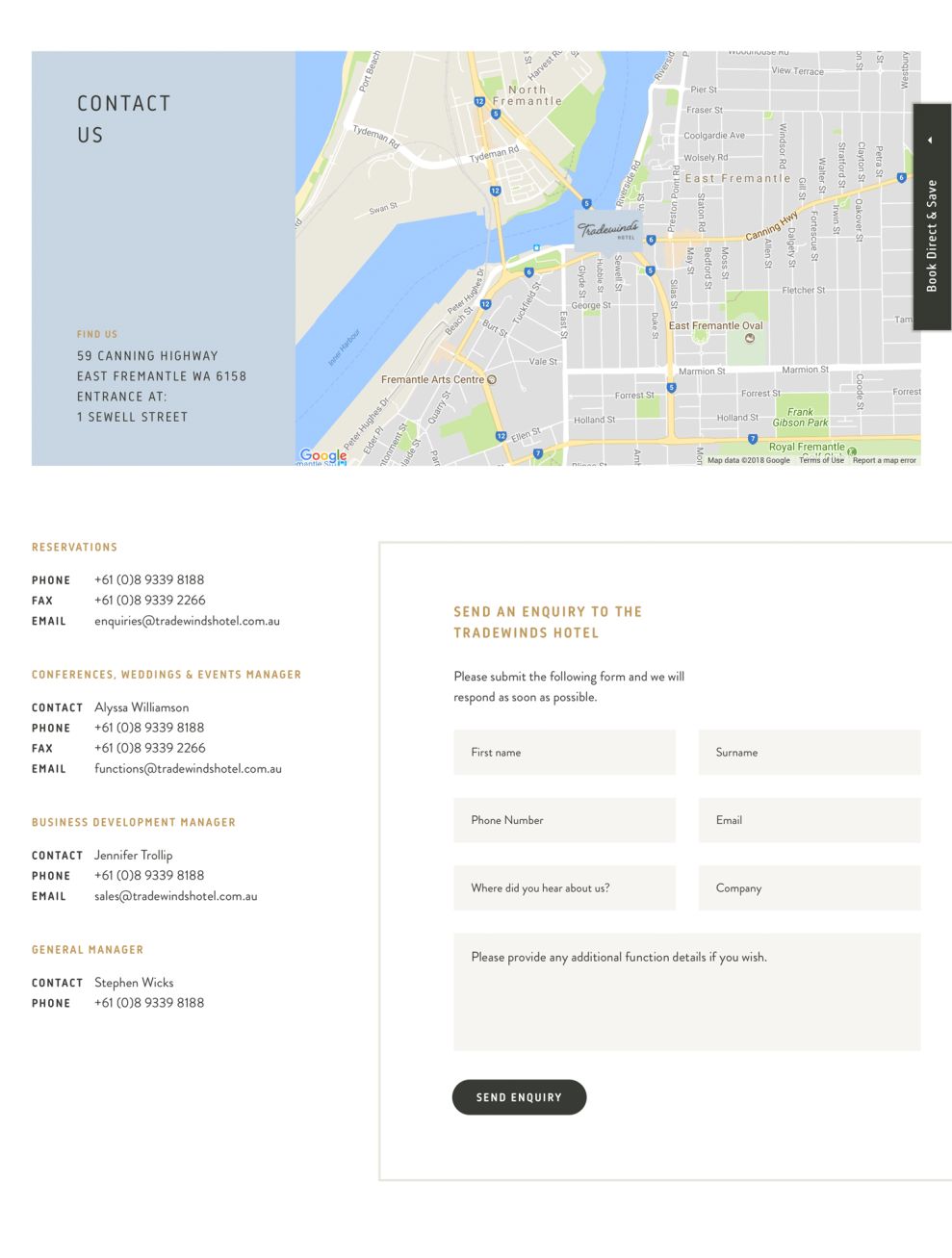
The Contact page is bright and welcoming, thanks to its white background and gold typeface. Its landing page features a full-screen fixed sidebar image. The vertical menu has a light blue backdrop and text that reveals the hotel’s contact information. On the right is a high-quality map that includes a marker representing the hotel’s location.
As users scroll down the page, they’ll come across a Contact form. Its layout is easy to follow, giving users the opportunity to communicate with the hotel about their amenities and booking information.
Tradewinds’ web design is simple and doesn’t depend on heavy or bulky content. Its layout is bright, airy, and welcoming, which is important for recruiting tourists to the area.
Tradewinds Hotel is a beautiful website design in the Hospitality and Travel industries.