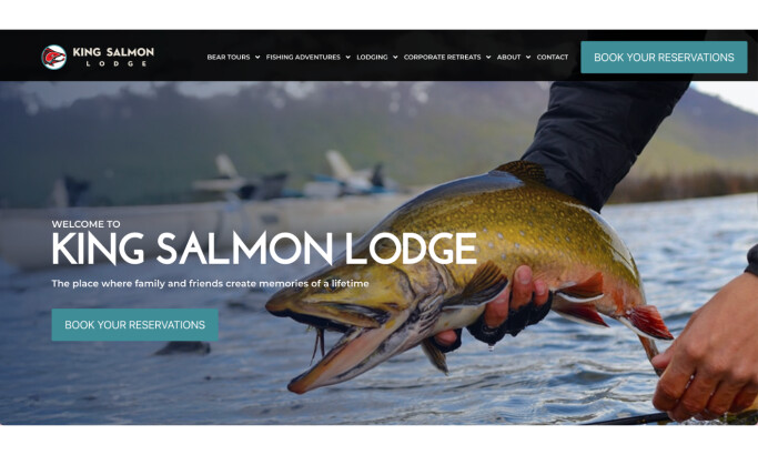
Talk about a stunning introduction. Casa Angelina is a luxury, boutique hotel on the Amalfi Coast which is known for its incredible views from the cliffs. When you arrive on the Casa Angelina website, you are immediately treated to the type of view that guests can enjoy every single evening. The photo moves your eye left to right, starting with the hotel as the anchor point. After your eye has analyzed the building, it moves out across the beautiful ocean sunset and finally lands on the Casa Angelina logo which has been built into the photo.
Everything on the main page works together perfectly. This tells us that Casa Angelina cares about details which is exactly what anyone booking a luxury, boutique hotel will care about. The classical music playing in the background is just another added feature to show that Casa Angelina has put a lot of thought into presenting themselves in the best, most complete way possible.

Even the menu gives a feeling of luxury. Instead of just having the menu pop out when you click the label, Casa Angelina has it slowly animate into the screen from the left-hand side. Each menu option reveals itself individually. The menu is clean and simple. There are no stunning photographs here and no bold, distracting typography. This is a smart design choice. Casa Angelina wants visitors to their website to be looking at photos of their luxury hotel, incredible food, and unbelievable views. Making the menu easy to navigate with no added clutter allows users to quickly find what they’re looking for and move on. It’s a clean, well-designed menu that feels luxurious without taking away from the real attraction on the website which is the photography.

We see the continued emphasis on photography when selecting product photo galleries. Above, you can see the “Rooms & Suites” gallery next to the “Gourmet Experiences” gallery. These will likely be two of the most important features of the hotel that luxury travelers will be concerned with. Much like in website design for architects, the photos are the focal point, conveying the aesthetic and functional essence of structures.
A clean, white theme is used in both photos with an accenting color. In the “Rooms & Suites” photo, a beautiful blue sky invites you to the balcony. It’s hard not to imagine waking up in that bed and seeing that view.

Finally, the website ends with a clean, simple blog. The three latest blogs are displayed. Again, there is an emphasis on the photography. One blog seems to have a placeholder logo image used. That may be the one shortcoming on what is otherwise a perfect site that holds true to the product and experience that it offers.
Everything about the Casa Angelina site screams, “luxury.” The views, the food and drinks, the rooms, and even the cutlery all work together to set Casa Angelina apart from a typical hotel experience.
Every animation is simple but does enough to show that no detail has been spared. Add to that the smooth scrolling effects that make it one of the top parallax websites, enhancing the opulence and depth of the visual experience! If you’re booking a stay; don’t forget to invite us.
Casa Angelina is a great website design in the Hospitality, Luxury and Travel industries.