Pandora's Web Design Uses Color Gradients And Texture To Add A Fresh & Modern Feel To The Music Streaming Site
Pandora is an online music service that allows users to create custom radio stations. The company uses advanced, music genome technology to continually provide songs and artists that users will like. This kind of democratic service, wherein users are in control of what they listen to, naturally requires a site that foregrounds the people involved in our global music culture.
And this website certainly turns heads and grabs attention, fostering a sense of curiosity, excitement and wonder.
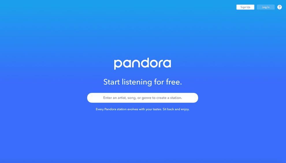
What first catches your eye about this site are the colorful gradients fused into the background imagery. Similarly, there’s a textured tone to these images that makes you want to look closer, dig deeper and learn more.
These bright colors gradients immediately pull you in and add a modern freshness to the design as a whole. And it shows users that this is an innovative brand that is pushing boundaries and leading the charge.
These colors make a bold statement and they also play on the emotions of the user, subconsciously urging them to interact and engage.
And this color trend and texture infusion really elevates the design and makes sense for a music-streaming brand. It shows a meshing of tastes and talents. It shows a merging of cultures and ideas. And that’s exactly the kind of possibilities music opens up for people.
As you watch these colors and textures blend, you’re experiencing the same things this music invokes overall. It becomes a shared experience for all music listeners across the globe. And that hits home.

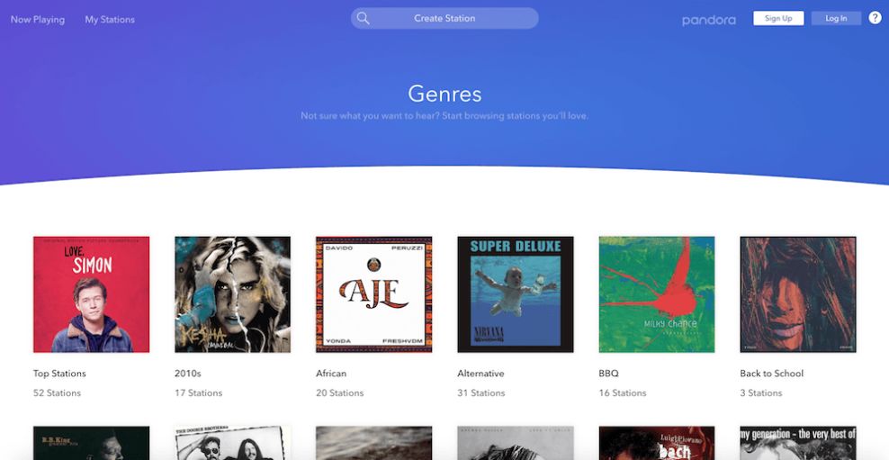
The Website Utilizes A Handy Toolbar And Navigation Menu To Make It Easy For Users To Find The Stations For Them
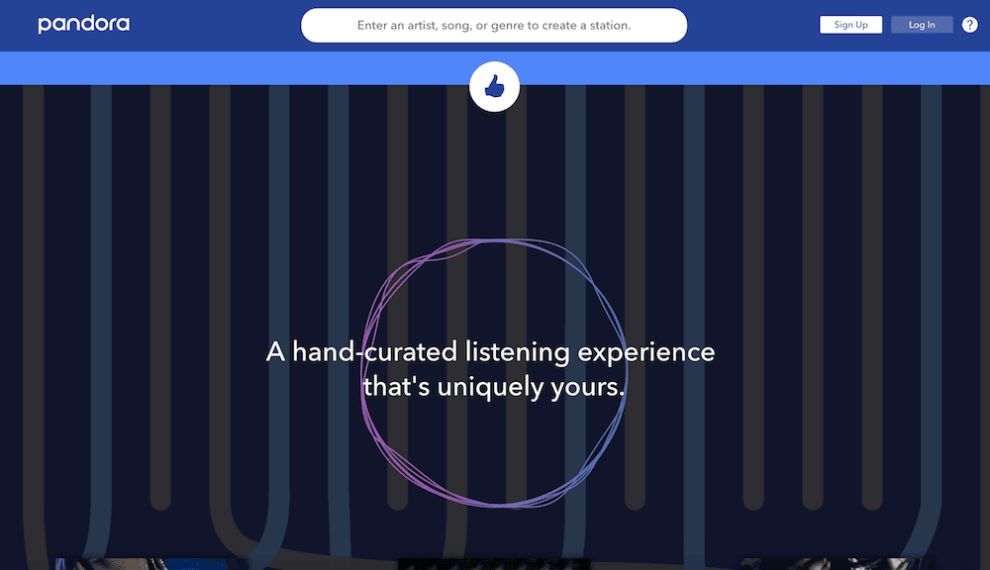
Pandora makes it easy for users to listen to the music that fits their mood. And that’s because of the simplicity infused into its navigational system.
All users have to do is plug in a song title, genre or artist into the search bar and then they can choose from a handy list of stations.
It’s easy, fun and hassle-free.
And the search bar is always on display, meaning you have full control over your listening preferences and can change stations at any time.
Similarly, when listening to a station, the pause, play and skip buttons are very clearly visible so that if you’re listening to a song that you don’t particularly like, you can easily just skip to the next one without worrying about wasting time searching for the right buttons or keys.
This is a very simple and straightforward design. The designers truly took the guesswork out of the platform to ensure that users had quick and easy access to the tools they were looking to use — the music-streaming service.
This simplicity and cleanliness really heighten the overall journey and guide users exactly where they’re looking to go. It's a similar technique to our services page design, where clear, uncluttered layouts streamline user interaction.
A Clean Online Aesthetic Lays The Foundation For A User-Friendly Experience
The Pandora website is an exciting and simple platform that connects users with an auditory experience that’s customized, personal and fun. And it gives users control in an easy and efficient way.
It pulls users in and appeals to their emotions with its color and texture. And it eases navigation thanks to its simple search functionalities.
But what really helps to bring this experience full circle is the minimal aesthetic that fosters an extremely user-friendly experience.
As we’ve said, this site is simple in nature. It includes the necessary sections like a blog and an “about” page, but the real star of the show is the music-streaming interface. And this is innately clean and minimal in nature.
There is one search bar at the top of the screen with a quick and clean drop-down menu of options to choose from.
And then once you choose your station and start listening, the screen stays static. There’s an image of the album or song cover, followed by a quick blurb about the artist and the song beneath.
Then, there are the straightforward play, pause and skip buttons.
All of this is set against a color gradient background with the faded album or song imagery lingering in the empty space.
It’s clean, modern and inviting. And it shows that this brand cares about a streamlined user experience.

The Pandora Blog Is A Visual Masterpiece That Breathes Life Into The Music Brand
On Pandora’s site, their blog page serves as a visual evocation of the role people play in consuming, creating and distributing music. We see an image of a horde of people, all enraptured by some musical performance, and the overlaying text emphasizes connecting fans, artists, and distributors. The blog then explores certain news events and theoretical musings related to the music industry.
However, the core of the blog is still centered around the people involved in these pieces, and they use this perspective to display everything they write. By creating a visual and textual evocation of the role people play in music, Pandora’s website designer has properly branded Pandora and its blog as human-centric.
The body of the blog is incredibly minimal. There are a few graphic elements throughout that make the overall experience a little more dynamic, but the bulk of the site is simply the blog articles themselves. Each of the blog posts, you’ll notice, deals with the intersection of music and people. By constructing a blog with content that focuses on people, and creating a design that focuses on that content, the designer has very subtly expanded Pandora’s human-based, personable brand.
This final page is the blog’s search menu, allowing users to peruse the blog with very specific discretion. Additionally, in the middle-right of the page, there are several social media icons that allow users to share the blog on their various social accounts.
This search-and-share page continues to expand Pandora’s unbridled humanity and user empowerment. By limiting the navigation and expression of their blog to only the words of the users themselves, the designer has created a truly human experience across the site.
What Is Pandora?
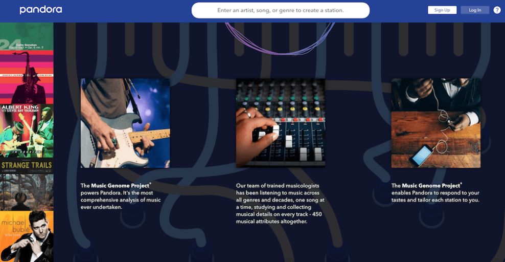
Pandora is a music streaming internet radio service. The music recommendation site was founded in 2000 under the name Savage Beast Technologies in Oakland, California.
Pandora works by allowing users to choose a specific song, genre or band. The service then auto-populates a list of songs that are similar to your interests. Users can like or dislike a specific track, which lets the service better hone in on the music that’s best for you.
Users can access Pandora via the Pandora app, or through the online web browser.
According to the brand:
Pandora is the world's most powerful music discovery platform — a place where artists find their fans and listeners find music they love. We aim to create a world inspired through listening. Our team of highly trained musicologists analyze hundreds of attributes for each recording which powers our proprietary Music Genome Project®, delivering billions of hours of personalized music tailored to the tastes of each music listener, full of discovery, making artist / fan connections at unprecedented scale. Founded by musicians, Pandora empowers artists with valuable data and tools to help grow their careers and connect with their fans.Pandora was created to heighten the music-streaming experience. It was built by a group of passionate music lovers and creators, and you can see that devotion and that drive in the services they provide and the platforms they’ve created.
The Pandora app is a full-functioning platform that gives users easy access to thousands of hours of music customized to their liking. And similarly, so is the online interface.
The Pandora website is an exciting, easy-to-use platform that is as intuitive and informative as it is user-friendly.
Pandora’s Intuitive Interface Makes It Easy For Users To Stream Music
The Pandora website is a creative and enchanting platform that gets you engaged right from the start.
And that’s because you can feel the passion and the love for music that the creators have — its embedded throughout.
From the bright and engaging color gradients to the clean aesthetic and simple navigation, Pandora makes it easy for users to get what they want out of the online digital destination.
And the brand even took an extra step by creating a blog that was informative, inspiring and entirely on-brand.
This website was built with its users in mind — it’s an easy-to-use destination that takes the stress and anxiety out of finding the right playlist because the brand creates it for you.
It’s a smooth, fluid and interactive design that has one purpose, and delivers on it ten-fold.