


- Agency:eDesign Interactive
- Client: Green Valley Lactose Free
- Category: Website — Food and Beverage
- Location: Sebastopol, California, United States
- Project Brief: Foster trust and encourage exploration through creating a modern, intuitive website that communicates Green Valley Lactose Free’s dairy offerings, educates users on the benefits of real milk without lactose, and delivers an engaging experience that highlights products, recipes, and brand values.
Some digital experiences don’t rely on explanation. They rely on alignment. Green Valley Lactose Free’s website meets users where they are, building on what already feels familiar and gently expanding it into something more meaningful. The result is an experience where understanding unfolds naturally, without ever feeling instructed, reflecting the principles seen in leading food and beverage website design.
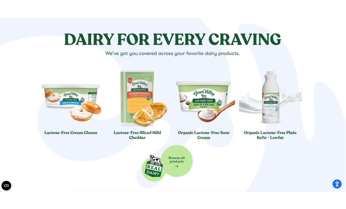
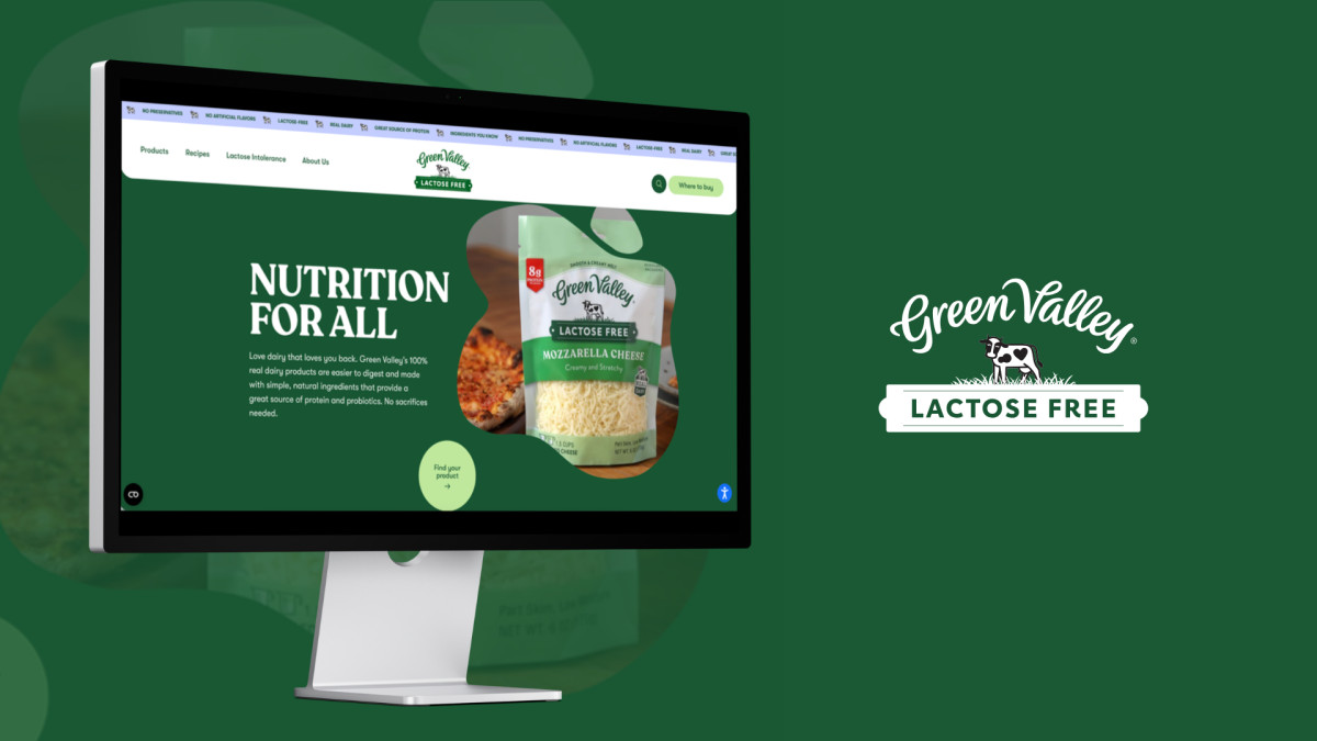
Green Valley does not lead with what its products lack. It leads with what they deliver. The hero section opens on "Nutrition for All," anchored by a product shot and a scrolling banner of certifications: no preservatives, no artificial flavors, real dairy, great source of protein. The reassurance is built into the navigation before a user reads a single paragraph.
The color system reinforces this. Forest green signals trust and naturalism. Soft lime accents prevent the palette from feeling clinical. Product photography is shot against warm, food-forward backgrounds rather than sterile white surfaces, shifting perceptions from health supplement to everyday kitchen staple.
The recipe section extends that logic further: circular category pills, keyword search, and editorial-style food photography position the brand inside a lifestyle rather than a dietary workaround.
Across the site, every element makes the same quiet argument: choosing lactose-free does not mean choosing less. The design never oversells it. Type, color, and photography all point in the same direction, page after page, without repeating themselves. That coherence is what separates a website that simply informs from one that actually persuades.