GoingClear’s B2B website redesign for Heller redefines what a good professional services site should be — sleek and conversion-driven without losing credibility or corporate weight.
As an executive search firm specializing in technology leadership, the brand needed a digital presence that matched their expertise.
Their messaging lacked clarity, the user journey felt disjointed, and the content wasn’t telling the full story.
GoingClear rebuilt everything from the ground up: a new visual identity, content strategy, and a custom HubSpot CMS-integrated website that brings the brand’s positioning into sharp focus and all connected via their CRM and marketing automation.
Industry Insight: 94% of first impressions are design-related, and users can quickly reject or mistrust a website if it has poor interface design. Heller’s website bridges that expectation by pairing enterprise credibility with crisp, modern usability.
Let’s explore why this design stands out.
Key Findings for Brands:
- Visual clarity and structured messaging boost engagement on service-heavy B2B sites
- Flexible CMS architecture supports scale and personalization without technical bloat
- Branded modules with built-in lead capture increase conversions without hurting UX
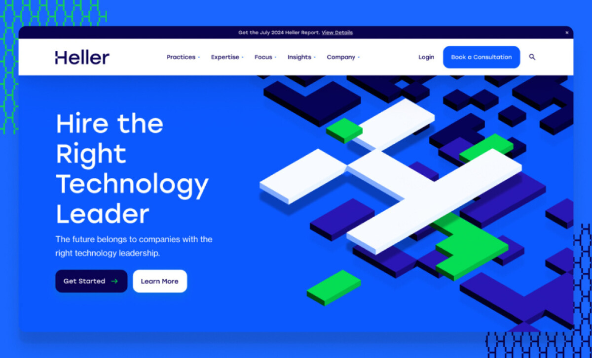
Direct and Helpful CTAs Guide the User Journey
The Heller homepage wastes no time.
Above the fold, an action-driven title with two CTA buttons immediately communicates purpose and gives users clear paths based on intent.
From there, every section of the homepage is purpose-built to move visitors down the funnel:
- Well-organized content cards provide clarity on Heller’s niche
- Blog and insight modules build topical authority
- Strategic placement of “Book a Consultation” and “Subscribe” CTAs ensures there’s always a next step
Rather than packing it with corporate jargon, the content is broken into digestible modules with white space and visual rhythm that invite exploration.
This structure improves flow and builds trust. Visitors instantly understand who Heller is for, what they offer, and how to engage.
Flexible CMS Modules Streamline Content Management
A key success metric for any professional services site? Agility.
With Heller’s marketing team operating on HubSpot, GoingClear prioritized CMS-native development, building the site using:
- HubDB for scalable, dynamic role listings
- Custom global modules to support rapid content changes
- Native HubSpot CTAs with branded styling for seamless lead capture
This architecture makes it easy for the internal team to update everything from insight articles to practice pages without developer intervention.
It also ensures design consistency. From accent blocks to typography and iconography, every update stays true to the visual system, even as the content evolves.
Plus, it solves a real pain point.
HubSpot’s 2025 State of Marketing report found that only one in five marketers say their data is fully integrated with the tools they use.
By building directly into the tools Heller already relied on, GoingClear made sure the new site would look better and smarter, too!
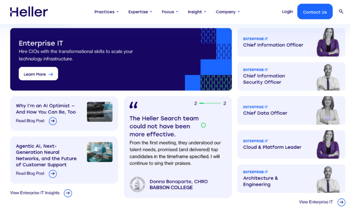
Bold Role Cards Elevate Visual Navigation

Scrolling through Heller’s “Roles We Recruit For” section is like swiping through a curated gallery of modern executive personas.
Each card features a partial portrait cropped to shoulder height, anonymous but confident. The approach is clever; it evokes professionalism without leaning into stock photo clichés.
The design language across the cards includes:
- Saturated deep blues paired with sharp geometric textures
- Negative space used as a visual pause between dense content blocks
- Subtle hover effects for interactivity without distraction
Together, these cards function as visual representations directing users to relevant positions without relying on dense paragraphs or dropdown menus.
Forms and Microcopy Maximize Conversions Without Friction
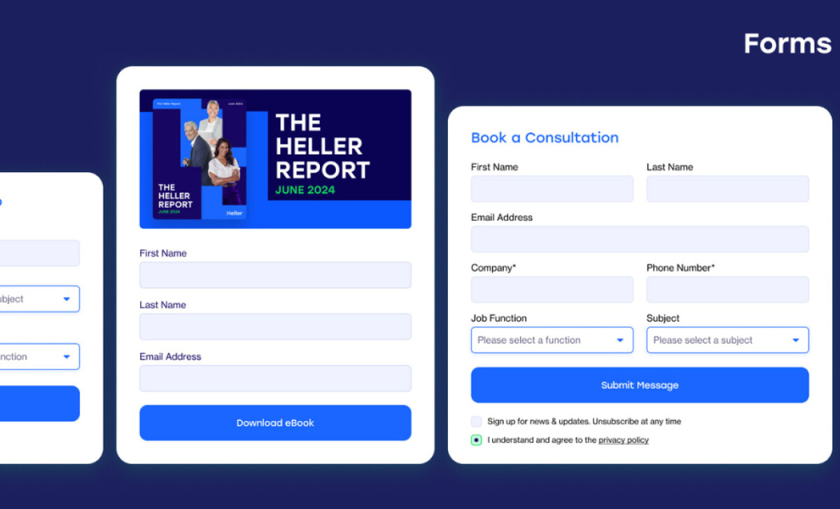
For a B2B service brand, the form is the finish line. And GoingClear gives it the attention it deserves.
Each form on the site is designed with frictionless UX in mind:
- Minimal boxes with clear input fields and dropdowns per form
- Responsive inputs and real-time validation feedback
- Concise titles and CTAs that match user expectations
The visual style of the forms reflects the larger brand: blue accent buttons, white input areas, and friendly but professional texts.
This level of design clarity matters.
According to Hotjar, 64% of users judge a site’s value within just a few seconds, and these forms pass that test. They offer immediate context and relevance, making it easy for visitors to take the next step.
The best part? Filling out a form doesn’t feel like a chore. It feels like starting a conversation, and that shift in experience has paid off.
Since launch, Heller has seen a measurable lift across key metrics: higher conversion rates, longer average session durations, and more pages viewed per visit.
What Agencies Can Learn from Heller
This project exemplifies how to modernize a B2B digital presence without overwhelming the user or the client’s internal team.
Here’s what creative teams can take away:
- Modular homepage layouts help guide diverse audiences
- Design systems built in CMS-native platforms drive long-term scalability
- Custom card components can serve both aesthetic and functional purposes
When design, content, and CMS development are handled holistically, even the most traditional B2B websites can become conversion engines.
Heller’s website design by GoingClear is a testament that even straightforward professional services sites can be bold, user-friendly, and optimized for action.
Reimagining both brand strategy and technical execution, this project sets a new bar for executive search firms going digital.
Looking to work with professional web designers who can translate business strategy into standout web designs? Explore our Agency Directory to find the best partners in:
And for more industry-leading creative work, browse our Designs Awards for your source for real-world design inspiration.