Morgan Stanley’s Website Highlights Key Aspects Of Financial Management
Morgan Stanley is an investment bank and financial services institution with a legacy of leadership and prominence in the financial industry.
Founded in 1935 and headquartered in New York City, Morgan Stanley is an international institution with offices in more than 42 countries, encompassing more than 55,000 employees and offering services to corporations, government institutions and individuals alike.
It’s a brand that has a rich heritage to it, with a prominence and an excellence that most people know even if they’ve never interacted with it.
But after the financial crisis in 2008 and the fallout that resulted for years later, the brand knew it had to shift gears. It was once known for its success as a stocks and bonds trader, but with the recession, it knew that people weren’t in the business of high-risk services and transactions.
They were in the business of saving, not spending. So Morgan Stanley shifted its strategy to accommodate.
Instead of emphasizing the institution’s abilities to take your money and invest it in possibly risky ventures, the brand changed its services to focus on its ability to take your money and save it, teaching you the tactics that would help you manage your money more effectively.
And the shift worked — instead of falling out of favor and losing its honor and prestige, the brand continued to reign supreme.
This can be seen in its commercials, its in-store experiences and in its overall brand voice. But it can also be seen in its stunning and sophisticated web design.
This modern and seamless online experience emphasizes the brand and its financial services in a clean and refined manner. It ditches the corporate stuffiness of other financial websites in favor of a more friendly, creative interface. And it works.
Morgan Stanley’s Blog-Heavy Web Design Provides Easy Access To Industry Insights
Instead of opting for a design that emphasizes its products and services first, the Morgan Stanley takes an innovative twist and focuses on promoting blog content, articles, and resources to inform and enlighten.
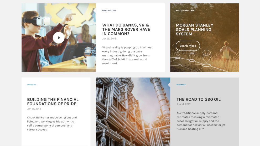
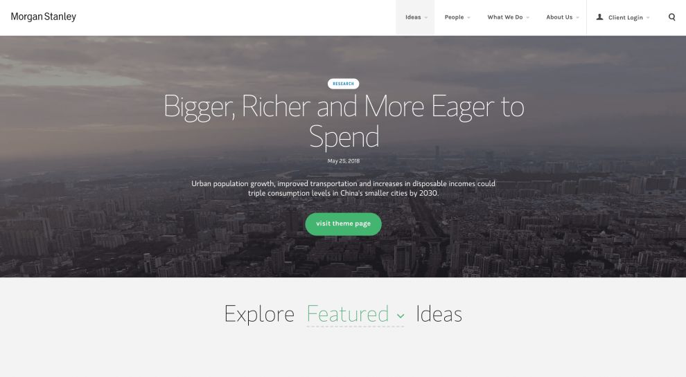
These are seen from the second you land on the homepage and continue throughout the website. The Ideas section of the website is where all of this content lives, but it exists throughout the website in a block-like format complete with images, text and CTAs.
This is a powerful way to drive brand identity, promoting helpful advice and insights over its own personal services and products. And the cleanliness that comes with this layout is innately compelling and engaging.
A blog is a great way to promote brand identity and use content to your advantage. Consumers and businesses want organic pathways to interaction, and often want to learn more about a brand and its overall identity as opposed to just what it has to offer.
And this blog is comprehensive and clear. There are dozens of topics that cover how-tos, business insights, trends and more. Users are given access to information that can help them become more in tune with the financial industry, gaining a better understanding of how they can manage their money going forward.
It's also very clean thanks to this blog content Morgan Stanley is now more in the business of wealth management and keeping your finances safe as opposed to investing them in stocks.
Blogs are exciting tools that engage on a more personal level. They also offer more in-depth information that isn’t readily accessible otherwise.
The Clean Morgan Stanley Layout Makes User Navigation Intuitive And Seamless
The layout and organization of the Morgan Stanley website is clean and clear. There is a block-like structure that separates the many landing pages — fit with engaging imagery and clear text that gives visitors clear actions to take.
Each blog and resource that lives on the homepage comes with a clear CTA button that leads them to that page. And each page comes with another CTA to learn more. Users are led on a seamless, focused journey from the second they land on the page.
The clean, white and bright interface is also broken up by sections thanks to different colors and clever icons. This adds a playfulness that encourages interactivity and encourages the user to keep scrolling and learning.
Sections of the website are also clearly differentiated thanks to a handy menu bar that offers ideas and insights, resources for consumers, resources for businesses, service breakdowns and an About page that is comprehensive and focused.
This menu bar is clean. It’s displayed in a straightforward way, and the drop-down menu is equally comprehensive and cohesive, making it obvious from the start where users are going for what information, and depending on what kind of consumer they are — individual, corporation or governmental institution.

Morgan Stanley's Image-Focused Design Simplifies Complex Financial Concepts
The Morgan Stanley website is a modern interface that offers visitors a serene and simple journey — from learning about financial insights to taking advantage of the services the bank has to offer.
Each landing page comes with a header image that is made up of either a bold photograph or an engaging, auto-playing video. This immerses users into the website immediately and adds a personality and a friendliness to the brand.
Icons sit to represent concepts and services. And these add a simplicity and an approachability that is necessary for a financial institution.
Not everyone understands complex financial concepts, brands, and services. And these icons aim to simplify and condense the concept so that it is easier for visitors to understand what exactly the institution has to offer.
It also shows that the brand is a leader in its industry and innately understands its audience, providing them with the necessary information they need with ease.
The Top Design Elements That Elevate Corporate Websites
Corporate websites have long been seen as unfeeling, unemotional and lacking in inspiration. But in modern times, it’s becoming increasingly clear that in order for brands to stand out and stay relevant, they have to be created with users emotions in mind and not just their intellectual entities.
In the past, brands have focused on delivering as much inspiration as possible in as simple of a way as they could. This led to boring, unengaging websites that were jam-packed with information but lacked a quality that actually made people want to interact.
But brands are learning, and they’re integrating more modern and transformative design elements that speak to consumers and businesses on a more personal level.
But what exactly can corporate and professional brands do to engage more with their audience?
Some exciting ways of interacting are creating designs that affect people on a more emotional level. Your brand can still give off a professional tone but interact more organically through imagery. High-resolution photography, auto-playing video, and creative icons help users on their journey by creating a seamless user experience and a simplicity that embodies the brand and its concept — but in a creative and easily digestible way.
It’s also good to err on the side of simplicity, creating a clean and clear layout that makes it obvious the journey you want to lead users on. Cleanliness promotes positivity and excitement that makes people actually want to interact with their design.
And ensuring your design is mobile-friendly is another necessity in an age where the majority of consumers and business complete transactions and searches on their mobile devices. And considering most of your audience likely lives on mobile, you can’t afford to miss out.
Follow modern design trends — like minimalism, color gradients and more. These will help your website and your brand stand out from the rest and increase traffic, leads, and conversions.
Check out these top professional services website designs for inspiration of your own!

Morgan Stanley’s Emphasizes User-Friendly Design And Relatable Elements To Better Approach Consumers And Businesses
Morgan Stanley responded to the financial crisis with a smart and successful strategy that maximized the institution’s financial savviness and financial excellence. It went from a financial service that promoted bond and stocks trading to one that emphasized a more wholesome and conservative message of money management.
And with a legacy like Morgan Stanley, it’s understandable that the business understood the importance of giving itself a necessary facelift. It’s an institution that understands not only consumers and businesses and their financial needs, but also understands what it takes to stay relevant and at the top of its game.
The brand did this by redesigning its marketing materials, operational structure, and even its website.
The corporate website shied away from the stuffy, sleek and modern feel that many modern corporate institutions take on these days. Instead of promoting a modern, minimal and cold design, Morgan Stanley created one that put its customers — both businesses and individuals — first.
The site opens up with a blog-heavy layout. A number of articles and resources litter the page and offer visitors insights into financial decision-making skills, trends, and predictions. And these blogs are carefully laid out, with blocks of text and images sitting in a cool and quirky setup that emphasizes cleanliness and creativity.
These messages and articles are straightforward and clear, but just creative enough that they add a playful and approachable edge to the design and the brand as a whole.
This playfulness and the user-friendly vibe is emphasized by the impact of imagery and its prominence in this web design. Images and bright colors make up header designs. Moving video pulls users in and creative illustrations simplify complex concepts. Similarly, icons live on the site to add a more seamless quality, leading users on their journey and making it easier for them to interact with the brand.
Navigation is aided by these icons, as well as by the simple, straightforward menu bar at the top of the screen with its clearly designated areas — for businesses, for consumers and for everything in between. These are paired with comprehensive drop-down menus that add sophistication and usability.
Overall, Morgan Stanley is an institution that’s been in the business of finance and wealth management for years. And it knows how to transcend its traditional, archaic and stuffy legacy through design to continue promoting a brand that exudes excellence, authority, and leadership in the industry.