Motus Website is All About Photographic Excellence
Motus is a company providing interactive photo booth installations and other products related to capturing professional photos at various, lavish events. Their website is a work of Anderson Collaborative creative agency.
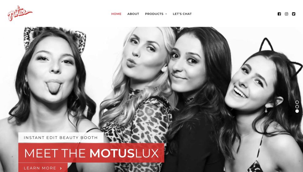
As a business providing top-notch photographic services, it was only natural for Motus website design to be heavily reliant on imagery and visuals. Right off the bat, an all-over-screen video of elaborate, exuberant events the company has helped capture on video, provides a first social proof to a prospect landing on the website.
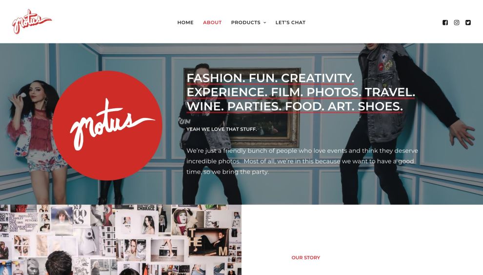
Showcasing both motion pictures and static imagery, the website provides enough variety to convince a potential buyer. Displayed in a carousel, standard gallery view and other methods, the images range from spontaneous portraits to carefully arranged sets.
All of these visual types complement the purposefully austere and laid-back design that exists to emphasize Motus’ portfolio. Other than having a dedicated page for promoting their booths’ products, the whole website is a statement of their capabilities (although there is a section that specifically promotes the actual booths and their technical specifications).

Navigation is Easy and Intuitive on Motus Website
The essence of any website navigation is the main menu. The best practices of UX web design dictate that the menu should be visible at all times and not too cluttered with content. This is exactly what Motus website’s menu navigation adheres to.
Keeping the menu items to bear essentials – Home, About, Products (with its subitems) and Let’s Chat – is making the user experience and user journey extremely simple, while not missing a beat in terms of visitor education.
To the right of these are the company’s social media icons, pointing to their respective social media channels. The brand’s logo – a very retro-looking typeface with a vector drop shadow effect – lies unobtrusively to the left.
The menu stays with the visitor the whole time even as they scroll (the so-called “sticky” menu), so as to provide ease of access to any page at any time of the customer journey.
Plenty of White Space Lets the Content Come to the Fore
Even around the menu are, it becomes obvious that the creative agency went with the generous use of white space as a way of making a disconnect from the colorful and busy photography on the website. Having too many garish elements would clash with the photos, leading to an appearance full of distractions.
White space, in that respect, aids the users’ focus and assists with digesting the content. It makes the reappearance down the home page where the products are listed as well as several other strategic places.
But white space isn’t necessarily white – it can be any color, as long as there is enough space or spacing separating two or more different elements. For example, red and black blocks of text are also given enough spacing between them and the imagery to keep them sufficiently apart.

Motus Website Typeface Contributes to Positive UX
There is not much to be said about Motus website design’s typography other than it is a) remarkably simple and easy on the eye and that b) the website never uses more than one type of font, which is a rarity in a time when most website design companies combine several fonts.
What is different is the size and weight of the font depending on where it is used. For example, the headings are in all caps and significantly larger than the main content, which stands to reason. Also, the call-to-action buttons feature the exact same font, although surrounded by square border lines.
Although the CTAs are not quite popping and bold, they do seem to be visible enough to stand out on their own and drive the visitors to the main conversion points.
This typography is quite legible and improves the user experience because the visitors can skim quickly through the content without much difficulty.
Motus Website Design is an Exercise in Successful Understated Appearance
As a company producing photography-related solutions and technology, Motus website puts all its eggs in one basket: the promotion of how good the photos turn out when using said products.
With very little in terms of visuals other than the photos and videos, Motus website design communicates it strongest point with concise messaging and minimal navigation.
Simplifying the process of prospect education while not leaving out anything that may be considered vital is a difficult task that the Anderson Collaborative creative agency has completed with success.
It is for these reasons and the fact that the website’s looks and heavy use of photography don’t compromise its speed that Motus website design with DesignRush’s Best Website Design Award for April 2022.


