As we navigate through health-critical times, the need to improve one’s vigor becomes a top priority. And this is where well-being websites come through.
These websites have the power to convince visitors to be proactive in maintaining their health the moment they open the webpage.
Here are nine of the best holistic website designs for 2023 that show how wellness pages should be done: organized, fresh and highly engaging.
Table of Contents
1. True Path Therapy by Strong Roots Web Design

Standout Features:
- An abundance of picturesque images
- Distinct CTA buttons
- Sticky hamburger menu
True Path Therapy reaches out to people who want to find their path in this world. Headed by Kim Colton, a Licensed Clinical Social Worker (LCSU), the brand is on a mission of creating a holistic approach to therapy unique to its clients. And with the way the website is designed, they can easily take that first big step.
The design team behind it, Strong Roots Web Design, made sure that the site feels like a safe space for those who might have lost their way due to anxiety, depression, self-doubt, etc. As an agency that specializes in designing therapist websites, they’ve got all the essentials covered.
They combined captivating images, inspiring quotes and cool-toned colors on the layout to evoke a sense of tranquility.
The full-screen banner displays a high-definition image and a subtext that easily catches the attention, “Heal the past. Find your own path.”
A CTA button is also strategically placed right below the tagline, as well as in other sections. This makes it easier for potential clients to connect with the therapist right away.
The sticky menu at the top provides quick navigation to the site’s other pages via the hamburger menu.
Lastly, you’ll find a statement written in large font before the footer section urging people to help those who are struggling by calling the suicide prevention hotline they provided.
2. My Recon Therapy by BragDeal

Standout Features:
- Detailed client testimonials
- Navigation menu on both header & footer section
- Logo utilized as a loading animation
BragDeal, a Vancouver-based design agency, is all about crafting clean and intuitive designs. These two principles can be seen almost instantly when they designed the My Recon Therapy’s website.
The site’s layout is easy on the eyes. Thanks to its straightforward navigation. All buttons are placed at the top of the page, making it easy to visit all the other pages of the website.
Right above the navigation bar are contact buttons that allow visitors to quickly get in touch with a therapist.
Unlike most well-being website designs, the agency veered away from using images and quotes that appeal to emotion. Instead, they highlighted more of the therapist’s credibility.
The homepage is filled with sections about the expert and the kind of treatment patients can expect. There’s also an embedded video that gives site visitors a nice preview of the whole therapy program.
Every page is clad in just two colors, white and beige, which offers just the right amount of simplicity. This is further complemented by minimalist icons in hollow style, adding aesthetic value to plain text.
And the icing on the cake? The website displays the logo as an animated loading transition every time you jump to another page.
3. Skin Health Alliance by Doublesided
Standout Features:
- Use of cool and refreshing colors
- Embedded videos on site
- A dedicated News section on the homepage
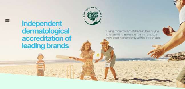
Skin Health Alliance is an independent dermatologist-led organization that accredits and checks skin products for efficacy and claims. Their website, designed by Doublesided, reflects this mission in a vibrant and sophisticated layout.
One extremely noticeable feature is the sticky hamburger menu. When clicked, it opens up to a teal-colored space filling up the entire screen with page links. It’s a total departure from the usual navigation bar used in well-being website designs but proves beneficial. It provides the visitors with a welcome break from the website’s content.
At first glance, the banner displaying a happy family playing by the beach may look too easy. However, with the brand’s vision in mind, this seemingly simple photo perfectly illustrates what they offer: the peace of mind of having the safe and best products for your skin within reach.
Right below it is where you get to learn more about the organization by watching a video walkthrough. It’s almost as big as the website banner, so users don’t have to enter full-screen mode to get a good view.
Adding a complete brand directory is also a nice touch. Since the site recommends skin-safe products, having instant access to accredited brands and companies is a convenient feature worthy of recognition.
4. Maxor by Atomicdust
Standout Features:
- On-brand decorative elements
- Sticky secondary navigation bar
- Well-designed and legible typefaces
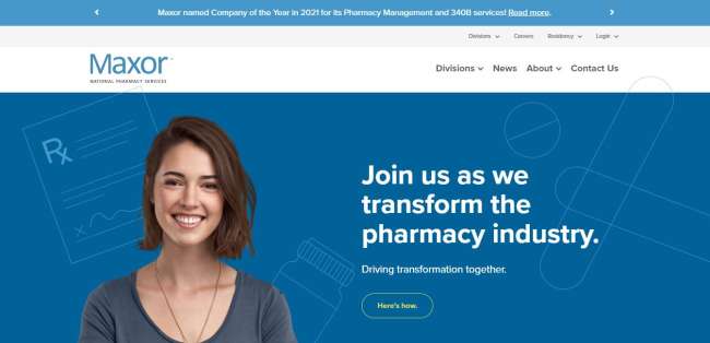
Pharmaceutical websites often have plain layouts, but Atomicdust made sure that Maxor won’t simply blend in with the crowd.
It truly stands out with its use of bright colors, fun shapes and icons. These add great artistic value and keep the information from looking too straightforward and industrial.
The agency playfully incorporated medicine-related graphics in the design, too. Notice the line drawings in the background displaying varied shapes of pills and tablets – a design move that isn't typical of a pharmaceutical brand but is definitely effective in capturing attention and staying on brand.
Despite the richness of visual elements, the interface still looks neat and organized. It has a double navigation bar that provides easy access to the pages whether in static or scrolling mode. On top of its two-level menu is a mini slider that displays announcements, promotions and other important info.
The CTAs are scattered quite deliberately, too. Each section is stamped with CTA statements and buttons, which is a great way to entice site visitors into clicking.
Overall, the balanced ratio of text and visuals, easy navigation and refreshing color palette are the reasons why Maxor is one of the best well-being website designs out there.

5. The Real Food Dietitians by Melissa Rose

Standout Features:
- Emphasized content through varied font styles
- Categorized two-tier menu navigation
- Integrated Search bar feature
Melissa Rose specifically designs websites for food and DIY bloggers. It is probably why browsing through The Real Food Dietitians’ website feels like visiting a blog. Visitors instantly feel welcomed by its friendly and approachable vibe.
Upon visiting the website, users will get a preview of sample recipes enclosed in image blocks. They attached mouthwatering images, inviting people to try them and embrace a healthy lifestyle.
At the top, the navigation buttons are laid out for easy access. Along with it are additional drop-down menus that provide more options for viewing. There’s also a CTA button on the upper left corner that links users to the group’s official cookbook. Displayed in an all-caps orange font style, it’ll be quite hard to miss!
One of the most important sections is “Meet The Dietitians.” It briefly introduces the people behind the company and highlights its mission, adding trust and credibility to the brand.
The variations in fonts also make the site more visually palatable. The mix of handwritten, serif, and sans-serif fonts makes the site contents more appealing without taking away the layout’s cohesiveness and organization. This creative use of typography is a great addition to health and wellness website ideas, as it perfectly enhances visual interest and readability.
6. BalanceTech by Fresh Consulting

Standout Features:
- Animated illustrations
- Industry resources revealed on the homepage
- Interactive quiz
Fresh Consulting, an agency specializing in dynamic designs, has done it again with BalanceTech’s website. They gave the website a fun modern look while achieving the perfect balance between visuals and content for better engagement.
The plain white background is the ideal canvas for all the colorful visuals dispersed within the pages in static and animated forms.
This approach justifies the simplistic design. Instead of putting elements in boxes, they lie flat on the page to avoid a busy interface. Important information, such as stats and figures, are enclosed in jagged shapes for emphasis. Also, some texts are given more focus by changing their font color.
The navigation is also pretty simple: just four buttons sitting at the top of the page. Scrolling down reveals an extra navigation section that redirects to the agency’s webpage.
CTA buttons are illustrated well, too. Enclosed in an oval shape that either comes in a solid color or hollow design, these CTAs encourage visitors to take BalanceTech’s quiz and browse more of the brand’s resource materials.
7. InYoga by Red Tally

Standout Features:
- Pop-up ads upon site entry
- Interactive events calendar
- Banner slider to break content
Red Tally, an agency defined as a new boutique web studio, opted for a fluid and uncomplicated design for InYoga. They effectively captured the essence of yoga in this clutter-free interface.
Staying true to its clean look, the menu navigation in this design is void of drop-downs and sidebars. Menu titles are spread out on the header of the page along with the brand’s logo in the center.
Underneath it is a simple yet captivating banner that displays an inviting statement along with a CTA button.
Most of the sections contain image sliders and banners with overlaid text in them. This is a great way to keep site visitors informed of the brand’s vision and services. It’s also a creative way to display details instead of just laying them flat.
Another notable element is the InYoga Live Timetable. It displays a calendar-style widget that shows a complete schedule for upcoming yoga classes. With the CTA button right beside it, users can easily book a slot upon entry.
Red Tally also placed an Events section at the bottom of the page, which is a great way to entice potential clients to try one of the classes. Check out the list of the best yoga website designs.
8. Culturally Connected by The Digital Panda

Standout Features:
- Prominent use of muted colors
- Small graphic animations upon mouse scroll
- A Vertical menu navigation
Digital Panda is a design agency headquartered in Vancouver, Canada that strongly believes in exercising creative freedom. They lived through this belief in designing Culturally Connected’s well being website.
In this magazine-style layout, the agency sprinkled a slew of creative nature elements and colors to bring several elements to life. Site visitors will get to see moving objects, artwork, and content blocks as they scroll down the homepage. They also added transitions to different sections, which makes page-turning a little more satisfying.
The sidebar navigation hosts the kebab menu, which opens up a full page of options that fills up the screen. On the same bar, there are numbered buttons that let you jump to specific sections on the homepage. It’s a Table of Contents of some sort.
The rich color palette makes for great eye candy, too. One would think that a mix of earthy and vibrant colors would clash, but muting some of the brighter shades did the trick.
Although the pages are filled with a lot of text, the accompanying visuals add enough illustration to keep the readers hooked.
9. Great Minds by Compass

Standout Features:
- Unique character icons
- Signup form at the side panel
- Single page website design
The combination of animated elements, colorful cartoons and a clean interface is what makes this website design by Compass a total success.
Right off the bat, users will understand that Great Minds centers on workplace well-being, thanks to the clear visuals and taglines.
All website information can be accessed on one page. The four-button navigation menu situated at the top of the page lets visitors navigate to a specific section of the page with a click. On the same line is a bright blue CTA button for “Free Wellbeing Tips” that opens up a side panel where users can subscribe for free wellness solutions.
Like most of the holistic well being website designs on this list, the agency used extensive and highly unique iconography to enrich the sections. We’re used to icons that look like badges. Compass, on the other hand, decided this old style won’t cut it anymore. They utilized cartoon graphics and characters to briefly illustrate the content they represent.
For content blocks, accompanying illustrations act as featured images for each one of the services offered. These elements, together with minimal animations in the background, balance out the text-heaviness on the site.
The design agency also added a web form at the bottom of the page, which makes reaching out to the brand a whole lot easier.