
Too often, color in web design gets written off as taste. That’s a mistake.
Color is measurable. It shapes 75% of snap judgments and can lift conversions when applied with strategy, not guesswork.
For CMOs and agencies, palettes aren’t decoration; they’re business drivers that influence revenue, retention, and trust.
In this piece, I’ll show how brands like Mailchimp, Monzo, and Zelis turned color into performance, and what agencies can learn to do the same.
Website Color Palette: Key Points
- Color directly impacts business performance: Over 75% of snap judgments about products come down to color, and websites with palettes built on psychology and hierarchy see conversion lifts of up to 38%.
- Color drives trust and differentiation in saturated markets: Monzo Bank’s unconventional coral accent became a key driver of brand recall and customer trust in the crowded fintech sector.
- Restraint can be as powerful as vibrancy: The Broad’s minimalist monochrome palette increased ticket sales by 17% YoY and cut page load time by 24%, proving that pared-back palettes can enhance both aesthetics and performance.
- For agencies and CMOs, palettes must be treated as strategy, not style: Best practices include testing palettes like funnels, tying colors to brand DNA, designing for accessibility as a baseline, and choosing palette trends that align with the client’s business model.
Real World Case Studies That Prove Color Palettes Deliver Measurable ROI
1. Mailchimp
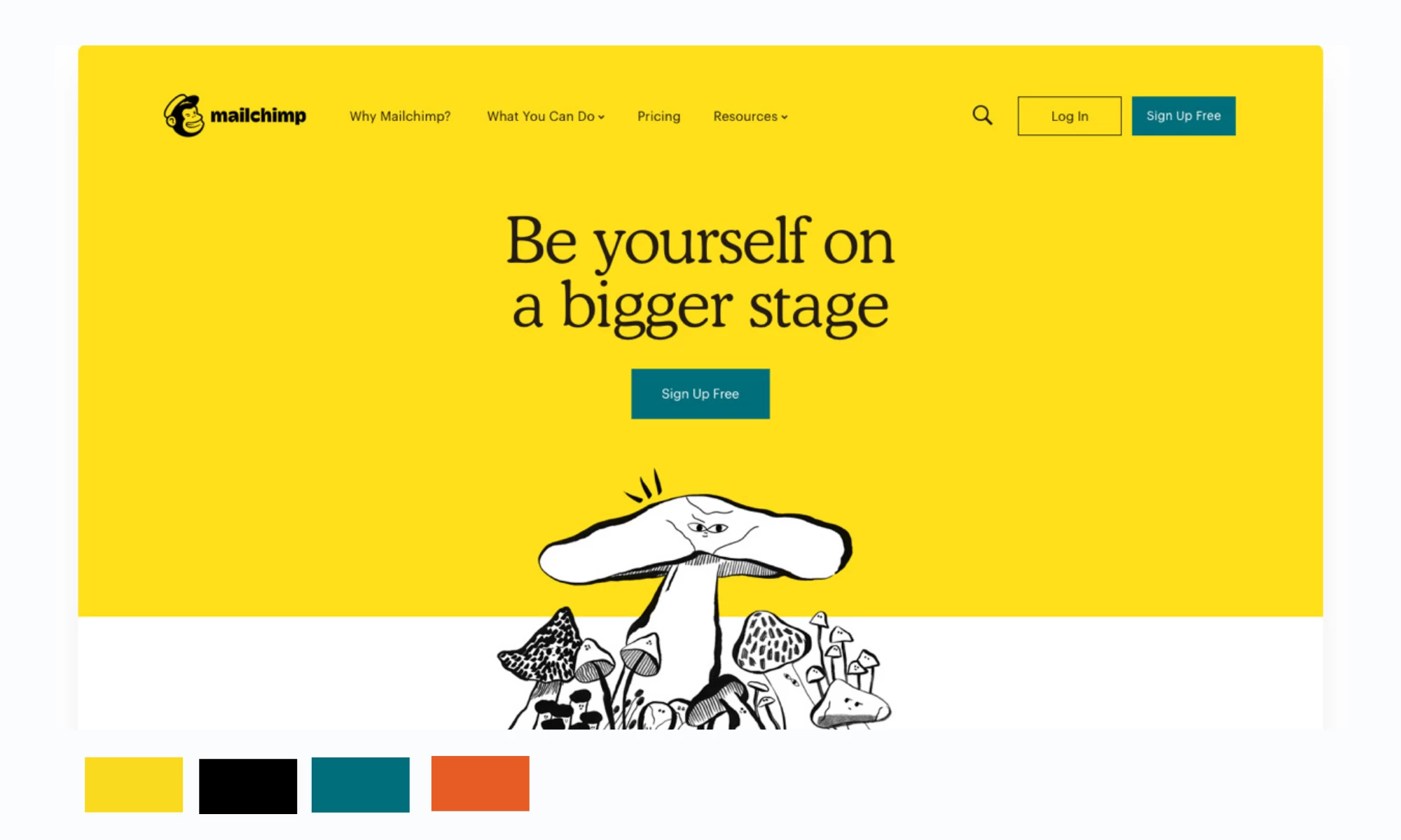
Palette Strategy
Adopted a bold yellow paired with warm tones, black typography, pushing beyond the industry’s typical muted B2B color choices.
The palette was applied across hero sections, navigation, and modular backgrounds, reinforced by playful illustrations and hand-drawn accents.
Why it Works
Yellow communicates optimism and approachability, traits Mailchimp wanted to emphasize in its shift from “email tool” to all-in-one marketing platform.
The strong modular system allowed the palette to scale consistently across web, app, and brand assets.
Business Impact
- +49% increase in brand recognition (Collins rebrand data)
- Broader positioning as an all-in-one marketing platform, not just email
- Strengthened equity culminating in Mailchimp’s $12B acquisition by Intuit in 2021
Design and Strategic Takeaway
Unexpected, high-risk colors succeed when paired with design clarity. Agencies can use bold palette shifts to reposition clients and increase memorability without sacrificing usability.
2. Monzo Bank
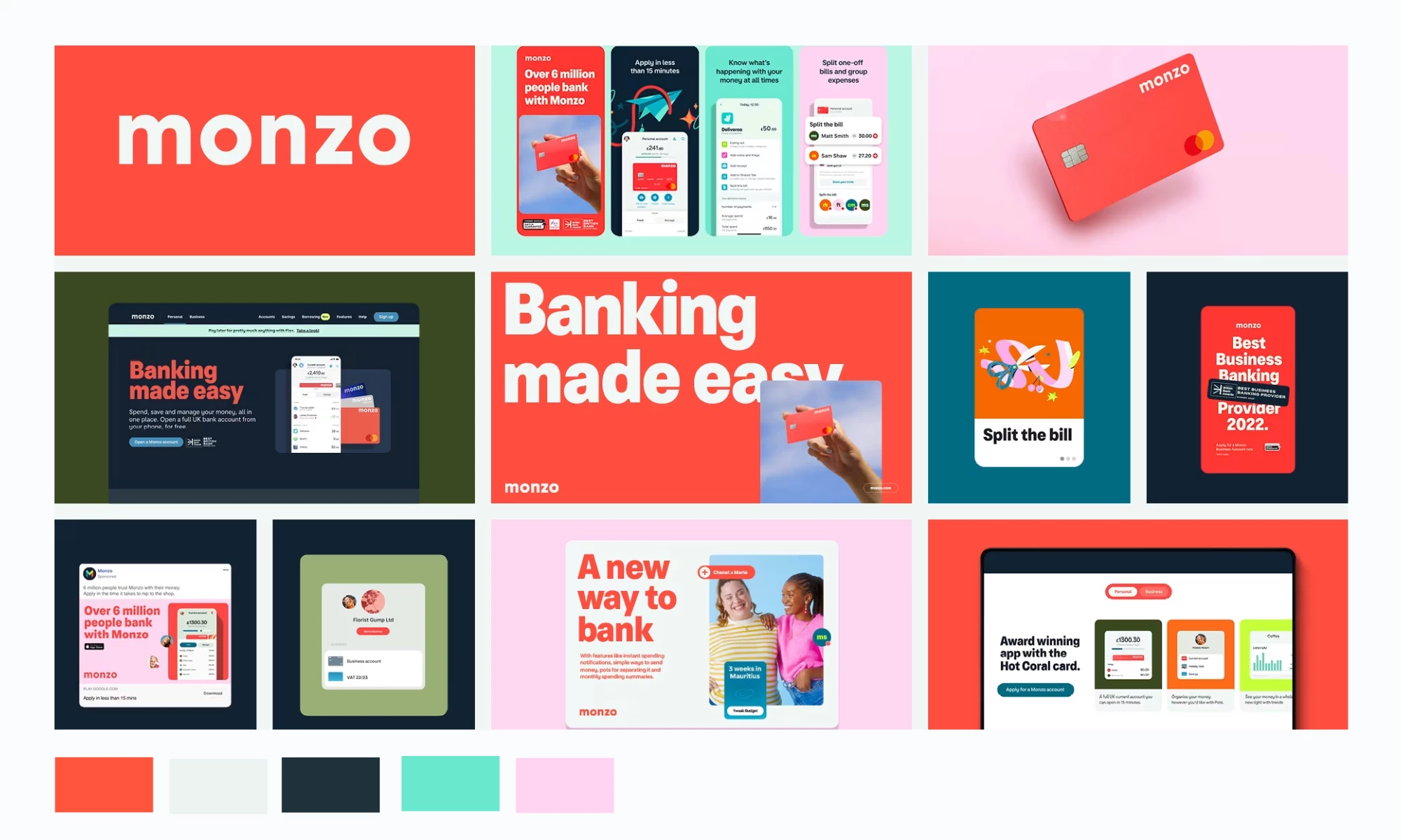
Palette Strategy
Adopted coral as a primary accent color for CTAs and branding, a bold departure from the blue-heavy fintech landscape.
Why It Works
Coral stands out visually and emotionally, it’s warmer and more human than typical fintech palettes. It signals transparency, safety, and personality in a space often perceived as sterile.
Business Impact
Widely cited by users as a differentiator, Monzo’s palette played a key role in brand recall and customer trust during its rapid growth phase.
Design and Strategic Takeaway
Challenger brands in saturated industries can use unconventional colors to signal disruption. Agencies should analyze category norms and recommend palettes that carve distinction while maintaining clarity.
3. ZELIS
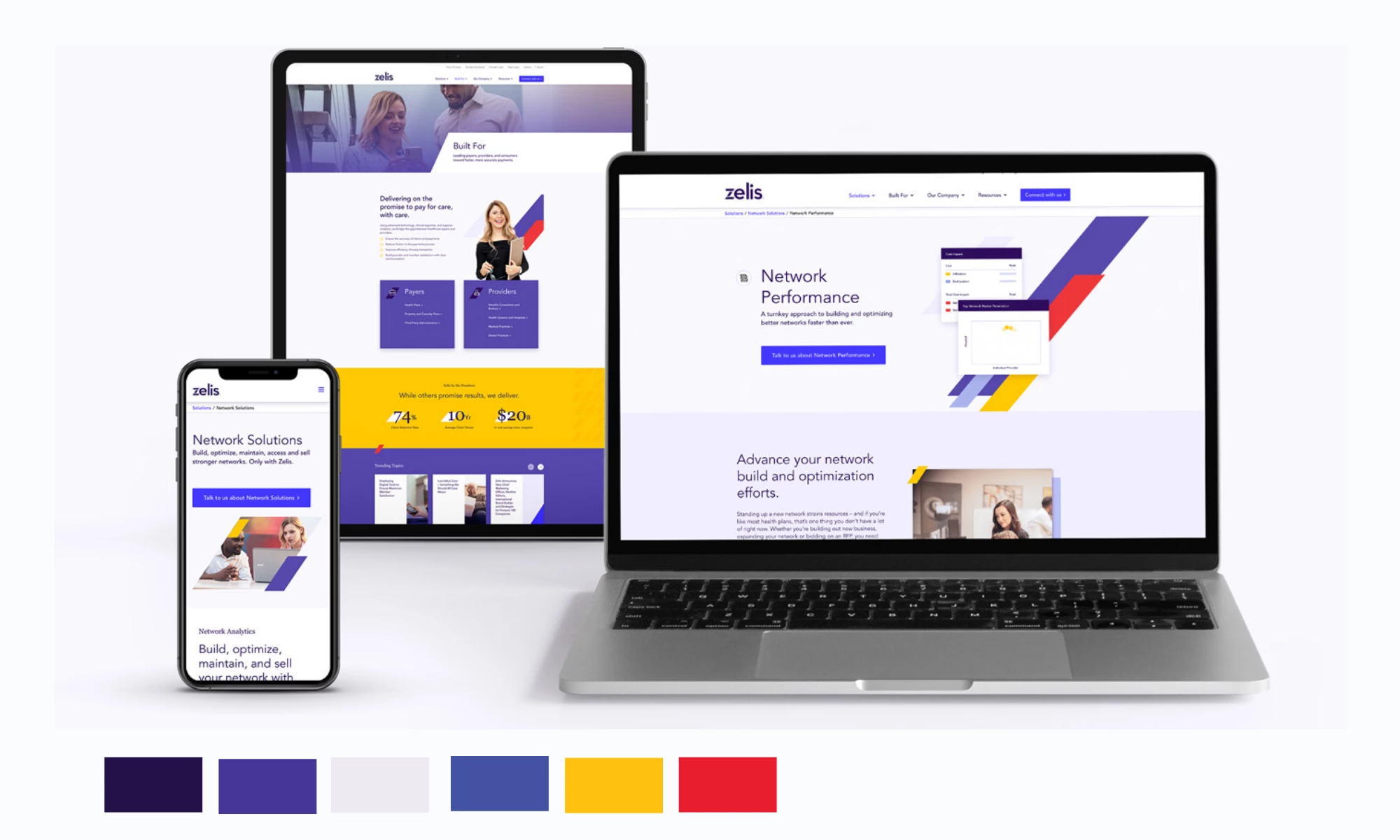
Palette Strategy
Zelis adopted a multicolor system (reds, purples, and yellows) mapped across core product sections of its redesigned website.
The palette modernized the brand and brought vibrancy to a traditionally muted healthcare-fintech space.
Why it Works
The palette helps users instantly recognize and separate offerings, while adding energy to a category usually defined by conservative blue tones. It makes a complex value proposition feel approachable and modern.
Business Impact
Following redesign:
- +62% conversions
- +20% new users
- +116% engaged sessions per user
Design and Strategic Takeaway
For SaaS and fintech firms, multicolor palettes can double as navigational and storytelling devices. They transform abstract services into intuitive journeys while driving measurable lifts in conversion and engagement.
4. The Broad (Museum)
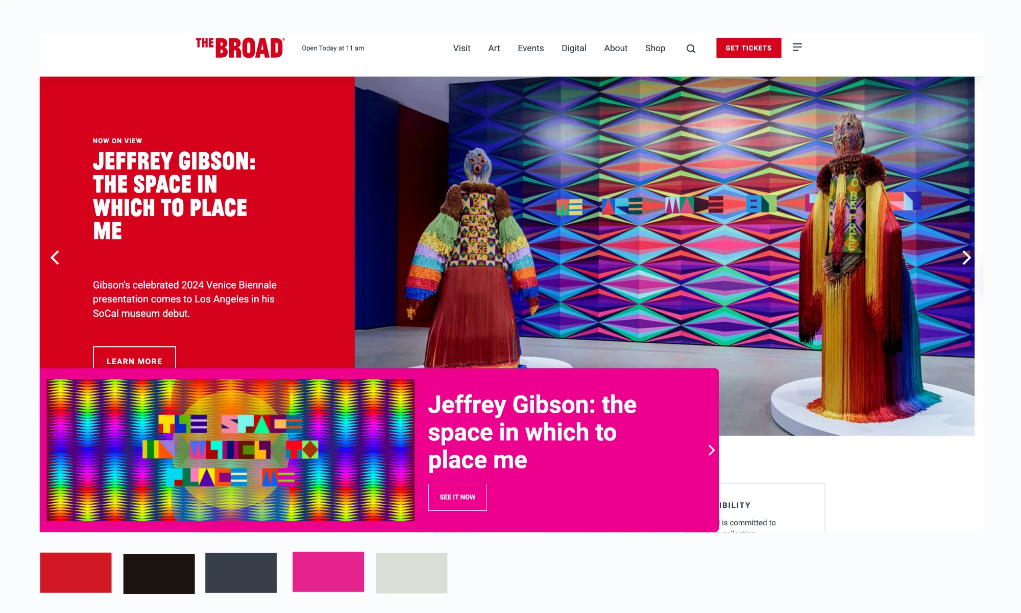
Palette Strategy
The Broad’s website uses a minimalist monochrome palette (black, white, grey), with subtle accent tones only for CTAs. This ensures artwork imagery drives the visual vibrancy, while the UI remains clean and unobtrusive.
Why it Works
The restrained palette mirrors a museum environment, placing artwork at the center of attention. The design communicates sophistication and allows for seamless integration of colorful exhibition visuals.
Business Impact
- 17% increase in ticket sales YoY after relaunch
- –24% page-load time, improving accessibility and user satisfaction
Design and Strategic Takeaway
For cultural or creative institutions, color restraint is strategic. By letting art or content supply the chroma, the brand identity conveys authority and focus, while performance metrics benefit from clean, efficient design.
5. Le Rose
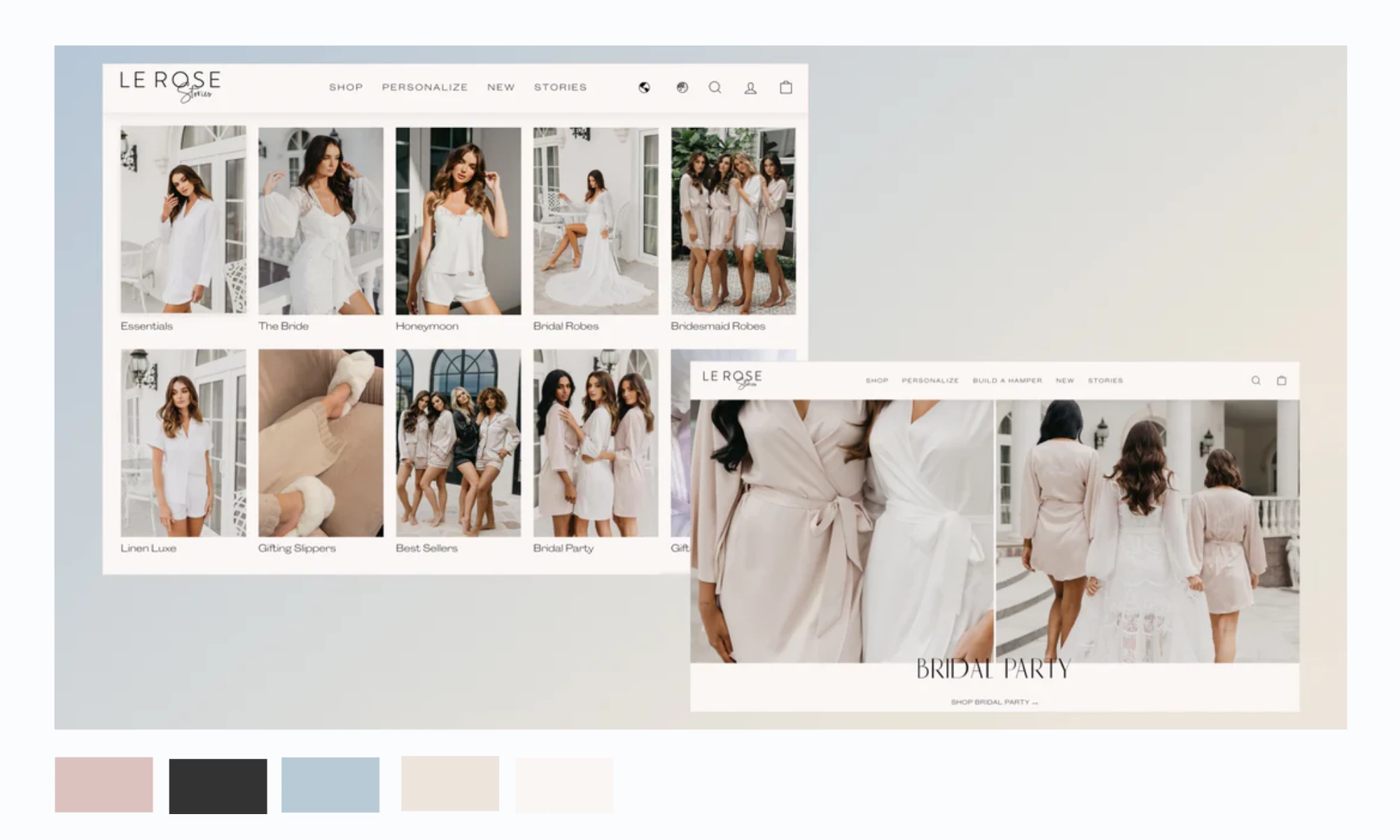
Palette Strategy
Soft blushes + ivory neutrals with understated metallic accents; dark, high-contrast type and clear, warm CTAs for scannability on mobile.
Why it Works
Bridal/fashion shoppers respond to palettes that mirror product aesthetics. The gentle neutrals elevate photography and keep attention on personalization flows (e.g., embroidery, set-building).
Business Impact
- +36% CVR
- +24% AOV
- 56% mobile bounce rate post-redesign
Design & Strategic Takeaway
For agencies and CMOs: A strategically implemented palette, especially one that serves both functional and emotive purposes, can become a foundational touchpoint for measurable business impact. Color isn't just brand expression; it's UX guidance, interest conversion, and performance optimization.
Common Pain Points Color Strategy Solves
Color is rarely the only factor behind an underperforming website, but it often plays a bigger role than leaders expect. Here are the most common issues it can solve when applied strategically.
Design–Performance Gap
- The frustration: “We spent on design, but conversions stayed flat.” Attractive sites fail when palettes don’t direct attention.
- The fix: Build color systems around hierarchy and calls-to-action. Test accent hues and contrasts specifically for buttons, links, and alerts to move users through the funnel.
Subjective Decision-Making
- The frustration: “Everyone argues about colors, and no one has proof.” Personal taste dominates, not strategy.
- The fix: Anchor palette choices in color psychology, accessibility standards, and competitor audits. Use heatmaps and A/B tests to replace opinion with data.
Lack of ROI Visibility
- The frustration: “We can’t tie colors to performance.” Leaders struggle to connect design to outcomes.
- The fix: Track palette changes against click-through rates, bounce, and session depth. Document color’s role in case studies to prove its contribution to conversions and retention.
Brand Consistency Across Devices
- The frustration: “The site looks different on mobile or in dark mode.” Palettes break down across touchpoints.
- The fix: Design with responsive palettes and WCAG compliance in mind. Test across breakpoints, operating systems, and modes to guarantee clarity and trust everywhere.
Template Trap
- The frustration: “Our brand feels generic.” Safe palettes make you look like everyone else.
- The fix: Audit category norms, then design a distinctive but usable palette system. Use controlled risks (like bold accents or unexpected pairings) to carve space without sacrificing legibility.
Why Color Strategy Matters for Clients, Not Just Agencies
Color strategy is often discussed as an agency deliverable, something designers use to sharpen aesthetics or differentiate a brand. But the impact doesn’t stop at the creative level. Executives and clients feel the effects in revenue, retention, and user confidence.
- SaaS leaders see trial-to-paid conversions rise when CTAs stand out with the right accent hues.
- E-commerce brands reduce abandoned carts when calming palettes let products take center stage.
- Cultural institutions increase ticket sales by using restrained palettes that highlight content over interface.
For CMOs and brand executives, palette decisions aren’t a side conversation in design reviews, they’re choices that directly influence performance, positioning, and growth at the boardroom level.
What Agencies Can Learn From These Examples
Case studies prove the impact, but the real question is: how do agencies translate those lessons into their own client work? Drawing from my experience as a designer, here are five practices that separate color-as-decoration from color-as-strategy.
1. Measure Color Like You Measure Funnels
Don’t let palettes live in mood boards. Treat them like conversion elements.
Run A/B tests on CTA contrasts, monitor shifts in bounce rates, and track form submissions. If a palette is working, the data will show it.
2. Stop Letting Trends Dictate Palettes
The fastest way to lose credibility is to apply a trend without context.
Neon might energize a youth brand but undercuts trust in fintech.
Agencies need to audit category norms and make sure colors reinforce a client’s DNA, not just look “fresh.”
3. Use Color to Clarify the Path to Action
Conversion gains often come from the simplest shifts: a CTA that contrasts sharply with its background, or an accent color that clearly signals interactivity.
Users don’t click because a palette looks “prettier." They click because color makes the next step obvious.
Agencies should always ask: does this palette reduce friction and highlight action?
4. Make Accessibility Invisible
Contrast ratios aren’t optional; they’re table stakes. But accessibility doesn’t have to kill creativity. You just need to refocus it.
Once you design within WCAG standards, push experimentation into gradients, hover states, or secondary accents. Done right, every user benefits without feeling like compromise was made.
5. Choose Trends by Business Model, Not Mood
Two palette extremes dominate now: bright multicolor/neon for viral shareability and muted earth tones for long-term trust.
Both work, but only when aligned with a client’s growth strategy. Agencies should guide brands toward palettes that match their business model, not just the trend cycle.
Conclusion: Where Agencies and CMOs Go From Here
Looking across the examples, Mailchimp, Monzo, Zelis, The Broad, Le Rose, Devensoft, it’s clear that color palettes aren’t decorative. They’re functional systems that move KPIs and reshape brand perception.
For leaders, the next steps are less about theory and more about discipline:
- Test palettes like funnels. Track CTA contrasts, click-throughs, bounce rates, and session depth. Let data prove whether color is doing its job.
- Tie palettes to brand DNA. A palette that doesn’t reflect who you are will never resonate, no matter how trendy it looks.
- Bakein accessibility. WCAG compliance isn’t optional; it’s a credibility threshold that also expands reach.
- Match trends to strategy. Bright systems fuel virality; muted tones build trust. Pick the one that aligns with growth goals, not seasonal aesthetics.
Color still gets sidelined as a matter of taste in too many design conversations.
It’s time to reframe it as performance infrastructure. Get the palette right, and the results will show up not only in your brand book but in your revenue reports.
![]()
For agencies and growth-minded brands, the difference isn’t in picking “pretty” colors, it’s in knowing how to turn palettes into performance.
Need a Design Partner Who Knows How to Build Palettes That Convert?
We rank top-performing agencies worldwide who connect color psychology with measurable ROI.
Visit our Agency Directory to connect with experts in:
You can also check out our Design Awards section to see how strategic palette choices are driving higher conversions, stronger brand recall, and measurable growth.
Website Color Palette: FAQs
1. How do website color palettes impact conversion rates?
Color palettes influence where users click, how quickly they navigate, and whether they trust a brand enough to convert.
High-contrast CTA colors, strategic use of accents, and palettes aligned with brand identity can lift conversion rates by double digits.
2. What makes a color palette effective for both branding and usability?
An effective palette balances personality with function. It reflects the brand’s DNA while maintaining clarity, accessibility, and consistency across devices.
The best palettes guide user attention without overwhelming the interface.
3. How can agencies prove the ROI of a website color strategy to clients?
Agencies should tie palette changes to measurable metrics: click-through rates, session depth, bounce rates, and trial-to-paid conversions.
A/B testing different color treatments provides hard data to demonstrate performance improvements.


-preview-webp.webp)
