-details-webp.webp)
Neumorphism: Key Points
- Digital Silk’s ProductSide redesign using soft UI, UX, and SEO drove a 681% traffic spike and 40% longer sessions.
- Soft UI works best on non-critical elements like toggles and cards, not CTAs, due to contrast and performance limits.
- Wellness, fintech, and boutique SaaS brands benefit most from soft UI’s warmth when paired with modern systems.
Neumorphism...remember that? The soft shadows, pillowy buttons, slick surfaces that once flooded Dribbble like it was the second coming of skeuomorphism. In 2026, it’s not a trend. It’s a tactic. And if you’re still asking whether it works, you’re asking the wrong question.
What matters is where it works. And why.
I’ve seen more design cycles than I can count—flat, brutalist, glass, skeuo, minimal—and here’s the truth: neumorphism isn’t dead. But it has matured. It doesn’t need to dominate the screen to do its job.
Used sparingly and strategically, it adds tactility, warmth, and brand depth, without killing your contrast ratios or load speeds.
Soft UI isn’t for everyone. So, I've come up with a field guide of sorts: when to pitch neumorphism, which verticals it performs in, and how pairing it with systems like glassmorphism creates visual lift without killing ROI.
Let’s get into where soft UI still earns its keep...and where to kill it with fire.
How We Got Here: Skeuomorphism, Flat Design & the Rise of Neumorphism
To understand where neumorphism fits, you’ve got to look at what came before it.
| Style | Core Traits | Example |
|---|---|---|
Skeuomorphism | Real-world textures, shadows, dimensionality | iOS 6 Calculator |
Flat Design | Clean, bold, shadow-free, purely 2D | Windows 8 UI |
Material Design | Depth, motion, and hierarchy via layering | Google’s Android apps |
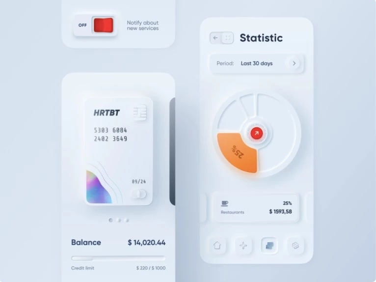
Neumorphism | Soft shadows, subtle contrast, tactile UI | Health apps, dashboards |
So based on this, I don’t see neumorphism as some radical shift. It’s more like a quiet return.
Prior to neumorphism, we kept stripping design down with flat and material styles; clean, efficient, fast. But sometimes, that came at the cost of warmth. Neumorphism brings a bit of that back. It adds enough texture and depth to make the interface feel human again.
Is Neumorphism Even Worth It? A Reality Check
Every so often, a design trend takes off; neumorphism being one of those. It looked crisp on Dribbble: soft shadows, embedded controls, minimal palettes.
But I always ask: does this serve a business objective, or just feed portfolio vanity?
Webflow notes how neumorphism began to fade as quickly as it rose, after usability concerns surfaced, especially around low contrast and subtle depth making UI elements hard to interact with.
This brings me to the million-dollar question: should agencies use it at all?
Should Agencies Still Pitch Neumorphism in 2026?
Neumorphism works best not as a visual statement, but as a strategic accent. When done right, it adds depth, tactility, and emotion; qualities many brands crave but rarely articulate.
In my experience, it performs particularly well in:
- Wellness and lifestyle sites where softness and calm are part of the brand voice
- Premium SaaS and fintech products that want to convey trust without feeling sterile
- Creative portfolios where personality matters just as much as performance
Note: But it’s not for mission-critical elements. I’ll use it on profile badges, dashboards, cards, places where texture can elevate without hurting usability.
Emotional design isn’t fluff. According to Forrester's 2025 CX Index research, brands that create emotionally positive interactions with customers tend to strengthen customer loyalty, which translates into higher retention and increased willingness to pay.
Although CX quality has seen a multiyear decline in North America, Forrester emphasizes that even modest improvements in emotional design can significantly reduce customer churn and increase share of wallet. These emotional connections are critical as customers increasingly seek value and meaningful experiences amid economic volatility, making emotional design a powerful lever for business growth across sectors.
Where Agencies Get It Wrong (And Right)
Let’s be clear: neumorphism isn’t a full-bleed solution. It comes with tradeoffs:
- Accessibility: Soft shadows and low contrast often fail WCAG 2.2 standards. Always test.
- Performance: Blur-heavy shadows drag page speeds. That’s a conversion killer.
- Overuse: Go all-in on soft UI, and your interface loses hierarchy. Keep it targeted.
- Inconsistency: What looks slick on desktop can fall apart on mobile. QA is non-negotiable.
What works? Use neumorphism on cards, toggles, profile badges; non-critical elements that benefit from visual richness. Leave your CTAs crisp and clear.
The Risks of Chasing Trends Without Strategy
1. Trend Fatigue Doesn’t Pay the Bills
Following neumorphism because it’s hot in the community is a luxury. In the real world, decisions like high contrast, fast load speeds, and clear clickable hierarchy win you business.
2. Accessibility is Non-Negotiable
Neumorphism often fails WCAG contrast checks. If users, especially those with visual impairments, can’t see your buttons, your funnel falls apart.
3. Portfolios ≠ Products
Josh Soldiers, a UX strategist, criticized the glut of neumorphic Dribbble shots; beautiful but lacking real-world context or problem-solving application. If it doesn’t solve a user problem, it simply doesn’t belong.
4. Hybrid, Not Hero
If there’s a case for neumorphism, it’s as a subtle accent. Think soft tag badges or card edges—not full screens. That’s where it can add finesse without weakening usability.
How to Make Neumorphism Work in 2026
Neumorphism on its own just doesn’t cut it anymore. Not for most brands, not in production.
But when you blend it smartly into a hybrid system, I think that’s where the magic happens. It becomes a texture layer, not the full paint job. In my experience, I use it to add dimension and softness where it supports the story.
Neumorphism + Glassmorphism
I’ve found this pairing works beautifully when I want a sense of depth without overloading the UI.
Soft shadows tucked under frosted glass panels create a tactile, high-end feel. It’s especially effective in luxury portfolios, boutique real estate platforms, and creative tech sites.
The interface feels layered, immersive, without sacrificing legibility.
Versus Brutalism and Minimalism
Brutalist layouts? Great for urgency and raw clarity. Minimalism? Still my go-to for SaaS dashboards and anything that lives or dies by speed.
But here’s the trick: drop a bit of neumorphism into the quieter corners (empty states, status cards, profile modules) and suddenly the interface feels alive. You keep the conversion-first logic, but add emotion to the periphery.
Practical Tips That Keep It Functional
- I always bump contrast for dark mode or low-light settings. No murky grays.
- Soft UI lives on non-critical elements. Never on nav menus or CTAs. Those need snap, not softness.
- I lean on CSS variables and GPU-accelerated shadows to avoid performance hits. No bloat.
- And yes, I QA the hell out of it across devices. A design that only looks good on one screen is a broken design.
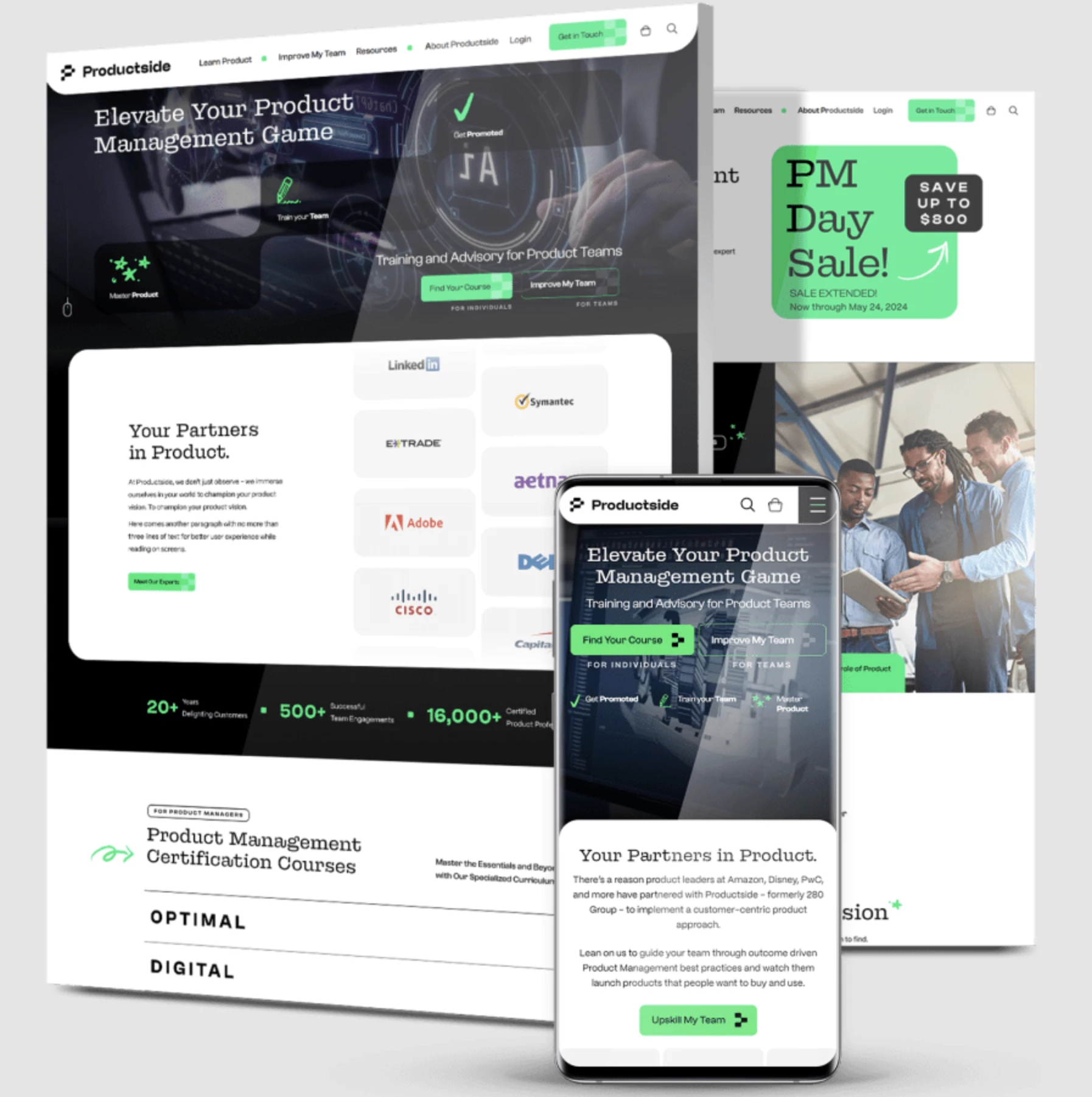
Case Study Spotlight: How Digital Silk Used Neumorphism to Drive a 681% Traffic Surge
Let’s talk results...because trends without ROI don’t move the needle.
One of the best examples I’ve seen of strategic neumorphism in action is Digital Silk’s redesign of ProductSide, a SaaS platform. They didn’t go full soft UI. Instead, they used neumorphic accents where it counted, complementing usability rather than competing with it.
Where Neumorphism Was Used:
- Cards: Featured soft shadows and subtle depth to distinguish content groupings
- Input Fields: Applied tactile cues to make form interactions feel more natural
- Overlays: Used pillowy effects to guide focus without visual noise
- Microinteractions: Enhanced affordance and visual feedback without overloading the interface
What They Avoided:
- No soft UI for CTAs: Kept buttons sharp, high-contrast, and conversion-focused
- Clear navigation: Prioritized hierarchy and accessibility over stylistic trends
- Lean performance stack: Avoided heavy rendering drag often associated with full neumorphism
Results:
- +681% increase in organic traffic
- +40% boost in time-on-site
- Faster lead conversion via simplified flow and clearer UI structure
Neumorphism wasn’t the hero. It was, however, the polish. That’s how you use it: strategically, tactically, and only where it adds to the experience, not distracts from it.
Where Agencies Should Focus in 2026
Selective Use Delivers ROI
Don't look at neumorphism as a trend. It’s a tactic. Agencies should use it sparingly, where it makes sense for the brand story or experience layer.
Know Your Verticals
Soft UI resonates in wellness, boutique SaaS, and fintech. Clients in these spaces want warmth, not sterile efficiency.
Hybrids Win
Blending neumorphism with other systems (glassmorphism, flat design, even brutalism) delivers design maturity and visual differentiation that generic sites lack.
The Takeaway? Be Intentional, Not Trendy
Neumorphism has design presence, but it doesn’t define value. If you decide to use it, test it rigorously:
- Measure engagement impact (dwell time, conversions).
- Validate contrast and layout across devices.
- Always back aesthetic choices with performance data.
To borrow a fitting metaphor: design isn’t fireworks. It’s architecture. Trends like neumorphism can enrich the space, but only when they’re in service of something, not just decoration.
![]()
For agencies and growth-minded brands, the real advantage lies in knowing when to lead with softness, and when to keep it sharp.
Need a Design Partner Who Knows When (and When Not) to Use Neumorphism?
We rank top-performing agencies worldwide who balance aesthetics with ROI.
Visit our Agency Directory to connect with experts in:
You can also check out our Design Awards section to see how strategic UI decisions are turning into measurable growth.
Neumorphism: FAQs
1. What design styles pair best with neumorphism?
From what I’ve seen in the wild, neumorphism works best as a supporting layer, not the main act. It pairs especially well with:
- Glassmorphism, where soft shadows add dimension beneath frosted panels. Great for luxury, tech, or creative portfolios.
- Minimalism, where it introduces subtle tactility without cluttering the interface.
- Even brutalist layouts benefit when you soften specific components (like toggles or empty states) for contrast.
The trick? Don’t force it. Neumorphism thrives when it’s balancing clean structures, not competing with them. Use it to add texture, not noise.
2. What types of businesses or industries benefit most from neumorphic design?
Soft UI works best for wellness brands, boutique SaaS platforms, and fintech products that prioritize warmth, calm, and trust.
In these sectors, subtle tactile elements can help improve emotional perception, which translates to loyalty and engagement.
3. Can neumorphism hurt accessibility or performance?
Yes, if misused. Overuse of soft shadows and low-contrast elements can lead to WCAG failures and slower page loads. That’s why top-performing agencies apply neumorphism only to non-critical UI components and always validate it through QA, performance testing, and real user feedback.