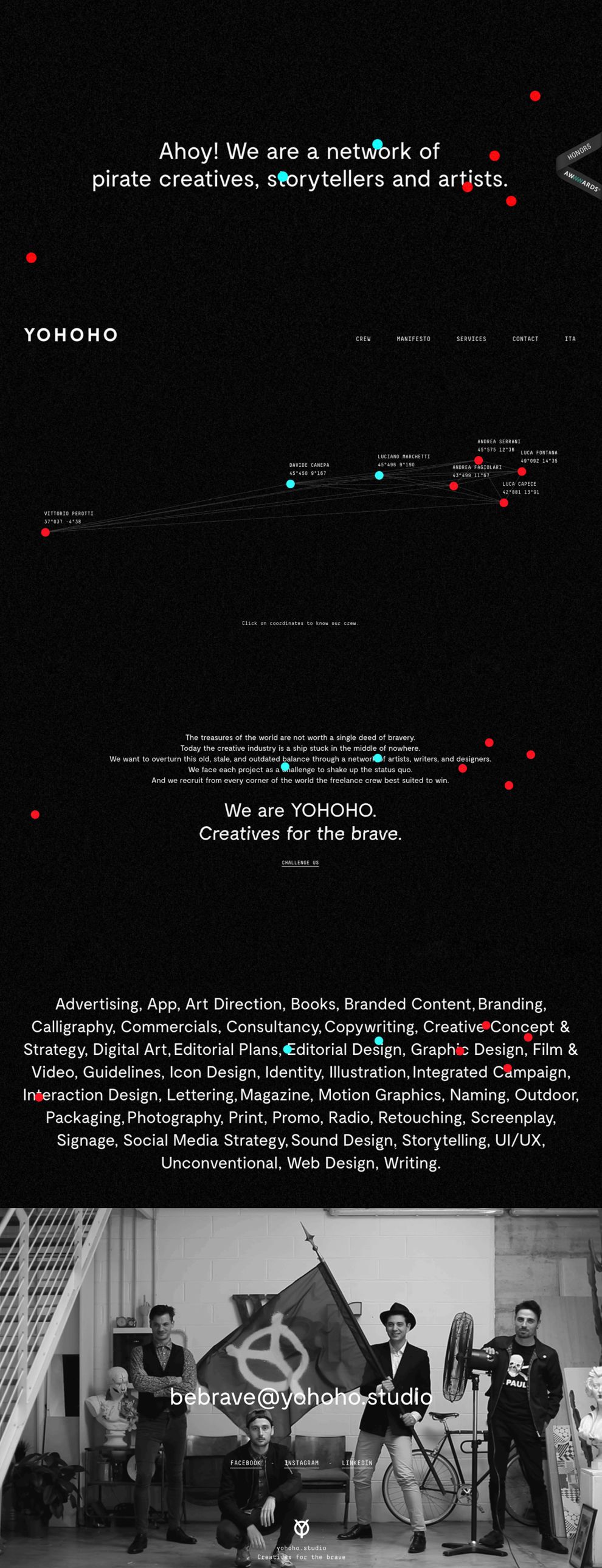
Yohoho is a network of “pirate” creatives, storytellers, and artists. They collaborate with clients on various digital design and web experience projects, all focused on experimentation and innovation. Yohoho’s home page features a fairly blank design scheme, with one graphic feature that makes the entire page feel that much more clever and creative. All around the page, blue and red dots seem to be floating around aimlessly. This slight animation generates strong user interest and curiosity.
The largely blank, black background of the page properly evokes the sense of futurism and “hack” culture that fuels the company’s brand. When navigating to a different page, the body of the site will colorfully glitch, as if something might be wrong with its integrity. But that’s not the case,. It’s simply another effective mechanism the designer has used to communicate Yohoho’s highly alternative brand.
-desktop.jpg)
This menu page, which follows the site’s home page, plays off of the very intriguing, floating, colored dots. As soon as a user clicks to navigate forward, the dots warp to specific locations, and they connect by thin, digitized lines. This creates a stunning, futuristic graph that almost looks like a star map. At each dot lies the name of a creative who works with Yohoho. The UI evokes the futuristic “pirate” image that the company has branded. They’re digital pirates, connected only by their rugged innovation and experimentation, represented here by a network of futuristic dots and lines.
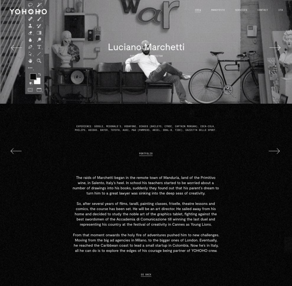
Here is one of the pages that users link to by clicking one of the dots. Each page is unique and intentionally different than the rest of the site, in terms of aesthetics. By visually distinguishing the individuals’ pages from the rest of the site, the designer is sub-textually communicating the nature of the company as an independent, creative network. This reinforces their “pirate” brand, since everyone operates independent of one another and is, in a sense, the captain of their own ship. This strong but subtle visual mechanism, and the other effects used throughout the site, do a great job creating a very specific user experience and communicating Yohoho’s brand.
Yohoho is a best website design in the Advertising and Professional Services industries.