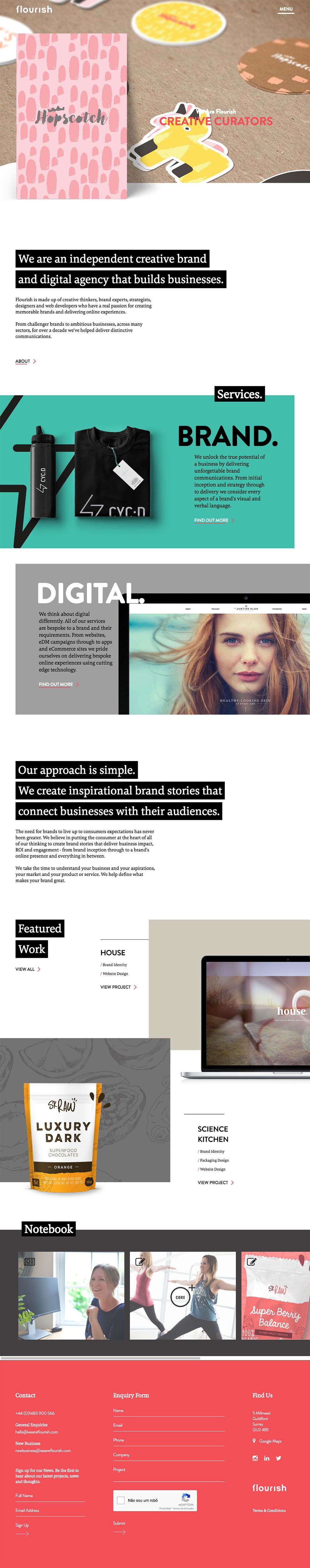
From beauty products to travel destinations, trusted brands ensure consumers that they are receiving consistent quality in both their basic daily purchases and their most outlandish adventures. Flourish is a British digital design agency devoted to making excellent brands unforgettable. Their website leaves some of the same imprint on its users, teasing the imagination with fantastic ideas of what the agency could come up with next.
A bright color palette stands against a simple white background to excite the eye. Red, yellow, green, and blue highlights pop out against text, headings, footers, and backdrops of samples, images, and slideshows. Photos, links, and written content are scattered in blocks of different sizes, while white text contrasts against block sections with bright backgrounds. The agency showcases its diverse capabilities by mixing a range of colorful, clean, corporate, and animated styles in its project displays.

Selecting the work portfolio from an opaque navigation menu leads users to a variety of digital samples created by the agency. Pages are full of vibrant images that depict food, drink, lifestyle, retail, beauty, education, travel, and other markets in which Flourish has produced quality brand strategies and content. The images are bordered by strips of white, and each fades slightly when users prepare to click on a given sample.
Once viewing one of the portfolio pieces, the experience continues to be colorful and attractive. It uses minimal text in rounded, black typography against stark backgrounds broken by large swatches of color or bright images. Color schemes are echoed in subtle details, like bullet points or checkmarks in lists. There is no question that well-placed and coordinated color is a priority in Flourish’s branding philosophy.

To access a full range of available services, users can explore additional site tabs and information arranged using a variety of platforms: social media, interviews and narratives, and article content. Images dominate the page space on many of these parts of the site, and sub-menus are arranged in asymmetrical patterns. Users can explore a variety of options by hovering over images as they scroll the website.
Each image goes dark in response to user movement, and white text with a short, snappy description of each project entices users to see more. Even if users stray far from the home or main menu navigation pages, a header with a hyperlinked Flourish logo stays at the top of each page. The minimalist theme, dominated from beginning to end by color and images, allows users to easily explore all the options available on the site. The full experience gives viewers a touch of the creative visual aesthetics and digital content this agency uses in much of its work.
Flourish is a clean website design in the Advertising and Professional Services industries.


-preview.jpg)