Key Findings
- Graphic design in 2026 is being shaped by technology, especially AI, which is helping create more immersive and personalized visuals.
- Trends like Retro Design and Punk Revival are bringing back elements from past decades but with a modern twist. These styles connect emotionally, using nostalgia and authenticity to grab attention.
- AI is also transforming motion graphics and generative design, making it simpler to produce high-quality, dynamic visuals.
- Mixed reality and 3D design are on the rise, as brands look to create interactive experiences that blend the digital and physical worlds.
1. Retro Design
Designers are revisiting styles from the ‘70s, ‘80s, and early 2000s — not just for nostalgia, but to bring warmth and familiarity into modern branding. In 2026, you’ll see more bold serif fonts, grainy textures, sticker-style icons, and soft neon palettes reworked for digital use.
Brands like Pepsi continue to roll out its heritage-inspired redesign from 2023 as well, which proves how past visuals can feel fresh when applied with intention. Experts believe this shift reflects a broader move away from minimalism toward authenticity and embracing your own character. You’ll likely see more of this style in logos, packaging, websites, and campaign visuals; anywhere brands want to tap into emotional resonance without losing relevance.
Execution ideas:
Retro design works best when it evokes familiarity without feeling dated. Here’s how you can apply it to your brand and marketing assets:
- Pair throwback fonts with modern layout grids for a clean, updated look
- Use textures like grain or halftone to give visuals a vintage print feel
- Reference specific decades through color (e.g., ‘70s earth tones, Y2K neons)
- Keep it balanced — avoid layering too many retro elements in one composition
Shailesh Singh, Research and Development Director of The Digital WOW notes that brands staying ahead of the curve tend to adopt trends selectively — weaving them into their existing identity, not overhauling it. That means keeping core elements intact, applying new styles strategically, and using experimentation to stay fresh without losing recognition.
2. Maximal Minimalism
Maximal minimalism takes the best parts of minimal design — clean layouts, white space, and simplicity — and adds just enough boldness to grab attention. It’s a shift we’re seeing in 2026 as brands look for clarity without blending into the background.
You’ll see it on websites, packaging, and campaigns where one oversized font, pop of color, or visual surprise breaks the silence. It’s also gaining traction across fashion, tech, media, consumer goods, and spaces where visual impact needs to be immediate.
This trend taps into a broader cultural shift. Kristin Marquet, CEO of Marquet Media, explains that consumers are overwhelmed by noise — so brands are leaning into “clean, emotionally resonant visuals” that signal calm, trust, and quiet confidence. It’s minimalism with meaning: high-contrast layouts, nostalgic typography, and understated elegance that delivers more by saying less.
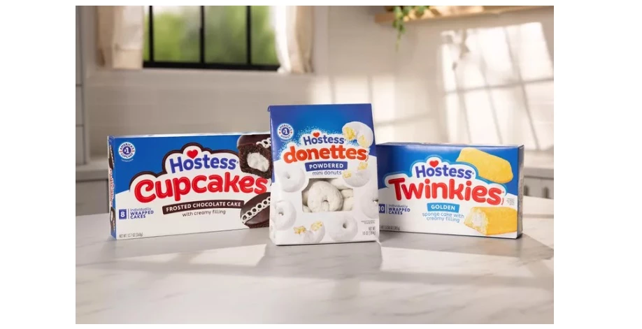
A good example of this is Hostess Snacks, which rolled out a refreshed look this year featuring a clean layout with a bubble-style font and a red heart — a bold but playful element that stands out without overpowering the brand. It’s a strong example of how one visual punch can transform a simple design into something more memorable.
Execution ideas:
This style works when contrast is intentional. Here’s how to bring it into your own work:
- Start with a clean, grid-based layout, and then add one standout element.
- Use oversized typography to anchor messaging without overwhelming it.
- Contrast muted backgrounds with bright or neon accents.
- Keep plenty of white space to amplify the bold features and maintain clarity.
3. Bold Typography
Bold typography isn’t new, but this year, it’s going to be more central. Designers are using oversized, high-weight types to lead layouts, anchor brand messaging, and make statements without relying on heavy visuals.
It’s easy to confuse this style with maximal minimalism, which also plays with contrast and boldness. The difference is that bold typography puts the type front and center — the font is the design. There’s no need for extra imagery or complex layouts when the words do all the work.
You’ll see this style in headlines, product packaging, billboards, and landing pages — especially in industries like fashion, tech, and publishing, where first impressions need to hit fast.
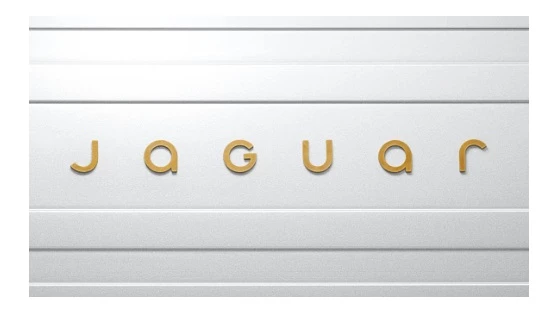
Jaguar’s updated branding is one recent example. Their new logo and visual system feature a bold, refined typeface that strips away excess while signaling confidence — aligning with their shift to a luxury electric lineup.
Execution ideas:
When typography leads the visual, design decisions need to support its clarity. Here’s how to apply it:
- Use bold fonts for primary messaging and give them space to stand on their own.
- Pair with muted or minimal backgrounds to keep the focus on the text.
- Avoid excessive effects like shadows or outlines that can affect readability.
- Choose typefaces that match your brand’s voice — bold doesn’t always mean loud.
4. AI-Enhanced Motion Graphics
Motion graphics will be faster to produce and more advanced this year, thanks to AI. Designers are using AI-powered tools and graphics software to automate animation steps, streamline visual effects, and create smoother transitions without needing to manually keyframe every detail.
A good example is the motion design for New York City Football Club’s new stadium website, created by DD.NYC. The animation blends clean transitions with dynamic movement, giving the site an elevated, high-energy feel. Projects like this show how AI can help agencies produce high-quality motion graphics that look polished without requiring large production teams.
David Barlev, CEO and Co-founder of Goji Labs, highlights how AI speeds up creativity in motion design:
"AI is speeding up motion design by automating the tedious parts—like keyframe interpolation or asset generation—so designers can focus on storytelling and user experience. It’s not replacing creativity; it’s unblocking it."
Execution ideas:
AI tools let you focus more on storytelling and less on repetitive edits. Here’s how to start using them in motion design:
- Use AI to automate keyframing, transitions, or background effects
- Speed up the revision process by generating animation drafts automatically
- Customize animations to user data or screen formats without starting from scratch
- Explore AI features in platforms like After Effects, Runway, or Canva’s motion toolkits
5. Punk Revival
The rebellious spirit of punk is back, and it’s not trying to be neat. Graphic designers are drawing from the anti-establishment energy of the punk movement — ripping up the rulebook (sometimes literally) and rejecting clean, polished visuals.
What makes punk design stand out is its deliberate messiness. Think cut-and-paste collages, scribbled type, and jarring contrasts. The style feels chaotic, but behind the scenes, it’s very intentional.
You’ll recognize it by:
- Distressed or DIY typography: Hand-drawn, eroded, or uneven fonts that feel raw and loud
- Layered, torn textures: Paper rips, photocopy grain, spray paint overlays
- High-contrast color palettes: Black, white, and neon clashing in your face
- Unconventional layouts: Overlapping elements and tilted frames that break visual rules
This look isn’t for every brand, but for industries that thrive on individuality or disruption, it’s a way to express authenticity, frustration, or edge.
Execution ideas:
If you’re leaning into this trend:
- Use collage or zine-style techniques to add texture and unpredictability
- Let your layout break rules — not everything needs to be perfectly aligned
- Mix bold messaging with aggressive styling to amplify emotion and stand out in scroll-heavy environments
6. Airbrush Surrealism
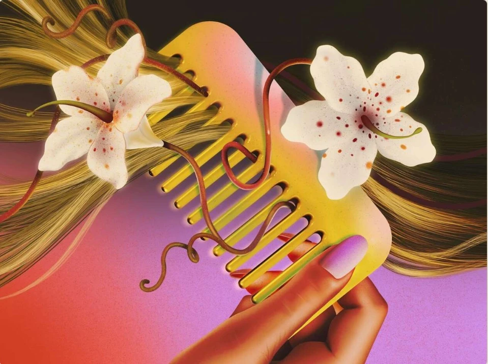
Airbrush surrealism is making a notable comeback in graphic design, but it’s getting a soft-focus upgrade. Designers are blending retro airbrush techniques with dreamy, exaggerated imagery to create visuals that feel both nostalgic and futuristic.
This style uses smooth gradients, chrome-like finishes, and surreal forms that challenge perspective and realism. It often shows up in editorial works, fashion campaigns, and brand visuals that want to spark emotion or curiosity.
One standout example is the work of Patricia Doria, whose airbrush illustrations mix bold colors with glossy, surreal compositions. Her pieces draw from '80s glam, nail art, and retro-futurism, but with a modern twist. Through collaborations with brands and publications, she’s helping bring back this soft-edged, surreal aesthetic into commercial design contexts.
Execution ideas:
If you’re exploring this trend, aim for emotional tone over realism:
- Use soft gradient blends to create an ethereal, dreamlike atmosphere
- Introduce abstract, exaggerated forms to build visual intrigue
- Layer textures and light effects to mimic the polished look of vintage airbrush work
- Mix in unexpected, humorous details to break the tension and add personality
7. Mixed Reality and 3D Design
Designers are using mixed reality and 3D visuals to create work that feels more dimensional and dynamic. Instead of flat layouts, brands are building immersive experiences that blend physical and digital elements, often with the help of AR, motion design, or interactive tools.
This shift reflects a larger demand for personalization, interactivity, and emotional brand experiences. As Singh notes, brands are leaning into “immersive, multisensory experiences that engage consumers on deeper emotional levels” — and design is playing a central role in making those moments feel real.
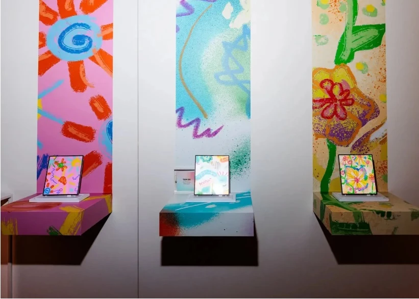
A recent example: Samsung and Vogue’s pop-up event during New York Fashion Week. They partnered with designer Colin LoCascio to create a playful, 3D environment where guests could customize digital backdrops, take selfies, and remix the visuals around them using Galaxy AI tools. His colorful, graphic style filled the space — from floor-to-ceiling screens to interactive product stations — turning a tech launch into a branded design experience.
Execution ideas:
You don’t need to build a full-blown installation to use this trend. Here’s how it can scale for your team:
- Use lightweight 3D elements to add movement and depth to digital layouts.
- Incorporate AR filters or on-site installations at events to boost engagement.
- Explore tools like Adobe Aero or Unity to prototype immersive or spatial design concepts.
- Include 3D renders in product pages or packaging mockups for more realism and flexibility.
8. AI-Powered Generative Design
AI tools are now both for speeding up tasks and generating entire visual directions. With the right prompts or parameters, you can explore layout ideas, iterate faster, or create multiple branded assets in a fraction of the time.
Instead of starting from scratch, teams are building on AI-generated variations, then customizing and refining them. It’s a shift from designing everything manually to collaborating with tools that can suggest smart starting points.
Marquet shares how her team uses AI for brand aesthetic testing, rapid mockups, and style exploration — as a way to visualize bold ideas early, before committing to full-scale creative. “AI has become a creative partner, not just a production tool.”
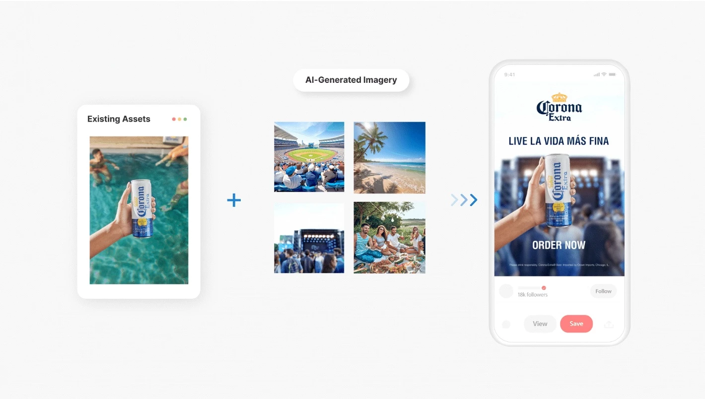
A good example is Corona’s Pinterest campaign, produced with the help of Shuttlerock. The brand supplied a single product image, and generative AI was used to create new backgrounds — like beaches and stadiums — which were then composited into short-form video content. The final asset was branded, copy-ready, and turned around in just four days.
Execution ideas:
If you're exploring generative design, these use cases are a good starting point:
- Generate visual options (layouts, color palettes, compositions) based on design briefs or mood boards
- Use AI to repurpose existing brand assets into new formats quickly
- Speed up mockup creation or branded content production for social and digital campaigns
- Explore tools like Adobe Firefly, Canva Magic, or Figma plugins with generative features
![]()
Our team ranks agencies worldwide to help you find a qualified partner. Visit our Agency Directory for the Top Graphic Design Companies, as well as:
- Best Graphic Design Companies in Dallas
- Top Design Agencies
- Top Web Design Companies
- Top Product Design Companies
- Top Logo Design Companies
Our design experts also recognize the most innovative design projects across the globe. Visit our Awards section to see the best & latest in design.
Graphic Design Trends: FAQs
1. How do I choose which trends to follow?
Start with your brand’s goals. Use trends that support the message or tone you want to convey — not just what looks current. If it doesn’t help tell your story or connect with your audience, it’s probably not worth it.
2. Will using trends make my brand look like everyone else?
Not if they’re applied intentionally. Trends become noise when they’re copied without context. The key is to adapt them to your brand’s identity — that’s where strong creative direction (and often, agency support) comes in.
3. When is the right time to update our brand visuals?
If your current look no longer reflects who you are, feels dated, or underperforms on key platforms, that’s usually the sign. Updating doesn’t mean a full rebrand — small, strategic changes can keep your visuals fresh and relevant.