Cannabis branding involves creating a brand identity that reflects the mission, values, and unique qualities of a cannabis product or company. The best examples show how brands effectively communicate their message through creative design, packaging, and marketing strategies, helping them stand out.
We’ve compiled a list of the 10 best cannabis branding examples to inspire your own branding efforts, so let’s dive right in!
1. JUJU Joints by Headquarters

Standout features:
- Sophisticated packaging
- Prominent logo
- Classy typography
One of the best cannabis branding examples today is JUJU Joints, a vape technology designed for ease of use, mobility, and discretion. The branding, crafted by Headquarters, is a textbook example of refined sophistication.
The primary branding element is the Adinkra Fern — an ancient African symbol used front and center — which is reminiscent of tribal wisdom and rituals (juju magic). This is contrasted with an upscale visual approach, launching JUJU Joints as a first-of-its-kind e-joint.
The packaging stands out with the generous use of foils, built-in displays, and a hidden accent color, details that contribute to the magical and premium feel of the brand.
As Rick Stevens, founder of JUJU Joints, puts it:
“Headquarters created an identity that embodies the market category, yet clearly positions us as a premium brand. They pushed the original vision beyond our expectations and into the realm of serious recognition and sales.”
2. Virtú CBD by Gitanos

Standout features:
- Well-balanced color scheme
- Wooden elements
- Union of minimalism and traditional values
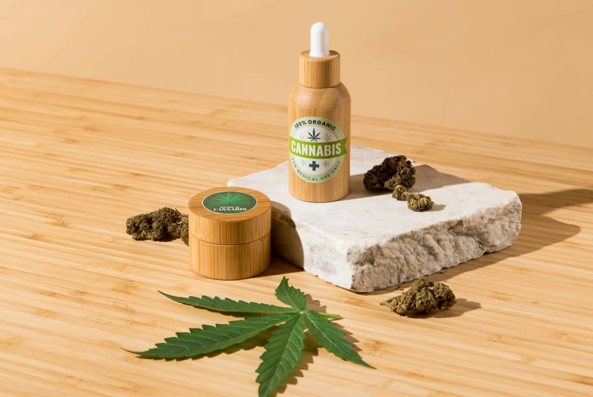
Another great example of cannabis branding done right is Virtú. Rooted in the lush tropical forests and untouched habitats of Costa Rica, Virtú was born from a desire to harness nature’s ancient wisdom to promote modern well-being.
Since the dawn of humanity, plants and their healing properties have played a key role in improving both physical and mental health. Virtú continues this long tradition of bringing humanity closer to nature. The visual identity created by Gitanos promotes harmony and balance, while the packaging, with its delicate colors, intricate linework, wooden decals, and minimalistic aesthetics, further reinforces this message.
3. Rise by Yesterday Design Co.

Standout features:
- Tranquil, “elevated” atmosphere
- Excellent use of color
- Striking typography
Some of the best cannabis branding examples are refreshingly simple, and that’s exactly what RISE Cannabis delivers. As a craft cannabis brand aiming to penetrate the growing Canadian market, RISE worked closely with Yesterday Design Co. to, quite literally, rise above the competition.
The design elements focus on how cannabis makes you feel — lifted and elevated. With a zen-like vibe, RISE’s branding features simple wood accents, natural notes, and calming powder blues, creating a minimalistic atmosphere without relying on stereotypical cannabis imagery.
4. Caliva by Lauren Jane Studio

Standout features:
- Great usage of color
- Clearly communicates product’s attributes
- Prominent logo
Another standout example of cannabis branding is Caliva, the leading and “most trusted name in cannabis” in California. Founded in 2015, Caliva operates as a direct-to-consumer (DTC) agency with a strong advantage due to its vertical integration.
Caliva's plant-based solutions are designed to complement any lifestyle. While widely recognized for its recreational products featuring colorful and illustrative packaging, Caliva branched out into the wellness category and introduced a new sub-brand with the help of Lauren Jane Studio.
The studio created a color-coded packaging design featuring custom illustrations and a hierarchical system to communicate product attributes and potency clearly. Although the general aesthetics largely follow traditional medical design trends, they effectively convey the “natural” and “relaxing” aspects of each product.
5. OM EDIBLES by Noise 13

Standout features:
- Sleek Sri Yantra symbol
- Tender/vibrant color palette
- Luxurious packaging
Noise 13, a San Francisco-based branding agency, continues to bring its signature elevated style to the cannabis industry with the remarkable redesign of cult wellness brand OM Edibles.
The revamped packaging exudes sophistication only found in uber-luxe apothecaries. From cannabis-infused Epsom salts and elixirs to edibles and balms, OM Edibles’ packaging demonstrates how cannabis and opulence go hand in hand seamlessly.
The system hierarchy works perfectly across various product forms and boosts the brand’s luxury appeal, both in design and consistency.
By redesigning the sacred Sri Yantra symbol into a more elegant, minimalistic line-art style, the packaging strikes a perfect balance between aesthetics and spirituality. Additionally, the vibrant color palette further enhances the design and reflects the natural energy and passion OM puts into every product.
6. Light Garden by I'm Lucy

Standout features:
- Light typography
- Fun design
- Custom illustrations
Light Garden is another good CBD branding example. It’s an exciting addition to the expanding CBD wellness market with the aim of helping customers “find light in your day” through its range of CBD-infused products.
Light Garden wanted a strong visual DNA and personality that would distinguish them from competitors; the brand approached I’m Lucy to get them there. The result is a branding style that feels familiar yet unique, using a playful, tongue-in-cheek voice.
The packaging is simple, fun, empowering, and highly “shareable” amongst the enthusiasts. It can sit proudly on the shelves among beauty and skincare products, without relying on the appeal of CBD.
7. Wicked Root by Rule29

Standout features:
- Prominent logo
- Black background “canvas”
- Fun and authoritative at the same time
When Wicked Root reached out to Rule29 for their brand launch, no one anticipated that this collab would result in one of the best cannabis branding examples. The goal was clear: the branding had to embody the essence of being “wicked.”
With bold typography and sharp, geometric angles, the Wicked Root brand portrays confidence and energy. Meanwhile, the brand’s vibrant color system could easily be swapped to differentiate products within the line.
However, what catches the eye immediately is Wicked Root’s hypnotic logo. Not only does it represent the brand’s first letter, but it also symbolizes three stems growing from a single root. The combination of typography, black backdrop, and vibrant color accents creates a sleek, almost metallic aesthetics that is sure to turn heads.
8. Wonderhemp by Redsky Studios

Standout features:
- Symmetrical design
- Nature-inspired color palette
- Traditional imagery
Another great marijuana branding example on our list is Wonderhemp, demonstrating that sometimes the right way is usually the least complicated one.
In their pursuit of original design, most cannabis brands shun the classic aesthetics, leaving space for those who don’t aim to think “outside the box” but rather to reinvigorate the “old ways.” Such is the case with Wonderhemp’s branding, courtesy of Redsky Studios.
It relies heavily on a natural color palette that reflects its product before and after processing: green cannabis turned into golden hemp oil!
The usage of traditional imagery and nature-inspired color schemes doesn’t mean a lack of creativity. Quite the opposite as each design element, from minimal typography to the prominent logo, relies on a meticulous sense of symmetry that is impossible to ignore.
9. NeonMind by Perry Chua

Standout features:
- Symmetrical design
- Nature-inspired color palette
- Traditional imagery
Our list of the best Cannabis branding examples includes NeonMind, a brand that goes a step further from your typical cannabis industry. Its immune-boosting medicinal mushroom coffee blend opted for a coffee design packaging that unites the two extremes into one sleek and forward-thinking solution.
Designed by Perry Chua, the packaging features a psilocybin-inspired color scheme and illustrations cleverly integrated into an engaging pattern.
10. TigerFiber by HempAware

Standout features:
- Sustainability-focused
- Innovative approach
- Unconventional color scheme
"Healing Our Soil With Hemp by Hemp(Aware)"
Our final top marijuana branding example is Tiger Fiber. Tiger Fiber’s mission is to build a sustainable agricultural system that will disrupt mass markets for the global good. Their goal is to assist in the reintroduction of hemp to American farmers, manufacturers, and stakeholders at every level of the industry.
Their branding, courtesy of HempAware, is a perfect stepping stone for the mission. It transcends the conventional imagery associated with the product and focuses on industrial value.
The choice of typography and color is subtle, yet attention-grabbing. The logo is prominent by itself but lies perfectly when placed alongside other elements.
Best Cannabis Branding Examples Takeaways
With the cannabis market expected to go over $64.7 billion by the end of 2024, many brands are investing in quality branding that will portray their voice and mission in the best light possible.
Cannabis branding helps build a brand that will be recognized and distinguished from the rest. It can show your business’s essence and position it as a top competitor in the industry.
Whether it’s a logo, packaging, or an entire rebranding endeavor, these professionals will help bring your unique branding vision to life!
![]()
Our team ranks agencies worldwide to help you find a qualified partner. Visit our Agency Directory for the Top Branding Agencies, as well as:
- Top Brand Strategy Agencies
- Top Brand Positioning Firms
- Top Small Business Branding Agencies
- Top Cincinnati Branding Agencies
And don’t miss our Awards section, where we showcase the top agencies recognized for exceptional creativity and impact.


-preview-webp.webp)