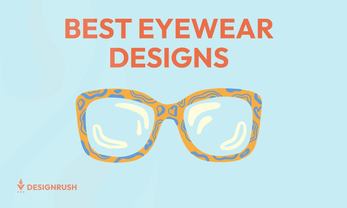
From timeless classics to revolutionary designs, eyewear design has evolved in recent years, with designers pushing the boundaries both in product and branding.
We’ve curated a collection of the best eyewear brands and designs from the top product designers, reflecting today’s biggest trends. From bold and expressive to sleek and refined, each piece offers a glimpse into the most fashion-forward eyewear branding designs.
1. OCULTY by Y AGENCY
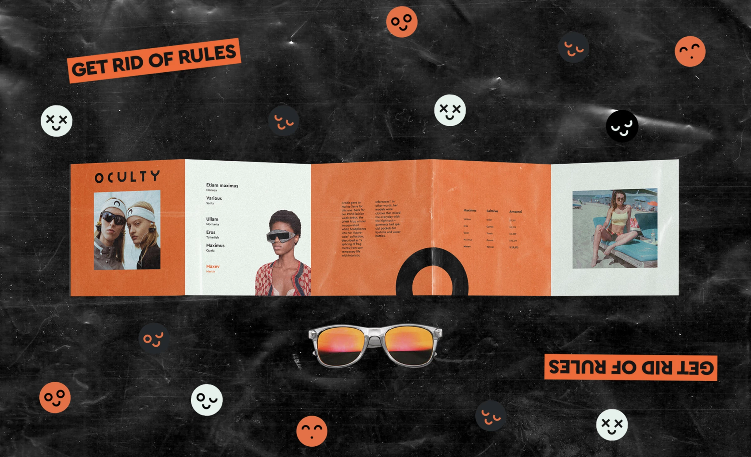
Standout Features:
- Bold and energetic
- High color-contrast
- Geometrical design
OCULTY, an eyewear brand, recently gave its identity a fresh makeover with the help of Y AGENCY. The agency brought a bold, edgy, and high-energy design to the brand that perfectly captures its vibe.
Staying on trend, OCULTY plays with geometric shapes and retro-inspired elements that are making waves in the eyewear market right now. The mix of nostalgic sticker-like details with a sleek, minimalist feel is a clever blend of the past and present, creating something entirely new and exciting.
The brand’s vibrant, high-contrast colors and geometric patterns speak directly to a younger, creative crowd — creative professionals and trendsetters who seek to break free from convention. With pops of neon orange and fun smiley face graphics, OCULTY brings an electric energy that makes it instantly recognizable and a must-have for those who love bold, unique style.
2. Candelaria by Diego Gonzalez
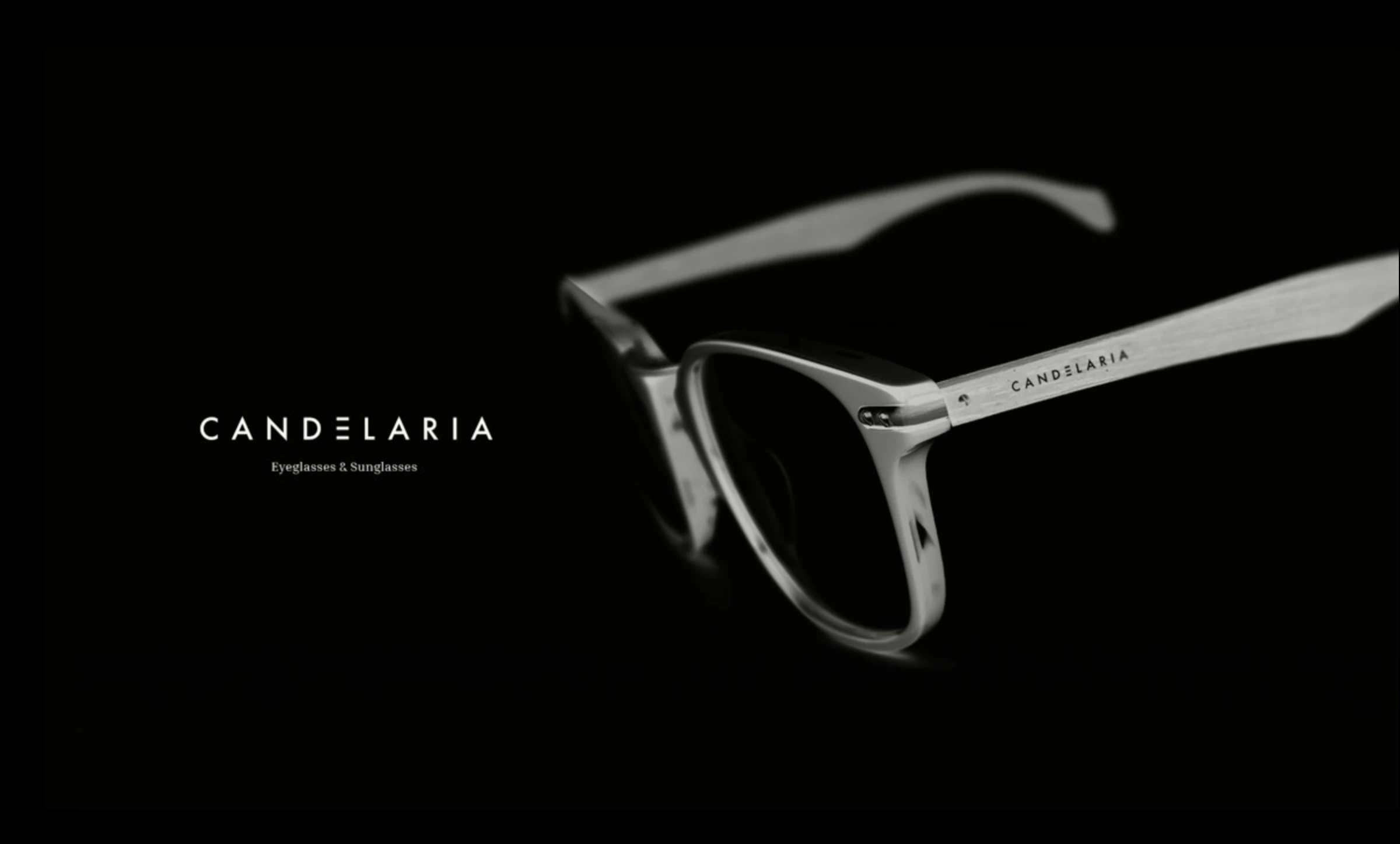
Standout Features:
- Monochromatic photography
- Hand-drawn gothic art
- Vibrant pink contrast
Candelaria by Diego Gonzalez delivers an identity that bridges historical depth with modern eyewear innovation. Drawing inspiration from Bogotá’s iconic historical center, the design integrates monochromatic photography with hand-drawn gothic art, creating a visual narrative that honors heritage while embracing a contemporary edge.
Candelaria targets a discerning audience that appreciates a blend of historical resonance and modern innovation — consumers seeking eyewear that reflects a multifaceted identity and a refined style. Moreover, its design aligns with current trends in eyewear design, such as the resurgence of subdued bases paired with bold color contrasts.
Overall, Candelaria represents a sophisticated fusion of history and modernity, positioning itself as a forward-thinking yet timeless choice in the evolving eyewear market.
3. Umbra Eyewear by Tea Vetyskova
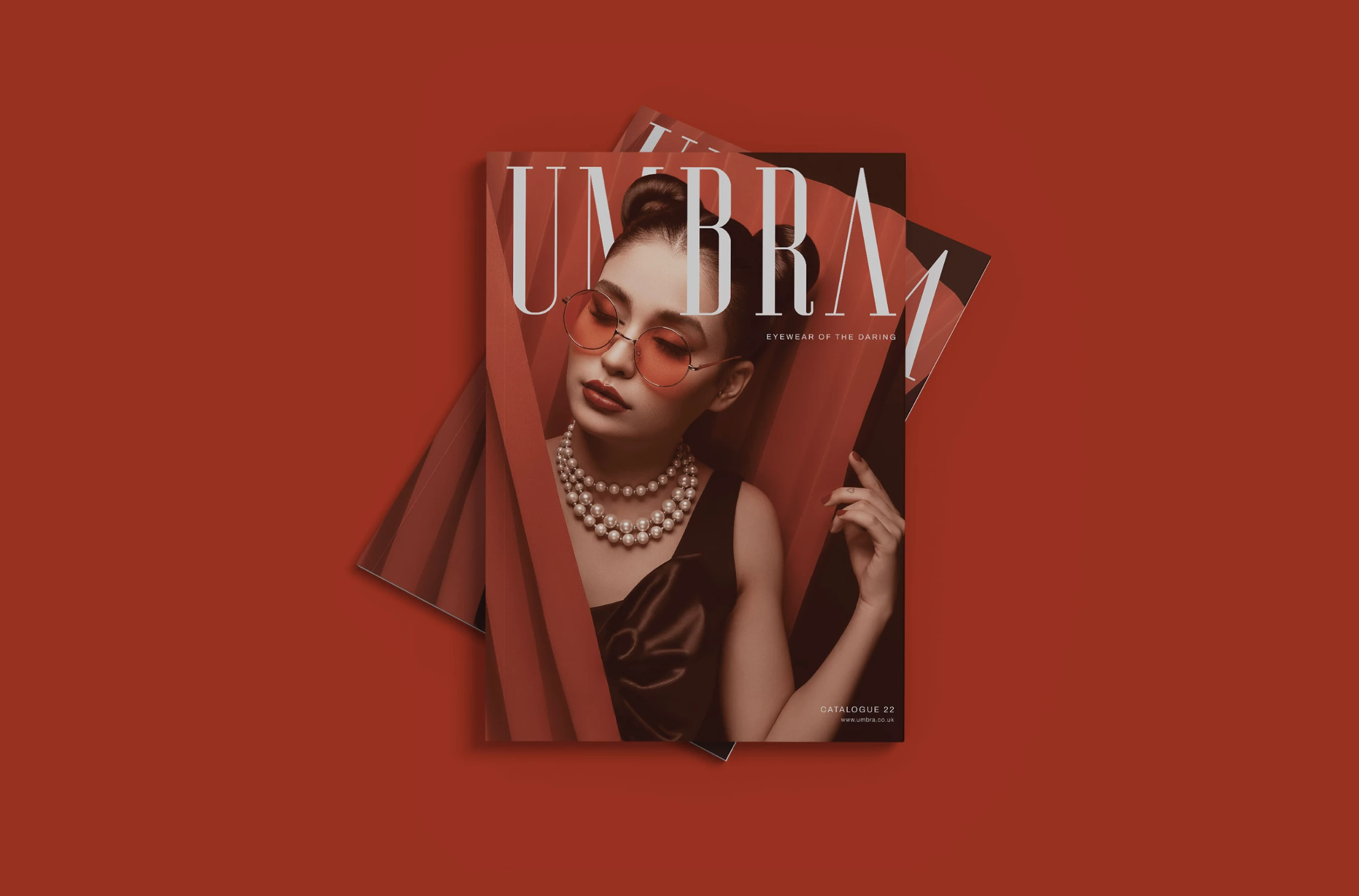
Standout Features:
- Glamorous and chic
- Play on words
- Edgy and inclusive
Umbra Eyewear is for those who dare to live life their way, particularly ladies who make their own rules. Tea Vetyskova developed an eyewear branding design that reflects the brand’s values: feminine, bold, and inclusive.
The use of diverse models in monochromatic settings, accentuated by bursts of devilish red, reinforces the brand’s commitment to inclusivity and celebrates individuality.
Umbra capitalizes on the juxtaposition of edgy typography and refined visuals. These choices mirror emerging trends in eyewear design, where minimalism meets dramatic flair.
4. SmartBuyGlasses by Jhonatan Alba
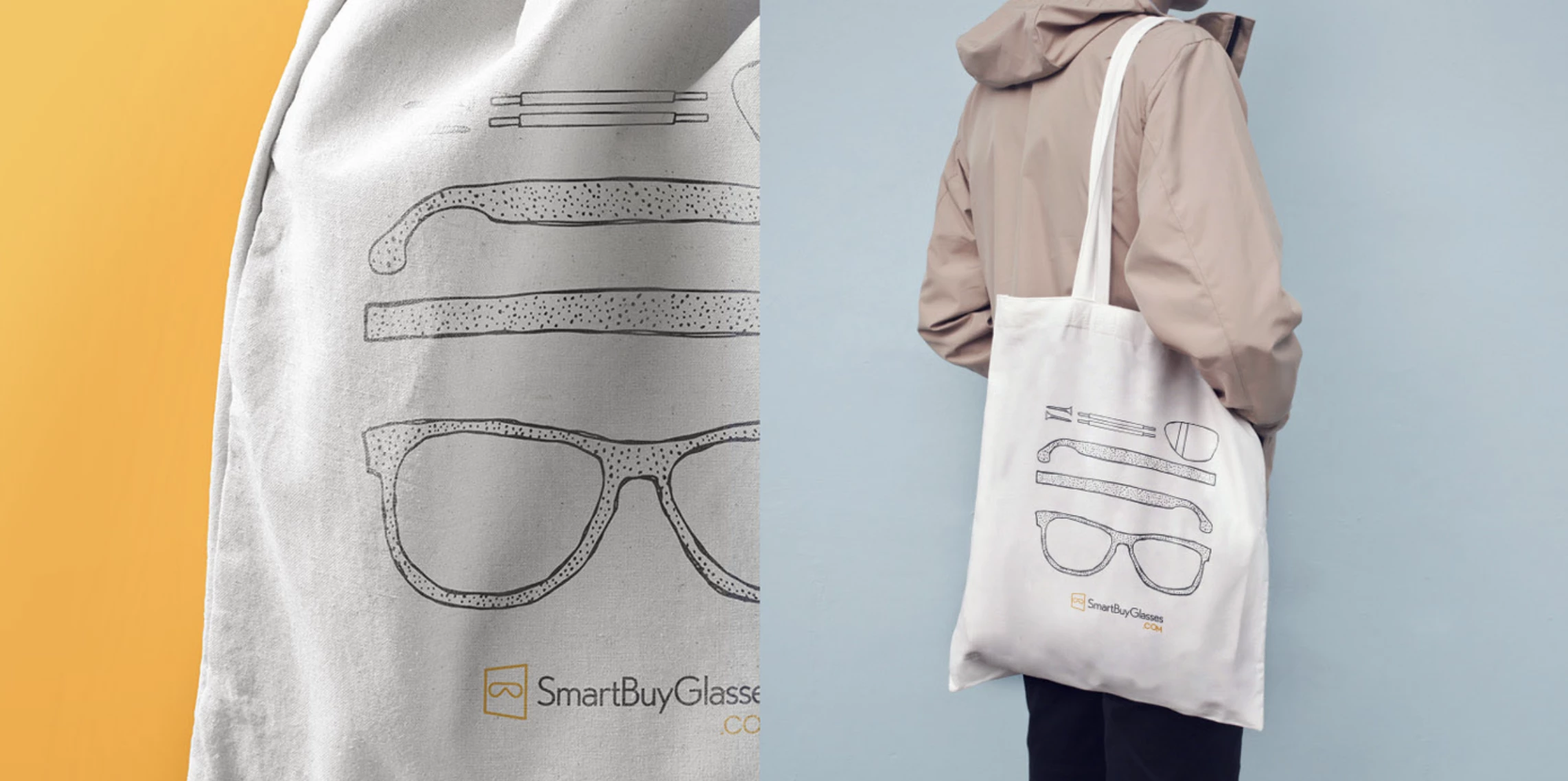
Standout Features:
- A quirky orange logo
- Orange-based identity
- Lively and positive imagery
Jhonatan Alba rebranded SmartBuyGlasses by creating a unique icon to represent it. The unique orange logo — a diagonally positioned square reminiscent of sunglasses — embodies the brand’s identity based on values of fun, dynamism, and limitless possibilities, while the vibrant, orange-based palette leverages color psychology to evoke warmth and creativity.
On the functional side, SmartBuyGlasses emphasizes the importance of ergonomics and advanced lens technology. Its collection is designed for everyday comfort, using lightweight, durable materials such as high-quality acetate and titanium. These materials not only ensure a secure fit but also contribute to long-lasting wear.
Additionally, advanced lens options offer robust UV protection and anti-glare coatings, ensuring visual clarity and eye safety in a range of environments — a critical factor for modern eyewear consumers.
SmartBuyGlasses’s quirky yet approachable design resonates with consumers who appreciate innovative, eye-catching branding paired with practical benefits.
5. WAREHOUSE by Aesthetichlo
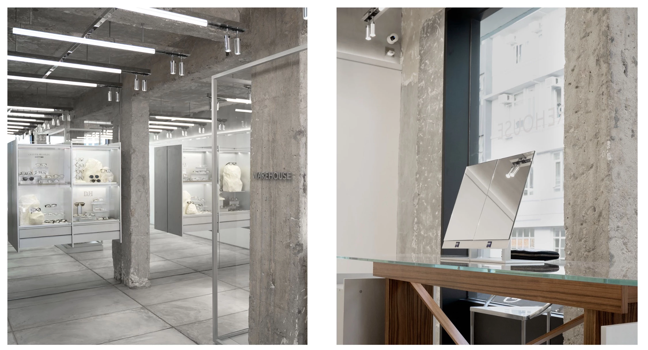
Standout Features:
- Minimal and brutalist
- A contrasting, cute mascot
- Artistic and symbolic
Aesthetichlo’s WAREHOUSE store branding combines two seemingly unrelated concepts into a brilliant idea. WAREHOUSE is a place for art that challenges your perception.
WAREHOUSE aligns with the current movement toward brutalist and minimalist design, where simplicity is elevated through precise, impactful details. The branding evokes a stark, industrial atmosphere, enhanced by minimalist packaging, clean typography, and the raw, grey tones of the store’s walls.
Against this austere backdrop, a contrasting, playful mascot — with its blue shirt and big green hat — provides an artistic focal point that brings life into the brutalist setting.
WAREHOUSE appeals to individuals who value both avant-garde aesthetics and everyday practicality. The design’s fusion of minimalism and colorful accents resonates with those who seek products that are utilitarian but also express a deeper, transformative story.
6. CONES & RODS by Blackink
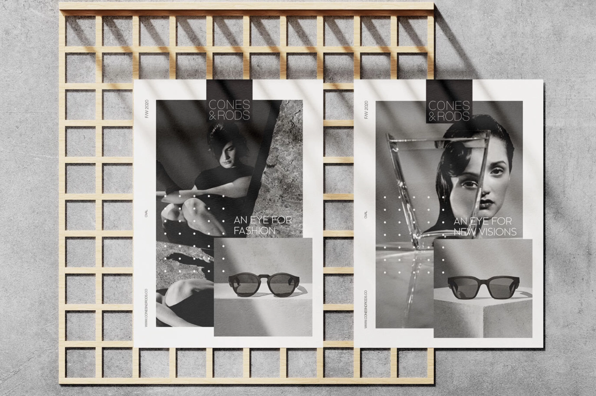
Standout Features:
- Sustainable and ethical
- Makes you look good and feel good
- Socially responsible branding
CONES & RODS’ rebranding by Blackink sets a high benchmark in sustainable eyewear design by fusing ethical production with modern aesthetics. It decisively counters fast fashion through a clean, minimalist approach that highlights both environmental responsibility and sleek design.
From a functional perspective, CONES & RODS eyewear is engineered for everyday performance. The ergonomically crafted frames, constructed from 100% titanium and metal, ensure a lightweight yet durable structure that offers a secure, comfortable fit.
The brand clearly targets environmentally conscious consumers who value both cutting-edge design and ethical manufacturing. This demographic, ranging from trend-savvy young professionals to mature buyers with a keen sense of social responsibility, is drawn to products that elevate their style and reflect their values.
7. Focus Packaging by Lindsay Frank
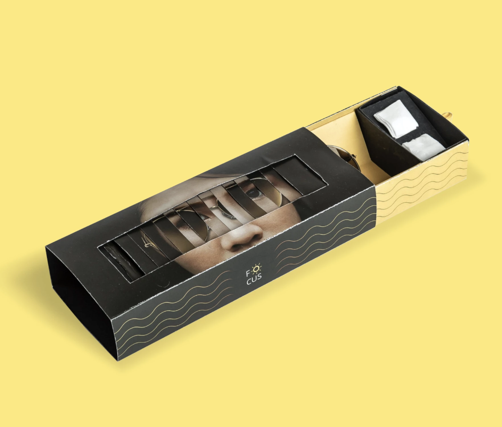
Standout Features:
- A distinctive product packaging
- Geometrical wavy lines
- Black-and-yellow combo
Designer Lindsay Frank developed a clever, one-of-a-kind packaging design for the fictional sunglass company, Focus, by relying on nothing but paper.
The exclusive use of paper not only underscores sustainability but also allows for precise fabrication methods such as laser cutting and digital printing. These techniques ensure clean lines, durable construction, and a consistent, high-quality finish — demonstrating that innovative packaging can be both environmentally friendly and visually compelling.
The rectangular box depicts a scaled-up face centered on a black background. The model’s eyes are represented through a set of rectangular blinds that start to shift as you pull the glasses out. This creative reveal elevates the moment of product discovery, ensuring the packaging is as memorable as the eyewear itself.
Targeting a youthful, style-conscious audience, this appeals to consumers who appreciate interactive elements in product design and value not just the product’s quality but also the experience surrounding its presentation.
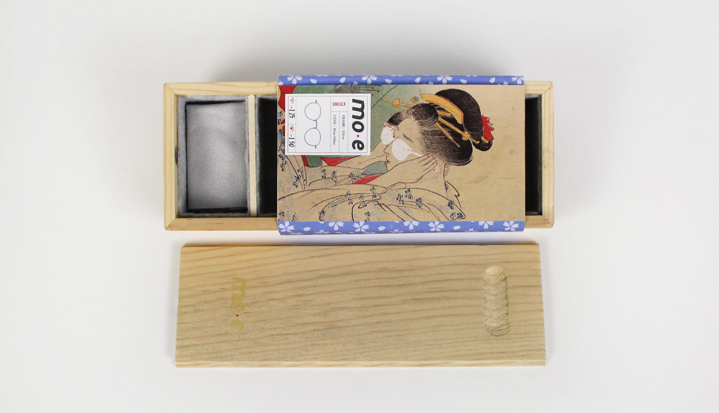
8. MO-E Eyewear by Mindy Saepung
Standout Features:
- Japanese art and symbolism
- Artsy, nature-inspired patterns
- A bento-box packaging
MO-E Eyewear represents the Japanese line of the renowned Spanish brand MO, reimagined by Mindy Saepung with a clever cultural twist. The addition of “-E” not only localizes the brand for Japan but also plays on the term “mo-e,” meaning “cute,” in Japanese.
MO-E appeals to design aficionados and lifestyle enthusiasts who value products that echo Japan’s rich artistic heritage, and the brand’s packaging is a testament to that ethos. The bento-box design — a symbol of care and thoughtful presentation in Japanese culture — adds a layer of affectionate storytelling.
Design trends are evident in the infusion of historical art and nature-inspired patterns throughout the packaging. The front panel’s display of traditional artwork, combined with a white window showcasing the product, creates an engaging narrative that balances playfulness with professionalism. This approach mirrors current trends that favor minimalism enriched with cultural detail.
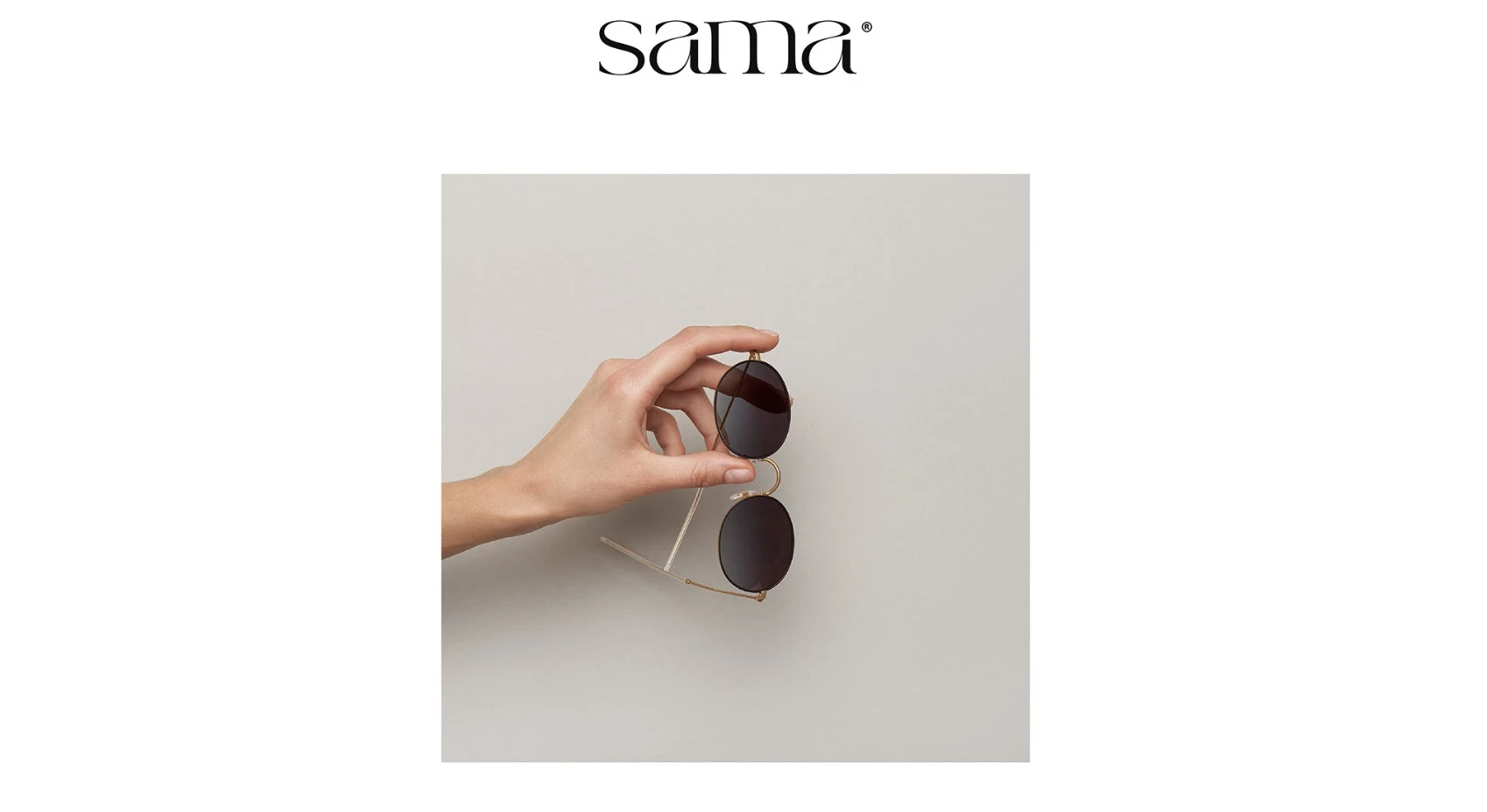
9. SAMA EYEWEAR by Carving-Jo
Standout Features:
- Luxurious and flexible
- Minimal and personal
- A freeline-drawing logo design
SAMA EYEWEAR by Carving-Jo epitomizes refined luxury and personal craftsmanship in its branding design. The freeline-drawn logo pays homage to Arab art through delicate, fluid lines that form the brand’s name. This refined design creates a memorable visual identity and hints at an eyewear product crafted with precision and bespoke quality.
SAMA EYEWEAR appeals to individuals who value subtle sophistication and cultural storytelling. Its personal, minimalistic visual identity resonates with consumers — from young professionals to seasoned connoisseurs — seeking luxury eyewear that combines artistic heritage with contemporary design.
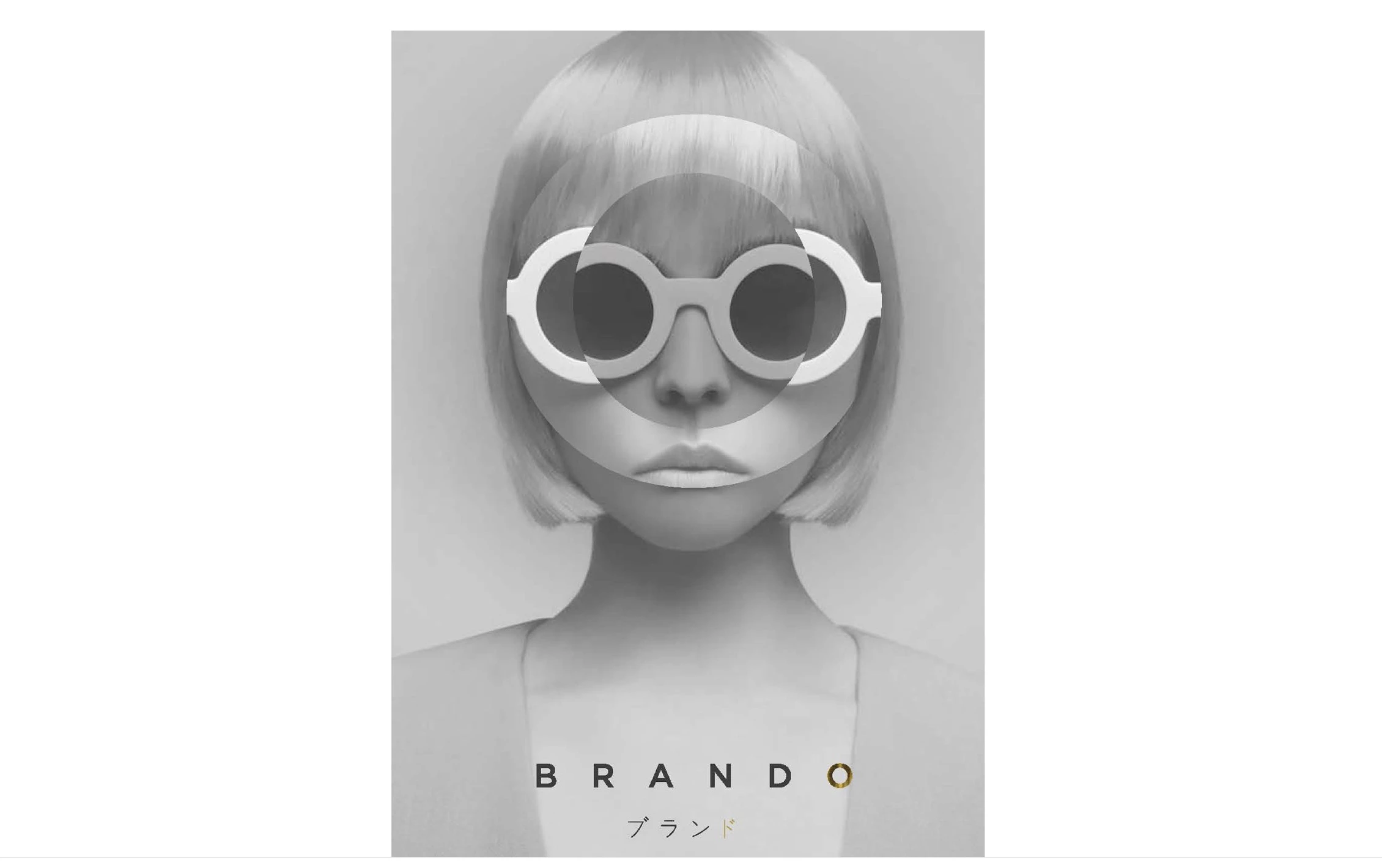
10. BRANDO Eyewear by LW Studios
Standout Features:
- Fluid, contrasting “O”
- Glossy edges
- Simple and elegant
BRANDO Eyewear by LW Studios embodies refined luxury through its minimal yet striking visual identity developed by LW Studios. BRANDO is in sync with the current minimalist luxury movement. Its clean lines, geometric emphasis, and selective use of metallic sheen are in line with emerging trends that favor simplicity enriched with tactile, eye-catching details.
The design speaks directly to an upscale, fashion-forward demographic that appreciates understated yet impactful luxury. The use of a monochromatic palette accented by a single golden element, along with subtle Japanese calligraphic glyphs, positions BRANDO Eyewear as a statement piece.
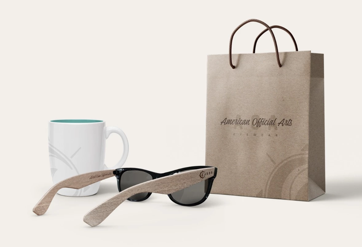
11. AOA Eyewear by Ampulla Digital
Standout Features:
- Watery visuals
- Sustainable materials
- Natural and adventurous
AOA Eyewear rebranding by Ampulla Digital is a masterful fusion of sustainable design and adventurous spirit. The refreshed identity is anchored by a dynamic logo featuring blue ocean waves and a vertical wave reminiscent of a surfboard, all enclosed within a compass-inspired circle.
This design evokes a deep connection with nature, effectively appealing to active, outdoor enthusiasts and eco-conscious consumers. By targeting adventurous individuals — from surfers and hikers to travel aficionados — AOA Eyewear resonates with a demographic that values both performance and environmental stewardship.
Reflecting current design trends, the brand leverages minimalist aesthetics and geometric shapes while emphasizing natural elements. The use of sustainable materials underscores a commitment to eco-friendly practices, a growing trend among modern consumers.
12. L.K. Bieleccy by ideative

Standout Features:
- A geometric-based design
- A soft, pleasant color palette
- An assertive, eye-catching shade of red
Ideative created a striking website design concept for Bieleccy Optical Salon, showing how clean, geometric minimalism can boost brand recognition while highlighting the brand’s focus on high-quality eyewear.
The eyewear offerings at L.K. Bieleccy Optical Salon are engineered to meet high standards. The brand is known for its wide selection of frames and corrective lenses that feature ergonomic designs for a comfortable, secure fit. Advanced lens technologies likely include UV protection, anti-glare coatings, and scratch-resistant finishes to ensure optimal clarity and durability for everyday use.
Targeting a diverse clientele — from fashion-forward young professionals to discerning individuals in need of premium corrective eyewear — the design resonates with those who value both style and functionality. The clean lines, geometric patterns, and strategic use of color reflect current design trends, positioning L.K. Bieleccy as both contemporary and timeless.
13. Phyllon Collection for Inhotim Loja by Barbara Luppi
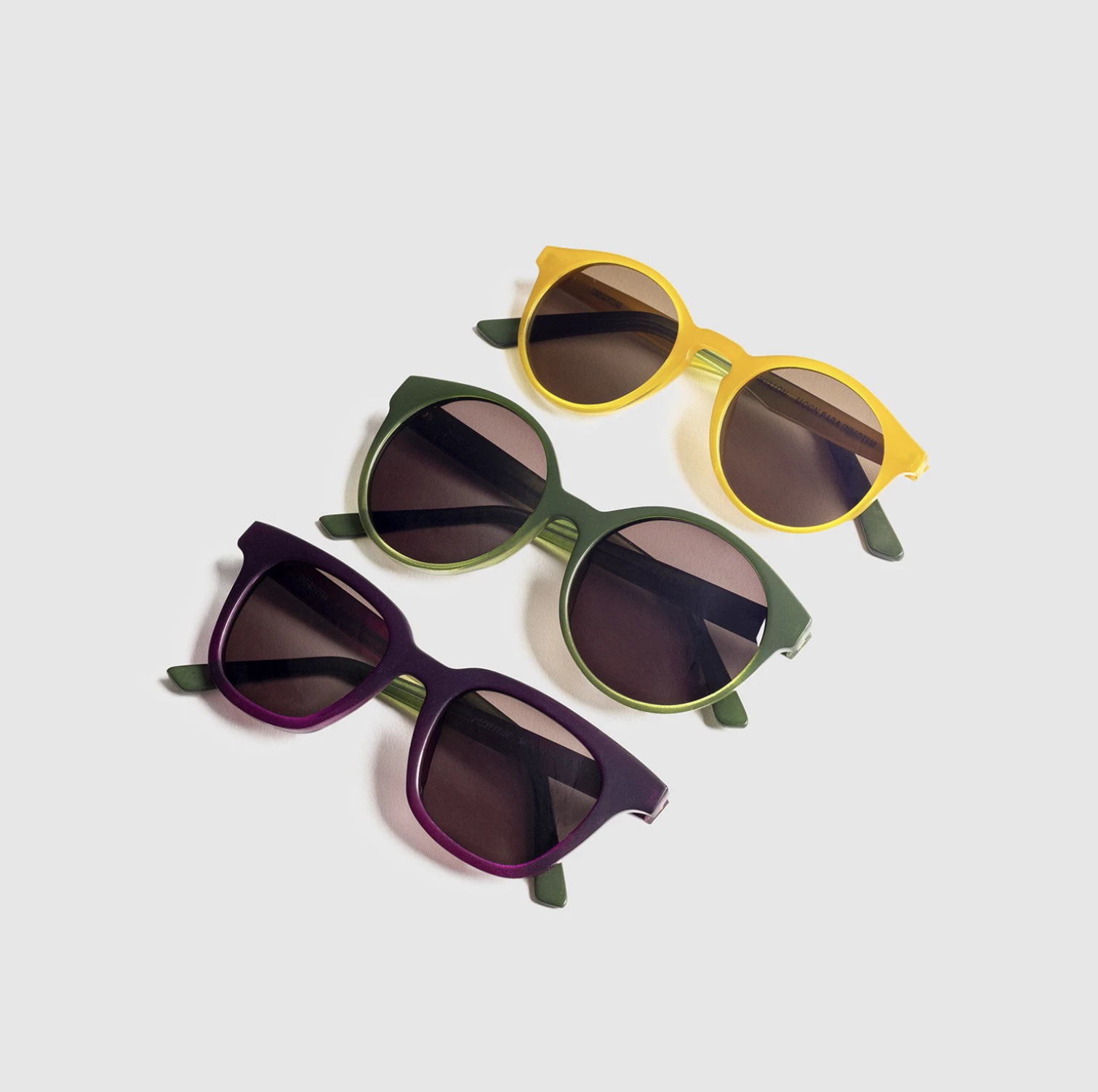
Standout Features:
- Cute tiny doodle art
- Engraved elements
- Gradient-based frames
The next best eyewear design on our list is created by Barbara Luppi. The agency found an uncommon similarity between the discovery of chlorophyll and the essence of the Inhotim eyewear brand — both the scientists and the brand wish to assimilate the known and transform it into something new.
This is best reflected in the Phyllon line, which celebrates nature’s transformative palette through gradient-based frames that transition subtly between hues, evoking the beauty of natural light.
Phyllon appeals to consumers who appreciate a blend of scientific homage and artistic expression. Current trends in eyewear favor such organic, hand-drawn details and subtle color transitions, positioning the Phyllon Collection at the forefront of modern design.
14. Arte Optik USA by Ruben Chamusca
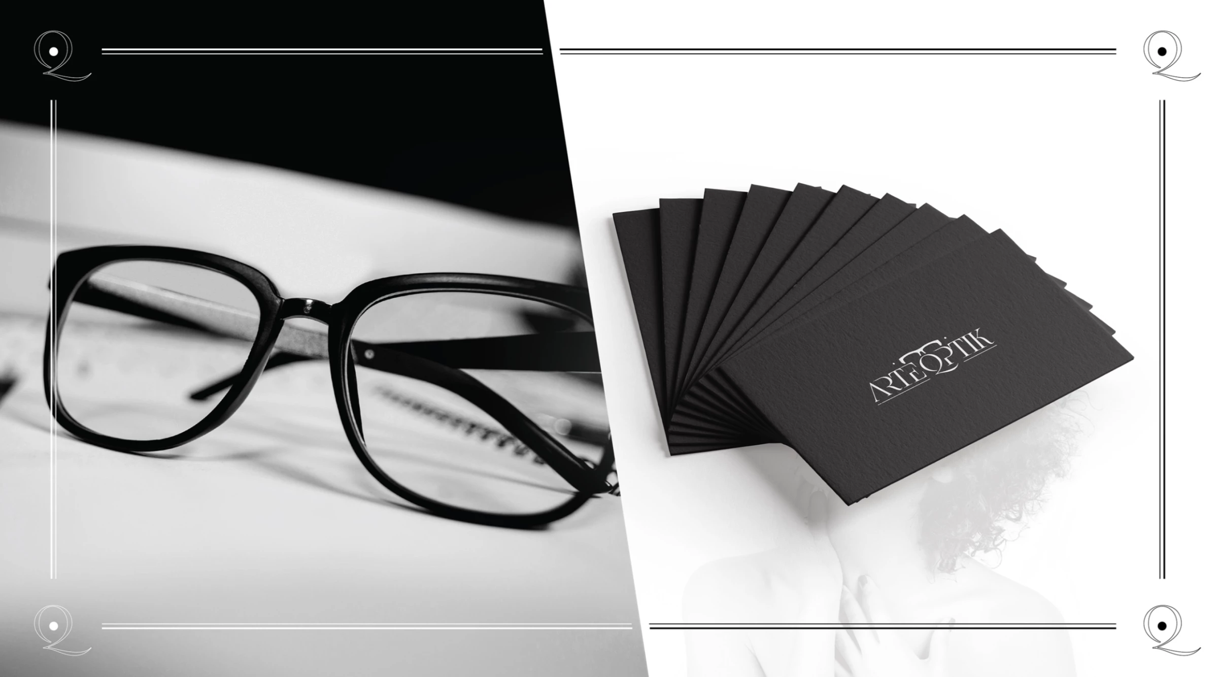
Standout Features:
- Modern, minimal, and elegant
- Monochromatic visuals
- A distinct logo design
Arte Optik wants you to see the world through their lenses. Ruben Chamusca created a modern, minimal, and elegant approach to eyewear branding, inviting customers to view glasses as a refined accessory rather than a mere functional tool.
Chamusca’s design features a distinctive minimalist logotype where an elongated “Q”— in place of a conventional “O” — creates a subtle, clever nod to eyewear. The marketing materials and merchandise are minimal and monochromatic, adding another sleek touch to the overall elegance of the brand. Meanwhile, the packaging boxes are entirely black, with only the logo printed on the center of the case.
Targeting discerning professionals, fashion-forward individuals, and design enthusiasts, Arte Optik USA appeals to those who appreciate understated luxury fused with innovative design.
15. Holysun Eyewear by Wellington Oliveira Design

Standout Features:
- A multifaceted logo design
- Sunny yellow and mysterious black
- Simple geometry
Wellington Oliveira Design created a branding solution for Holysun Eyewear. Drawing inspiration from the sun, eyes, and an angel’s halo, the branding emphasizes the sacred value of vision.
Holysun’s branding extends beyond the logo, incorporating abstract circular patterns across packaging, business cards, and merchandise. These designs blend black, yellow, and white elements, creating dynamic visuals that maintain a sense of harmony and refinement.
This eyewear branding speaks to an audience that values style and meaning in their accessories. The blend of spiritual symbolism and modern minimalism sets Holysun apart, positioning it as a brand that transcends fashion to emphasize vision as a treasured gift.
Through its thoughtful design choices, Holysun Eyewear delivers a brand identity that is both visually impactful and deeply meaningful.
16. EYEVAN 7285
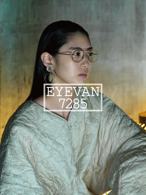
Standout features:
- Japanese-architecture-inspired lines
- High-fashion aesthetics
- High-contrast visuals
EYEVAN 7285 fuses cutting-edge technology with high-fashion aesthetics, establishing a brand identity that’s as innovative as it is functionally robust. The visual identity is marked by sleek, Japanese-architecture-inspired lines and bold accents that immediately signal modernity and precision — a design ethos that mirrors the advanced performance of its eyewear products.
Targeted at tech-savvy, trendsetting professionals aged 20 to 40, EYEVAN 7285 resonates with individuals who value both cutting-edge style and practical performance. The brand’s aesthetic appeals to dynamic consumers who balance a fast-paced lifestyle with an appreciation for innovation. They seek accessories that not only complement their modern wardrobe but also enhance their everyday functionality.
EYEVAN 7285 capitalizes on the minimalist and geometric influences prevalent in today’s eyewear market, resonating with modern consumers who demand excellence in every aspect of their eyewear.
17. Vontelle
Vontelle fuses vibrant cultural heritage with precision engineering, creating eyewear that is as visually striking as it is functionally impeccable. Drawing inspiration from African and Caribbean aesthetics, each pair of Vontelle frames boasts bold, unique patterns and vibrant colors reminiscent of traditional textiles like mud cloth and kente cloth. The designs pay homage to African, Caribbean, and Latin heritage, empowering wearers to see the world through a culturally enriched, global lens.
In line with current design trends, Vontelle blends traditional motifs with modern aesthetics, offering eyewear that is as much a cultural statement as it is a fashion accessory. The infusion of bold patterns and vibrant hues mirrors emerging trends in eyewear design, where heritage and innovation intersect.
The brand’s striking designs have attracted notable figures such as Steve Harvey, Marcus Samuelsson, Fat Joe, and Queen Latifah, underscoring its status as a statement accessory for those who demand both style and substance.
Eyewear Design & Branding Trends
Trends in the eyewear industry are driven by shifting consumer preferences, technological advancements, and bold design thinking. Here are some of the most notable ones shaping both eyewear product design and brand identity:
- Minimalist aesthetics: Clean lines, neutral color palettes, and geometric forms are the new faces of modern eyewear. Many brands are leaning into minimalism to highlight the craftsmanship and let quality speak for itself.
- Sustainability: Today’s consumers care about how products are made. Brands are stepping up with eco-friendly materials like recycled plastics, acetate alternatives, and even bamboo, turning sustainability into a key part of their identity.
- Customization & personalization: People want glasses that feel uniquely theirs. From lens shape to color and engraving and personalized touches, tailored designs are on the rise.
- Tech-integrated eyewear: With the rise of smart glasses and AR features, eyewear is getting smarter. The challenge (and opportunity) for designers is to make sure all that tech still looks stylish and wearable.
- Inclusive design: More brands are embracing inclusivity, offering a wider range of sizes, styles, and gender-neutral designs to serve diverse audiences.
Eyewear Design Takeaways
Eyewear has undergone a remarkable transformation, evolving from a simple vision aid into a powerful fashion and technological accessory. Over the centuries, innovations in materials, design, and functionality have shaped how glasses are used today.
Customization and sustainable materials have also gained popularity, reflecting consumer demand for both style and eco-conscious choices. As technology continues to advance, eyewear is becoming even more integrated into everyday life, balancing aesthetics with functionality.
![]()
Our team ranks agencies worldwide to help you find a qualified partner to implement the latest AI solutions. Visit our Agency Directory for the Top Branding Agencies, as well as:
- Top Small Business Branding Agencies
- Top Product Design Companies
- Top Product Marketing Agencies
- Top Cincinnati Branding Agencies
- Top Brand Strategy Agencies
And don’t miss our Awards section, where we showcase the top agencies recognized for exceptional creativity and impact.


-preview-webp.webp)