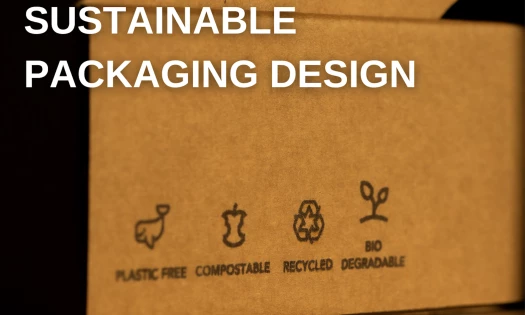
Developing a packaging design can be a tedious job or a cherished art. It all depends on who you ask. While some see boredom, talented packaging designers seize this opportunity to express their creativity.
However, when designing a packaging box, creativity must respect the arrangement’s most vital objective: to reflect and enhance the product it shelters.
What differentiates brilliant from good is the ability to represent the brand’s mission, values, and visual identity through the right colors, prints, typography, and materials. Think of all the mentioned elements as pebbles. A masterful box packaging design separates a bunch of rocks from an elevated mosaic.
Here are some examples of the stunning box packaging designs that reflect their brands perfectly:
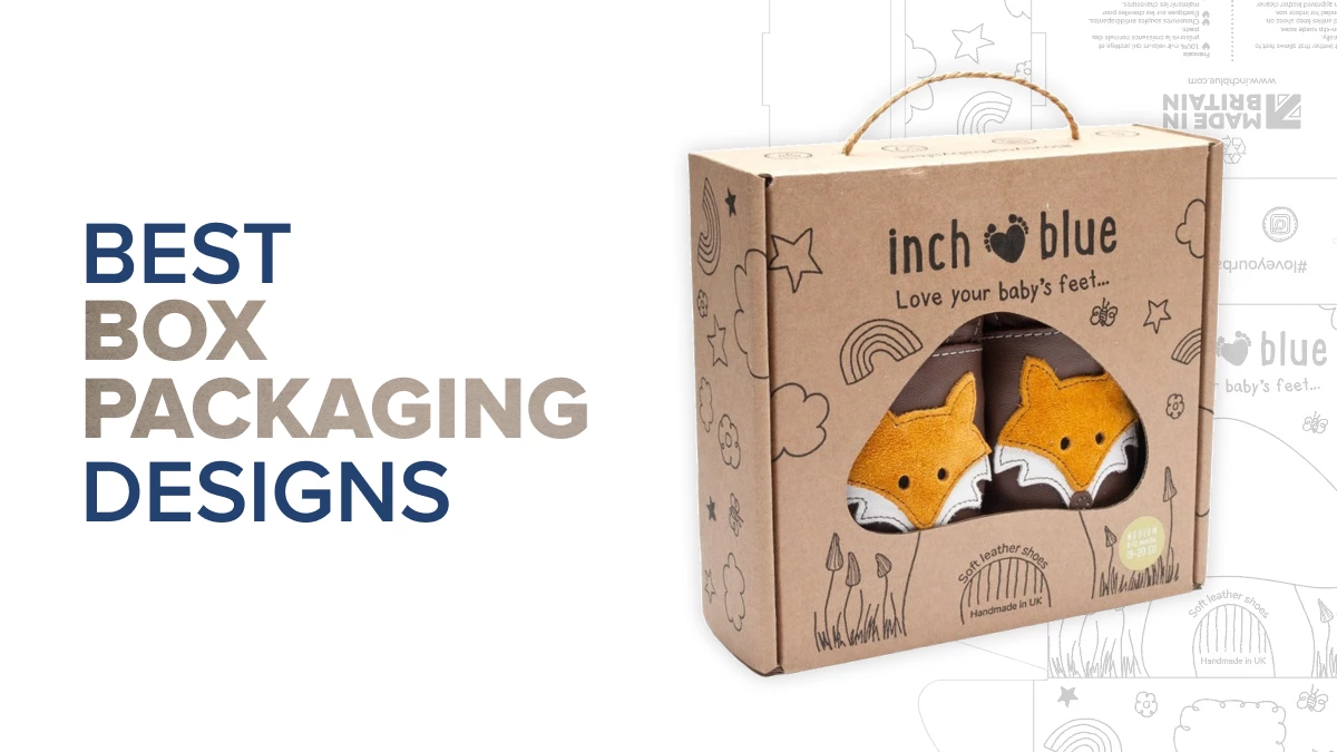
1. Inch Blue by Dora Laszlo
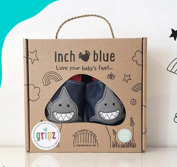
Standout Features:
- Cutout window
- Sustainable materials
- Cute, monochrome illustrations
Inch Blue is a leather baby shoe manufacturer based in the UK. More precisely, the brand’s headquarters is deep in the Welsh countryside, where they handmake their shoes with love and care. Inch Blue follows an ethical code of making toxic-free and eco-friendly products for newborns. The same goes for their packaging design.
Dora Laszlo understood the need to steer clear from plastics, so the leather shoes were placed in a custom-made cardboard box. The box is not painted, indicating a sustainable and safe approach. However, it’s full of cute monochrome illustrations that children would love.
One of the drawings includes a big mushroom in the center of the box. The mushroom head is cut out, emphasizing the product. Above it, you’ll find the brand’s logo print and a rope handle to help carry it around like a bag.
2. Regina Hazelnuts Dark Chocolate Packaging by Gaspar Costa
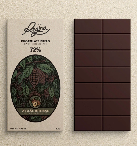
Standout Features:
- A minimalistic, vintage design
- Hand-drawn elements
- Depicting the ingredients
Regina is a renowned chocolate brand bellowed by many. Gaspar Costa is one of the loyal fans of the brand. And while he enjoyed the product, Costa concluded that the packaging design didn’t do it justice. So, he designed an alternative concept in an attempt to improve it.
Costa chose the dark hazelnut chocolate and opted for a complete visual representation of the fruit, stimulating the connection between the chocolate and the raw hazelnut taste. Through a vintage design, Costa reminded us of the long legacy of this brand.
The design is clean, decorated with a hand-drawn picture of hazelnuts on a tree, lush nature, and muted colors (green and brown). The centered illustration is cleverly outlined by a thick black frame, providing more depth.
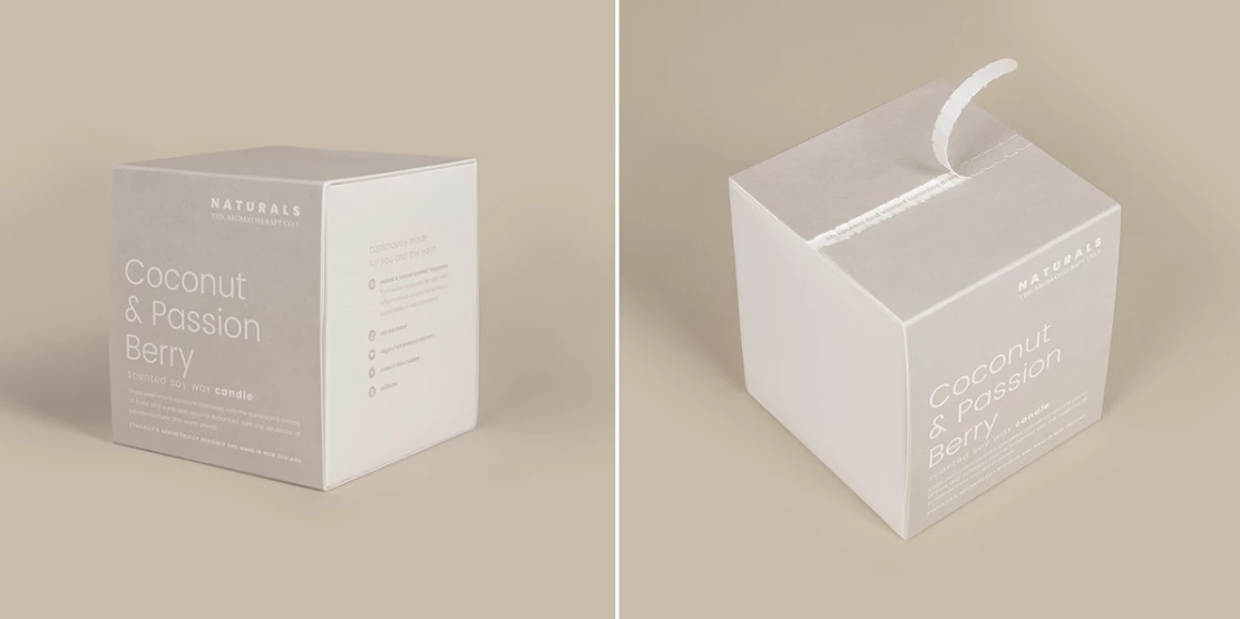
3. NATURALS by Sarah Johnston
Standout Features:
- A clean design
- Eco-friendly materials
- Embossed typography
NATURALS is a perfect example of the old Latin phrase, “Nomen est omen,” since the name signifies the brand’s values and identity. Naturally, the packaging design needed to reflect this as well. Sarah Johnston helped the brand reinvent the packaging design to show how important sustainability is to the brand.
The new design is based exclusively on recycled materials and a cotton card from the textile industry fabric off-cuts. Laminates and foils were removed or replaced with vegetable oils to preserve their total and easy recyclability.
The packaging shapes vary, but there’s a ubiquitous note – each package maintains a clean design that takes advantage of the positive space. It’s decorated with soft and gentle font choices, so the overall atmosphere of the design is soothing.
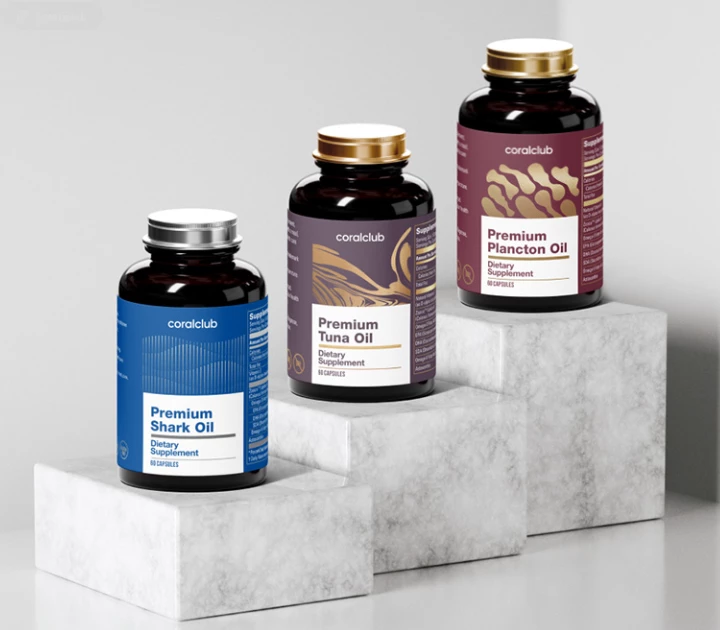
4. Coral Club Oils by PaninDesign
Standout Features:
- Liquid and abstract design elements
- A pastel color palette
- A prominent label
Coral Club Oils produces high-end biologically active additives like shark, tuna, and plankton oils. And PaninDesign made sure its packaging design was as transparent and premium as the brand’s products.
Each bottle contains a 360-label wrapped around it. The label is prominent in color, visuals, and text. It is full of vital information about the oils, including the dosage, recommended ways of consummation, and a thorough list of the ingredients.
Variations are differentiated by the color of the label and the intriguing visuals that represent the marine life crucial for the production of the particular item. The labels feature pastel colors – Bordeaux red for plankton oil, purple for tuna, and blue shark oil.
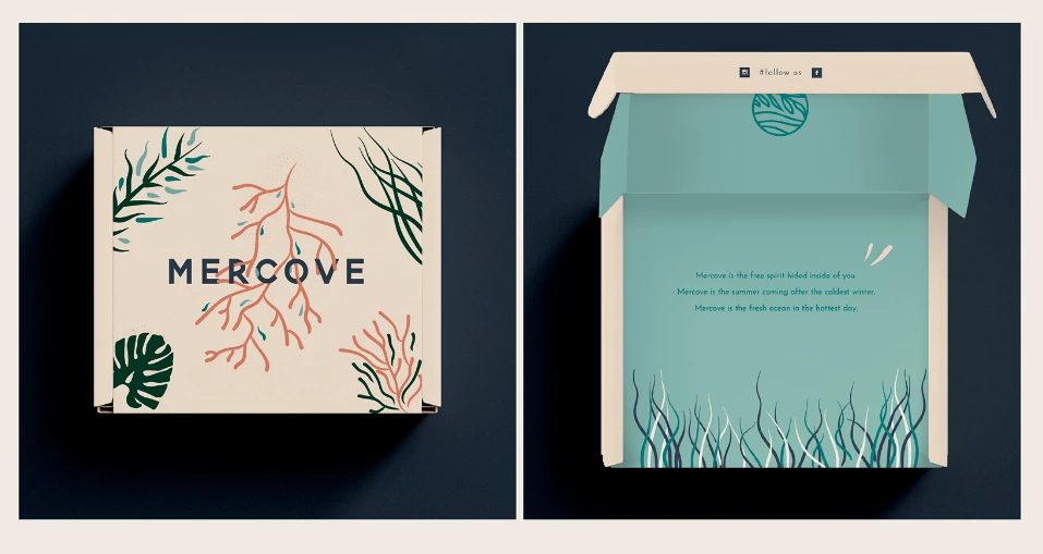
5. MERCOVE by Erica Fierro
Standout Features:
- Natural vibe
- Soothing messaging inside
- Sea world variations
MERCOVE is a swimwear brand looking for a way to express the essence that inspires its products. It needed a way to show its vibe and let the customers form a connection with the shared values. Erica Fierro helped the brand by encapsulating the feelings and atmosphere in a unique, feminine box packaging design.
The box is decorated with calming illustrations representing the wildlife of the sea world. Various colors and shapes printed on the main panel and on the inside help convey the message that women should accept their bodies and all of their unique natural qualities.
The combination of the natural and feminine soothing atmosphere is crowned by sweet messages about MERCOVE placed on the inner side of the packaging.