As more and more people move towards a healthier lifestyle, the demand for sustainable food options continues to spike up. In 2020 alone, the vegan food market reached a whopping $23 billion.
It’s a fast-growing market, indeed!
That’s why now more than ever, plant-based brands need to step up their presentations to cater to this ultra-specific yet vastly expanding market. Enter the best branding agencies on the market!
Creating a distinct, recognizable, and all-natural visual identity is the key to standing out, especially if you’re marketing a specialized product like vegetarian food items.
To get you inspired, we’ve rounded up the best plant-based visuals that show how a meaningful and appealing design can convince a consumer to switch to healthy living.
1. Double Zero by Truffl

Standout Features:
- Dark theme
- Minimalist layouts
- Clean and simple typography
Inspired by the regional cuisine of southern Italy and home to the traditional Neapolitan Pizza, Double Zero is a plant-based food chain with a cult following. To satisfy the brand’s loyal consumers, Truffl put its design and food branding expertise to good use by creating this packaging beauty.
We have a pizza box that’s totally out of the ordinary. Double Zero comes in a pitch-black package in a sea of brown and white boxes that visually capture its exotic and high-end character.
The standout feature here is the two die-cut holes representing the two-letter Os in Double Zero. With this style choice, buyers get a peek at the actual pizza without opening the box. And from a design perspective, it adds a nice pop of color to the dark, minimalist aesthetic!
Since it’s known for using green, local, and handmade ingredients, the brand’s green and fresh quality is showcased via straightforward product labels. Tags like “unprocessed” and “natural ingredients” instantly notify the consumer that, unlike other pizzas loaded with calories, Double Zero is a healthy option.
2. Kestrel Kitchen Nut Butters by Zeki Michael Studio
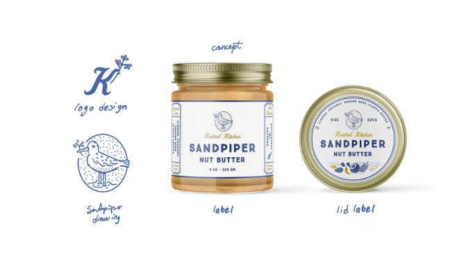
Standout Features:
- Varied product designs
- Bird-inspired branding
- Handmade-quality illustrations
Kestrel Kitchen is a small homegrown brand that makes delicious nut and seed butter for gluten-free lovers. To show its artisanal character, Zeki Michael Studio created a branding and packaging design that speaks to the heart of every plant-based enthusiast.
Like most spreads and dessert toppings, these kinds of butter come in jars, which is the standard packaging for such food items. What made them extra special is aside from being the healthier option, the product variants come in different presentations as well.
Each flavor is designed uniquely in terms of color and illustration. The brand’s main symbol (a bird) comes from different species.
Why birds, you ask?
According to their project brief, Kestrel Kitchen is best represented by birds and their relationship with nuts and seeds. Each bird has a different character, but they all give joy and spread a positive feeling to their surroundings.
Lastly, to designers followed a standard layout: a clean white canvas, handwritten typography, and doodle-style graphics to keep everything cohesive.
3. Sainsbury’s SO Organic by BrandMe

Standout Features:
- Nature-inspired visuals
- Transparent packaging
- Green color story
BrandMe exemplified the best practices of plant-based branding and packaging through this design project for Sainsbury’s SO Organic.
As the name implies, the company has prided itself on creating organic and healthy food items for over two decades. That’s also why they tapped the design agency’s rebranding expertise to create a fresh, bold, and exciting look.
The new identity is all about living in harmony with nature, and the visuals for all the brand assets effectively reflect that. With green as the primary color, the company’s fresh and all-natural produce is appropriately highlighted. The gradient leaves are used as recurring illustrations for the print designs, and the packaging is also a great touch.
Speaking of packaging, the product presentations are transparent – literally. The packaging material lets buyers see the actual product from the outside. Of course, they didn’t forget to put honest labels like “no added salt,” “organic,” and so on.
With this rebranding strategy, SO Organic achieved its goal to celebrate the natural imperfection of organic produce while reassuring consumers of the premium quality and expertise that Sainsbury’s name brings to the range.
4. Almanati by Melt Design

Standout Features:
- Pastel color theme
- Eco-friendly packaging
- Minimalist aesthetic
Almanati is a Brazilian cosmetics brand that aims to “bring health to people and the world” through all-natural products made of organic and biodynamic raw materials. Melt Design did an excellent job creating a visual identity that translates such a valuable proposition.
They used a minimalist approach to designing the brand assets. Through bright and pastel colors, outlined illustrations, and simple typography, they could visually convey the brand’s stripped-back character.
Like their products, the packaging is also eco-friendly.
They used green polyethylene material, which is plastic made from sugarcane. The packages also carry the “I'm Green” seal to indicate that the paper comes from good forest management and the FSC seal – a big nod to sustainability!
In addition to the material choices, the designers added tags to the layouts that contain relevant information for each product. They stamped labels like “100% natural” and other product compositions that generate the least possible impact on the consumer and the environment.
5. Rebl Chef by Laura Voet
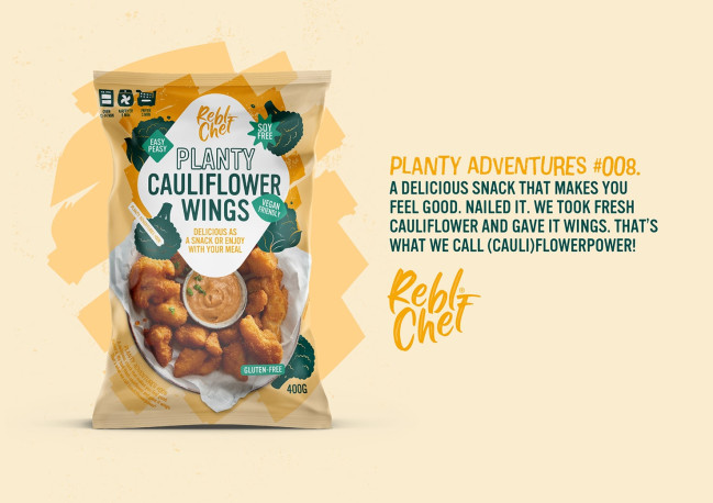
Standout Features:
- Badge-style labels
- Gourmet product shots
- Ingredient illustrations
Rebl Chef serves “feel good food” through their yummy and accessible plant-based alternatives on the retail shelf.
To communicate this brand character to the health buffs, Laura Voet whipped up a corporate identity and packaging design that looks good and takes everyone on daily vegetable adventures.
The fun and eccentric graphic design is the perfect vehicle for such a brand mission. The designer used a spectrum of colors to give every product variant its distinct flavor profile and identity.
They took it even further by adding rugged illustrations of the food’s key ingredients scattered throughout the layout. To ensure that consumers on a plant-based diet are getting the proper snacking fix, they added badge-style tags “soy-free,” “vegan-friendly,” “gluten-free,” and so on.
Aside from these food items being a healthy option, one can’t simply forget that Rebl Chef makes gourmet-quality food. To highlight this, every packaging showcases a beautifully shot gourmet presentation of the product. With this, every package looks like it came straight out of the Chef’s kitchen!
6. Tiptoh by Broos

Standout Features:
- Straightforward product descriptions
- Graphic bars and icons
- Integrated brand story
Every Tiptoh milk box isn’t just a product – it’s an experience. This is what Broos design agency had in mind when creating the visual identity and packaging for Tiptoh, an innovative plant-based drink made from split peas.
At the front of the box, we get to see the pea-inspired logo taking almost half the space of the layout. Visibility, check! Thanks to its straightforward presentation, buyers can instantly identify that this milk goes well with their diet.
Moreover, the “no milk just peas” brand statement sits underneath the logo for instant recognition. They didn’t forget to put the nutritional facts front and center and visualized them through badge-style icons representing each transparency label.
These elements, laid out on a plain white canvas, allowed for a clean and streamlined presentation. The use of graphic bars also kept everything organized and not too text-heavy.
To create brand affinity, they also integrated the brand’s journey, mission, and achieved goals into the packaging design.
7. Solely Fruit Jerky by Workshop Branding
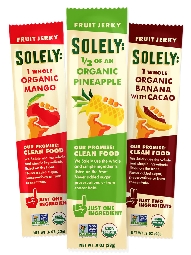
Standout Features:
- Vibrant color story
- Hand illustrations
- Certifications and product seals displayed
With just one, two, or three ingredients per strip, Solely’s Fruit Jerky is well on its way to becoming every health enthusiast’s go-to snack. This all-natural and stripped-back character is perfectly visualized in this branding design courtesy of Workshop Branding.
One of the most noticeable qualities of this design is the color story. They took vibrant and flashy colors like reds, yellows, and greens and mixed them to create that massive color pop. An absolute standout on the market shelves!
To add some character to these packets, the designers added various illustrations of a hand,; one holding the fruit jerky and one pointing to the brand’s story and mission on the front of the package.
To show that Solely delivers on its promise to offer clean food, the packaging has been stamped with the appropriate certifications like “USDA Organic,” “100% vegan”, and “Non-GMO Project Certified.”
Having this many visual elements and text descriptions, the use of a single sans serif font made the typography easy to digest (pun intended).
8. Bamboo Vegan by Hut Creative Studio
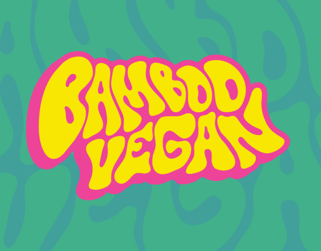
Standout Features:
- Funky logo redesign
- Two-toned aesthetic
- Gradient colors
As the name implies, Bamboo Vegan is a vegan café & mini market in Athens, Greece, that’s been in the business for a decade now. Hut Creative Studio stepped in to create a new visual identity for the brand, bringing an improved and modernized visual.
Here’s the result – a fun and playful branding strategy that re-establishes the company in a modern plant-based marketplace.
One of the most visually satisfying things to come out of this project is the new and improved logo. What used to be a plain, one-dimensional ensemble has been transformed into a unique visual that displays the brand name in a distorted, retro fashion. It’s got the funk!
With this creative brand presentation stamped in front of the establishment, every passerby’s attention (even that of the non-vegans) is sure to get hooked.
Lastly, the gradient-style blending of bright and vibrant colors like pinks, oranges, yellows, and greens followed the brand’s retro aesthetic.
9. Plantein by Date of Birth

Standout Features:
- Loud and vibrant color pops
- Graphic illustrations of natural ingredients
- See-through packaging
Plantein is an Australian brand that is not only good for the people, but also for the planet. The company’s range of meat-free products is geared towards growing the “flexitarian” market, so needless to say; they had to stand out on the loaded shelves.
By the way,Date of Birth designed their visual identity, achieving that goal.
The food items come in several design variations, but they differ primarily in color. The designers went with vibrant primary colors to make these plant-based alternatives pop beside other options.
To bring out its cruelty-free character, the designers created fun illustrations of the foods’ natural ingredients and integrated them across all brand assets. They paired these graphics with sharp and high-contrast product images to satisfy consumers visually.
Not to mention the minimalist typography, which effectively balanced out this loud and outgoing character. Using a single font from the logo up to the product labels translated to a clean, polished, and natural look.
10. Portland Salad Company by Design Vegan
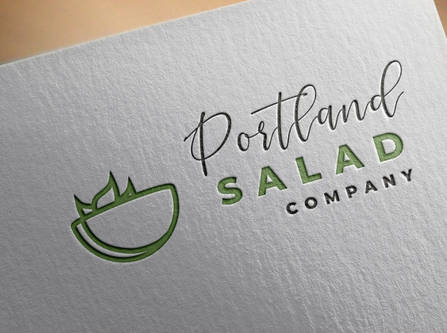
Standout Features:
- Modern and sophisticated logo design
- User-friendly website layout
- Clean and simple typography
In a competitively growing vegan market, Portland Salad Company is one of those startups that needed an extra branding push to make its products shine.
So, the company collaborated with Design Vegan for a new visual strategy, which is truly remarkable. The designer created a logo and web design that perfectly translates the company’s forward-thinking values and positioning.
The logo features a graphic illustration of an outlined salad bowl, which is still instantly recognizable from the get-go even with the minimalist aesthetic. Besides the symbol, the brand name is displayed in tandem with handwritten and sans-serif fonts for simple sophistication.
The website gives a modern, intuitive, and convenient experience in getting your daily salad dose. Accessible buttons, a responsive interface and overall comfortable navigation make for a user-friendly online vegan journey.
11. Grated by Jade Agard Design

Standout Features:
- Bright and fun colors
- Doodle-style visuals
- Simple typography
Dairy-free cheese alternatives are some of the most popular vegan options. With the mission to become the best option on the market and to bring a tasty visual treat to plant-based consumers, Grated tapped the design services of Jade Agard.
And the result? A total success!
One of the most visually satisfying aspects of this design is its equal blend of maximalist and minimalist elements. In a rack full of vegan options, Grated immediately catches the eye with its vibrant packaging. The blocks of cheese are wrapped in sheets of purple and orange for that instant color pop.
The agency filled the empty spaces with doodle-style illustrations of cheese variants, adding more oomph to the design.
To keep things streamlined, they went with a single sans serif font for all the product descriptions, nutritional facts, and other tags. Not forgetting the mandatory plant-based seal that says the brand is 100% dairy-free!
![]()
Our team ranks agencies worldwide to help you find a qualified partner to implement the latest AI solutions. Visit our Agency Directory for the Top Branding Agencies, as well as:
- Top Brand Positioning Firms
- Top Small Business Branding Agencies
- Top Product Design Companies
- Top Product Marketing Agencies
- Top Cincinnati Branding Agencies
And don’t miss our Awards section, where we showcase the top agencies recognized for exceptional creativity and impact.