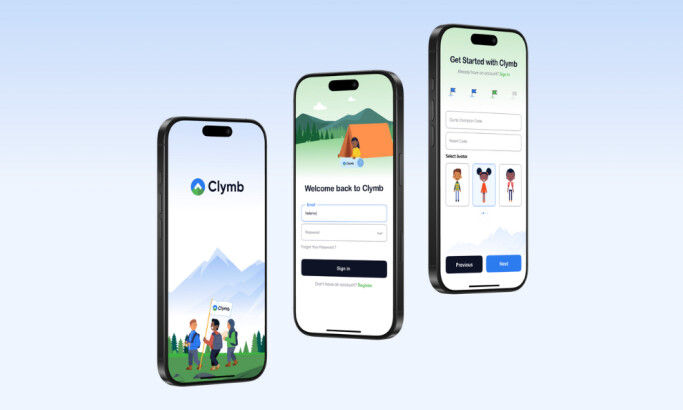
Hyre’s App Design Is a Multi-Faceted Package Neatly Presented in a Modern Interface
Hyre is a complex digital HR platform that provides a more streamlined approach to managing a shift-based workforce.
It offers a convenient way to create and organize employee schedules and source quality staff for events, particularly in the healthcare and hospitality industries.
Simply put, it’s the 21st-century alternative to the rather outdated systems of traditional staffing agencies.
The challenge for the app designer, Passionate, was to efficiently and aesthetically arrange the software’s huge basket of features on the app. With heaps of pages to present, the agency managed to condense the extensive information on a desktop or mobile screen – all without compromising the program’s usability.
To achieve this, mobile app developers should come up with straightforward and easily accessible and discernible sections. Passionate achieved this with flying colors.
Upon logging in to the system, users get to view a simple dashboard that shows a preview of their ongoing and upcoming tasks.
The sidebar interface modernizes the desktop app design. It provides comfortable navigation and a wider space for workforce planning. This space lets users access the main menu for the various pages along with several outlined icons that perfectly represent the tools in the system.
On the mobile app, these sections can be accessed via the hamburger menu, and the different sections are arranged in a list view for a clean and organized presentation.
All-Encompassing Page Design Sums Up Key Staff Management Functions
The calendar view is a great way to let users conveniently drag and drop employee names into the date boxes for quick staff scheduling. Alternatively, it allows the employees to select their shifts themselves. Creating singular or recurring shift schedules can also be done with a click of a button.
The designers included digital timesheets to eliminate the hassle of manually calculating total hours worked and overtime shifts. Also, a separate timesheet dashboard is added to notify users about critical shift discrepancies like unverified or missing clock-in and clock-out times.
Additionally, users can utilize digital time clocks to punch in and out of their shifts on the mobile app. With this, time tracking won’t be such a huge stretch!
The mail icon opens up a built-in team messaging tool that looks like your typical direct messaging layout. It’s divided into two parts: an inbox and a messaging thread, allowing teammates to message each other like how they would on Facebook Messenger. That goes without saying they can create group chats, too.
When it comes to organizing multiple departments and facilities by hierarchy, this app design ticks the boxes as well. Users can customize their staff by facility or department across multi-level users with independent privacy settings.
That’s without mentioning the Hyre app design’s Diary Feature, which helps users organize all their sessions into a single profile that displays relevant information like their calendar, digital passport, finances, and so on.

Hyre’s Job Marketplace Design Provides a Convenient End-to-End Staffing Journey
Sourcing quality staff and signing up for great shifts is a breeze on this app.
On the employer’s end, users get to view a simple yet detailed profile of potential candidates for staffing. The resume-style view includes vital information like personal data, qualifications, experience, completed jobs and so on.
They can also narrow down the search by using the convenient shift building feature. This allows users to indicate their staff preferences that suit a particular shift schedule. They can set certain parameters like the experience level, hourly wage, past ratings, uniform, certifications and other requirements for the job.
At the career-seekers end, the app displays a rundown of available shifts containing important details about the job. That includes the job title, company, date and duration of the shift, rate and location.
Jobseekers can also use the calendar view to fill gaps in their schedules with the jobs available on the marketplace. Similar to employers, they can set specific parameters for their job search.
For instance, they can search for shifts based on their preferred location. The app’s job search bar lets users choose their assignments by proximity and availability. They can also view a map that shows the event's exact location and get directions to the area.
Hyre's List Style Mobile App Design Makes Financing and Documentation a Breeze
As an all-in-one solution, Hyre handles the process of workforce management from start to finish. As such, it contains the essential tools for doing paperwork and settling payroll for completed shifts.
Arranged in sections, these features are represented by instantly recognizable outlined icons. The “My Documents” section contains an organized view of all documents sent and received by users through the app.
The Payments section opens up a dashboard that displays all invoices for individual shifts. Aside from the details and amount, the app design also included a status bar that indicates whether the invoice is pending, paid, due, overdue, or whatnot. And for greater focus and distinction, they come in different colors.
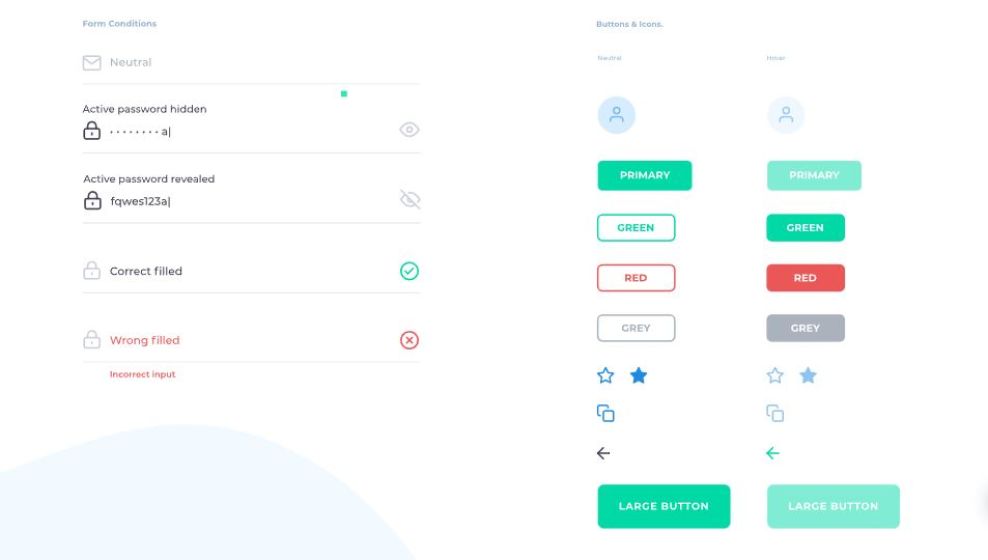
Fresh Colors Translate to a Better User Experience
For a tool with such a complex character, the usual design route is to use a spectrum of colors that represent variety. The app designers, however, steered clear of that direction. Instead, they used a simple color story to keep things clean and cohesive.
A gradient of blue, violet and green offers a cool and refreshing experience that’s rarely used in the workforce niche. This is a complete departure from the usual presentations that are too straightforward and industrial.
By using fresh colors, Hyre immediately gives off a fun and approachable vibe, which is something that translates well for staff-seekers and jobseekers. The blocks of color are also bright and vibrant enough to stand out in a mostly white app canvas.
The addition of bold colors like greens, reds and yellows as status indicators is also great for aesthetics and functionality. Having these color distinctions, especially on the calendar view, adds to the app’s overall usability and user-friendliness.