
Naming might seem like a small detail in design systems, but I’ve learned it’s crucial.
A clear, consistent naming convention makes components easier to understand, scale, and navigate. Get it wrong, and things quickly get messy.
But here's the good news: It’s simpler than you might think.
So, let me share what naming conventions are, common mistakes to avoid, and best practices that make design systems more collaborative and effective.
Design System Naming Conventions: Key Points
- 65% of design teams report confusion and slowdowns due to inconsistent naming conventions in design systems, leading to rework and missed deadlines
- Clear naming conventions can increase component reusability by 40%, enabling teams to reduce duplication and maintain consistency across projects.
- 52% of users say they’ll leave a website if its design isn’t visually appealing. Consistent naming conventions ensure cohesive designs that align with your brand’s identity and foster trust.
What are Naming Conventions for Design Systems?
Naming conventions are the rules for how you call elements in your design system. They ensure everyone on the team refers to the same thing by the same label.
Let’s say you’re working on a product design development project. For this website, one person calls a button the “home button,” someone else calls it “main nav,” and another just says, “top button.”
Such a mix-up can lead to confusion, slow down your workflow, and make collaboration more challenging.
That’s why naming conventions exist. They keep things clear, simple, and organized for you and your team. But to be effective, your naming conventions must be consistent, descriptive, and most of all, easy to understand.
Where Should You Apply Design System Naming Conventions?
Design system names can be applied to many different parts.
Whether you're building a modular web design, designing a mobile app, or creating a full product interface, naming conventions keep everything organized.
Here are some areas where design system naming conventions come in handy:
1. Colors
You use colors in every part of your design, from the buttons to your backgrounds.
But using different shades of the same color without a clear system can quickly break the visual harmony you're trying to create. And that matters a lot.
On top of that, colors play a significant role in branding.
When you stick to consistent brand colors, you help build recognition and awareness. Over time, those colors become part of your identity, making your brand feel familiar and easy to remember.
Yes, it can be tricky to develop naming conventions for colors, especially when working with an extensive palette. But the important thing is to choose a system that works for you and your team.
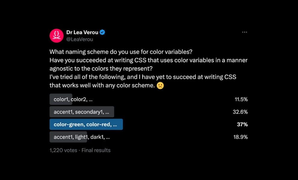
Dr. Lea Verou, Product Lead at Font Awesome, even ran a survey on X to explore how designers name colors in their systems. The results showed just how varied naming approaches can be and that there’s no one-size-fits-all solution.
2. Typography
Type choices directly shape the functionality of digital interfaces. That’s why naming conventions around text styles are an essential part of any design system.
These usually cover:
- Category
- Size
- Style
- Attribute
- Font Family
- Variant
Using names like these helps you apply the correct style quickly and consistently.
If you ever need to make changes, such as updating the size of all headings, you can simply update them in one place rather than going through each element individually. This saves time, keeps your typography clean, and makes your whole design system easier to manage.
3. Spacing
Now, aside from spacing in your typography, there’s also spacing for padding, margins, and gaps between elements. These small details make a big impact on how your design looks and feels.
When you use a consistent naming convention for spacing, it becomes much easier to apply the proper spacing across your design. This helps create a clean, organized layout that feels balanced and visually pleasant.
After all, 52% of users will leave your website, never to return again, if it’s not visually appealing.
Manually entering spacing values every time only slows you down. It can also lead to inconsistencies and small mistakes. With named spacing tokens, you simply choose the one you need, which speeds things up as you go.
4. Components
Here’s another design element that benefits from clear naming: components. These include things like:
- Buttons
- Inputs
- Cards
- Modals
- Dropdowns
And more!
Using a consistent component naming convention makes it easier to reuse them across your project. It also helps your team avoid building the same thing more than once or getting confused about which version to use.
5. Icons
Just like components, icons also need proper naming conventions to keep your design system organized and efficient. You’ll often use icons for:
| Category | Icon | Examples |
| Navigation | Home | icon-home |
| Back | icon-back | |
| Menu | icon-menu | |
| Actions | Edit | icon-edit |
| Delete | icon-delete | |
| Add | icon-add | |
| Download | icon-download | |
| Status | Success | icon-success |
| Error | icon-error | |
| Warning | icon-warning | |
| Info | icon-info | |
| Social Media | icon-facebook | |
| icon-instagram | ||
| Media Controls | Pause | icon-pause |
| Play | icon-play | |
| Volume | icon-volume |
This also helps developers during handoff. They won’t have to guess which icon matches which function, as they will know exactly which one to use just by looking at the name.
6. States
States show what’s happening in the interface based on how a user interacts with it. For example, when a user hovers over a button, clicks it, or when a button is disabled, these are all different states.
| State | Description | Example |
| Default | The button’s normal appearance | button-primary |
| Hover | When the user hovers over the button | button-primary--hover |
| Active/Pressed | When the button is being clicked | button-primary--active |
| Focus | When the button is focused via keyboard | button-primary--focus |
| Disabled | When the button is not clickable | button-primary--disabled |
| Loading | When the button is processing an action | button-primary--loading |
Using clear naming conventions for states makes it easier for developers to apply the right styles. It also helps designers keep track of how components behave in different scenarios, so the experience stays consistent across the product.
Mistakes in Design Systems & How to Avoid Them
As I’ve mentioned, the goal of naming conventions is to help your team collaborate smoothly and avoid confusion.
But to really make that happen, you must steer clear of a few mistakes that can get in the way:
1. Assigning vague names
When names don’t clearly describe what something is, it becomes difficult for anyone, even the person who named it, to understand its purpose later on.
To prevent this, use descriptive names that clearly indicate what the element is or how it’s meant to be used.
| Bad Name | Better Name | Why it’s better |
| box1 | CardContainer | Tells you it holds cards |
| style123 | HeadingLarge | Tells you it's a big heading text |
| buttonA | SubmitButton | Tells you it submits something |
2. Naming based on how it looks
Design elements often evolve, and if you change the appearance but keep the same name, it can become misleading. So, base your naming conventions on the element’s purpose or where it’s used.
This approach maintains accurate and useful names, even as the design changes. Here are some good examples:
| Bad Name | Better Name | Why it’s better |
| blueButton | PrimaryButton | It’s the main button, no matter the color |
| redText | ErrorMessageText | It shows an error, not just red text |
3. Mixing different naming styles
Using multiple naming styles across your design system can lead to confusion and make things harder to maintain. Sticking to a single naming format helps keep your system clean, predictable, and easier to use, like the following:
- PascalCase
- camelCase
- kebab-case
Select a format that suits your workflow or team's preference, and apply it consistently throughout your design system. Consider these formats:
| Mixed Styles | One Style | Why it’s better |
| card_title | CardTitle | Easier to read and find |
| text-title | TextTitle | Keeps everything the same style |
| buttonPrimary | PrimaryButton | Clear and organized |
4. Making names too long
Overdoing naming conventions can cause confusion. When names become too long or complicated, even if they try to explain their use and purpose, they can end up making things more challenging to read and understand.
Keeping names short, simple, and straightforward usually gets the job done more efficiently, like this:
| Too Long | Better Name | Why it’s better |
| MainComponentHeaderTopLeftNavLink | NavLink | Short and easy to find |
| FooterSectionSocialLinksRow | SocialLinks | Still clear, less cluttered |
5. Using temporary names
You’ve probably seen how some people name their files with names like 'final', 'finalfinal', or even 'finalfinalfinal'. This kind of naming doesn’t really help and often causes confusion down the road.
Instead of using temporary, vague names, it’s better to choose clear, definitive, and permanent ones that will make sense even after a long time. Try these naming conventions:
| Lazy Naming | Better Name | Why it’s better |
| final_button_style | SecondaryButton | Clear role, not temporary |
| new_text_style_2 | BodyTextSmall | Describes the size and purpose |
Design System Naming Conventions: The Wrap-Up
Strong naming conventions transform a design system from a loose collection of components into a cohesive, usable framework. They help teams speak the same language, reduce decision fatigue, and enhance design efforts without chaos.
As your product grows, so does the need for clarity and structure. Thoughtful naming is a foundational part of scaling strategies that actually work in the long run.
Design System Naming Conventions FAQs
1. How do you name your design system?
Set clear and consistent rules for naming everything in your design, including colors, buttons, typography, icons, and spacing. To do this, you should:
- Choose a simple and descriptive names that explain what each element is or what it does
- Pick one naming style and use it consistently across your system
- Avoid using vague or temporary names
The idea is to ensure everyone on the team uses the same names, so there is no confusion and work moves more efficiently.
2. What are the four naming conventions?
The four standard naming conventions that teams often use for design systems are:
- PascalCase: Each word starts with a capital letter (ex. PrimaryButton)
- camelCase: The first word is lowercase and each following word begins with a capital letter (ex. primaryButton)
- kebab-case: Words are all lowercase and separated by hyphens (ex. primary-button)
- snake_case: Words are lowercase and separated by underscores (ex. primary_button)
3. What are examples of naming conventions?
Here are some examples that show how clear naming conventions can replace vague or generic labels in different parts of a design system:
- Instead of buttonA, use SubmitButton to clearly show the button’s role
- Instead of blue1, use PrimaryBlue to describe the color’s purpose
- Instead of style123, use HeadingLarge to explain the style and size
- Instead of icon1, use icon-home to match the icon’s meaning

-preview-webp.webp)