I've spent time with dozens of leading fitness apps, and the winners all do the same thing: they make it easy to keep going.
For this list, I focused on retention, onboarding speed, and friction: how fast can a user act without thinking? Let's see the best 10 that show how intentional design turns user goals into lasting engagement.
Fitness App Design: Key Findings
- Design emotion into retention metrics: Emotional design cues directly influence day-7 and day-30 retention. Audit drop-off points and inject emotion where users disengage.
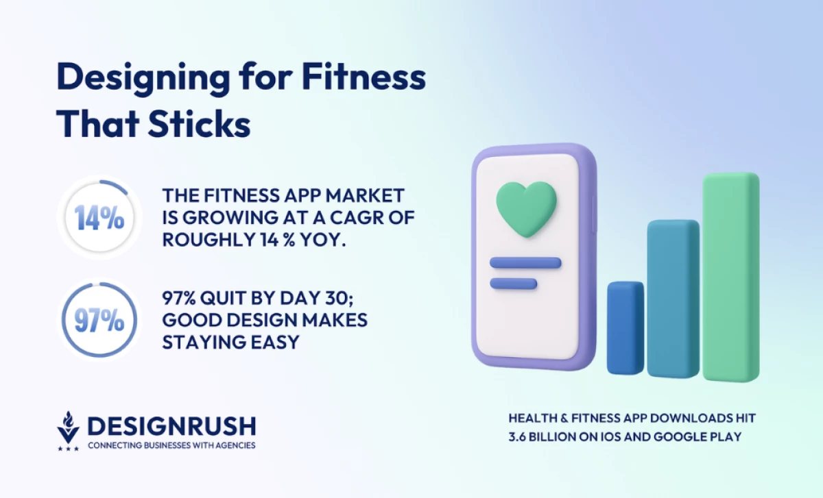
- Tie every design decision to revenue impact: The $3.98B fitness market rewards retention over installs. Find funnel drop-offs, redesign around habit triggers, and cut anything that doesn't lift LTV.
- Ruthlessly eliminate friction: 97% churn by day 30 from overload. Remove unnecessary taps, run 5-second clarity tests. Frictionless experiences scale; clever ones don't.
- Build for recognition, not just function: With 3.6B downloads, brands need instant recall. Define one signature UI element and systematize it across platforms and ad creative.
1. Strong: Best Fitness App Design for Strength Training
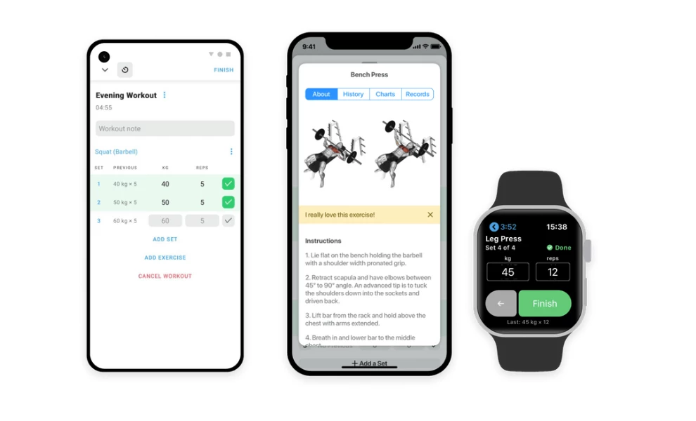
- Standout Feature: The thoughtful, data-first tools, like the visual plate calculator and in-workout rest timers.
- Key Takeaway: A fitness app design succeeds when it removes all friction from its core loop; Strong builds consistency by making the act of logging data fast and simple.
A great app design should guide users naturally from intention to action. Each screen, gesture, and color choice supports one goal: making consistency feel effortless.
Strong’s design is built for pure function. It acts as a powerful digital workout notebook that helps users stay focused and consistent.
The main interface is a data-dense logbook. A dark mode with green and blue accents is easy to read in a gym. The app clearly displays sets, reps, and weight, while a built-in rest timer automatically counts down between your sets.
View this post on Instagram
The design's intelligence is in its details. When you enter a weight, a pop-up shows a visual plate calculator. This tool tells you exactly which plates to add to the barbell and removes guesswork from your workout.
The app supports this core loop with a deep library of over 250 exercises, complete with animated instructions. It also provides clean, simple charts that visualize your progress in both your lifts and your body measurements.
2. ASICS Studio: Best Guided Workout App Design

- Standout Feature: The app's strong focus on audio-led workouts paired with clear visual guidance.
- Key Takeaway: Fitness app design can succeed by appealing to multiple senses; ASICS Studio uses motivating audio coaching and music alongside video to create an immersive workout experience.
ASICS Studio uses the brand’s deep blue palette with clean white space. This combination gives the interface a calm, athletic feel, which perfectly suits its audio-first workout model.
The app's core feature is its large library of audio workouts led by personal trainers. These sessions, from strength training to meditation, are backed by motivating music. The app's simple design ensures you can focus on the audio instructions.
Clear typography makes the vast library easy to navigate. Large, uppercase headers define each session, while small subheads quietly list the target muscle groups. This allows you to find the right workout without friction.
When you need visual help, tapping a workout tile opens a bold, full-screen instructional video. The app also includes an offline mode to download sessions, letting you use it anywhere from a gym to a local park.
3. MyFitnessPal: Best Nutrition and Diet App Design

- Standout Feature: Data presentation that feels approachable.
- Key Takeaway: Nutrition tracking is often intimidating; a great health app design succeeds by making complex data feel human and easy to understand.
The interface organizes massive data into simple, bite-sized summaries. Calorie, protein, and carb metrics are broken down into a clean circular chart that uses bold blue and white tones, so nothing feels buried. Every number sits where you expect it, and each screen transition feels deliberate.
The layout allows for both depth and speed, letting users log an entire meal from one screen. You can also zoom in to see nutrient details with a single swipe. That balance between efficiency and control keeps the experience satisfying, even for long-term users tracking months of progress.
4. Strava: Best Fitness App Design for Activity Tracking

- Standout Feature: The app's ability to turn workout data into engaging stories and social connections.
- Key Takeaway: Fitness app design can build community; Strava shows how visualizing data and encouraging social sharing keeps users motivated.
Strava uses GPS to track runs, rides, and over 40 other activities. Its interface relies on a dark background where bright orange accents draw your eye. This visual hierarchy makes your key stats easy to spot during or after an activity.
The app excels at visualizing your progress. Clean charts show improvement over time, while detailed maps display your routes. Strava even allows you to compete on specific route sections, called Segments.

Beyond personal tracking, Strava builds a community. You can join clubs, participate in challenges, and share your activities directly to your feed or other social platforms. The app packages your stats into shareable graphics, turning personal achievements into social stories.
Every screen has a clear purpose. Maps are easy to follow, and stat cards pulse gently when they load. Achievements even glow with the same orange as the brand's logo. The whole design feels active and confident, just like the runners who use the app.
5. Headspace: Best App Design for Mindfulness and Wellness

- Standout Feature: Color psychology as a functional design system.
- Key Takeaway: Consistent emotion through fitness mobile app design can shape user behavior more effectively than any push notification.
Headspace’s visuals use warm oranges, soft blues, and gentle gradients that shift subtly through the user journey. The colors are paired with rounded typography and smooth animations that slow the user down by design. Every screen feels intentional, inviting a short pause before the next tap.

The result is a mobile space that feels alive but never overstimulating. Each breathing exercise, story, or session opens with full-bleed illustration that sets a tone before sound begins. It’s a visual breathing room that turns UX into part of the mindfulness routine.
6. Freeletics: Best App Design for Personalized Training
-content-large-webp.webp "Freeletics App Design")
- Standout Feature: An AI personal coach that creates truly customized workout plans based on user input and feedback.
- Key Takeaway: Personalized guidance is a powerful motivator; Freeletics shows how a clean interface can support a complex AI engine to deliver adaptable training.
View this post on Instagram
Freeletics positions itself as a digital personal trainer. Its core is an AI coach that learns from your goals, fitness level, and feedback after each workout. The app uses this information to build tailored HIIT sessions.
The interface supports this adaptive training model. It uses a stark, high-contrast palette of black, white, and focused blue accents. Screens prompt users for clear input, asking about available time, equipment, or space to adjust the day's workout instantly.

With over 350 exercises and numerous "Training Journeys," the app offers deep content personalization. The clean design presents these options without overwhelming the user, keeping the focus on the next workout.
7. ZRX (Zombies, Run!): Best Gamified Fitness App Design
 App Design")
- Standout Feature: The seamless integration of immersive audio storytelling with real-world fitness tracking.
- Key Takeaway: Fitness motivation can be powerfully driven by narrative; ZRX proves that making exercise part of an engaging story keeps users coming back.
The ZRX app, home to the popular "Zombies, Run!" experience, transforms your run or walk into an unfolding audio adventure. You become the hero in a story — like escaping zombies or joining Marvel superheroes — while the app tracks your movement via GPS.
The interface uses a dark theme with high-contrast visuals for each story module. Mission screens present the narrative setup with clean sans-serif text. A clear "Start Workout" button gets you into the action quickly.
ZRX cleverly layers the audio drama over your real-world activity, even integrating with your personal music playlists. Progress unlocks story extras and lore, adding game-like rewards that complement the standard fitness statistics the app also tracks. makes the experience unfold at the same rhythm as the user’s run, steady, cinematic, and deeply immersive.
8. Nike Run Club: Best App Design for Activity Tracking

- Standout Feature: The app's clean, high-contrast interface designed for quick glances while in motion.
- Key Takeaway: A running app's design must prioritize immediate clarity; NRC shows how bold typography and focused layouts help runners stay informed without breaking stride.
Nike Run Club (NRC) offers tools for runners of all levels. The app tracks key metrics like pace, distance, elevation, and heart rate during your run. It uses GPS to map your route.
The interface uses a clean white background. Bright neon accents highlight your progress and key stats. This high-contrast design makes the important information easy to see at a glance, even while running.

NRC includes features like Audio-Guided Runs with Nike coaches. It also offers training plans and community challenges. A safety feature lets you share your live run location with selected contacts. Data is presented clearly through maps and summaries, with achievements celebrated visually.
9. Kaia Health: Best Fitness App Design for Pain Management

- Standout Feature: The AI Motion Coach™, which uses computer vision via the phone's camera to provide real-time feedback on exercise form.
- Key Takeaway: Effective fitness app design can provide personalized therapeutic guidance; Kaia shows how AI and computer vision create a supportive home exercise experience.
Kaia Health offers a drug-free way for people to manage muscle and joint pain at home. The app delivers customized exercise therapy plans created by medical experts. These plans adapt based on your specific pain levels and fitness feedback.
The app’s Motion Coach™ technology stands out. It uses your phone’s camera to track your movement during exercises. This AI provides real-time posture correction and guidance to ensure proper form.
Kaia's interface uses a clean, light design with calming blues and greens. Daily plans appear in simple cards. The app also includes educational content and relaxation exercises for a holistic approach to pain relief.
10. Sweat: Best Fitness App Design for Women

- Standout Feature: The app's extensive library of structured workout programs designed specifically for women, including pre and postnatal options.
- Key Takeaway: A fitness app can build a strong community by offering diverse, goal-oriented programs that cater to a specific audience's unique needs and life stages.
Sweat provides a wide array of fitness programs for women, led by popular trainers like Kayla Itsines. The app covers styles from HIIT and strength training to yoga and Pilates. It offers plans for home or gym workouts, with options for various equipment levels.

The interface uses a clean, bright design with pink and magenta as primary action colors. Workouts and healthy recipes are presented in clear, easy-to-browse cards. Each exercise includes video demonstrations and substitution options.
Sweat also fosters a large online community. Users can schedule workouts, track progress, and share updates. The app includes educational content on fitness and nutrition, creating a supportive ecosystem for its users.
What Agencies Can Learn From Great Fitness Mobile App Design
For the top app design agencies investing in the fitness space, every interaction is an opportunity to turn habit into loyalty. These lessons from top fitness app design examples reveal what separates apps that last from those users that delete after a week.
1. Make onboarding effortless
Top fitness apps prove that fewer screens create faster engagement. Your onboarding flow is the first real chance to earn trust. Try limiting inputs, letting users skip steps, and asking only one question at a time. This simple approach lowers friction and gets users active straight away.
2. Lead with purpose-driven aesthetics
Color and motion shape emotion long before text appears. Headspace builds calm through soft gradients, while Strava channels energy through bright contrast. The best fitness app designs should start by defining how users should feel before and after a session.
3. Integrate content around the user journey
Strong health and fitness app designs adapt to a person’s habits instead of locking them into rigid paths. Whether someone logs meals, tracks recovery, or measures progress, structure should support smooth flow. Simplicity keeps people engaged day after day.
4. Use micro-interactions
Tiny animations like a subtle vibration, a soft sound, or a confetti burst can make a digital product feel alive. When you design web or mobile experiences, use micro-interactions to create delight. These small touches help humanize the technology you build.
5. Growth follows usability
The category’s 14% year-over-year growth reflects how design clarity drives monetization. Agencies should treat UI refinement as a revenue strategy, not an aesthetic touch.
Fitness App Design: The Bottom Line
These fitness app design examples all succeed for a similar reason. They understand that motivation is personal. A truly effective health and fitness app design acts like a good coach. It knows when to push, when to guide, and when to simply get out of the way.
From my review, the best workout app design always puts the user's journey first. It uses clean layouts, intuitive flows, and thoughtful micro-interactions to build consistency. This focus on the human element is what turns a piece of software into a trusted daily companion. In a market growing at roughly 13-14 % CAGR, investing in a thoughtful fitness app design strategy pays long-term dividends.
The apps that last aren’t necessarily the flashiest; they’re the ones that anticipates your needs and celebrates your progress, and makes fitness feel familiar and easy to return to.
![]()
Our team ranks agencies worldwide to help you find a qualified partner. Visit our Agency Directory for the Top App Design Companies, as well as:
- Best App Designs
- Best Website Designs
- Best Logo Designs
- Best Print Designs
- Best Packaging Designs
- Best Video Designs
Fitness App Design: FAQs
1. How important are social features in a fitness app?
Social elements can be powerful motivators for some users, like Strava's community features clearly show. I find they work best when they feel optional. A design should first deliver a great solo experience and then offer social sharing or challenges as an added layer for those who want it.
2. What role does color play in fitness app design?
Color is a key tool for setting the mood and guiding attention. High-contrast colors like Nike Run Club's neons work well for quick information during intense activity. Calmer palettes like Headspace's pastels create a relaxing atmosphere. The key is using color intentionally to support the app's specific purpose.
3. Should my fitness app connect with wearables like Apple Watch?
Absolutely, if it makes sense for your app's core function. For apps tracking runs, heart rate, or sleep, seamless wearable integration is expected by users. I believe this connection enhances convenience and makes the tracking feel automatic, which helps build long-term habits.