Mobile App Icons: Key Points
- SplitMetrics’ 2024 ASO Benchmarks report found that optimizing app icons can boost user acquisition by up to 25%. Finance apps saw an average 12% lift in conversions by using bold colors, with vibrant visuals also increasing user dwell time by over 1.35 seconds.
Agencies that package app icon design services within branded offerings or ASO retainers can unlock new revenue streams and expand client acquisition opportunities in the highly competitive mobile market.
Maintaining design consistency across platforms strongly supports brand retention and market share growth, especially as global mobile app spending is projected to exceed $500 billion by 2026.
Pressed for time?
We’ve distilled the top insights on what makes app icons stand out, from sleek shapes to strategic color moves, and how top apps turn pixels into brand power.
Tune in to the audio recap now on Spotify.
What This Means for Agencies
- Recurring Revenue Opportunities: Package icon optimization into ASO retainers, app launch bundles, or mobile-first identity refreshes.
- Visual Strategy as a Differentiator: Use icon A/B testing and conversion data to position your agency as ROI-focused.
- Client Acquisition Edge: In a saturated app market, offering data-proven visual upgrades can open doors with mobile-first startups and product-led brands.
Why Icons Matter More Than Ever
- First impressions happen fast: Most users decide whether to tap or skip your app in under a second—often based solely on the icon.
- Your icon is your elevator pitch: In an oversaturated app ecosystem, visual simplicity and recognition win attention before any text does.
- 650+ million people visit the App Store every week, amplifying the potential reach of a strong icon.
- 65% of downloads come from App Store search, making your icon a critical driver of visibility and conversion.
- Icons impact ASO performance: Alongside titles and screenshots, the icon is one of the most influential elements in determining tap-through and install rates.
We’re breaking down proven app icon design strategies, exploring how top brands build app visibility through great iconography, and revealing how agencies can use this skill to expand offerings, improve client ROI, and win new business.
4 Case Studies That Prove Mobile App Icon Impact
Case Study 1: Nanobit – Mobile Gaming Studio
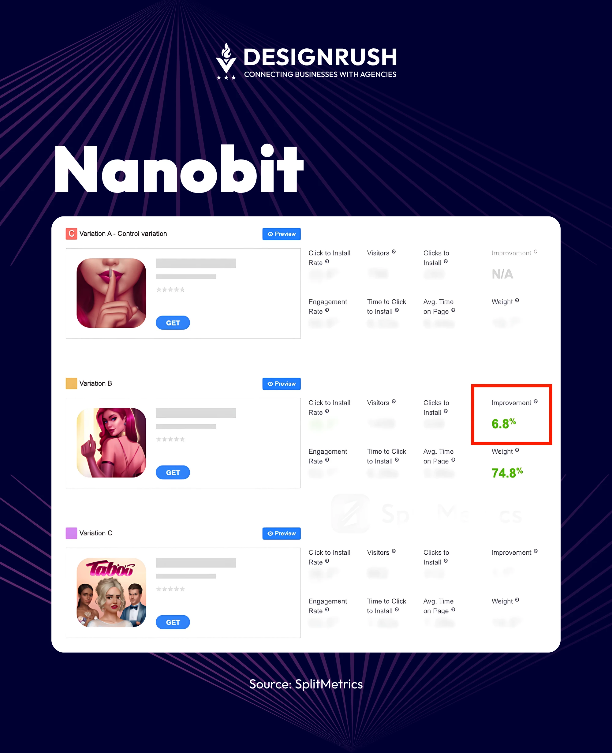
Overview: Nanobit, a successful mobile game developer, aimed to improve organic installs through a fresh app icon design aligned with their core gameplay visuals.
The Challenge: Saturated competition in the mobile gaming space made it difficult to stand out in app store listings and drive consistent organic conversions.
The Tactic:
- The Test: A 40-day A/B test was conducted using SplitMetrics Optimize, targeting iOS users through organic traffic.
- Control: Existing app icon with moderate visual detail and lower contrast.
- Variant: A simplified, high-contrast version with clearer edges and iconography reflecting core gameplay themes.
The Result:
- 22% increase in organic installs
- 18% lift in conversion rate
Business Insight: In visually competitive verticals like gaming, minimalist, high-contrast icons help cut through the clutter. Agencies targeting entertainment clients can productize icon optimization as a recurring conversion-growth service.
Case Study 2: Uplyfe – Health App Branding and Icon Design
Overview: Tubik Agency designed a bright, distinctive brand identity and app icon for Uplyfe, an AI-powered health app focused on personalized health improvement.
The Challenge: Uplyfe needed to establish credibility in a crowded health-tech space. The app required a visually compelling identity and app icon that conveyed innovation, trust, and AI-powered personalization without relying on complex visuals or medical clichés.
The Tactic:
The design team employed a bright, clean color palette that evokes freshness and energy.
They simplified the icon to a streamlined shape that hints at an AI element (such as a stylized pulse or circuit pattern), while remaining highly recognizable.
The icon was integrated into a cohesive brand suite, ensuring consistency across app UI, marketing materials, and onboarding screens.
The Results: While no install metrics were shared, the redesign boosted brand recognition and trust. Post-launch, stakeholders praised the icon for visually anchoring Uplyfe’s mission.
Business Insight: Iconography can visually anchor brand purpose, even without hard metrics.
Case Study 3: Uber – Global Brand Refresh
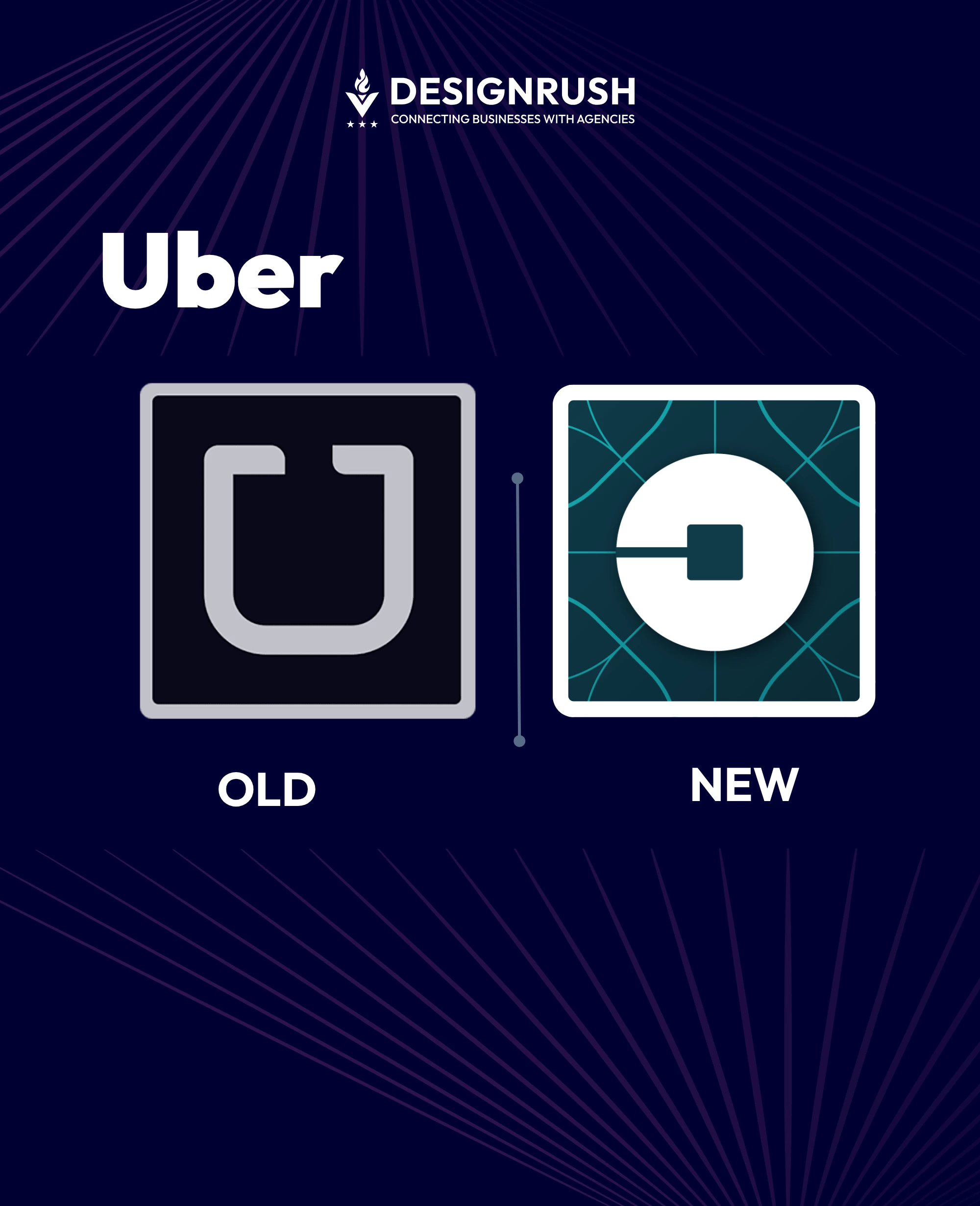
Overview: In 2016, Uber executed a global rebrand, including a bold redesign of its app icon, tailored across 65+ countries.
The Challenge: Uber aimed to shed its rigid, elite image and reposition itself as a locally responsive, inclusive global mobility brand.
The Tactic:
- Rather than A/B testing, Uber conducted a brand-wide icon rollout using regionalized iconography and localized color palettes to resonate with diverse markets.
- The previous icon was a stark, black-and-white “U” on a minimalist background. The rebrand used geometric icons (circles for riders, hexagons for drivers) with country-specific color schemes (e.g., turquoise for India, red for China).
The Result:
- 28% increase in brand value, reaching $29.7 billion in 2018
- Stronger consumer perception and localization alignment across global markets
Business Insight: For enterprise-level brands, icon redesign can support macro objectives like repositioning and market expansion. Agencies can pitch icon updates not just as cosmetic changes, but as strategic tools for brand transformation.
Case Study 4: Raven – Hospitality App Icon & Brand Identity Redesign
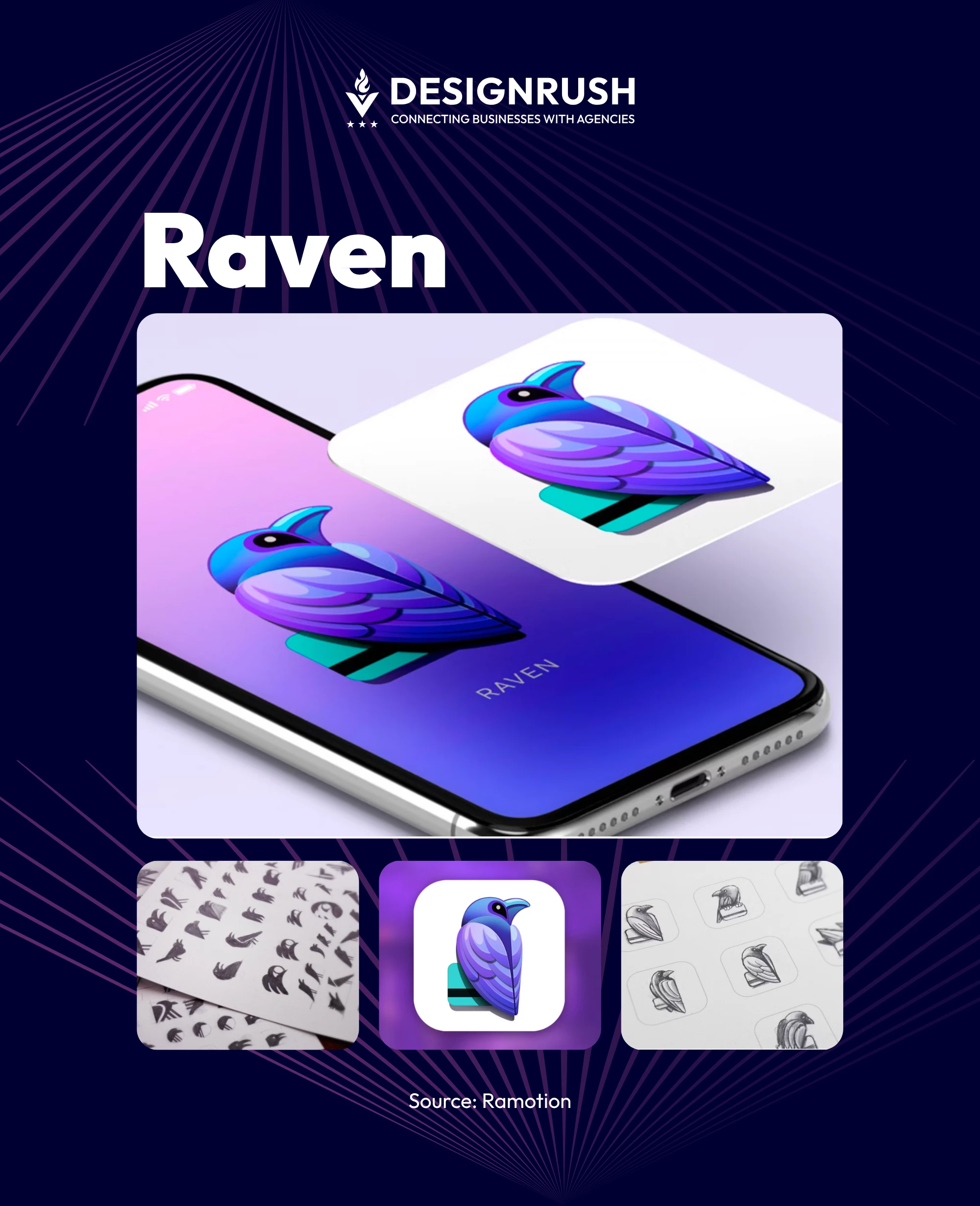
Overview:Raven is a mobile hospitality application designed to enhance the dining experience by streamlining restaurant interactions, including ordering and payments, through a seamless digital interface.
The Challenge: Raven sought to establish a distinctive brand identity and app icon that encapsulated exclusivity and trust, aligning with its innovative approach to dining experiences.
The Tactic:
- The design team initiated the process with mood boards to capture the desired emotions and themes. Various logo concepts were explored, focusing on shapes and symbols that would resonate with the brand's values.
- Prior to this project, Raven did not have an existing brand identity or app icon, as it was in the development phase.
- The chosen design featured a stylized raven icon, symbolizing exclusivity and security. The logo was crafted following the Golden Ratio to achieve aesthetic harmony and dynamism.
The Result: The collaboration culminated in a cohesive brand identity and a compelling app icon that effectively communicated Raven's core values and enhanced its market presence.
Business Insight: A thoughtfully designed app icon and brand identity can significantly influence user perception and engagement, especially in the competitive hospitality sector.
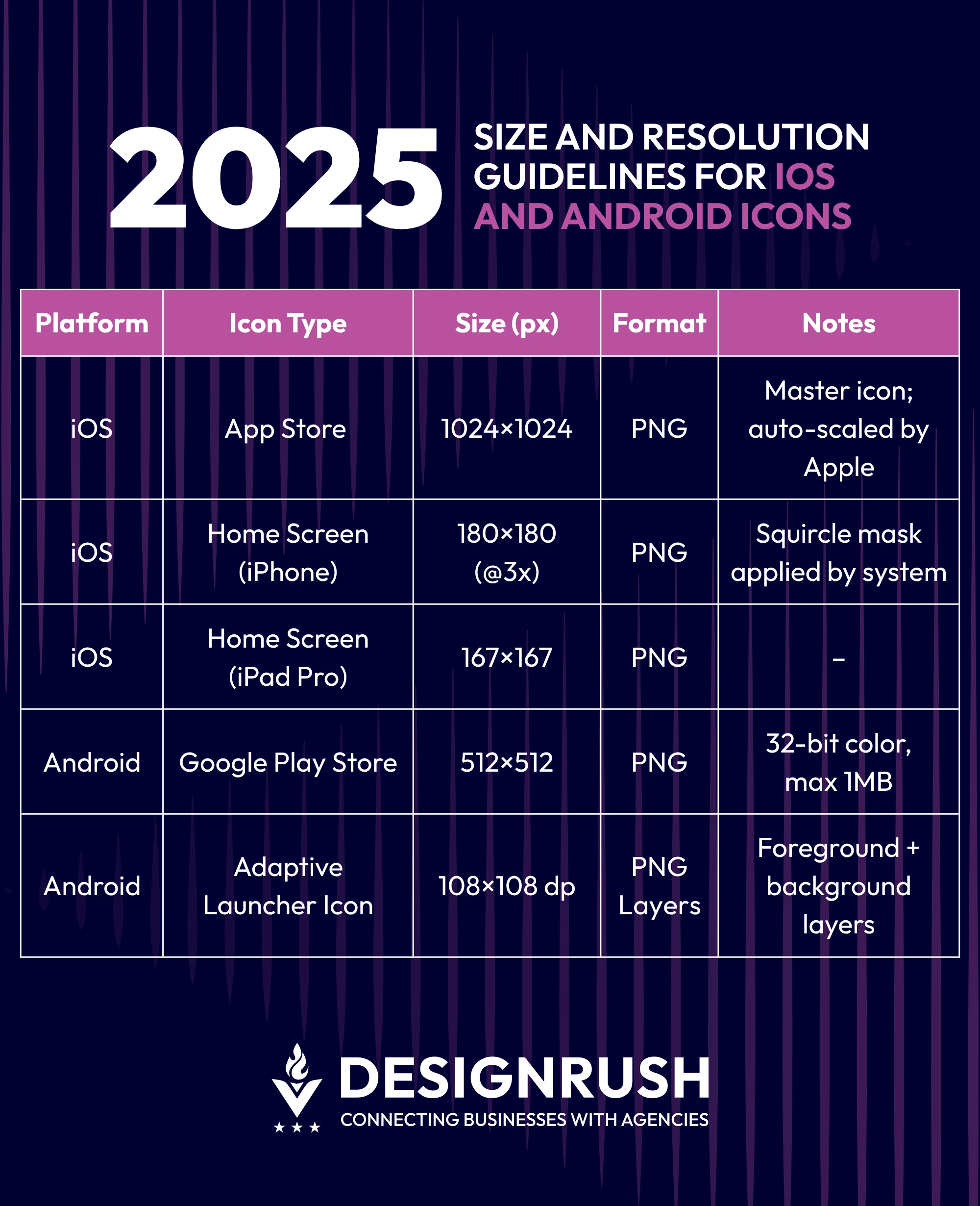
App Icon Design Best Practices for 2026
1. Respect Platform-Specific Guidelines
- Designing for both iOS and Android requires respecting each platform’s standards:
- Apple’s Human Interface Guidelines require icons to be 1024×1024px, layered simply, and rendered without transparency.
- Google’s Material Design system emphasizes adaptive icons that maintain integrity across diverse shapes (e.g., circle, squircle, square).
2. Design for Small Sizes
- Your icon needs to communicate at as small as 60×60px. High-performing icons typically:
- Use bold, minimal shapes
- Avoid small typography
- Incorporate high-contrast color schemes for visibility on both dark and light backgrounds
3. Leverage Color Psychology
Colors can influence install intent:
- Blue = trust, commonly used in finance and healthcare
- Green = growth and wellness
- Red = urgency or entertainment (often used in gaming and dating)
Ensure your palette works across global markets and remains legible in both light and dark modes.
Here's a cheat sheet of mobile app icon design size and resolution guidelines, updated for 2026:
Best App Icon Designs: 5 Real-World Examples That Drive Installs
1. Duolingo

Duolingo’s friendly owl mascot is not just visually charming; it creates a memorable, brand-linked experience across app and marketing touchpoints.
What to Learn:
Icons that double as brand mascots create emotional recall and multi-channel versatility. For consumer apps, especially in education or lifestyle, character-driven icons can build a fanbase, not just an install base.
2. Notion

Monochrome, text-free, and designed for minimalism, Notion’s icon blends seamlessly with its UI and reflects its workspace DNA.
What to Learn:
Less can say more. For B2B or productivity apps, minimal icons with strong geometry can signal focus, flexibility, and brand confidence.
3. Calm

The gradient and soft font mimic the brand’s mission of relaxation. It stands out in health and wellness categories due to its emotional appeal.
What to Learn:
Color is emotion. For wellness or mental health brands, a gentle palette and fluid form can prime users for the intended experience, and increase conversions by aligning visual tone with user mindset.
4. Robinhood

A feather in motion, symbolizing upward momentum. Its vibrant green hue signifies growth and financial aspiration, ideal for its user base.
What to Learn:
Symbols matter. If your app promises transformation (financial, physical, or otherwise), use iconography that embodies movement, aspiration, or empowerment. Clarity + symbolism = performance.
5. Tinder
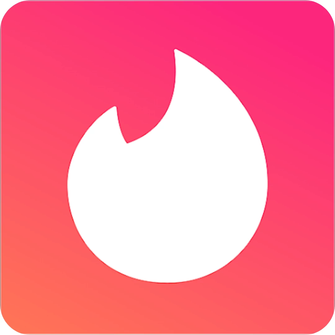
Its fire symbol speaks directly to its function: sparking connections. Simple, bold, and emotionally intuitive.
What to Learn:
Icons don’t need to be literal; they need to be felt. For lifestyle or dating apps, abstract visuals that tap into desire or urgency can outperform more descriptive designs.
Top Tools for Designing Mobile App Icons Efficiently
1. Figma & Sketch
These vector-based tools are ideal for responsive icon design. Benefits include:
- Real-time collaboration
- Component systems for scalable editing
- Mobile preview plugins
2. Adobe Illustrator
Still the gold standard for precise vector control and scalable exports. Ideal for clients requiring asset delivery in multiple formats.
3. Procreate
Useful for brands seeking hand-drawn or mascot-driven icons. Excellent for gaming, kids’ apps, or DTC brands with playful identities.
4. Export and Testing Tools
- LaunchKit: Simulates your icon in App Store listings
- AppIconTemplate.com: Export iOS/Android icon sets instantly
These tools help agencies deliver polished, tested icon assets ready for cross-platform deployment.
Common Mistakes to Avoid in App Icon Design
- Using text: Icons should visually summarize, not explain.
- Overcomplicating visuals: Detail gets lost at smaller sizes.
- Ignoring platform constraints: A great icon on Android may break on iOS if the spacing is off.
- Lack of visual hierarchy: Icons should pop on cluttered home screens.
- Color inaccessibility: Low-contrast combinations can reduce visibility for colorblind users.
How Agencies Can Position App Icon Design as a Growth Driver
1. Productize and Scale Your Design Offering
Agencies can turn icon design into a recurring revenue stream by integrating it into:
- ASO packages
- App launch strategy bundles
- Visual identity refresh campaigns
This low-lift, high-impact service offers measurable results, ideal for performance-based contracts.
2. Use Results to Drive Client Retention
- Data from icon A/B testing can be used to:
- Showcase ROI during quarterly reviews
- Justify upsells into full ASO or UX engagements
3. Build compelling client case studies
Agencies that frame icon design as a growth lever, not just a deliverable, win longer, stickier contracts.
Small Icon, Big Leverage: Wrap-Up
Your app icon takes up less than a square inch on someone’s screen, but it can move markets. From pushing install rates up double digits to repositioning global brands, the ROI it brings isn’t hypothetical, it’s happening.
It earns you a seat at the growth table, ties your work to hard metrics, and gives clients a reason to stick. In an app ecosystem drowning in sameness, a great icon still cuts through, and that makes it one of the most underpriced levers in your entire strategy stack.
![]()
Our team ranks agencies worldwide to help you find a qualified partner. Visit our Agency Directory for the Top , as well as:
1. Top App Marketing Companies
2. Top Healthcare App Development Companies
3. Top Consumer App Developers
4. Top Enterprise Mobile App Developers
5. Top Graphic Design Companies
Our design experts also recognize the most innovative design projects across the globe. Visit our Awards section to see the best in app design.
Mobile App Icon Design: FAQs
1. What makes a mobile app icon successful?
Simplicity, recognizability, and visual alignment with brand purpose. It must perform well at small sizes and across platforms.
2. How can changing an app icon impact performance?
Icon changes can significantly increase tap-through and install rates—up to 560% in some tests—by improving visibility and brand clarity.
3. Do iOS and Android have different icon design rules?
Yes. iOS icons are uniform in shape, while Android uses adaptive icons that must function across various device frames and masks.