
Udacity’s Informative App Design Makes Learning Easy
Udacity is a learning platform that offers users access to free courses from leading experts. The Udacity mobile app makes the learning experience accessible to users wherever they are by offering a variety of courses that can help them grow their skill sets and further their careers.
Here’s the mission this brand strives for:
Our mission is to democratize education through the offering of world-class higher education opportunities that are accessible, flexible, and economical. Virtually anyone on the planet with an internet connection and a commitment to self-empowerment through learning can come to Udacity, master a suite of job-ready skills, and pursue rewarding employment.The app offers lifelong learners the opportunity to learn new skills and strengthen existing ones with ease thanks to this highly intuitive and comprehensive app design.
This service has helped many people build their portfolio, rise in their own jobs and connect with recruiters and other professionals to put them in a place of professional success.
Udacity began as an experiment in online learning when Standford instructors offered a free course on artificial intelligence. 160,000 students in more than 190 countries enrolled in the free class. And from this attempt, the Udacity concept evolved.
Most of the app’s offerings are tech-focused — offering courses on AI, web development and other in-depth topics. And you can see it in the way the app was designed and set up.
It’s sleek, modern and bright. The layout is clear and focused and the intuitive nature makes learning new concepts a breeze.

The Udacity Interface Is Clean, Focused And Inspiring
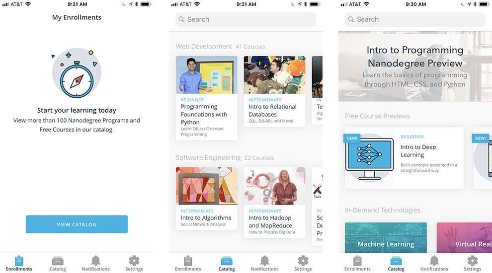
The Udacity app is built with a minimalist design that makes its detailed information the focal point of the user experience.
Lightweight grey typography is set against a white background, while a blue accent color is used to punctuate the experience and indicate the user’s location within the navigation.
The menu bar is clear and concise, offering enrollments, catalog, notifications and account tabs in a concise way. And these pages are equally clear and bright.
Finding your next course is as simple as scrolling through the offers that are succinctly marked and sufficiently displayed in rows of boxes.
Clicking on a concept — which is displayed in a bright color gradient box — brings you to another minimalist, modern and open page where users can learn more about the concept and find dedicated courses.
This design is bold, colorful yet clean. It’s minimal and clear, putting all the hard stuff in the classes, and taking the stress out of managing and creating your course load.
Udacity’s Mobile App Promotes A Positive User Experience With Streamlined Navigation
You might think that an educational app would be jam-packed with text, images and a design that confuses and overwhelms, but you’d be wrong with the Udacity app. Navigation is easier than it is with most basic apps — but it still doesn’t sacrifice content for cleanliness.
Much of Udacity’s catalog of courses is focused on technology and development. Course categories include Software Engineering, iOS, Data Science, and Web Development. On the home screen of the app, courses are grouped together by category and presented in a card-based carousel. Each course listing features a poster image, learning level (eg; beginner, intermediate, advanced), course title, and a brief description.
Udacity is for serious learners, and every course detail page is packed with information. There’s a detailed course summary and a lesson-by-lesson syllabus breakdown. The detail page also answers key user questions like what the learner should already know going into the course and what they’ll learn by taking it. Users can also access information about the course instructors to get a sense of their expertise. Course materials can be downloaded so users can continue learning even when they don’t have a data or wifi connection.
This app is clear, focused and concise. There is a lot of information, but it is condensed in a clean and clear way that makes moving throughout the app, adding courses and completing them easy and efficient.
Navigation of the Udacity app is handled through a bare-bones tabbed menu at the bottom of the screen. Here users can access their personal course enrollments, explore actual courses through the catalog, and adjust their account settings.
This simple, streamlined menu bar, combined with its clean interface and bright CTAs put you one step closer to progressing even farther in your career.
The Udacity App Connects People With A Catalog Of Educational Topics With Ease And Satisfaction
The Udacity app is a fun, easy-to-use digital platform for learning new skills and developing a greater knowledge about growing topics and trends in the tech industry.
Its clean layout, bright colors and attention to design trends in its use of gradients is compelling, engaging and fun. The overall layout is clean, modern and minimalistic, with a minimal toolbar, clear CTA and category boxes and little left to the imagination.
Because of its simplicity, navigation is a breeze. Find a class, add it to your schedule and start learning with ease and simplicity.
This brand is working towards democratizing education, and they want to do so in a way that is approachable for everyone involved, so they need an app interface that is clean, fresh and clear.
This app makes education fun, and it does so with personality.


-preview.jpg)
