The Goal Of Vantage App Design Is To Streamline Every Aspect Of The Waterpark Operations
Vantage is a company that specializes in services that provide in-depth analytics for waterparks. They are experts in the field of entertainment, which makes their business easier. As a result of the award-winning Vantage App design, the waterpark visitors have more fun.
Wanting to elevate their business efficiency and visitor experience even further, Vantage employed the service of Umbrella IT to create a superb app to streamline every aspect of Waterpark functionality and user experience design.
In the company’s own words:
"The seed for Vantage was planted in the waterpark industry, as its parent company, WhiteWater, sought to find a solution for the challenges and pain points faced by the clients. Vantage understands that park’s success hinges upon more than just iconic water slides, but on its ability to engage guests and streamline operations."Vantage App is poised to change the way venues operate. The platform allows for discovery, understanding and acting upon every possibility and/or hindrance.
From the client-side, Vantage’s “brandable” guest app allows visitors to start planning their vacations and fun-loving days before they even step inside the waterpark gates.

Vantage App Is Simple, Intuitive And Interactive So That Both Guests And Waterpark Staff Will Want To Use It
Experienced app designers understand the importance of aligning app functionalities with its core purpose. In the case of the Vantage App, the goal is to create smart parks; it gives park operators a focused insight into every single area of their park.
They can see, in real-time, how attractions are performing, how long the cue lines are, what the waiting times are, all the way to vehicle life cycles and flow rates.
One of its main appeals is that operators don’t need any special training since the app is streamlined, clean and easy to use.
The staff can even aid the waterpark’s marketing efforts as they can see the demographics of visitors, where they are, what rides they like, even what types of food they buy. They achieve this by giving their guests Smart Bands to wear, transforming the parks into full-service resorts.
These Smart Band wearables benefit the guests as much as the operators.
They allow park visitors to see attraction wait times, make purchases, open their lockers and find their family and friends in the crowd.
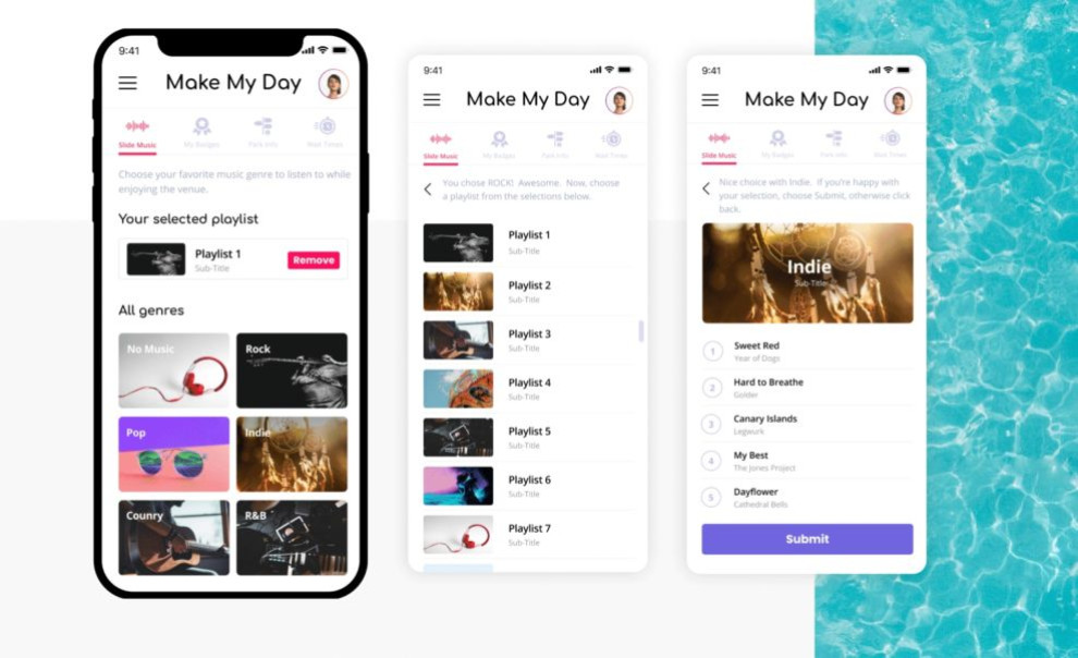
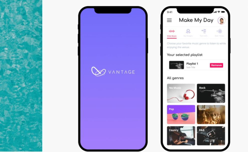
Vantage App Allows Users To Effortlessly Choose Their Favorite Activities And Find Points Of Interest
Across all industries, personalization has become an imperative, not only for marketing efforts but customer retention. Branding professionals recognize this and are increasingly integrating data-driven elements into their designs.
Vantage App design leverages personalization by offering visitors a multitude of options without the added effort of custom-tailoring every single experience.
The App presents visitors with the so-called “Make my day” option that lets them choose areas according to their preferred music genres. It also awards them with points to gamify their experience.
Throughout the day, a person can receive various rewards by completing “tasks”, earn points and collect badges. This makes a visitor’s day more fun. Guests can also spend their accumulated points to shorten the wait time for attractions, get discounts, buy souvenirs, drinks and more.

Eye-Candy Illustrations, Colorful Graphs And Images Lend A Distinctive Personality To The Vantage App Design
Custom, unique illustrations and welcoming images provide a dash of originality and character to Vantage app design. They make the whole app instantly recognizable and engaging.
Vibrant colors and cheerful graphics make the stats and graph sections pop and look more interesting.
The app’s simple interface helps with the user attention span – a major endeavor, especially when you have a group of waterpark-goers impatient to try out all the attractions.
To help users navigate through the wealth of options, the app uses simple, colorful buttons and menu navigation.
Vantage App Design Leans Heavily On Minimalist Trends, Sleek Typography And Engaging Color Palette
When it comes to the actual usage and functionalities, Vantage App interface design assumes a sleek, straightforward and functional layout.
For this reason, the whole app opts for a minimalist design. It looks stylish and prevents distractions both for users and operators.
When it comes to the color palette, Vantage App uses two primary hues, #7165E3 Marguerite and #EB366E Magenta. Although opposing at first glance, these variations on classic blue and red, perfectly complement each other, infusing the whole experience with playful and cheerful notes.
White is the primary color of the app’s background. This creates negative space that improves readability.
The Comfortaa Bold typeface adds to the minimalist nature of the app. Its rounded geometric sans-serif font is simple, legible and cute-looking, especially on colorful backgrounds.
With an app that looks and works just as fun as the waterparks it’s meant to serve, Vantage app design definitely deserves a spot in this year’s Best Design Awards.


