Most infographics about millennials miss the point. They pile on statistics without context, use clip art that feels dated, or worse, they patronize an entire generation with avocado toast jokes that stopped being funny in 2017.
Lately, with the popularity of data visualization, I started to spend time analyzing what separates infographics that drive understanding from the ones that get scrolled past.
As it turns out, the best millennial infographics do more than present data. They also reveal patterns in behavior, spending, and values that help brands make better decisions.
Millennial Infographics: Key Findings
- Design for shareability, not just readability: Millennials share content that validates their identity or challenges stereotypes. Build infographics that spark conversation, not just consumption.
- Ground every visual claim in credible data: This generation fact-checks. Citation isn't optional; it's the foundation of trust. Weak sourcing kills credibility faster than poor design.
- Make mobile the priority, not an afterthought: 97% of millennials use smartphones as their primary device. If your infographic doesn't work on a 6-inch screen, it doesn't work.
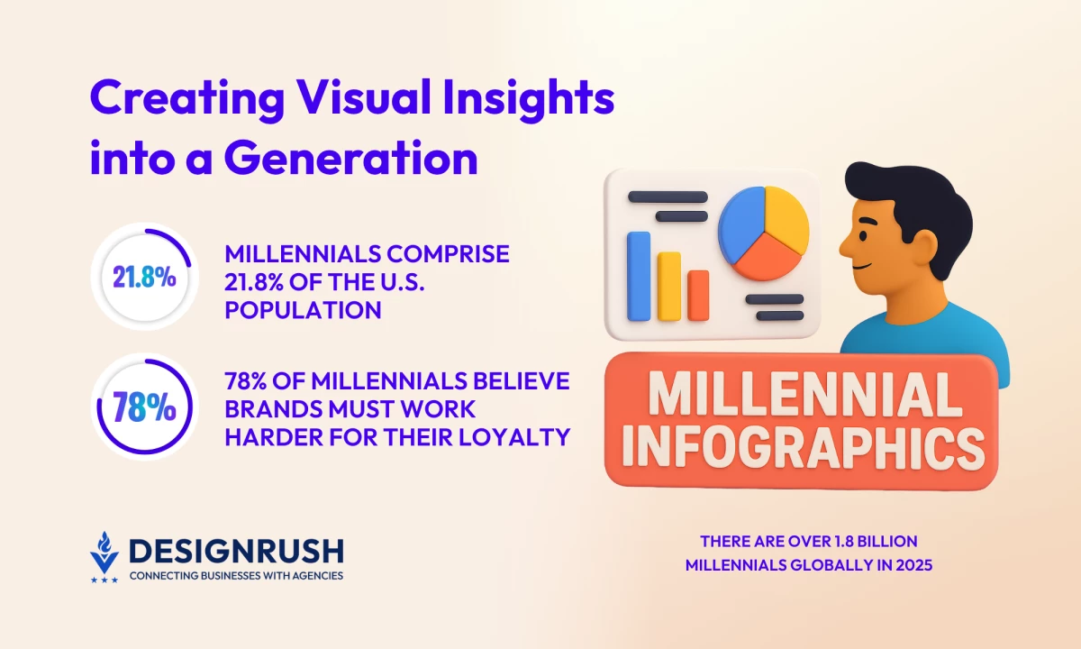
- Design with brand skepticism in mind: 78% of millennials say brands have to work harder to earn their loyalty than they had to for their parents' generation. Authenticity in data presentation matters more than polish.
What Are Millennial Infographics and Why They Matter
Millennials, also known as Generation Y, include people born roughly between 1981 and 1996. The oldest millennials are around 44 years old today, while the youngest are about 29. They represent the first generation to come of age during the digital era, which shaped everything from how they work to how they spend.
As of 2025, there are 74.2 million millennials in the U.S., accounting for 21.8% of the nation's population.
Millennial infographics decode this generation's lifestyle patterns, purchasing behaviors, and cultural values through visual data summaries. They serve as strategic tools for understanding a demographic that controls significant spending power and influences market trends across industries.
These visual data presentations serve three critical functions in my experience.
- They simplify complex behavioral research for marketing teams who need to make decisions quickly.
- HR departments use them to understand workplace expectations and retention drivers.
- Academic researchers rely on them to communicate findings to audiences outside peer-reviewed journals.
The best Gen Y data visualizations make patterns instantly visible in ways traditional reports cannot. Effective generation infographics come from intentional design choices that prioritize clarity over decoration.
7 Millennial Infographics That Actually Work
- Talkin' 'Bout My Generation
- The Habits of Highly Successful Millennials
- The Magic of Millennial Marketing
- Millennial Moms in the Aisle
- Food-Obsessed Anatomy of a Millennial
- Millennial Money Habits
- Why Does Gen Y Buy?
I've selected these examples because they demonstrate principles that translate across categories. Each one makes specific choices about hierarchy, color, and information density that serve the story being told.
1. Talkin' 'Bout My Generation

Standout Features:
- Segmented data blocks with strong typography create scannable hierarchy
- Orange, blue, pink, and green palette improves information retention
- Brand loyalty, consumption habits, and media preferences organized thematically
Key Takeaway: Modular design structures let viewers navigate complex data sets without feeling overwhelmed. This infographic breaks millennial behavior into digestible sections: brand trial factors, loyalty comparisons, and media influence.
Marketing teams can extract insights for specific campaigns without wading through irrelevant statistics. The data reveals that 78% of millennials say brands have to work harder to earn their loyalty, a critical insight for agencies building long-term strategies.
2. The Habits of Highly Successful Millennials

Standout Features:
- Teal and gold color scheme signals professionalism with approachability
- Icon-driven layout grounds abstract concepts in relatable imagery
- Pew Research Center citation establishes immediate credibility
Key Takeaway: Challenging stereotypes with data builds trust. This infographic counters negative narratives about millennials through behavioral research that shows confidence, connectivity, and adaptability.
Agencies can use this approach to position clients as thought leaders who understand nuance instead of relying on tired clichés.
3. The Magic of Millennial Marketing by Annie DiFazio on Again Interactive

Standout Features:
- Coral background with white space prevents visual fatigue
- Circular progress indicators make percentages instantly scannable
- Habits, consumption patterns, and values split into logical sections
Key Takeaway: Segmented information architecture improves retention. Dividing data into "Habits and Interests," "Desired Consumption," and "Virtual Values" acknowledges that different stakeholders need different insights.
Marketing teams can quickly find what matters to their specific initiative without parsing through everything else.
4. Millennial Moms in the Aisle by Ann D'Adamo and Shannan Conley

Standout Features:
- Neutral gray background lets green accent guide the eye to key statistics
- Icon system for influence factors creates visual checklist of decision drivers
- Shopping frequency and loyalty participation framed as actionable insights
Key Takeaway: Subsegment analysis uncovers hidden opportunities. This infographic proves that millennials aren't a monolith. Millennial mothers represent a distinct purchasing pattern with specific triggers.
Brands targeting this group need packaging, reviews, and product positioning that speaks to convenience and value, not just aesthetics.
5. Food-Obsessed Anatomy of a Millennial by Laura Callaghan

Standout Features:
- Vibrant yellow background creates immediate visual impact and shareability
- Illustrated character with product callouts makes abstract data tangible
- Humor integrated with statistics transforms dry information into social currency
Key Takeaway: Personality-driven design increases engagement and reach. The illustrated approach makes complex consumption data feel approachable while maintaining accuracy
Agencies creating content for food, beverage, or lifestyle brands can adapt this style to make research findings shareable without sacrificing credibility.
6. Millennial Money Habits

Standout Features:
- Mint green palette signals financial stability and calm decision-making
- Progress bar visualizations make percentages feel optimistic rather than clinical
- Saving priorities illustrated with icons create emotional connection to financial goals
Key Takeaway: Visual framing changes perception. This infographic emphasizes savings rates, financial security, and budgeting discipline to reposition millennials from financial stereotypes to responsible planners.
Financial services agencies can use this reframing technique to build campaigns that respect their audience's actual behavior instead of relying on cultural assumptions.
7. Why Does Gen Y Buy?

Standout Features:
- Beige neutral background with selective color highlights maintains sophistication
- Illustrated figure with product callouts creates lifestyle narrative around purchasing
- Purchase drivers and behavioral statistics integrated into character design
Key Takeaway: Storytelling through character design makes data memorable. This infographic embeds buying factors into a visual narrative instead of presenting them as a bulleted list.
E-commerce companies can apply this approach to user personas, transforming data summaries into characters that stakeholders remember and reference throughout product development.
Each of these millennial infographics proves that design choices are strategic decisions. The ones that work understand their audience, respect their intelligence, and make information accessible without condescension.
What Agencies Can Learn From Millennial Infographics
 I've built enough infographics to know that the process reveals as much as the final product. The best ones emerge from clear thinking, not just design skill.
1. Start with the strategic question, not the data
Every successful infographic I've seen answers a specific question. "What influences millennial purchasing decisions?" is strategic. "Here's data about millennials" is not. The question determines which data makes the cut and which gets left behind.
I always ask: What decision does this information support? If the answer is vague, the infographic will be too.
2. Build hierarchy before you build design
Visual hierarchy controls the sequence in which information is processed. Primary insights should register in two seconds. Supporting data can reveal itself on closer inspection.
The infographics that fail bury key findings in visual noise. I see this constantly: every statistic gets equal weight, which means nothing has impact. Prioritization must happen before design begins.
3. Use color strategically, not decoratively
Color creates meaning. In the millennial money habits infographic, mint green signals financial calm and responsible planning. The choice is psychological. It reframes saving behavior as aspirational rather than restrictive.
I choose palettes based on the emotional response I need to trigger. Warm tones for community and connection. Cool tones for trust and stability. High contrast for urgency and action.
4. Make mobile performance non-negotiable
Desktop-first design thinking doesn't work for millennial-focused content. With 97% of this generation using smartphones as their primary device, I test every infographic at smartphone scale before considering it finished. Text that reads well at 1920px width becomes illegible at 375px.
Gabriel Shaoolian, CEO of Digital Silk, underscores how essential mobile-first thinking has become for visual content:
"Let's think anecdotally of the way we as consumers utilize the internet. It is almost always from our phones – especially in a personal (rather than professional) capacity."
Responsive design for infographics means more than scaling down. It often requires alternative layouts, simplified data sets, or progressive disclosure. If it doesn't work on the device this audience uses most, it doesn't work.
5. Cite sources like your credibility depends on it
Because it does. Millennials grew up with Wikipedia's citation standards and Reddit's source-checking culture. When I present data, I name the research organization, year, and methodology if relevant.
The best millennial infographics I've analyzed all share this trait: visible, credible attribution. "According to Pew Research Center" carries weight. "Studies show" does not. Citation becomes part of the narrative, not fine print tucked at the bottom.
Turning Millennial Data into Lasting Visual Impact
The truth about millennial infographics is that format follows function. The best ones don't just make data visible; they make it actionable. When I build visual data presentations, I focus on clarity, credibility, and strategic purpose. Everything else is decoration.
If you're creating infographics about Generation Y, make them count. Use them to challenge assumptions, reveal patterns, and drive decisions. When executed with discipline, millennial infographics don't just inform. They persuade, they clarify, and they endure.
Millennial Infographics: FAQs
1. What makes an infographic effective for illustrating millennial data?
Clear visual hierarchy, credible sourcing, and culturally relevant presentation make millennial infographics effective. The design must respect the audience's intelligence and fact-checking habits while delivering insights quickly. Mobile optimization is essential, not optional.
2. What software is best for creating infographics?
Canva works for fast turnarounds and template-based designs. Piktochart offers more customization for data-heavy projects. Adobe Illustrator provides complete control for complex layouts and brand-specific design systems. The right tool depends on timeline, skill level, and output requirements.
3. How can businesses use millennial infographics effectively?
Millennial infographics drive impact in marketing presentations, social media campaigns, internal training materials, and client reports. They work best when answering specific strategic questions about audience behavior, not just displaying generic demographic data. Distribution format should match the channel where the target audience consumes content.
![]()
Infographic designs are changing how brands pitch ideas, scale campaigns, and monetize data-driven content.
For creative teams and ambitious marketers, the real advantage belongs to partners who can combine automation with human-centered storytelling. The goal is to create visuals that reflect millennial values of transparency, creativity, and connection.
Searching for a Partner Who Blends Data, Design, and Strategy?
Our team ranks leading agencies around the world to help you find collaborators who understand both the business and the emotion behind design.
Visit our Agency Directory to explore:
You can also visit our Awards section to see how smart design and visual strategy are delivering measurable results across industries.