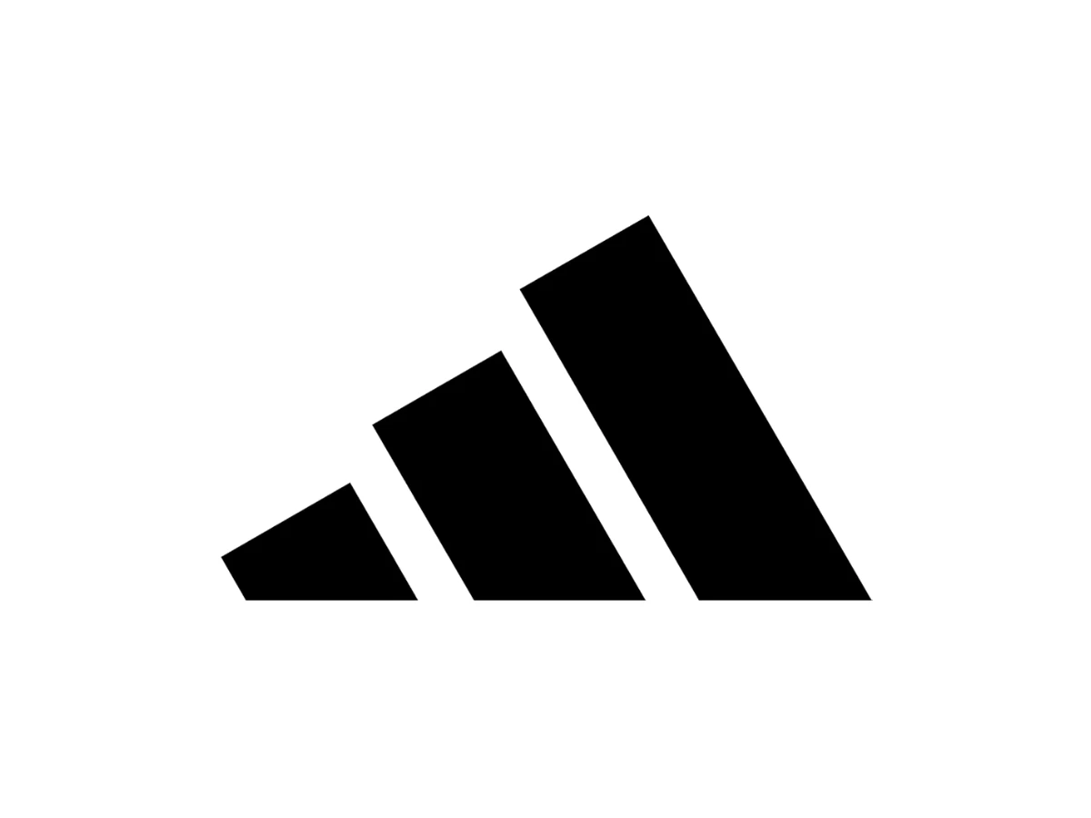

The adidas logo changed hands for about 1,600 euros and, as the story goes, two bottles of whiskey. Three stripes, bought secondhand from a cash-strapped Finnish sportswear company, now sit on more than a billion shoes and get defended in courtrooms worldwide. It is the most accidental global symbol in fashion, and almost none of it was planned.
What To Know
- adidas runs three logos at the same time: the trefoil (Originals), the three-bar mountain (Performance), and the lowercase wordmark, all built from the same three stripes.
- The three stripes began as a functional detail on Adi Dassler's shoes and were bought from Finland's Karhu Sports around 1952 for roughly 1,600 euros and, by legend, two bottles of whiskey.
- The trefoil (1971) marked the move into apparel, and its leaves stood for the continents where adidas sold. The mountain (1991), by designer Peter Moore, stood for athletic challenge.
- Run-DMC's 1986 song "My Adidas" led to the first music-to-sportswear endorsement deal, worth about $1 million, and set the template for later artist partnerships.
The Whiskey Deal That Almost Never Was
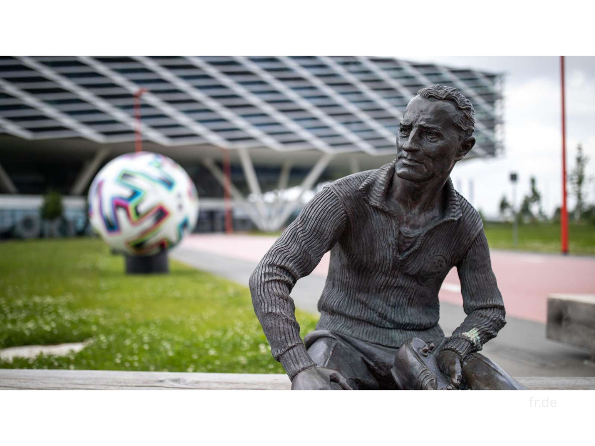
The negotiation happened after the 1952 Helsinki Olympics, where Finnish runners in three-striped shoes won 15 gold medals. Adi Dassler wanted those stripes for his own shoes, but a Finnish company, Karhu Sports, already held the trademark.
The two sides met in Germany and, as the story goes, settled on the equivalent of about 1,600 euros plus two bottles of whiskey. The company has never formally confirmed the whiskey part, and a former Karhu manager has said there is no record of it, but the price is not in dispute.
One of sport's most defended symbols changed hands for the cost of a good dinner.
Everything the brand became descends from that transaction. The stitching that once held a leather shoe together turned into intellectual property worth more than most of the shoes it appears on.
From A Washroom To The Berlin Olympics
Adi Dassler began making shoes in his mother's washroom in Herzogenaurach, Germany, in the early 1920s. With his brother Rudolf, he founded the Dassler Brothers Shoe Factory in 1924, and the two built a reputation for track spikes before their partnership collapsed during World War II.
Rudolf left to start Puma, and Adi renamed his half by fusing his nickname, Adi, with the first letters of Dassler.
The stripes came before the split, and they were a practical choice. Dassler tested different numbers of side stripes and found that three read most clearly in newspaper photographs, which mattered in an era when a shoe seen in print sold more shoes.
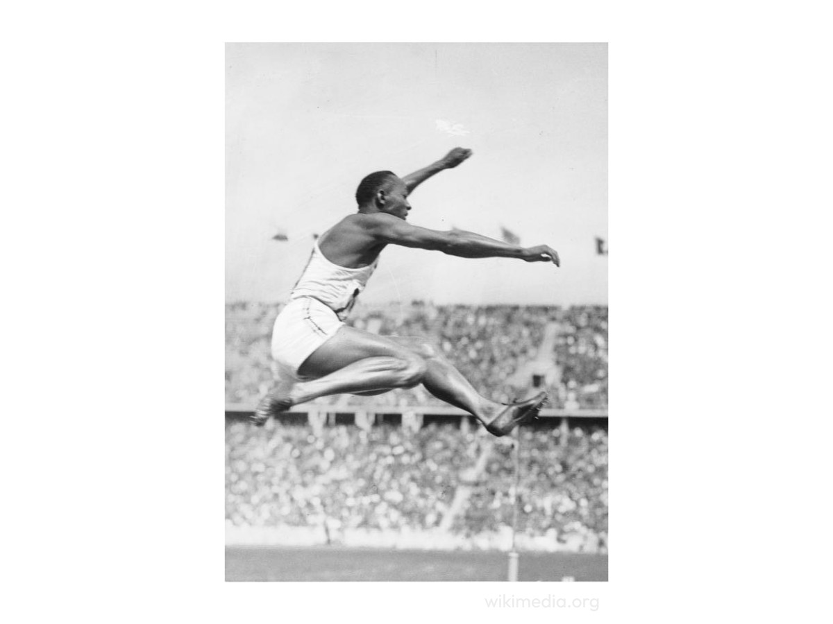
That approach to logo design paid off in 1936, when he persuaded the American sprinter Jesse Owens to race in his spikes at the Berlin Olympics.
Owens won four gold medals at the Games that Hitler had staged as a propaganda event, and he did it in shoes cobbled by a German craftsman. Dassler did not plan the politics. He believed in the product and lobbied the fastest man at the athletes' village to wear it.
Three Logos, One Set Of Stripes
Here is the first thing to know about the adidas logo: there is no single adidas logo. The company runs three marks at once, each aimed at a different buyer, and all built from the same stripes.
The meaning of the adidas logo depends on which one you are looking at, so reading the brand starts with telling them apart.
The Trefoil (1971)
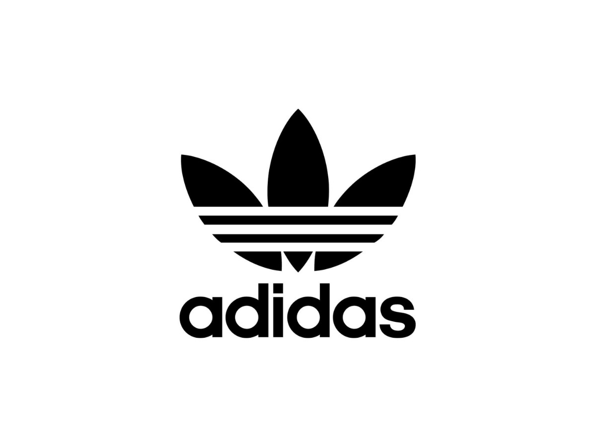
Designed ahead of the 1972 Munich Olympics, the trefoil arrived when the company moved from shoes into apparel.
Three leaf shapes fan out from a base, with the three stripes running through them, and the leaves were meant to stand for the continents where adidas sold at the time: the Americas, Europe, and Asia.
It read as a claim of global reach. Today the trefoil belongs to adidas Originals, the heritage and streetwear line, and it is the old adidas logo most people picture when they think of the brand's early decades.
The Mountain (1991)
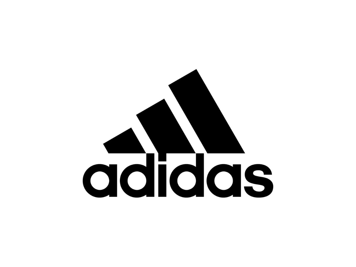
As the company pushed deeper into high-performance gear, it needed something that looked technical.
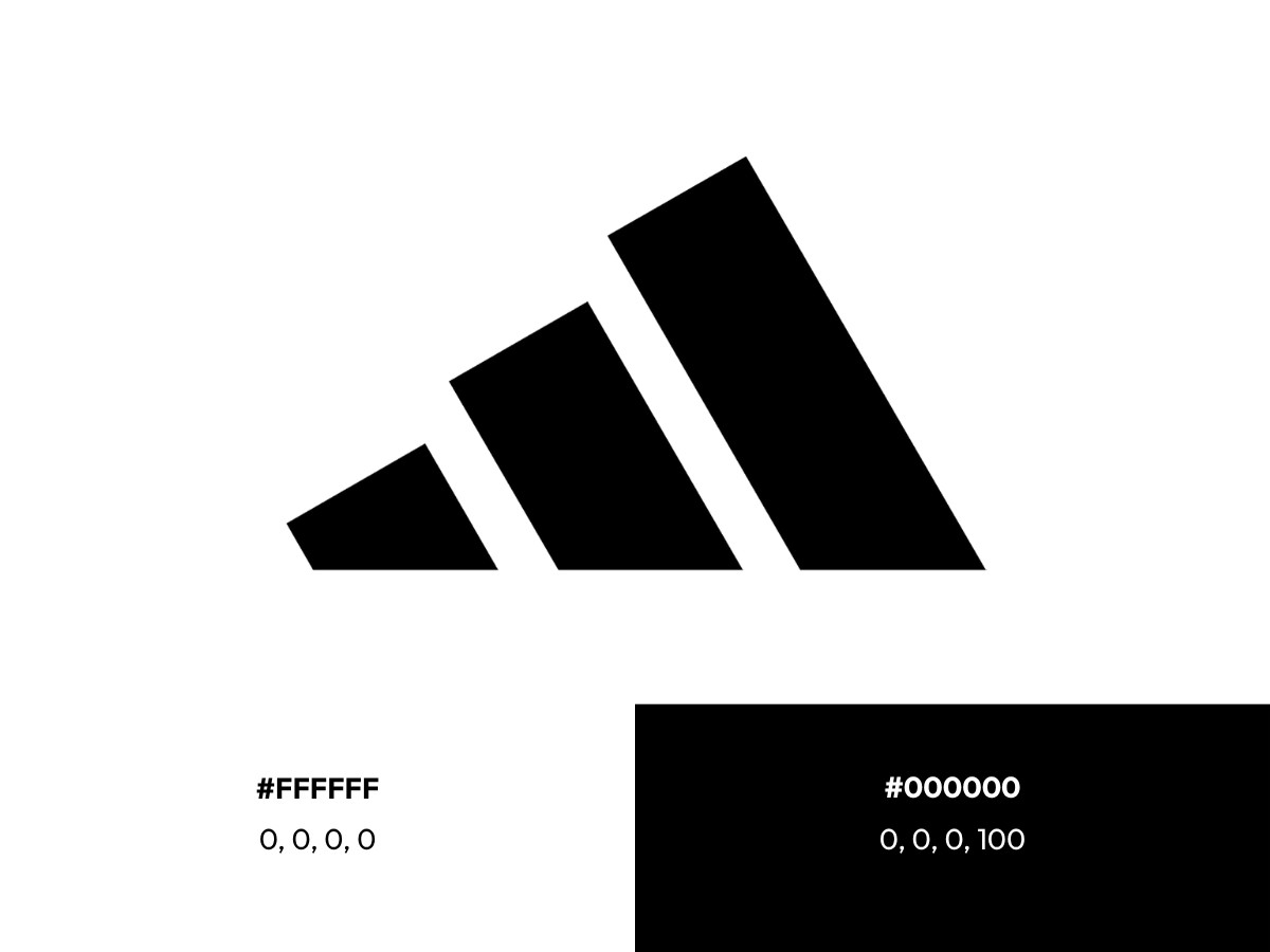
Creative director Peter Moore drew three slanted bars into the shape of a mountain, a few years after he had designed the Air Jordan line and the Jumpman mark for Nike.
The slope stood for the obstacles an athlete climbs and the goal at the top, and the idea reportedly came from sketching the stripes as seen looking out through the heel of a shoe. That mark now runs on cleats, boots, and the kits of clubs like Real Madrid and Bayern Munich.
The Wordmark (1967)
The lowercase adidas wordmark predates both symbols. A clean geometric sans-serif, always set in lowercase, it holds the textual line across every product and pairs with whichever symbol fits the context.
The lowercase is the most consistent decision in the brand's history, and it carries a message about the company: approachable rather than corporate, built around the athlete.
Three marks running at once, each aimed at a different buyer, work as deliberate segmentation. The trefoil pulls in sneaker collectors and fashion buyers who have never run a race.
Competitive athletes recognize the mountain on their boots and kits, while the wordmark carries the name across everything else. adidas is not the only storied brand that runs more than one mark at a time, and the split between a full crest and a stripped-down kit version is a familiar tool for anyone managing a heritage identity.
It is one company and one set of stripes, translated into separate visual languages for audiences that rarely overlap.
When The Stripes Left The Track
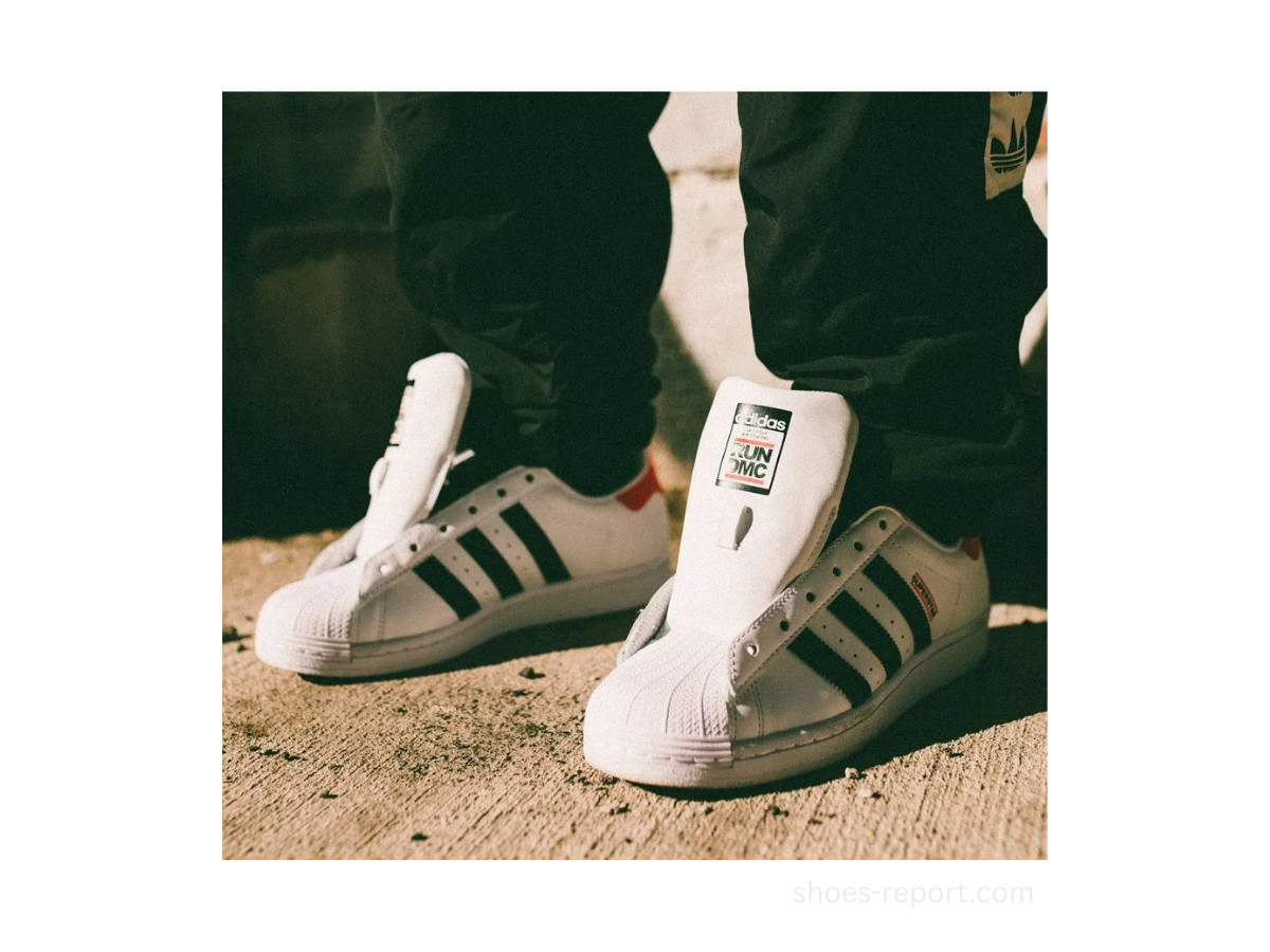
In the late 1970s, the stripes found an audience adidas had not courted. Breakdancers, DJs, and graffiti writers across the Bronx and Queens adopted the Superstar, a 1969 basketball shoe built to challenge Converse, and wore it off the court and onto the block.
The shell toe and leather panels worked in a setting no executive in Herzogenaurach had imagined. B-boy style and adidas were fused before the company noticed.
Run-DMC came out of Hollis, Queens, wearing adidas since they were teenagers, long before any contract existed. Their 1986 single "My Adidas," from the album Raising Hell, was a tribute to shoes they already owned rather than an ad.
It also answered a novelty record called "Felon Shoes," and the group rapped directly against the association with prison. They wore their Superstars without laces, tongues out, a look that started in jails where inmates could not keep laces, and turned it into a statement of style.
The turn came on July 19, 1986. Co-manager Lyor Cohen had invited adidas executive Angelo Anastasio to the group's Madison Square Garden show, where Run asked the crowd to hold their sneakers overhead during the song.
Thousands of shoes went up at once, and Anastasio watched it happen. The company had already seen Superstar sales climb without knowing why, and now it had the reason in front of it.
What followed was a $1 million endorsement deal, the first between a music act and a sportswear brand. That contract set the template for everything after it, from Kanye West's Yeezy line at its multibillion-dollar peak to partnerships with Beyonce and Pharrell Williams, and it shaped how brands would later sign artists across the industry.
A song about shoes going places the brand had never sent them created the modern artist endorsement.
Why Three Logos Is The Strategy
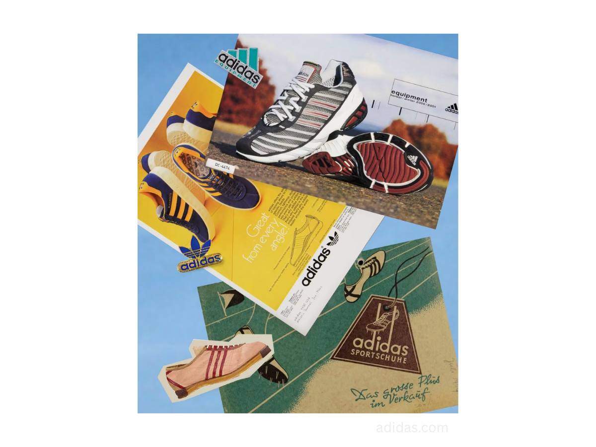
This is also the answer to why adidas seems to keep changing its logo. It never really swapped one mark for another.
It added marks as it added product lines, the way some crests gain an element without a full redesign, and it kept all of them. The three logos do not compete with each other. They divide the market.
The trefoil turns up at fashion weeks and on Stan Smiths worn by people who will never time a sprint, the mountain rides on World Cup kits and running shoes, and the wordmark sits under both.
Across all of it, the stripe is the constant, stitched into shoes, pressed into packaging, folded into the trefoil's leaves, and formed by the bars of the mountain. The company treats those three lines as property and defends them hard in court, which is why "the brand with the three stripes" is a legal position as much as a slogan.
What Designers Can Take From It
The lesson for anyone working on a brand identity is that the strongest marks are rarely the most planned ones.
Dassler chose three stripes because they photographed well, and the meaning arrived later, supplied by athletes and musicians the company never hired. A mark earns its weight through where it travels, and the brand's job is to notice when that is happening and get out of the way.
The three-mark system also shows how far a single element can stretch. Because the stripe stays fixed, adidas can run a heritage line, a performance line, and a corporate identity without any of them reading as a different company, which is a cleaner outcome than most rebrands manage.
The strongest heritage marks tend to grow without reinvention, and restraint holds this one together. The lowercase name has barely moved since 1967, and that steadiness does more for recognition than any redesign could.
On color, the brand keeps it spare. The core palette is black (hex #000000, CMYK 0/0/0/100) and white (hex #FFFFFF, CMYK 0/0/0/0), with a heritage royal blue reserved for select Originals and archival marks.
The absence of a loud brand color is the point. The shape does the identifying, so the color does not have to.
The Stripes Never Planned Any Of This
The three stripes started as a way to hold a shoe together in a washroom workshop.
They ended up on the fastest man at a Nazi Olympics, in a song that invented the modern endorsement deal, and on the backs of the best athletes in the world.
None of that was on Adi Dassler's drawing board, because there was no drawing board. For the people who design brands for a living, that is the uncomfortable part and the useful one: you can draw the mark, but forces outside the design room decide what it means.

Our team ranks agencies worldwide to help you find a qualified partner. Visit our Agency Directory for the Top Logo Design Companies as well as:

_5b9def34de02-preview.jpg)
_dd9d19b80049-preview.jpg)
_c0dbf3cab9a0-preview.jpg)