In the 2006 World Cup final, Zinedine Zidane lowered his head and drove it into Marco Materazzi's chest. It was the last act of the greatest French player of his generation, in the biggest match of his career, and it earned a red card on a stage no footballer ever wants to leave that way. Stitched to his chest as he walked off was a rooster.
Not an eagle. Not a lion. A rooster, the kind that struts around a farmyard at dawn.
That choice is the whole story of the France National Football Team logo history. Most national teams pick a predator and tell you to fear it. France picked a barnyard bird, put it on the crest almost from the beginning, and then kept it there through two world wars, a string of federation overhauls, decades without a trophy, and two World Cup wins. The rooster on Zidane's shirt had looked roughly the same for nearly 40 years by 2006. It would outlast even him.
So the question worth asking is not what changed in each crest. It is why the most stylish footballing nation on earth built its identity on a crowing farm animal, and why no redesign in more than 130 years has dared remove it.
France National Football Team Logo History
France played its first official match on May 1, 1904, a 3-3 draw with Belgium, and joined FIFA that same year as one of the founders. The team went on to win two World Cups, in 1998 and 2018, along with two European Championships and a 1984 Olympic gold.
The visual record holds more than a dozen recognizable versions since 1894. Read closely, they collapse into four eras, and one element survives all of them. Here is how a Roman insult became one of the most successful logo designs in sport.
1894 – 1919: The Bird Arrives
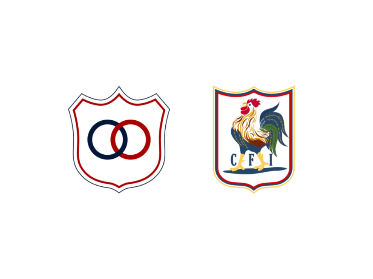
The earliest mark predates the federation itself. France's footballing roots lie in the Union des Sociétés Françaises des Sports Athlétiques (USFSA), the body that oversaw sport in the country. Its 1894 emblem set two intersecting rings inside a shield, a figure known as the Vesica Piscis. The rings stood for the unity of the sports organizations that formed the USFSA and read more broadly as infinity and stability. The same shape later became the precursor to the Olympic rings. No rooster yet.
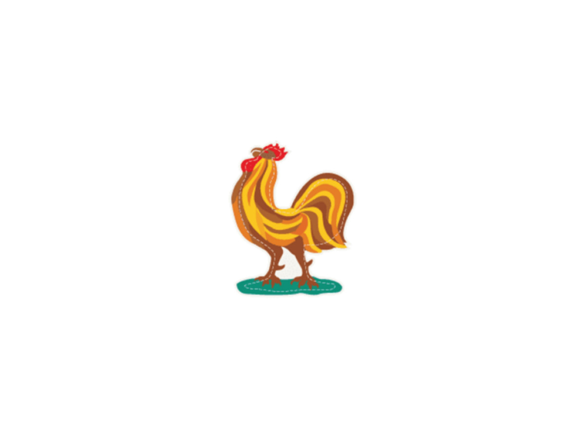
The bird arrived in 1907. A rooster appeared on a shield with the letters CFI, for the Comité Français Interfédéral, set between the bird's legs. The Gallic rooster carried the nation's pride and strength, and the shield added a sense of protection and confidence. This was the first step toward giving French sport a national identity.
The reason the rooster stuck runs back to Rome. During the conquest of Gaul, Roman writers played on the Latin word gallus, which means both Gaul and rooster. The French, who count themselves descendants of the Celts, adopted the pun as a point of pride, reading the bird as a symbol of nobility, bravery, and stubbornness. The symbol gained further weight during the First World War, when it stood for French resistance. By the time football needed a badge, it was already centuries old and waiting.
1919 – 1967: The Long Settle
The 1919 redraw coincided with a change of ownership. On April 7 of that year the Comité Français Interfédéral became the Fédération Française de Football, with Jules Rimet as its first president. The federation gave the badge a stylized rooster standing on grass, the green standing in for the football field. The bird's feathers, drawn in several shades of gold, made it shimmer in the light, a nod to rebirth, national pride, and France's agricultural roots.
This version then ran for nearly half a century. That is the quietest stretch in the entire record and also the most important. Forty-eight years of one rooster means every French player, every team photograph, and every kit across that span shares a single visual identity. By 1967 the bird was so embedded that modernizing the mark read as a risk rather than an improvement.
1967 – 2006: The Gold Rooster and the First Star
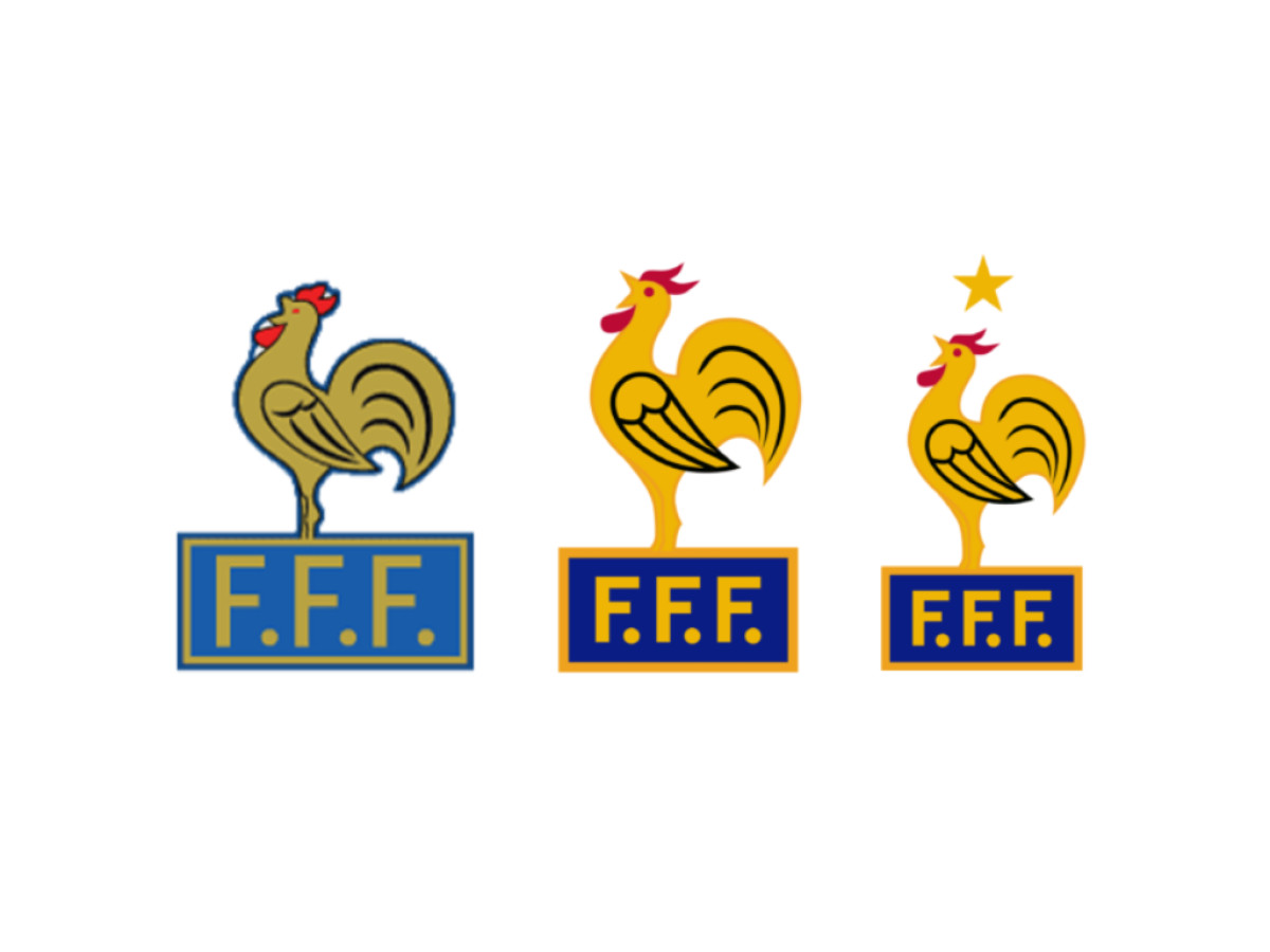
The 1967 redesign brought the federation into the modern era with a golden rooster standing on a large blue rectangle carrying the FFF abbreviation. The mark signaled the federation's backing of the French game and strengthened the team's standing on the world stage.
The 1970 version produced the crest most fans picture when they think of France. The rooster turned bright yellow against a deep blue background, the lettering bold and clear, and the whole emblem read as a new era of professionalism and ambition. It became the federation's defining look and held for decades.
Then came 1998, and the most disciplined design decision in the team's history. After France won its first World Cup on home soil, the French Football Federation added one thing: a single star above the crest. No rebrand, no commemorative badge, no celebration graphics. Every other element stayed exactly as it was, and the logo ran for eight more years.
The 2006 redesign began to loosen that consistency. The cockerel was rebuilt from bright flame-like forms, standing on a pedestal of three Fs inside a golden rectangle, the whole thing resembling an award statue. For a study in updating a mark without breaking it, the run up to this point sits alongside the better logo redesigns in sport.
2006 – 2018: The Restless Years and the Second Star
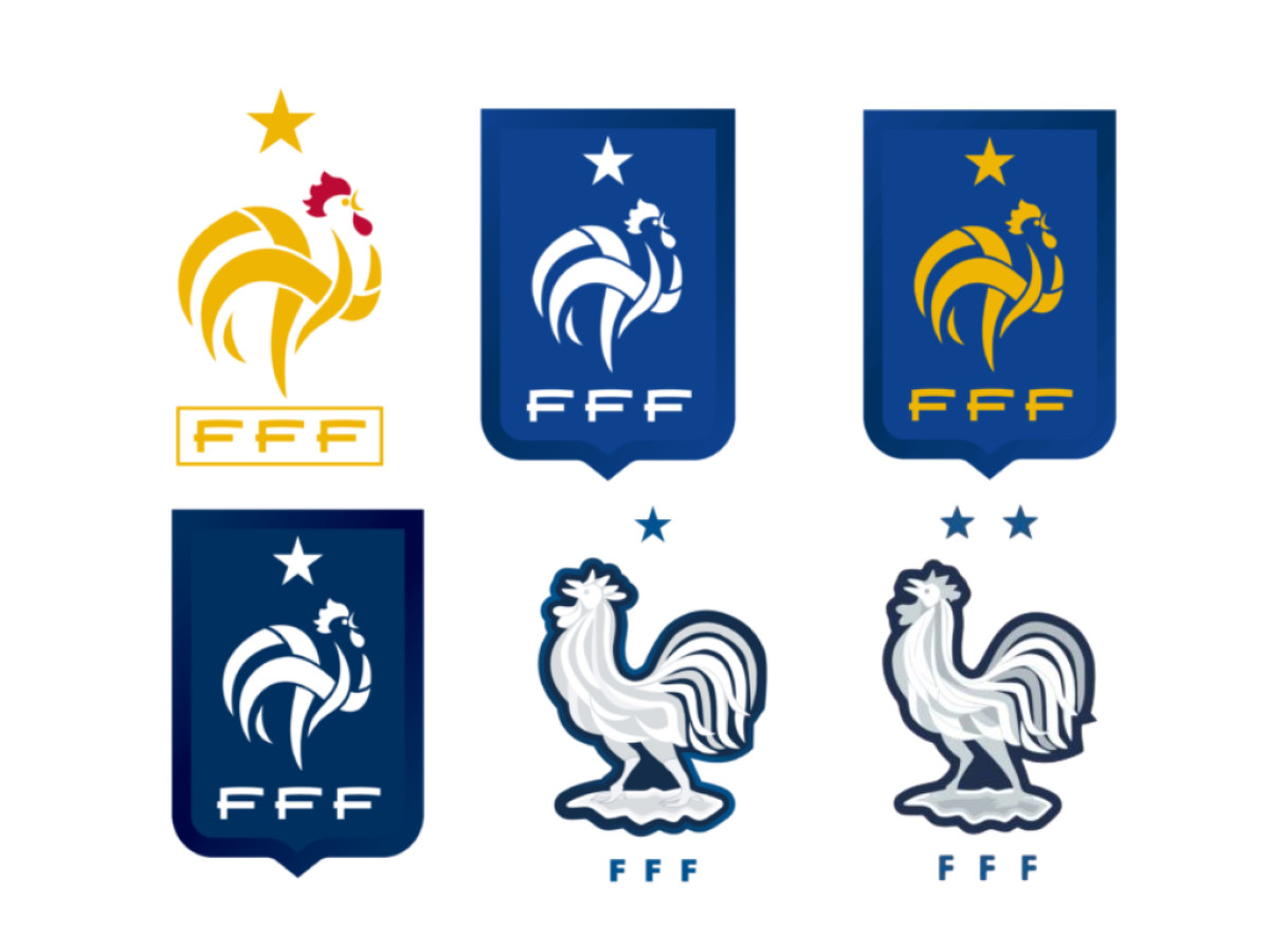
The years after 2006 were the busiest in the badge's life. In 2011 the federation went minimalist, a white rooster with a single star and the FFF abbreviation on a blue shield. In 2012 the white elements turned gold to mark national and sporting ambition under a new coach. In 2013 the gold came off again and the blue darkened, with a black outline added so the white stood out. In 2014 the blue background disappeared entirely, leaving a white rooster with a thin blue outline that looked as though it had stepped off a heraldic crest.
Four restyles in four years, after decades of near silence.
The run settled in 2018. After France won the World Cup in Russia, the federation repeated its 1998 move and added a second star above the 2014 mark.
The Crest Today, and What It Teaches Brand Builders
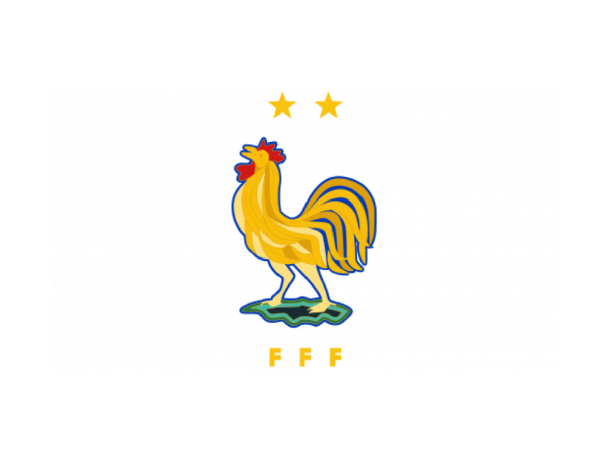
The badge's current form, introduced in 2024, returns it to where it began: a golden rooster with two gold stars, walking on green grass and fertile soil. Worn into the 2026 World Cup, it is the most heraldic and polished version of a bird that has been crowing on the French chest since 1907.
The rooster is a working case study in how symbols earn power. Five lessons stand out for anyone shaping a brand with real history behind it.
The symbol you inherit outweighs the one you invent. France did not design the Gallic rooster. It absorbed the bird from a Roman pun, embedded it in national mythology, and put it on a football crest before professional branding existed. No agency brief can manufacture that depth. When a client owns a genuine artifact in its past, a founding mark, a legacy material, a name with real etymology, the smart move is to build on it rather than replace it.
Restraint after success is a decision, not an absence of one. France answered its 1998 World Cup with a single star. No full rebrand, no special-edition crest, no triumph visual language. In a market where brands rush to capitalize on every milestone, that quiet is close to radical, and it makes the star hit harder for what does not surround it.
Decades of consistency build equity no campaign can buy. The 1919 to 1967 era is easy to skip as the section where nothing happened. But 48 years of one rooster means the whole period reads as a single identity. That is brand equity earned the slow way, through time and repetition, and by the late 1960s it was strong enough that changing the mark felt like a gamble.
Design churn often signals identity churn. France tried four badge directions in four years, from 2011 to 2014, the same window in which it exited Euro 2012 in the quarterfinals, finished third at the 2014 World Cup, and aired public arguments about squad culture. Whether cause or coincidence, the visual turbulence ran alongside the on-pitch turbulence. When an organization starts swapping identities at speed, it is often a sign of deeper questions about who it is. The badge is a symptom, not the diagnosis.
Stars are proof points, not decoration. Each star above the crest marks one verifiable thing: a World Cup win in 1998 and another in 2018. Not a generic excellence mark, not an abstract flourish. That is how brand symbols should work, pointing at something real. Logos loaded with unverifiable laurels dilute the trust they chase. France has two stars because it won twice.
The France Crest Is Inherited, Not Designed
France's badge is the rare football crest whose central symbol predates organized football by centuries. The rooster came from Roman wordplay about Gaul, long before the federation ever needed a logo, and the team simply carried it forward.
Read that way, the crest's stability stops looking like caution and starts looking like fidelity. More than a dozen versions since 1894, almost all built on the same crowing bird, add up to a federation that understood it did not own the symbol so much as keep it. The rooster that stood on grass in 1919 stands on grass again in 2024, a century later and barely changed at heart. For designers studying sports and leisure logos, or the parallel story of the England National Football Team crest, the lesson is stubborn: when a mark already carries that much meaning, the smartest work is often to leave it alone.
Looking to apply the same approach to your growing market? We can connect you with the right creative partners.
Browse our Agency Directory to find the most capable agency that can help elevate your brand:
And if you’re curious for more inspiration, don’t miss our other features on standout logo designs in sports.